Statistika part #1~ PJJ Matematika Kelas XII #diagrambatang #diagramlingkaran #diagramgaris
Summary
TLDRIn this educational video, teacher Dwi Septiana introduces a remote learning session for 12th-grade health students at SMK Malaka. The lesson focuses on statistical concepts, including data presentation methods like frequency tables, bar charts, pie charts, and line graphs. The session also covers data measures such as central tendency (mean, median, mode) and data spread (range, standard deviation). Teacher Dwi explains the steps involved in each concept, providing examples for students to better understand the application of statistics. The video encourages students to stay motivated despite the challenges of remote learning.
Takeaways
- 😀 Students should be familiar with four main types of data presentation: frequency tables, bar graphs, pie charts, and line graphs.
- 😀 A frequency table is used to organize and display how often each value in a data set occurs.
- 😀 A bar graph uses bars to represent data, with each bar’s height corresponding to the frequency of the data category.
- 😀 Pie charts represent data as a circle divided into sections, where each section is proportional to the frequency of the data.
- 😀 Line graphs track data over time, with points representing data values and a line connecting them.
- 😀 Students are reminded that learning statistics may feel challenging, but persistence and practice are key.
- 😀 Understanding the difference between 'data groups' and 'single data' is important in statistics, and they are handled differently in frequency tables.
- 😀 In a frequency table, data is organized by values (e.g., scores on a test), and the frequency column shows how often each value appears.
- 😀 The calculation of percentages for pie charts involves dividing the frequency of a category by the total number of data points and then multiplying by 100.
- 😀 To construct a line graph, the X-axis represents time (or other categories), and the Y-axis represents the measured data values.
- 😀 Students are encouraged to practice drawing and interpreting data visualizations, such as bar graphs and pie charts, to reinforce their understanding.
Q & A
What is the main focus of the video presented by Dwi Septiana?
-The main focus of the video is about distance learning (PJJ) for the students of SMK Malaka, specifically covering the topic of statistics for class 12 health students.
What is Dwi Septiana's background and role at SMK Malaka?
-Dwi Septiana is a mathematics teacher at SMK Malaka, teaching since 2013. She is responsible for teaching various classes, including 10 TKJ 2, 10 Tale, 10 MM 2, 11 TTL, 12 TPM, and 12 MM.
What is Dwi Septiana's educational background?
-Dwi Septiana graduated with a degree in Mathematics Education from UNJ (Universitas Negeri Jakarta).
What are the key topics covered in the statistics lesson for class 12 students?
-The lesson covers topics such as data presentation, measures of central tendency (mean, median, mode), measures of data spread (range, variance, standard deviation), frequency tables, and different types of charts like bar charts, pie charts, and line charts.
How is data presented in statistics as explained in the video?
-Data in statistics can be presented in various ways, including frequency tables, bar charts, pie charts, and line charts.
What is the difference between 'single data' and 'grouped data' as explained in the video?
-Single data refers to individual data points, while grouped data involves a range or interval of values, such as age or height categories.
What example is used to explain the concept of a frequency table?
-An example of 30 students' results from a mathematics quiz is used, where the frequency of scores is organized in a frequency table, similar to how election results are presented.
How is a bar chart constructed and what is its significance in presenting data?
-A bar chart is constructed using horizontal or vertical bars where the X-axis represents categories (such as years or data points), and the Y-axis represents the frequency of those categories. The bar chart visually displays data changes over time or categories.
What is the process of calculating percentages for a pie chart?
-To calculate percentages for a pie chart, you divide the number of cases for each category by the total number of cases, then multiply by 100. For example, if 175 students are in SD out of 1000 total students, the percentage is (175 / 1000) * 100 = 17.5%.
What is the difference between representing data in percentage and degrees (angles) for a pie chart?
-In a pie chart, data can be represented either as a percentage (which adds up to 100%) or as angles (with the total angle being 360°). The percentage and degree calculations are done differently, but both methods represent the data proportionally.
How is a line chart created and what does it represent?
-A line chart is created by plotting data points over time on a graph where the X-axis represents time (e.g., months) and the Y-axis represents the measured value (e.g., KWH usage). The points are connected by lines to show trends and changes over time.
Outlines

このセクションは有料ユーザー限定です。 アクセスするには、アップグレードをお願いします。
今すぐアップグレードMindmap

このセクションは有料ユーザー限定です。 アクセスするには、アップグレードをお願いします。
今すぐアップグレードKeywords

このセクションは有料ユーザー限定です。 アクセスするには、アップグレードをお願いします。
今すぐアップグレードHighlights

このセクションは有料ユーザー限定です。 アクセスするには、アップグレードをお願いします。
今すぐアップグレードTranscripts

このセクションは有料ユーザー限定です。 アクセスするには、アップグレードをお願いします。
今すぐアップグレード関連動画をさらに表示

Vektor part 1~ PJJ Matematika Kelas XI #panjangvektor #besarvektor

PRAKTEK PEMBELAJARAN TERPADU di SD || Kelas 2 - TEMA 2 SUB TEMA 1 || Universitas Terbuka

Mengajar Menggunakan TikTok dan Podcast, Seru! #AGII2020

Simulasi Praktik PKR Model 222 🌻
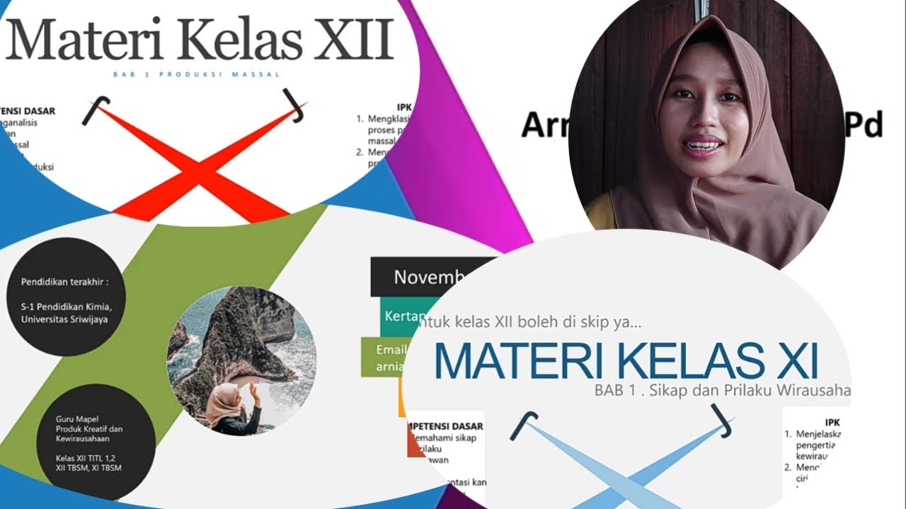
PENGENALAN MATERI PRODUK KREATIF DAN KEWIRAUSAHAAN || Pertemuan ke 1 || kelas XI dan kelas XII

LITOSFER 1
5.0 / 5 (0 votes)
