Types Of Plot By Purpose - Introduction
Summary
TLDRThe video introduces different types of plots used for data visualization and their purposes in data analysis. It covers six key objectives: identifying relationships, measuring deviation, ranking, understanding distribution, analyzing composition, and tracking changes, particularly in time series data. The speaker explains various plot types like scatter plots, histograms, and time series plots, and highlights how each can be used to achieve specific analytical goals. Future sessions will focus on coding these plots using a Jupyter notebook. Viewers are encouraged to follow along to learn practical visualization techniques step-by-step.
Takeaways
- 📊 Data visualization involves using different types of plots for specific purposes in data analysis.
- 📉 One primary purpose is identifying relationships between two variables using correlation plots like scatter plots and heat maps.
- 📈 Deviation plots, such as diverging bars and dot plots, help understand variance within a dataset.
- 📋 Ranking plots, like ordered bar charts and dot plots, are used to rank data within a dataset.
- 📐 Distribution plots, such as histograms, density plots, and box plots, help identify how continuous and categorical data are distributed.
- 🥧 Composition plots, like pie charts and treemaps, are used to understand the makeup of a dataset.
- 🕰️ Time series plots are important for tracking changes over time, especially for time-series data.
- 🔧 Each type of plot serves a specific purpose, from understanding correlations to analyzing changes over time.
- 📝 Future sessions will focus on coding and creating each type of plot in Jupyter notebooks.
- 👨💻 The session emphasized the practical application of different plotting techniques in data visualization.
Q & A
What is the primary purpose of using plots in data visualization?
-The primary purpose of using plots in data visualization is to visualize data effectively, making it easier to understand patterns, trends, relationships, distributions, and compositions within a dataset.
How can plots help in identifying the relationship between two variables?
-Plots such as scatter plots, correlation plots, and heatmaps help in identifying the relationship between two variables by visually representing how one variable changes with respect to another.
What type of plot is commonly used to identify variance within a dataset?
-To identify variance or deviation within a dataset, diverging bar plots and diverging dot plots are commonly used. These plots help in visualizing how much a data point deviates from a central value.
How can ranking be represented within a dataset?
-Ranking within a dataset can be represented using order bar charts and dot plots. These plots help in visualizing the order or rank of data points based on certain metrics, such as maximum or mean values.
What are the key plots used to visualize data distribution?
-The key plots used to visualize data distribution include histograms, density plots, and box plots. These plots help in understanding how continuous or categorical variables are distributed across a dataset.
What is the role of composition plots in data visualization?
-Composition plots, such as pie charts, treemaps, and bar charts, are used to visualize the composition of different categories or elements within a dataset. These plots help in understanding the proportion of each component in relation to the whole.
Which plots are most useful for analyzing time-series data?
-For time-series data, time series plots and time series decomposition plots are most useful. These plots help in visualizing changes, trends, and patterns over time within the dataset.
What is a scatter plot with a line of best fit used for?
-A scatter plot with a line of best fit is used to visualize the relationship between two variables while also showing the overall trend or pattern through a line that best represents the data points.
How do you visualize both continuous and categorical variables in data analysis?
-Continuous variables are often visualized using histograms and density plots, while categorical variables are visualized using bar charts, pie charts, and treemaps to show distribution and composition.
What are the key topics covered in the session related to data visualization?
-The session covers the purposes of data visualization, including identifying relationships, deviations, rankings, distributions, compositions, and changes within datasets. It also discusses various types of plots used for these purposes, such as scatter plots, histograms, bar charts, pie charts, and time series plots.
Outlines

このセクションは有料ユーザー限定です。 アクセスするには、アップグレードをお願いします。
今すぐアップグレードMindmap

このセクションは有料ユーザー限定です。 アクセスするには、アップグレードをお願いします。
今すぐアップグレードKeywords

このセクションは有料ユーザー限定です。 アクセスするには、アップグレードをお願いします。
今すぐアップグレードHighlights

このセクションは有料ユーザー限定です。 アクセスするには、アップグレードをお願いします。
今すぐアップグレードTranscripts

このセクションは有料ユーザー限定です。 アクセスするには、アップグレードをお願いします。
今すぐアップグレード関連動画をさらに表示
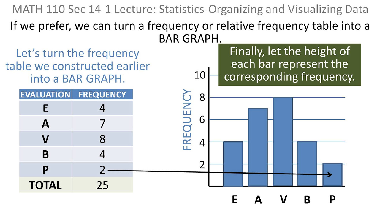
Statistics: 01 Organizing and Visaulizing Data
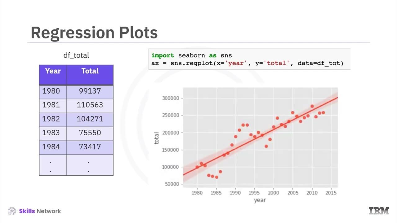
V2 Seaborn and Regression Plots
Data Visualization Tutorial For Beginners | Big Data Analytics Tutorial | Simplilearn
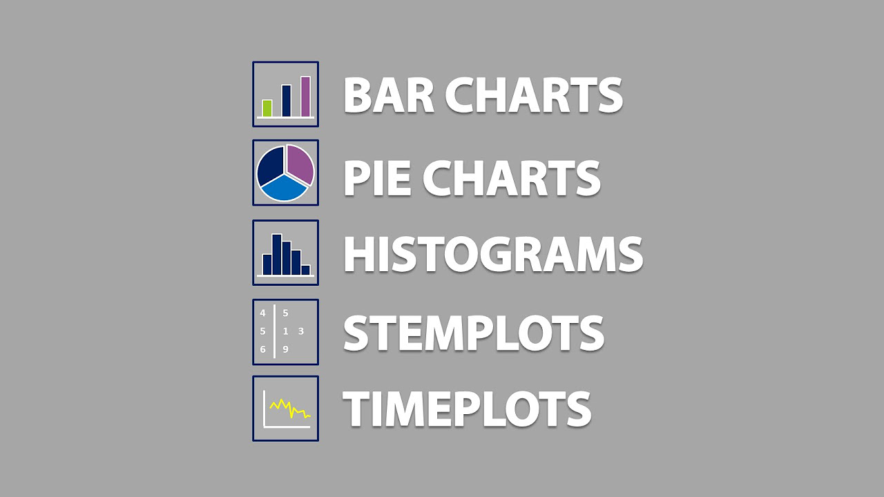
Bar Charts, Pie Charts, Histograms, Stemplots, Timeplots (1.2)
Data Visualization Techniques | Data Visualization Techniques and Tools | Data Visualization Trends
Visualisasi Data - Informatika Kelas X
5.0 / 5 (0 votes)
