Visual Hierarchy Part 3
Summary
TLDRThis transcript focuses on web design best practices, particularly in visual hierarchy and information architecture. It highlights how differentiation, color contrast, and font hierarchy play crucial roles in creating an intuitive user experience. The speaker emphasizes the importance of clear call-to-action (CTA) elements and provides examples, such as Netflix, to showcase effective use of color and design. Key topics include adapting designs to meet user needs, organizing content through font hierarchy, and enhancing website accessibility. The session encourages students and designers to apply these principles to improve engagement and functionality in web development.
Takeaways
- 😀 Visual hierarchy is essential in web design, as it helps users easily navigate and interact with the content.
- 😀 Clear differentiation and proper use of color and contrast can direct attention to important elements, like calls to action (CTAs).
- 😀 Netflix is an example of effective UI, providing users with an engaging experience through simple yet powerful design choices.
- 😀 The use of color contrast in web design can help users focus on specific actions or areas of a website, improving usability.
- 😀 Information architecture plays a significant role in structuring content for easy access and readability on a website.
- 😀 A website should cater to different user groups (e.g., students, faculty) by adapting its content and structure to meet various needs.
- 😀 Adding clear, easy-to-read FAQs and organized content can enhance user experience, especially in academic or institutional settings.
- 😀 Proper font hierarchy (primary, secondary, and tertiary) helps organize text, making content more readable and accessible.
- 😀 Interactive elements, such as submission buttons or links, should stand out and lead users toward important actions.
- 😀 A website’s design should focus on scalability and adaptability to enhance long-term user engagement and growth.
- 😀 The design process should involve constant iterations, ensuring the end product is intuitive and user-friendly while considering specific requirements like video embedding or upload capacities.
Q & A
What is the main focus of the video in terms of web design?
-The video focuses on the principles of visual hierarchy, information architecture, and how they can be used to enhance user experience on websites. It discusses how elements like color, contrast, and font hierarchy can guide users and improve their interaction with web content.
How does color and contrast play a role in web design?
-Color and contrast are used strategically to draw users' attention to important elements, such as call-to-action (CTA) buttons. By using contrasting colors, like purple for CTAs, designers can make these elements stand out and encourage user interaction.
What is the significance of 'Call-to-Action' (CTA) in web design?
-The Call-to-Action (CTA) is a critical element in web design. It directs users toward actions that the website's owner wants them to take, such as subscribing or making a purchase. The design and placement of CTAs are essential for driving user engagement.
Can you explain the concept of font hierarchy in web design?
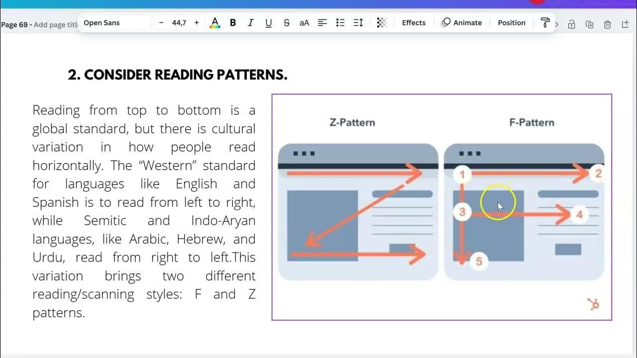
-Font hierarchy involves using different sizes and styles of text to organize content and guide the reader's attention. Primary text is the largest and most prominent, followed by secondary text, which adds context. Tertiary text is smaller and used for less important details like captions or long paragraphs.
How should web designers consider the needs of different users when designing a website?
-Web designers should understand that different users, such as students, faculty, and staff in an academic environment, may have different needs and behaviors. The website should be tailored to accommodate these differences, ensuring that users can easily find the information or services they need.
Why is it important to use contrasting colors in web design?
-Contrasting colors help to create visual focus and guide the user’s attention to important elements, such as CTAs, navigation buttons, or key messages. This enhances usability by ensuring users can easily identify what actions they can take on a website.
What are some real-world examples mentioned in the video?
-Netflix is used as a real-world example, illustrating how the platform uses clear CTAs and design principles to improve user experience. The example emphasizes the use of contrasting colors and the ease of accessing various services like unlimited movies and TV shows.
What role does typography play in web design?
-Typography plays a key role in organizing content and making it readable. Using a hierarchy of fonts helps prioritize information, with larger, more prominent text for important content and smaller text for secondary or supporting information. This helps guide the user through the content in a logical way.
What is the significance of 'secondary' and 'tertiary' text in web design?
-Secondary text supports the primary content and provides additional context, often appearing in smaller sizes but still noticeable. Tertiary text, the smallest, is used for less prominent details, such as captions or disclaimers. Together, they create a clear visual hierarchy and help organize information.
How can web design help improve the user experience in academic websites?
-In academic websites, it's important to address the diverse needs of users, such as students and faculty. The design should focus on providing clear, accessible information, possibly incorporating features like frequently asked questions (FAQs) and categorized content to cater to different user groups.
Outlines

Cette section est réservée aux utilisateurs payants. Améliorez votre compte pour accéder à cette section.
Améliorer maintenantMindmap

Cette section est réservée aux utilisateurs payants. Améliorez votre compte pour accéder à cette section.
Améliorer maintenantKeywords

Cette section est réservée aux utilisateurs payants. Améliorez votre compte pour accéder à cette section.
Améliorer maintenantHighlights

Cette section est réservée aux utilisateurs payants. Améliorez votre compte pour accéder à cette section.
Améliorer maintenantTranscripts

Cette section est réservée aux utilisateurs payants. Améliorez votre compte pour accéder à cette section.
Améliorer maintenantVoir Plus de Vidéos Connexes


5.0 / 5 (0 votes)
