But what is the Fourier Transform? A visual introduction.
Summary
TLDR本视频以动画形式介绍了数学中一个极其重要的概念——傅里叶变换。视频首先通过声音频率的分解来引入傅里叶变换的概念,然后展示了这一概念如何超越声音和频率,延伸到数学乃至物理学的多个领域。通过将纯音信号(如440赫兹的A音)的图形围绕圆圈缠绕,视频展示了如何通过调整缠绕频率来观察图形的质心变化,从而识别信号中的频率。视频还探讨了傅里叶变换如何应用于声音编辑,例如滤除录音中的高频噪音。此外,视频还简要介绍了傅里叶变换的数学公式,并解释了复数在描述旋转和缠绕时的便利性。最后,视频以一个数学难题结束,鼓励观众思考并关注后续视频,以深入了解傅里叶变换在数学其他领域中的应用。
Takeaways
- 📚 视频介绍了傅里叶变换(Fourier transform)的概念,旨在为不熟悉该概念的观众提供入门介绍。
- 🎵 通过声音频率分解的经典例子开始,展示了如何将复杂的信号分解为纯频率。
- 🌀 引入了将信号图形围绕圆圈“缠绕”起来的概念,以此来观察不同频率下图形的变化。
- 📈 通过中心质量的变化,构建了一个数学模型来区分不同频率的信号。
- 🧲 当缠绕频率与信号频率相匹配时,图形的高值和低值会在圆圈的一侧对齐,从而在中心质量上产生显著偏移。
- 📊 通过跟踪不同缠绕频率下中心质量的变化,可以创建一个几乎傅里叶变换的图形,帮助识别信号中的频率。
- 🔍 展示了如何将包含多个频率的信号通过变换机器分解,挑选出各个频率。
- 🎛️ 讨论了傅里叶变换在声音编辑等领域的实际应用,例如通过变换来过滤掉不需要的高频声音。
- ⚙️ 介绍了逆傅里叶变换的概念,它能够从变换后的频率数据恢复原始信号。
- 🔢 详细解释了傅里叶变换的数学公式,包括复数的使用和积分的概念。
- 🌟 强调了傅里叶变换在数学和物理学中的普遍性和重要性,以及它如何超越了信号处理的范畴。
- 📘 视频最后提供了一个数学难题,鼓励观众思考和解决,同时宣传了赞助商Jane Street并提供了相关信息。
Q & A
什么是傅里叶变换?
-傅里叶变换是一种数学变换,它能够将信号从时间域转换到频率域,帮助我们分析信号中的频率成分。在视频中,它被介绍为一种思考方式,用于分解声音中的频率。
为什么傅里叶变换在数学和物理中有广泛的应用?
-傅里叶变换因其能够将复杂的信号分解为不同频率的简单波形而在多个领域中非常重要。它不仅用于声音和频率分析,还扩展到数学和物理的许多其他领域,如信号处理、图像分析、量子物理等。
视频中提到的将信号“卷绕”在圆周上的方法是什么?
-这是一种可视化方法,通过将信号的每个时间点的高度与圆周上的距离相对应,来创建一个旋转的向量。高值对应于离原点更远的距离,而低值则更接近原点。这种方法有助于分析信号的频率成分。
如何使用傅里叶变换来“分离”混合在一起的不同频率的信号?
-通过调整所谓的“绕线频率”,我们可以观察到不同频率的信号在绕线图上的不同表现。当绕线频率与信号频率相匹配时,信号的峰值和谷值会在圆周上的特定位置对齐,从而可以通过中心质量的变化来识别信号频率。
视频中提到的“中心质量”是如何帮助我们识别信号频率的?
-中心质量的概念是指在不同绕线频率下,信号图形的“重心”如何变化。当绕线频率等于信号频率时,中心质量会有显著的偏移,这可以帮助我们识别出信号的主要频率成分。
为什么傅里叶变换对于声音编辑特别有用?
-在声音编辑中,傅里叶变换可以将声音信号从时间域转换到频率域,使我们能够看到声音中的不同频率成分。这样,我们就可以识别并过滤掉不需要的频率,比如去除录音中的刺耳高音。
什么是逆傅里叶变换,它如何帮助我们从频率域返回到时间域?
-逆傅里叶变换是一种数学操作,它将频率域的信号转换回时间域。这意味着,一旦我们通过傅里叶变换分析了信号的频率成分并进行了修改,逆变换可以帮助我们得到修改后的时域信号。
在视频中,为什么将信号的图形视为具有质量的金属丝?
-将信号的图形视为具有质量的金属丝是一种直观的方法,用于理解信号的中心质量如何随绕线频率的变化而变化。这种方法有助于我们可视化和理解信号频率成分的分布。
视频中提到的傅里叶变换的公式是什么,它如何与复数相关?
-视频中提到的傅里叶变换的公式涉及到复数指数。这个公式使用复数来描述信号的旋转和平移,因为复数在数学上非常适合描述旋转和振荡。傅里叶变换的输出是一个复数,它包含了信号中特定频率的强度和相位信息。
为什么傅里叶变换在处理长时间持续的频率时会放大其幅度?
-傅里叶变换的公式中没有对时间区间进行归一化,这意味着如果一个频率在较长时间内持续存在,其在傅里叶变换中的幅度会更大。这反映了信号中频率成分的强度和持续时间。
视频中提到的数学难题是什么,它与傅里叶变换有何关联?
-视频中的数学难题是关于凸集的性质的证明。虽然这个难题本身与傅里叶变换没有直接关联,但它体现了数学中的抽象思维和问题解决技巧,这与理解和应用傅里叶变换所需的数学技能是相似的。
Outlines

Cette section est réservée aux utilisateurs payants. Améliorez votre compte pour accéder à cette section.
Améliorer maintenantMindmap

Cette section est réservée aux utilisateurs payants. Améliorez votre compte pour accéder à cette section.
Améliorer maintenantKeywords

Cette section est réservée aux utilisateurs payants. Améliorez votre compte pour accéder à cette section.
Améliorer maintenantHighlights

Cette section est réservée aux utilisateurs payants. Améliorez votre compte pour accéder à cette section.
Améliorer maintenantTranscripts

Cette section est réservée aux utilisateurs payants. Améliorez votre compte pour accéder à cette section.
Améliorer maintenantVoir Plus de Vidéos Connexes

Vibration Analysis for beginners 5 (Rules for evaluating machine vibration, Signal path from sensor)
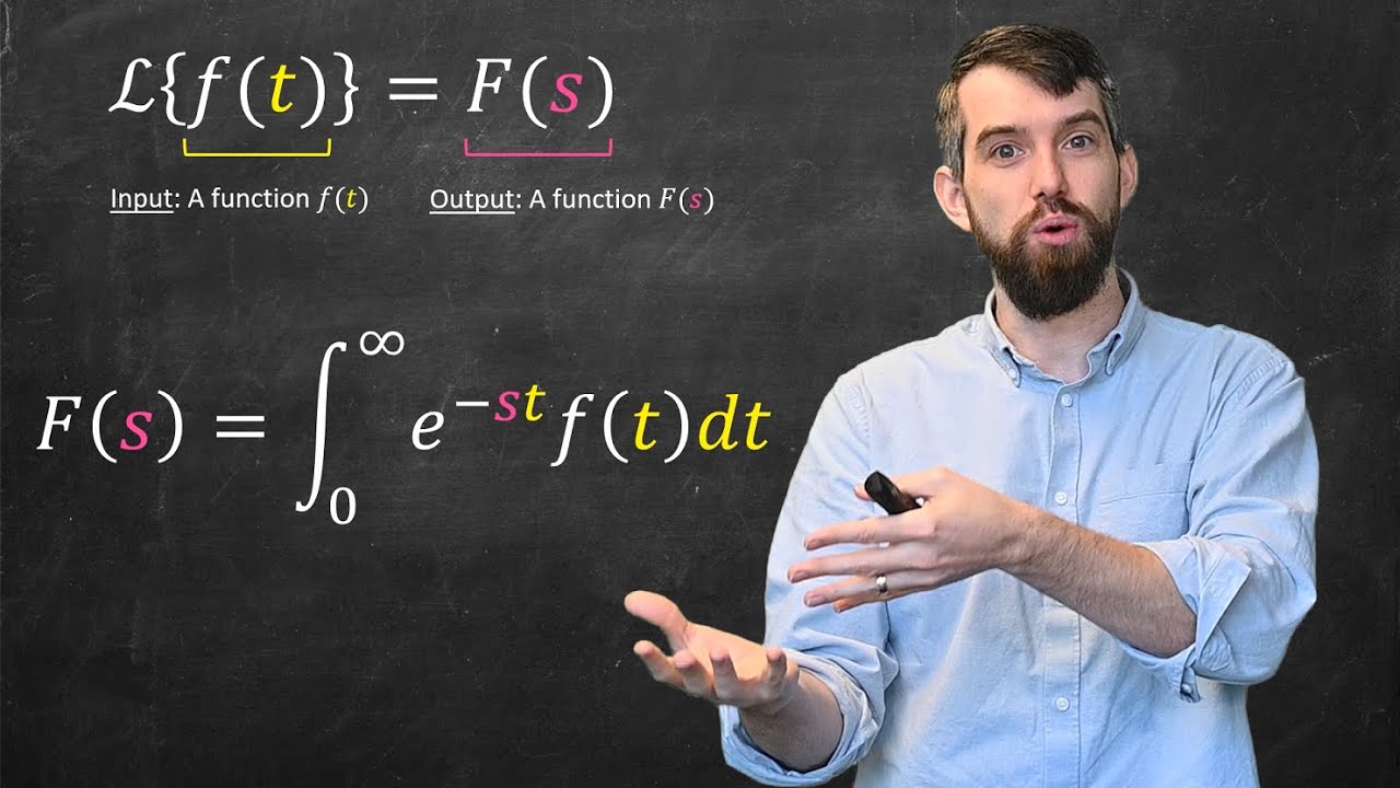
Intro to the Laplace Transform & Three Examples
人類的存在有何目的?一套解釋萬物的哲學理論?世界的本質為何?世界為何存在?亞里斯多德的百科全書式哲學 | 四因說 | 潛能理論 | 形上學 | 實體學 | 哲學爽歪歪EP6

Hibridación del carbono
【中学公民⑦】三権分立の入試に出るポイントを解説します(中学社会・高校入試)

Grammar 101 Introduction to Dependency Grammar
5.0 / 5 (0 votes)
