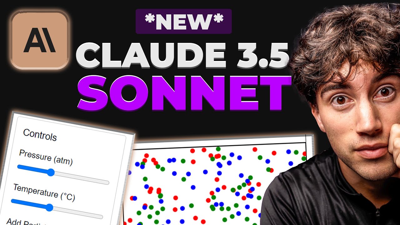
How We Make Clicky Thumbnails Using Ai and Psychology.
Summary
TLDRIn this video, a YouTuber shares their journey of improving thumbnail design over 4 years, highlighting the use of AI and psychology since 2023. The video explains key thumbnail design principles, such as the Rule of Thirds and Symmetrical Rule, and demonstrates practical steps for creating engaging thumbnails using tools like Canva and Lightroom. Emphasizing the importance of imagination, color focus, and minimal text, the creator offers detailed tips and examples to enhance visual appeal and viewer engagement.
Takeaways
- 🎨 Thumbnail evolution: The creator has been making YouTube thumbnails for 4 years, showing significant improvement over time.
- 🛠️ Consistent tools: Only one main tool has been used for thumbnails, with AI being added since 2023.
- 🧠 Psychological approach: Both AI and psychology play roles in the evolution of thumbnails.
- 🔍 Key experiments: Five types of experiments were conducted to find the most effective thumbnail strategies based on psychology.
- 📏 Rules of composition: Two main rules are followed—Rule of Thirds and Symmetrical Rule. The Rule of Thirds focuses on placing key elements at grid intersections, while the Symmetrical Rule emphasizes balanced layouts.
- 👀 Viewer behavior: Thumbnails are designed to capture attention by placing important elements on the left side, as people tend to look from left to right.
- 📝 Text simplicity: Thumbnails should have minimal text, ideally 2-3 words, to quickly convey the message.
- 🌈 Color focus: High contrast and saturated colors are used to make thumbnails stand out, with specific colors preferred for their ability to pop.
- 🖼️ AI and customization: AI-generated images are customized further using tools like Discord’s inside face bot and Canva for personalization.
- 📸 Final adjustments: Thumbnails undergo final color grading and enhancements using tools like Lightroom to ensure high quality and visual appeal.
Q & A
What are the two main rules used in creating effective thumbnails, as mentioned in the script?
-The two main rules are the Rule of Thirds and the Symmetrical Rule.
What does the Rule of Thirds state?
-The Rule of Thirds states that the position of your image should be where the grid lines intersect, as the human eye sees these points first. Your main subject should be placed on these intersection points.
Why is the left side of a thumbnail considered important according to the script?
-The left side is important because most people look at it first due to the way they read and write (left to right). It represents the viewer's perspective and can grab their attention immediately.
What role does psychology play in thumbnail creation according to the script?
-Psychology helps in understanding how viewers perceive thumbnails. By following psychological principles, like the Rule of Thirds and the importance of the left side, creators can design thumbnails that are more likely to attract viewers' attention.
What is the significance of colors in thumbnails?
-Colors are crucial for making thumbnails stand out. Bright, contrasting colors attract more attention, while colors like black or gray are less likely to pop up. The right choice of colors can make a thumbnail more eye-catching.
What experiment does the creator mention having done with thumbnails in the past year?
-The creator mentions having done five types of experiments on thumbnails to determine which approach works best according to psychology.
What is the importance of text in thumbnails?
-Text in thumbnails should be minimal, ideally two to three words, to convey the message quickly and clearly. The choice of words is more important than the amount of text.
How does AI contribute to the creation of thumbnails?
-AI helps in generating realistic and engaging images for thumbnails. The creator uses AI to imagine and create the initial images, which are then customized further.
What is the role of Lightroom in the thumbnail creation process?
-Lightroom is used for color grading and enhancing the thumbnail's visual appeal. Adjustments to exposure, contrast, highlights, shadows, vibrance, saturation, and other effects are made to make the thumbnail more attractive.
Why should creators use presets in Lightroom?
-Using presets in Lightroom helps save time and ensures consistency in color grading across different thumbnails. Presets store preferred settings, making it easier to apply the same adjustments to new thumbnails.
Outlines

Esta sección está disponible solo para usuarios con suscripción. Por favor, mejora tu plan para acceder a esta parte.
Mejorar ahoraMindmap

Esta sección está disponible solo para usuarios con suscripción. Por favor, mejora tu plan para acceder a esta parte.
Mejorar ahoraKeywords

Esta sección está disponible solo para usuarios con suscripción. Por favor, mejora tu plan para acceder a esta parte.
Mejorar ahoraHighlights

Esta sección está disponible solo para usuarios con suscripción. Por favor, mejora tu plan para acceder a esta parte.
Mejorar ahoraTranscripts

Esta sección está disponible solo para usuarios con suscripción. Por favor, mejora tu plan para acceder a esta parte.
Mejorar ahoraVer Más Videos Relacionados

How a Pro YouTuber Actually Makes Thumbnails

How to Become a THUMBNAIL DESIGNER in 2025? (From Scratch)

YouTube Automation with AI | Make FACELESS YouTube Videos with AI

15 INSANE Use Cases for NEW Claude Sonnet 3.5! (Outperforms GPT-4o)

How I'd learn UX Design (if I could start over)

How to Make VIRAL YouTube Thumbnails
5.0 / 5 (0 votes)
