A Practical Guide To Website Page Layouts (1/3)
Summary
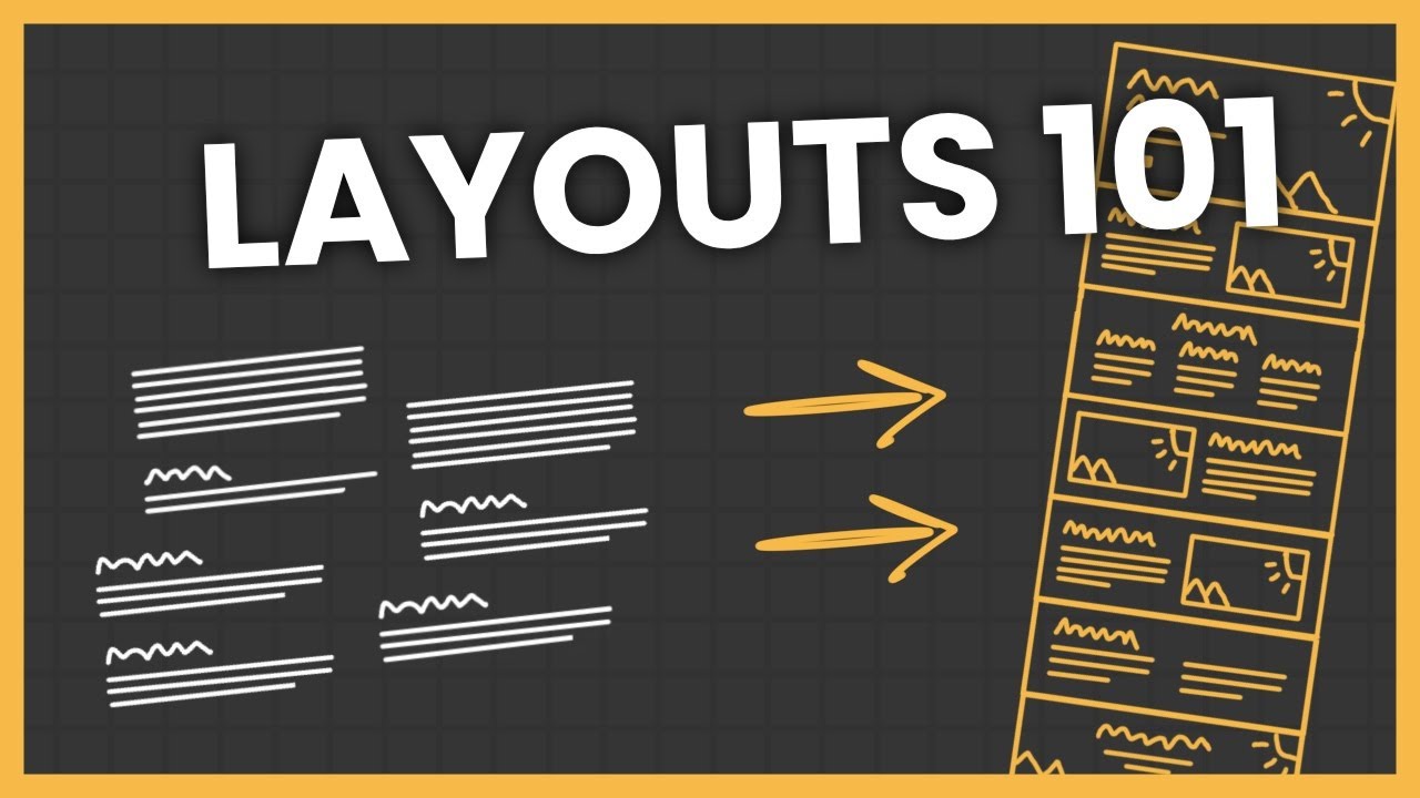
TLDRThis video is the first in a three-part series aimed at web designers, focusing on effective website layouts by utilizing distinct sections. It emphasizes the importance of organizing content into visually identifiable parts, each centered around a single idea to enhance user experience. Clear headings are crucial for quick navigation, while techniques like background colors and spacing help differentiate sections. The video also discusses horizontal layouts and the necessity of hierarchy. By breaking down pages this way, designers can create more organized, professional, and user-friendly websites.
Takeaways
- 😀 A well-designed webpage is organized into sections, each representing a distinct idea or content subject.
- 📊 Sections should be visually distinct to enhance user experience and make content easily consumable.
- 📋 Each section must have a clear heading that allows users to quickly understand its content.
- 🔄 Avoid mixing multiple ideas in one section, as it can confuse users and disrupt information flow.
- 🌐 This layout strategy applies to various pages, including home, about, service, and contact pages.
- 🎨 Background colors, images, and adequate spacing can be used to differentiate sections visually.
- 🖥️ Horizontal sections can be effective but should be limited to two for clarity and hierarchy.
- ⚖️ Establish a visual hierarchy when using multiple horizontal sections to guide user focus.
- 🔍 Clear and descriptive headings improve navigation and user engagement by enabling easy scanning.
- 💡 Remember that the ultimate goal is to create an organized and professional appearance for the website.
Q & A
What is the primary focus of the video series?
-The video series focuses on practical guidance for web designers on creating effective website page layouts, specifically discussing the use of sections.
Why are sections important in website design?
-Sections help break down a website page into smaller, manageable parts, enhancing user experience by making content easily consumable and organized.
What does a well-designed website page consist of?
-A well-designed website page is made up of distinct sections, each representing a single idea or content subject, usually arranged vertically.
How should content be organized within sections?
-Each section should contain only one main idea to avoid confusion and improve the flow of information, which enhances the user experience.
What is a recommended practice for headings in sections?
-Every row should have a clear and descriptive heading, allowing users to quickly scan and understand the content's relevance to them.
What techniques can be used to make sections visually distinct?
-Sections can be made distinct through the use of background colors, background images, adequate spacing, or dividers.
How does horizontal stacking of sections affect user experience?
-Horizontal stacking can be effective if limited to two sections and if a clear hierarchy is established; otherwise, it may confuse users.
What are some common pitfalls when using headings?
-Using vague or overly marketable headings can lead to a poor user experience, as they may not clearly indicate the content of the section.
How does culture influence website design and layout?
-Cultural differences can impact user preferences and interpretations of layouts, but the video does not delve deeply into this aspect.
What is the overall goal of organizing content into sections?
-The goal is to create a user-friendly experience that requires less cognitive effort for users to find the information they are looking for.
Outlines

Esta sección está disponible solo para usuarios con suscripción. Por favor, mejora tu plan para acceder a esta parte.
Mejorar ahoraMindmap

Esta sección está disponible solo para usuarios con suscripción. Por favor, mejora tu plan para acceder a esta parte.
Mejorar ahoraKeywords

Esta sección está disponible solo para usuarios con suscripción. Por favor, mejora tu plan para acceder a esta parte.
Mejorar ahoraHighlights

Esta sección está disponible solo para usuarios con suscripción. Por favor, mejora tu plan para acceder a esta parte.
Mejorar ahoraTranscripts

Esta sección está disponible solo para usuarios con suscripción. Por favor, mejora tu plan para acceder a esta parte.
Mejorar ahoraVer Más Videos Relacionados

How to Properly Layout A Website (For Beginners)

64. OCR A Level (H046-H446) SLR12 - 1.3 HTML

How to apply Graphic Design Principles to your Designs | Alignment | Episode 1 #graphicdesigning

Breaking Down a Rhetorical Analysis Prompt | Coach Hall Writes

Responsive Design Beginner's Tutorial for Figma

Short trick for RC | Golden rules for Reading Comprehension - Part 1 | Verbal Ability | Priyasha Das
5.0 / 5 (0 votes)
