Design Better Than 99% of UI Designers
Summary
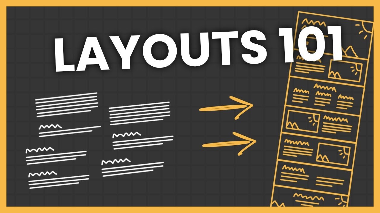
TLDRThis video tutorial outlines seven essential guidelines used by top 1% designers to elevate their websites. It covers typography, spacing, grid structures, breaking monotony, color choices, impactful visuals, and attention to detail. By transforming a mediocre site step-by-step, the video demonstrates how to achieve a modern, visually appealing design that stands out, emphasizing the importance of simplicity and minimalism in web design.
Takeaways
- 🔡 Typography is crucial for creating amazing websites, with a focus on the art of text and clean visuals.
- 🔧 Stick to one font for consistency, but if using two, learn from well-designed websites to create a text style guide.
- 📐 Spacing is key in design; use a multiplier based on the relationship between elements to create a visually pleasing layout.
- 📏 Grids help in structuring designs, ensuring visual coherence and alignment of elements.
- 🔄 Breaking the monotony by occasionally breaking grid rules can add interest and surprise to a website's layout.
- 🎨 Colors play a significant role in website aesthetics; use a limited palette with a base, primary, and neutral color for balance.
- 🖌️ Visuals are as important as typography; high-quality images and illustrations can greatly enhance a website's appeal.
- 🌈 Use color with caution, ensuring good contrast and readability, and applying opacities to create hierarchy.
- 📸 Utilize free resources for visuals, such as illustrations and 3D assets, to avoid poor-quality imagery.
- 🏷️ Details make the difference; subtle effects like glows and shadows can elevate the design without overcomplicating it.
- 🛠️ Keep design simple and minimal, avoiding the temptation to over-embellish, to maintain a clean and modern look.
Q & A
What are the seven key guidelines discussed in the video for creating top-tier websites?
-The video does not explicitly list all seven guidelines in the provided transcript, but it covers typography, spacing, grids, breaking monotony, colors, visuals, and details as important aspects of web design.
Why is typography considered essential in web design?
-Typography is essential because it is a fundamental aspect of the visual communication of a website. It can make or break the user experience and is often one of the first elements noticed by visitors.
What is the recommended approach for using multiple fonts on a website?
-The recommended approach is to stick with one font, but if two are necessary, one should find an existing well-designed website using two fonts, inspect the text elements to understand the font properties, and then apply these properties in their own design tool.
How can one determine the appropriate spacing in a web design?
-Appropriate spacing can be determined by considering the relationship between elements. Elements with a closer relationship should have less space between them, and a multiplier can be used to determine the space between elements with a more distant relationship.
What is the significance of using grids in web design?
-Grids provide a visual structure to the design, making it more aesthetically pleasing and organized. They help align elements and create a consistent layout that is easy to navigate.
Why is it important to break the monotony in a web design?
-Breaking the monotony adds interest and surprise to the design, which can enhance user engagement. It helps to create a dynamic and less predictable visual experience.
How should colors be used in web design to ensure they enhance rather than detract from the website?
-Colors should be used carefully with a clear hierarchy and good contrast. A foolproof system is to use three colors: a base color for the background, a primary color for calls to action and details, and a neutral color for text elements.
What role do visuals play in web design, and how can they be improved?
-Visuals are crucial as they can convey the brand's message and aesthetic. They can be improved by using high-quality images, illustrations, and 3D assets that align with the website's overall theme and color scheme.
What are some common pitfalls to avoid when adding details to a web design?
-Common pitfalls include overdoing effects, adding too many elements, and not maintaining a simple and minimal design. It's important to keep the design clean and not let details distract from the overall user experience.
How can the use of opacities in text elements create a hierarchy in web design?
-Using different opacities for text elements can create a visual hierarchy, making it easier for users to distinguish between headings, subheadings, and body text. For example, using 80% opacity for larger text and 70-60% for smaller text can help establish this hierarchy.
What is the importance of maintaining a good reading experience in web design?
-A good reading experience is crucial for user engagement and comprehension. It involves ensuring that text content does not span too wide, which can make reading difficult, and that there is adequate spacing and padding for readability.
How can one use the Framer tool to build custom websites quickly?
-The video suggests that Framer allows for the quick creation of custom websites by applying the discussed design guidelines. It implies that using Framer can streamline the process of web design, though specific steps are not provided in the transcript.
Outlines
🔠 Typography and Text Styles
The first guideline focuses on the importance of typography in web design. It emphasizes the reliance of many websites on text and clean visuals, advocating for the use of a single font but providing a method to effectively use two fonts if necessary. This involves inspecting and replicating the text styles from well-designed websites, including font family, size, weight, letter spacing, and line height. The summary also touches on the strategic use of different heading sizes to create hierarchy and calls to action, as well as the significance of good spacing to enhance readability and visual appeal.
📏 Spacing and Grid Structures
This paragraph delves into the principles of spacing and grid usage in web design. It discusses the negative impact of poor spacing on layout and how good spacing can be achieved by considering the relationship between elements. The concept of using a multiplier based on the relationship between elements to determine spacing is introduced. The paragraph also covers vertical spacing, padding, and the use of grids to ensure visual structure and balance. It highlights the importance of breaking the monotony by occasionally breaking the grid to create a dynamic and engaging user experience.
🎨 Colors and Visual Impact
The third paragraph discusses the role of color in web design, suggesting a three-color system for a harmonious palette. It advises using a base color for backgrounds, a primary color for calls to action and details, and a neutral color for text elements. The importance of contrast between base and primary colors is stressed, along with the use of color opacity to create a hierarchy and enhance readability. The paragraph also briefly introduces the use of visuals, such as images and illustrations, to add character and pop to a website, and the importance of maintaining simplicity and minimalism in design.
Mindmap
Keywords
💡Typography
💡Visuals
💡Spacing
💡Grids
💡Monotony
💡Colors
💡Contrast
💡Details
💡Opacities
💡Structure
Highlights
Seven key guidelines used by top 1% designers to create outstanding websites.
The importance of typography in website design and how to study and apply it effectively.
Using a single font for consistency, with a trick for those who prefer using two fonts.
How to create a text style guide by inspecting well-designed websites.
Applying text styles to different sections and headings for a cohesive design.
The concept of spacing based on the relationship between design elements.
Using multipliers for spacing to create a visually appealing layout.
The significance of maintaining a maximum text width for better readability.
Introduction to grids and their role in creating visually structured designs.
Breaking the monotony with creative deviations from the grid layout.
Strategic use of color to enhance website appeal and maintain professional look.
A three-color system for foolproof color palettes in web design.
The impact of visuals on website aesthetics and the availability of free resources.
A quick workflow example using Mid Journey for creating modern visuals.
The importance of details in web design and the need to avoid overcomplicating.
Using subtle effects like glow for a trendy yet refined design touch.
Transforming a below-average website into a modern and crisp design using the seven guidelines.
The benefits of using Framer for building custom websites quickly and efficiently.
Transcripts
in this video we'll cover seven key
guidelines that the top 1% designers use
to consistently outshine the other 99%
we'll do this by studying examples of
great websites all while transforming a
bad website into a top tier one
guideline by guideline starting with the
first one typography I've covered this
in depth in another video but we simply
cannot create amazing websites without
diving deep into the art of text if we
just look at any website collection
website wow that's meta we'll notice
that a lot of websites rely almost
solely on text and clean visuals which
is also an important thing that we'll
get to later in this video the visuals
now I almost always suggest that you
stick with just one font for your
website but if you're rebellious and you
just need to use two fonts for whatever
reason the world is going to explode
zombie apocalypse then I have a trick
for you first you find an existing
well-designed website that's using two
fonts then if you're using Chrome or
Brave browser you just right click to
inspect their text elements next you
head to computed and check the following
what's the font family what's the font
size what's the font weight what's the
letter spacing and what's the line
height then you just head into your web
design tool of choice and since I'm
using framer I'll just go into framer
and add this as a text style I'll do
that for each and every one of the text
Styles they have on their website and
once that's done you have your text
style guide and now you can apply it
accordingly I usually use my H1 in
combination with my biggest body text
size for the hero and certain sections
that I want to call out like the last
call to action section then I use the H2
as the heading for most other sections
and if you have multiple headings in one
section then I usually will gradually
decrease the size like in this section
H2 for the main heading then H3 for the
subcategories if you have a section
where you need to cram even more
information into it like this social
proof section well then I usually jump
down one or two sizes even further for
the headings for the body text I use
body large for my 1es body medium for
the H2S and body small for smaller
details again use your website of choice
as a reference here and there we have it
just a quick typography change across
the board and the website already looks
so much better but there is something
else that not only breaks Hearts but
also layouts bad spacing all the
goodlook websites you see on the web use
good spacing in a lot of websites use
different spacing but they still somehow
look good so what spacing is the correct
spacing well as always in design there
is no one Golden Rule that just always
works but there is one neat little trick
that I like spacing based on
relationship now what do I mean by that
well if we look at our design here we
can kind of agree that certain elements
have a closer relationship than others
for example this hero text has a closer
relationship to the body text than it
has to either of the two buttons so with
that we can increase the distance
between the text elements and the
buttons and for this increase I like
using a multiplier if the text elements
are spaced 24 pixels apart from each
other then the space between the text
elements and the buttons should be two
times that so 48 pixels math same for
for the button and the text below they
belong together and should probably live
happily ever after together there's no
such thing as happily ever after so 24
pixels again the same goes for the next
section but since the text sizes are a
bit smaller here what we can do is to
reduce the base spacing so instead of 24
pixels we can use 16 pixels the text
elements belong together and the icon or
image will be pushed with a multiple of
too now while not a 100% exact science
because nothing in design is you can use
this multiplier relationship Concept in
most cases to get a nice enough
Breathing Room between a group of text
and an image for example I'll make sure
to have at least 80 to 96 pixels of
distance you'll have to eye this a bit
and see what looks good with your eyes
but generally more breathing room is the
safest route one caveat here though if
you have a big container then just make
sure your text content doesn't span
wider than 600 pixels because if the
container of text is too wide then the
reading experience takes a big hit for
the vertical spacing in a section I
usually go with at least 160 pixels on
each side and for paddings and cards and
other content wrappers with smaller
content like this 32 pixels as a
baseline rarely goes wrong but keep in
mind the larger text you have usually
the bigger spacing you'll need here as
well two guidelines in and it's already
starting to look like something we could
probably show our mother-in-law but it's
still lacking structure so next up grids
you see using grids allow us to make
sure that our designs are visually
structured that they look nice to the
eye once again you'll see it in action
all the way from Bento grids to Artistic
websites relying on typography and
imagery some 1% designers do this
without even using grid features in
tools like figma or framer and others
use the grid features available to them
by the way if you want to learn how to
use framer to build fully custom
websites just like this one super
quickly feel free to join the weight
list to my upcoming Z to Hero course the
links Down Below in the end though it
doesn't really matter if you use the
grid features in the tools or not the
most important thing is that things look
structured but if you're a beginner it
can really help to just throw on the
grid feature then make sure you have a
container box of a decent Max width I
like 960 pixels for this design now you
just have to make sure that most of your
content stays in here and I see most
because there's an important exception
to the rule that we'll get to a bit
later I also like dividing my inner
content into equally sized chunks
whether it's 2x two 3x3 or one by one
and since we have everything in our 960
pixel Max withd container you'll see
that for example all the 2 by tws line
up nicely with each other even if we
throw them
around structure the ultimate antidote
to any layout OCD but if we rely only on
this it could risk becoming a bit
monotonous which brings us to the next
Point breaking the monotony as much as
we like predictability and patterns and
grids we as humans also kind of like
sometimes when the rules are broken and
this is a super important aspect of
creating good-look websites we need to
break the monotony you'll see this in
action all across the web we stick to
our grid and then we break it we stick
to our pattern and then we break it we
make it predictable and then we surprise
so sometimes we need to break the
beautiful grid that we just created
typical places would be the logo sliders
where we'll just have it continue into
infinity or even carousels like this
social proof Carousel here we can have
it start in the Grid on the left but
then bleed outside on the right same
with the last call to action section
here after using images in a very
consistent manner throughout the website
here we mix it up by throwing it into
the open space and Center aligning the
text container you know what let's even
Center align the hero text container
because why not I like to think of the
goal of this exercise to be achieving a
website flow that resembles a
wave so we have the typography we have
the spacing we have the structure and we
Bur break the structure life is good but
with that said none of this would really
matter in the end if we had shitty
colors which brings us to colors and I'm
not going to linger too much on this one
because it's kind of a super covered
topic already but I will give my
perspective on it and maybe a little
system you can use now colors can make
websites pop give them character have
them stand out and it can also destroy
websites make them look um professional
draw attention away from the most
important things so it's very important
that we use colors carefully and the
most foolproof system that I found is to
just use three colors one base color for
your website background one primary
color for your call to action and
potentially small details and one
neutral white or dark depending on your
theme for text elements the Only Rule
here is to make sure that your B base
color and your primary color have a good
contrast then just head to either a
website you like and take inspiration
from their palette or go to coolers or
any other color tool and find your
palette now once you have the palette
ready you can start assigning colors
again base color for background primary
color for call to actions and in this
case for Icon details and the logo types
then neutral color for text to round off
as a sneaky little ninja move we'll use
opacities of the neutral color for our
text elements I like to use around 80%
for the top size and 70 to 60% for
smaller sizes to create a nice hierarchy
just make sure that all your Tech sizes
maintain good readability then you can
use the primary color with 5% opacity
for secondary buttons and cards that you
want to call out without stealing the
show look at the difference this color
shift made for the website now we're
getting close to the final result but
there are two important things left and
let's start with the first one visuals I
mentioned this when I talked about
typography and it cannot be neglected
just take a look at this website by
wealth simple this beautiful piece of
HTML and CSS is basically just visuals
even without the text it would still
look amazing but not everyone can get
clean and crisp visuals like that right
or can they with free video websites
like pixels figma's community files with
illustrations the 3D assets shared in
spin's community and mid Journey or
Dolly you have so many options there
really are no excuses for bad visuals in
this day and age sorry now to give you
just a fast and easy example I'll show
my 30 second workflow with mid Journey
first I ask myself what Niche I'm in for
this example agriculture then I ask
myself what kind of style I want in this
case I think isometric 3D would be cool
lastly I ask myself what kind of colors
I need and this is important because we
want our image assets to blend really
nicely with our overall website lastly I
just make sure to write a prompt that
includes white background now I can
produce a bunch of cool visuals download
them remove the background and upscale
them in a tool like canva and then add
them to my website and this change to
Modern and crisp image assets brings us
almost all the way to the final website
we're like 80% of the way and the last
19% comes from the details and this is
where a lot of people trip up this is
where websites quickly become a m mess
it's where people start adding anything
and everything to give life to a design
but in the end it just turns out bad so
we have to be careful at this stage we
don't want to overdo it and my best rule
of thumb and Guiding Light in design
always is to keep it simple and minimal
one of the most popular things on
websites right now is the glow effect
and I think we have linear to thank for
this so fine we'll get into the trend
and we'll add a glow but we'll make it
subtle I'll take the logo we have I'll
upscale it blur it out and throw it
behind our image doesn't have to be the
logo you have it could be just a shape
with a linear gradient or a radial
gradient or as in this case an angular
gradient with a blur and some fading
maybe some opacity I can then reuse the
same technique to create pieces of
delight throughout the whole design by
just decreasing the opacity a bit to
make the buttons feel less flat and
lifeless we can add a tiny little white
inner Shadow to the top and a faded out
drop shadow same for the secondary
buttons here I'll add a primary color
border of 5% opacity along with the
shadow this exact style I'll then just
copy over to the card components and
with that ladies and gentlemen we are
done we went from this uninspiring below
average website into a very crisp and
modern website with just seven
guidelines and to be completely honest
with you creating websites like this
gets even easier when you use a tool
like framer so if you haven't already
checked out my upcoming framer course
you can check it out in the link down
below now until the next one have a
great life
Weitere ähnliche Videos ansehen
5.0 / 5 (0 votes)