Control Charts simply explained - Statistical process control - Xbar-R Chart, I-MR Chart,...
Summary
TLDRThis video script introduces control charts as statistical tools for monitoring and controlling processes by tracking key variables over time. It explains the purpose of control charts, such as identifying trends and unusual patterns, and provides an example using an x-bar R chart in a fulfillment center. The script also discusses different types of control charts for continuous and discrete data, including x-bar R, I-MR, NP, P, C, and U charts, and how to choose the appropriate chart based on data format and variability.
Takeaways
- 📊 Control charts are statistical tools used for monitoring and controlling processes by tracking key variables over time.
- 🔍 They help identify trends, shifts, or unusual patterns that may indicate a problem with the process.
- 📈 A decision tree can be used to determine the appropriate type of control chart based on the format of the available data.
- 📚 An example of an x-bar R chart is used to monitor the average processing time in a fulfillment center to ensure efficiency.
- 📝 Data for control charts is obtained by taking random samples and measuring key variables, such as processing time in the given example.
- 📉 The x-bar chart involves plotting mean values over time, with the center line representing the overall mean and control limits indicating process variation boundaries.
- 📌 The upper control limit (UCL) and lower control limit (LCL) are typically set at three standard deviations from the mean, representing the process's upper and lower variability thresholds.
- 🔢 Sigma, or standard deviation, can be calculated in different ways, with some methods being more accurate or straightforward.
- 📉 The R chart, often used alongside the x-bar chart, plots the range of values each day to provide additional insight into process variability.
- 🔄 The individual moving range (IMR) chart is used when there is only one observation per point in time, plotting the difference between consecutive points.
- 🔢 Discrete data control charts, such as the NP, p, C, and u charts, are used for processes with defects or events counted, and they can accommodate both constant and variable sample sizes.
Q & A
What are control charts and why are they important?
-Control charts are statistical process control tools used to monitor and control processes by tracking the performance of key variables over time. They are important because they help identify trends, shifts, or unusual patterns that might indicate a problem with the process, providing crucial information about the stability of the process.
How does a control chart differ from a decision tree?
-A control chart is a tool for monitoring process stability and identifying issues, while a decision tree is a flowchart-like structure used to help decide which control chart to use based on the format of the available data. The decision tree guides the selection of the appropriate control chart.
What is an x-bar (x̄) R chart and how is it used?
-An x-bar (x̄) R chart is a type of control chart used to monitor the average (x̄) and range (R) of a process over time. It is used to ensure that the process remains stable and within acceptable limits, such as the average processing time in a fulfillment center.
How is the data for an x-bar (x̄) R chart collected?
-Data for an x-bar (x̄) R chart is collected by taking random samples of the process at regular intervals. For example, in a fulfillment center, the processing time of five orders per day could be measured over a period of 25 days.
What are the three lines on an x-bar (x̄) R chart and what do they represent?
-The three lines on an x-bar (x̄) R chart are the center line, the upper control limit (UCL), and the lower control limit (LCL). The center line represents the mean value of all data points, the UCL is set at three standard deviations above the mean and indicates the upper boundary of process variation, and the LCL is set at three standard deviations below the mean, representing the lower bound of process variation.
What is the difference between control limits and specification limits?
-Control limits are based on process variability and statistical calculations, indicating the natural variation within a process. Specification limits, on the other hand, are defined by customer requirements or engineering tolerances and represent the acceptable range of product characteristics from a quality perspective.
What is an I-MR chart and when is it used?
-An I-MR chart, which stands for individual moving range chart, is used when there is only one observation at each point in time. It plots individual data points over time and uses the moving range (the difference between consecutive points) to monitor process stability.
How is the moving range calculated in an I-MR chart?
-The moving range in an I-MR chart is calculated as the difference between consecutive data points. For example, if the first and second data points are 10 and 11, respectively, the moving range would be 1.
What are the types of control charts for discrete data?
-Control charts for discrete data include the np chart (for constant sample size and one defect per unit), the p chart (for variable sample size and one defect per unit), the c chart (for multiple defects per unit and constant sample size), and the u chart (for multiple defects per unit and variable sample size).
When would you use an np chart instead of a p chart?
-An np chart is used when monitoring the number of defects in a process with a constant sample size and one defect per unit, such as when counting the number of defective light bulbs produced each day with a sample of 10 bulbs.
How can you create control charts for discrete data using a data tab?
-To create control charts for discrete data using a data tab, you can input your data into a table, select the appropriate variables, and use statistical process control tools to automatically generate the desired control chart, such as an np, p, c, or u chart.
Outlines

Dieser Bereich ist nur für Premium-Benutzer verfügbar. Bitte führen Sie ein Upgrade durch, um auf diesen Abschnitt zuzugreifen.
Upgrade durchführenMindmap

Dieser Bereich ist nur für Premium-Benutzer verfügbar. Bitte führen Sie ein Upgrade durch, um auf diesen Abschnitt zuzugreifen.
Upgrade durchführenKeywords

Dieser Bereich ist nur für Premium-Benutzer verfügbar. Bitte führen Sie ein Upgrade durch, um auf diesen Abschnitt zuzugreifen.
Upgrade durchführenHighlights

Dieser Bereich ist nur für Premium-Benutzer verfügbar. Bitte führen Sie ein Upgrade durch, um auf diesen Abschnitt zuzugreifen.
Upgrade durchführenTranscripts

Dieser Bereich ist nur für Premium-Benutzer verfügbar. Bitte führen Sie ein Upgrade durch, um auf diesen Abschnitt zuzugreifen.
Upgrade durchführenWeitere ähnliche Videos ansehen

Cartas de Controle (Aula 01) - Introdução ao Gráfico X-Barra / R

Statistical Process Control (SPC) in Quality Management + How to create Control Charts
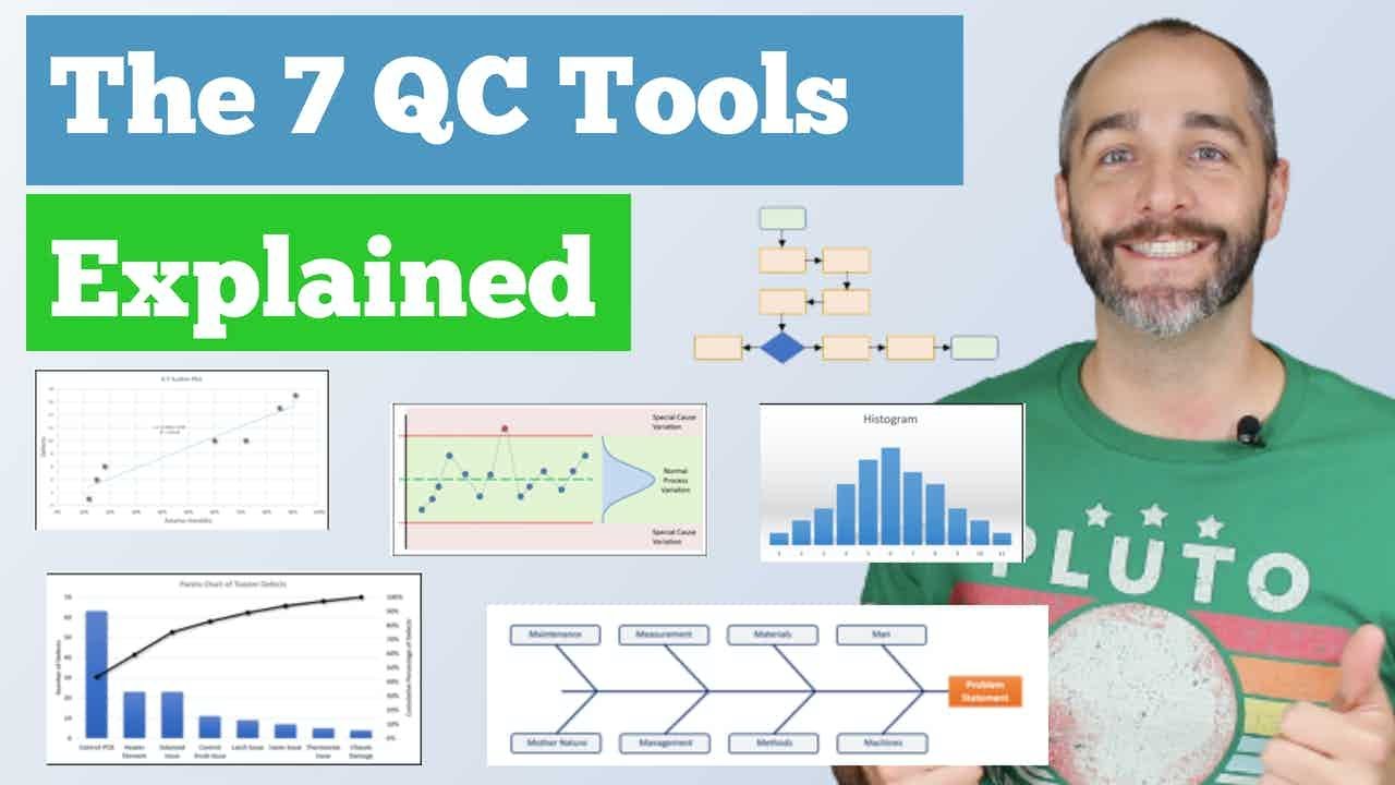
The 7 Quality Control (QC) Tools Explained with an Example!

CEP Controle Estatístico de Processo, conceitos de controles aula 1

Varians dalam Penelitian Eksperimen
How to Tally, Encode, and Analyze your Data using Microsoft Excel (Chapter 4: Quantitative Research)
5.0 / 5 (0 votes)
