ANALISIS DATA KELAS 8 SMP
Summary
TLDRThis video script introduces the basics of statistical analysis, focusing on data interpretation through tables, bar charts, line graphs, and pie charts. It explains statistical concepts such as data collection, organization, analysis, and conclusion drawing. Practical examples are provided, including analyzing student test scores and interpreting graphical data like visitor numbers and agricultural production. The script also offers problem-solving exercises, helping students understand how to read, analyze, and predict data trends. Overall, it emphasizes the importance of statistics in daily life and encourages active learning in mathematics.
Takeaways
- 😀 Statistics is a scientific method for collecting, organizing, analyzing data, and drawing conclusions to make informed decisions.
- 😀 Real-world applications of statistics include tracking population density, poverty rates, body weights, and educational statistics.
- 😀 In this lesson, students will learn how to analyze and interpret data using tables, bar diagrams, line diagrams, and pie charts.
- 😀 A table can display data such as student test scores, and can be analyzed to find key information like the most common score or the number of students below the passing grade.
- 😀 Bar diagrams are useful for comparing quantities, like the number of visitors to a tourist location on different days of the week.
- 😀 A line diagram helps track changes over time, such as the rise or fall in corn production from one year to another.
- 😀 Pie charts are used to show proportions, like the percentage of students participating in various extracurricular activities.
- 😀 When analyzing a table, students need to calculate totals and identify patterns such as the most frequent score or the number of students below the minimum passing grade.
- 😀 The key steps in interpreting bar diagrams involve identifying the highest and lowest data points and calculating the differences between them.
- 😀 In line diagrams, the focus is on identifying periods of increase or decrease in the data, helping to track trends over time.
- 😀 The ultimate goal of learning statistics is to develop the ability to analyze data accurately and make predictions based on solid reasoning.
Q & A
What is the definition of statistics as explained in the video?
-Statistics is a scientific method that involves the collection, organization, analysis, and interpretation of data to draw valid conclusions and make rational decisions.
What are some common real-life applications of statistics mentioned in the video?
-Examples include data on population density, poverty rates, body weight, and educational data, all of which have significant impacts on society.
What is the main focus of the analysis of data in class 8 as per the video?
-The main focus is learning how to read, analyze, and predict data based on tables and diagrams such as bar charts, line graphs, and pie charts.
What types of diagrams were discussed in the video?
-The video discussed bar diagrams, line diagrams, and pie charts.
In the first example, how did the teacher determine the total number of students who participated in the math test?
-The teacher added up the number of students in each group, which were 3, 5, 4, 10, 5, and 2, totaling 20 students.
According to the analysis, what was the most frequent score in the math test?
-The most frequent score was 80, as it was the highest, with 10 students achieving this score.
What does the analysis suggest as possible reasons for students scoring below the KKM (minimum passing grade)?
-Possible reasons include not studying enough or not being focused during the test.
In the bar chart example of tourist visitors in Bawean, which day had the fewest visitors?
-Friday had the fewest visitors, as shown by the lowest bar in the chart.
How did the teacher calculate the difference in the number of visitors between Sunday and Friday?
-The teacher subtracted the number of visitors on Friday (144) from the number on Sunday (600), resulting in a difference of 500 visitors.
What was the trend in corn production from 2013 to 2020 as discussed in the line graph?
-The corn production increased in several years, with the largest increase happening from 2017 to 2018, which saw a rise of 40 tons.
Outlines

Dieser Bereich ist nur für Premium-Benutzer verfügbar. Bitte führen Sie ein Upgrade durch, um auf diesen Abschnitt zuzugreifen.
Upgrade durchführenMindmap

Dieser Bereich ist nur für Premium-Benutzer verfügbar. Bitte führen Sie ein Upgrade durch, um auf diesen Abschnitt zuzugreifen.
Upgrade durchführenKeywords

Dieser Bereich ist nur für Premium-Benutzer verfügbar. Bitte führen Sie ein Upgrade durch, um auf diesen Abschnitt zuzugreifen.
Upgrade durchführenHighlights

Dieser Bereich ist nur für Premium-Benutzer verfügbar. Bitte führen Sie ein Upgrade durch, um auf diesen Abschnitt zuzugreifen.
Upgrade durchführenTranscripts

Dieser Bereich ist nur für Premium-Benutzer verfügbar. Bitte führen Sie ein Upgrade durch, um auf diesen Abschnitt zuzugreifen.
Upgrade durchführenWeitere ähnliche Videos ansehen
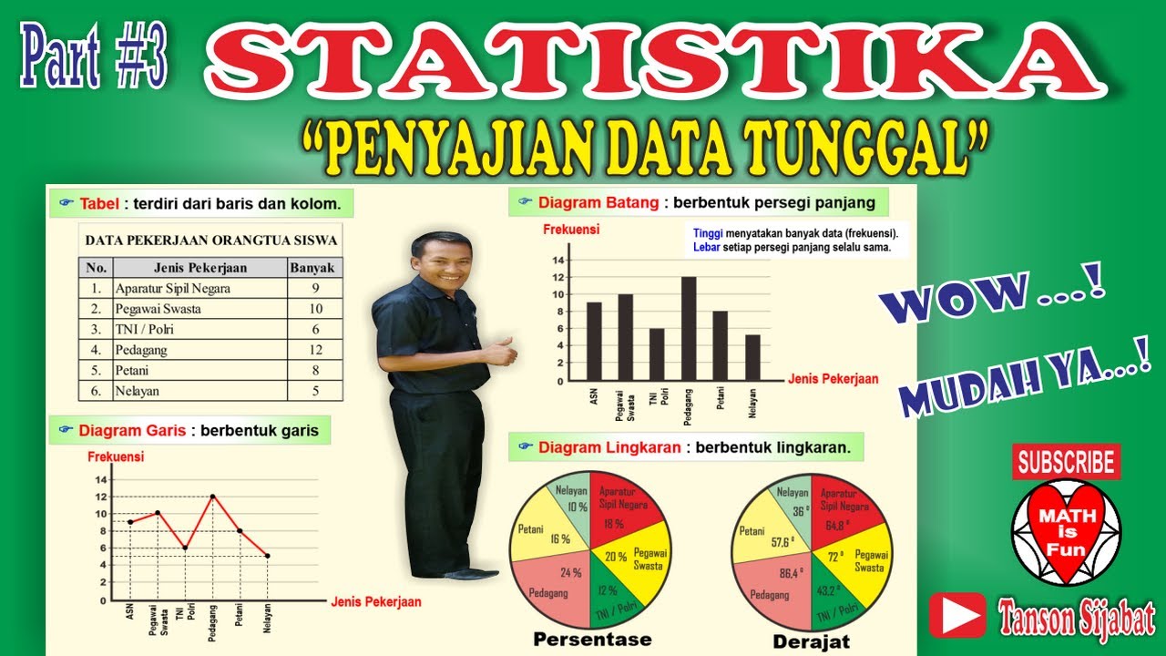
STATISTIKA | PENYAJIAN DATA TUNGGAL [Tabel, Diagram Garis, Diagram Batang, Lingkaran]

PENYAJIAN DATA || TABEL DIAGRAM GRAFIK (PART 1)
Statistika Kelas 8 [Part 1] - Menganalisis Data
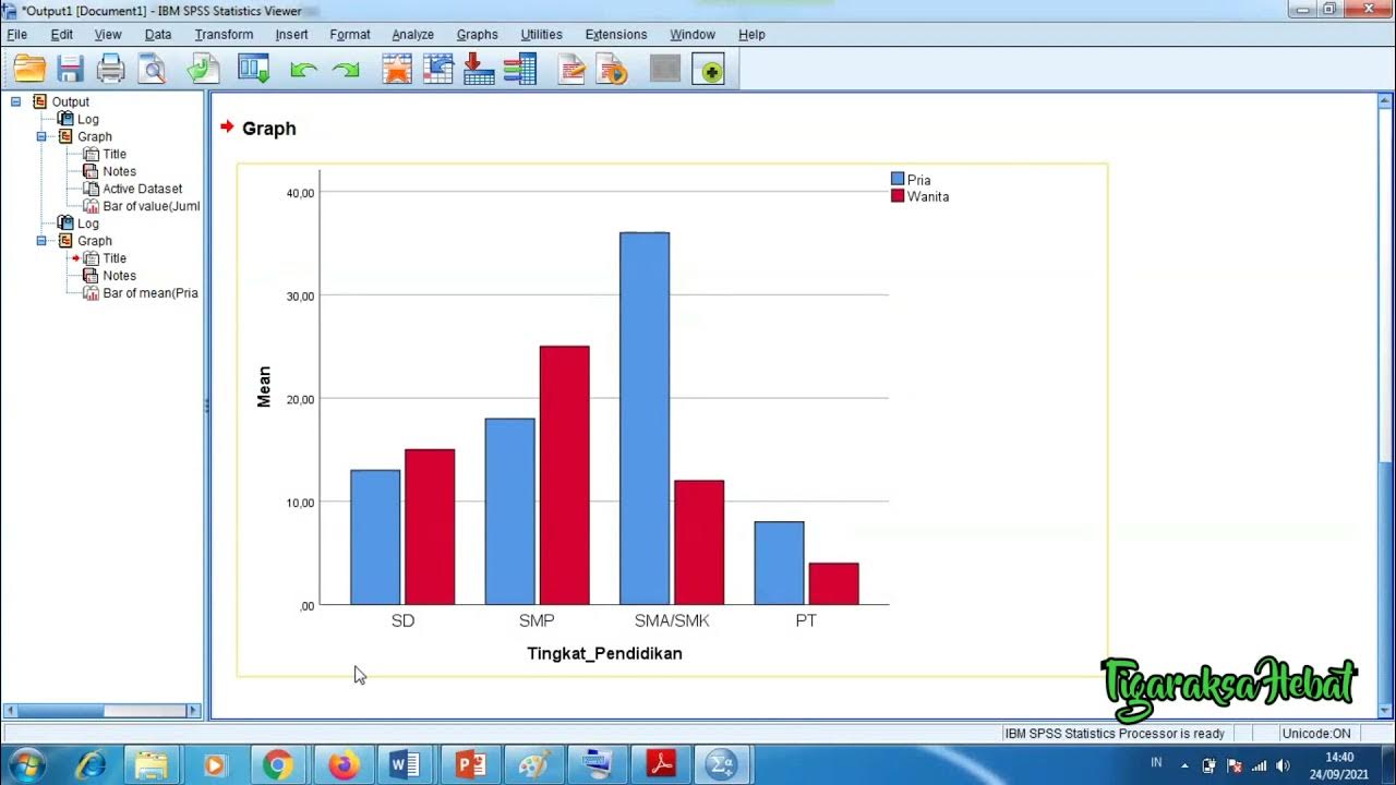
Penyajian Data Statistik Menggunakan SPSS
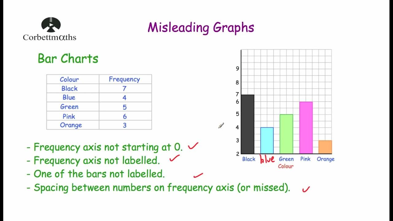
Misleading Graphs - Corbettmaths
Penyajian Data (Part-1) ~ Tabel dan Diagram (Materi PJJ Kelas VII / 7 SMP)
5.0 / 5 (0 votes)
