Marca Colombia
Summary
TLDRThis video highlights Colombia's positive transformation, focusing on its rich natural, cultural, and environmental diversity. The nation aims to reshape its global image by showcasing its various regions, landscapes, and people through creative and dynamic branding. Key visual elements, like geometric shapes and vibrant colors, represent Colombia’s geographical and cultural richness. The flexible, modern logo and creative system reflect the country's innovation and adaptability. Music is also emphasized as a way to express the nation’s diversity. Overall, Colombia is rebranding itself as a global hub for new partnerships, investments, and unique experiences.
Takeaways
- 😀 Colombia is experiencing a positive transformation, aiming to improve its global image.
- 😀 The country's 'megadiversity'—its natural, human, environmental, and cultural richness—is central to the new national identity.
- 😀 Geometric shapes and vibrant colors are used to represent the country's diverse regions and resources.
- 😀 The colors in the branding symbolize Colombia’s key elements: green for nature, violet for flowers, yellow for energy, blue for water, and red for the spirit of the people.
- 😀 The new logo is flexible and dynamic, designed to adapt to different contexts and messages.
- 😀 Colombia’s branding adopts an international alphanumeric code, aligning with global standards to enhance recognition and modernity.
- 😀 The rebranding effort emphasizes Colombia’s modernity, innovation, and contemporary approach.
- 😀 The country's diversity in music is used as a key element in communicating cultural richness through different genres, rhythms, and instruments.
- 😀 The initiative positions Colombia as a destination for new experiences, opportunities, and partnerships in business, investment, and tourism.
- 😀 Colombia’s branding is designed to be memorable, distinctive, and easily recognizable on the global stage.
- 😀 The country aims to turn the page on past negative perceptions and present itself confidently as a leading global player in various sectors.
Q & A
What is the primary goal of Colombia's new image campaign?
-The primary goal is to rectify Colombia's negative image and build a positive, unified identity that highlights its diverse strengths, both nationally and internationally.
What does 'Geometría Creativa' represent in Colombia's new branding system?
-'Geometría Creativa' represents a flexible, adaptive graphic system designed to communicate different messages, allowing the logo to transform based on context while retaining a modern and innovative feel.
How do the colors in the branding represent different aspects of Colombia?
-Each color in the branding represents key elements of Colombia: Green reflects mountains, valleys, and plains; Violet represents the nation's flowers, particularly the orchid; Yellow symbolizes the sun, minerals, and energy; Blue represents rivers, seas, and lakes; and Red reflects the talent, warmth, and spirit of Colombia's people.
Why is the logo not rigid and 'intangible' in the new branding approach?
-The logo is designed to be flexible to adapt to different communication needs. This ensures that the brand remains dynamic and relevant in various contexts, reflecting Colombia's diversity and modernity.
How does Colombia's new image position the country globally?
-The new image positions Colombia as a modern, innovative, and global player, shifting from a country often questioned to one that is a confident answer to the world's search for new experiences, partners, and opportunities.
How does the use of geometric shapes in the branding reflect Colombia's diversity?
-The geometric shapes represent Colombia’s different regions and cultures, visually symbolizing the country's varied landscapes, climates, and people. The shapes also serve to unify these diverse elements under one cohesive design.
What role does music play in Colombia's new brand identity?
-Music plays an essential role by reflecting Colombia's cultural diversity. The branding incorporates flexible elements that adapt to different musical genres, rhythms, and instruments, emphasizing the richness and variety of Colombian culture.
What does the use of the international code 'ISO CO' in the logo symbolize?
-The use of 'ISO CO' in the logo connects Colombia to a global recognition system, symbolizing modernity, international presence, and easy identification, reinforcing the country's commitment to digital and innovative strategies.
Why is flexibility important in Colombia's new brand image?
-Flexibility is crucial because it allows the brand to evolve with different contexts and messages while maintaining a consistent identity. This adaptability makes the brand more relatable and impactful in various international and local scenarios.
How does Colombia's 'megadiversity' influence its branding?
-Colombia's 'megadiversity'—its vast natural, cultural, and human richness—is central to the branding, with each region, culture, and natural feature represented visually to emphasize the country's unique position in the world.
Outlines

Dieser Bereich ist nur für Premium-Benutzer verfügbar. Bitte führen Sie ein Upgrade durch, um auf diesen Abschnitt zuzugreifen.
Upgrade durchführenMindmap

Dieser Bereich ist nur für Premium-Benutzer verfügbar. Bitte führen Sie ein Upgrade durch, um auf diesen Abschnitt zuzugreifen.
Upgrade durchführenKeywords

Dieser Bereich ist nur für Premium-Benutzer verfügbar. Bitte führen Sie ein Upgrade durch, um auf diesen Abschnitt zuzugreifen.
Upgrade durchführenHighlights

Dieser Bereich ist nur für Premium-Benutzer verfügbar. Bitte führen Sie ein Upgrade durch, um auf diesen Abschnitt zuzugreifen.
Upgrade durchführenTranscripts

Dieser Bereich ist nur für Premium-Benutzer verfügbar. Bitte führen Sie ein Upgrade durch, um auf diesen Abschnitt zuzugreifen.
Upgrade durchführenWeitere ähnliche Videos ansehen

Principios constitucionales

Dampak Positif Dan Negatif Keragaman Sosial Budaya Serta Cara Mewujudkan Sikap Menghormati Keragaman

Geography Now! Colombia

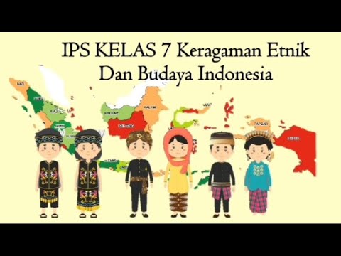
Keragaman etnik dan budaya Indonesia || materi IPS kelas 7

Aku belajar dari Wonderful Indonesia yang kaya banget karya Ati Nurrohmah

Keragaman Lingkungan Alam dan Masyarakat Dunia plus LKPD #ips #benua
5.0 / 5 (0 votes)
