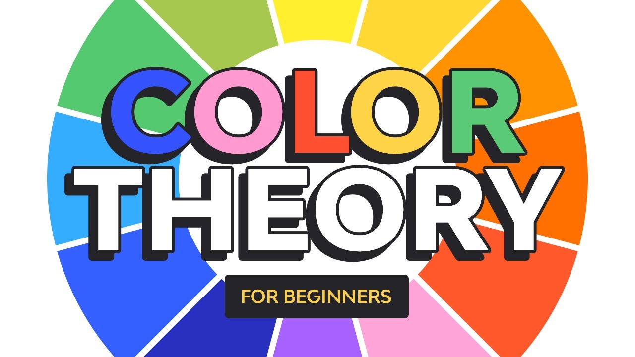
Intro to Color Theory
Summary
TLDRIn this engaging video, the speaker, shooting in a bathroom for perfect white balance, explores the fundamentals of color theory. They begin by explaining primary, secondary, and tertiary colors, and how warm and cool tones can be identified. The difference between the RYB (used for physical mediums) and RGB (used for screens) models is highlighted. The video delves into color schemes like monochromatic, analogous, and complementary, using real YouTube thumbnails as examples. The speaker offers tips on enhancing color balance, avoiding visual discomfort, and concludes with a fun mention of personal favorite color schemes.
Takeaways
- 🎨 The speaker is discussing color theory and is filming in a bathroom for better white balance.
- 🟥 The primary colors are red, yellow, and blue. Mixing them creates secondary colors (orange, green, and purple), and mixing those with primary colors creates tertiary colors.
- 🟡 The color wheel is split into warm (red, orange) and cool (blue, green) colors, and colors like red and green can be warm or cool depending on context.
- 💻 On digital screens, we use the RGB color model, which is additive, while the RYB color model is subtractive, usually for physical media like paintings.
- 🎛️ Hue refers to the base color, saturation refers to the intensity of the color, and lightness (or value) refers to how light or dark a color is.
- 🎨 A monochromatic color scheme uses one hue with different tints and shades, while analogous color schemes use colors next to each other on the color wheel.
- 🟢 Complementary colors are opposite on the color wheel and can cause a vibrating effect when placed next to each other if they're the same value, which should be avoided in designs like YouTube thumbnails.
- 📸 Real-world examples of YouTube thumbnails show how using color theory can enhance the appeal of the visuals by adjusting saturation and choosing analogous or complementary color schemes.
- 🖌️ For a balanced design, it's important to adjust saturation and value and avoid placing complementary colors of the same value next to each other to avoid uncomfortable visual effects.
- 🎨 The speaker gives advice on color schemes for improving the design of thumbnails, suggesting the use of neutral colors to avoid distracting from the main content.
Q & A
What is the primary focus of the video?
-The video focuses on explaining color theory, specifically complementary colors, color models, and how to create effective color schemes.
Why is the creator shooting the video in the bathroom?
-The creator is shooting the video in the bathroom to ensure a perfectly white-balanced background for the discussion on color theory.
What are the primary colors according to the RYB color model?
-In the RYB color model, the primary colors are red, yellow, and blue.
What are the complementary colors of bright green, bright yellow, bright pink, and bright blue?
-Complementary colors are opposite on the color wheel, but the video doesn't specify exact pairs for these colors. However, bright green’s complement is usually red, bright yellow’s is purple, bright pink’s is green, and bright blue’s is orange.
What is the difference between the RYB and RGB color models?
-The RYB color model is subtractive and is used for physical objects like paintings, while the RGB model is additive and is used for digital screens, where colors are illuminated from a source.
How can you avoid the 'vibration' effect when using complementary colors?
-To avoid the 'vibration' effect, you can change the value (lightness or darkness) of one of the complementary colors instead of keeping them both at the same saturation and value.
What are the three key properties of color, and what do they mean?
-The three key properties of color are hue (the color itself), saturation (the intensity of the color), and lightness or value (how light or dark the color is).
What is a monochromatic color scheme?
-A monochromatic color scheme involves using different tints and shades of the same hue by adding white (tints) or black (shades).
How did the creator suggest improving Josh Sunquist’s thumbnail for 'Kiss Miss'?
-The creator suggested increasing the saturation of the red and yellow and removing the cyan altogether, replacing it with a neutral white to avoid the 'vibration' effect and create a more cohesive, analogous color scheme.
What is the benefit of using neutral colors in design, according to the video?
-Neutral colors like white, gray, or black are useful in design when bright colors are already competing for attention. Neutrals can be used for highlights or shadows without adding more visual complexity or distraction.
Outlines

Dieser Bereich ist nur für Premium-Benutzer verfügbar. Bitte führen Sie ein Upgrade durch, um auf diesen Abschnitt zuzugreifen.
Upgrade durchführenMindmap

Dieser Bereich ist nur für Premium-Benutzer verfügbar. Bitte führen Sie ein Upgrade durch, um auf diesen Abschnitt zuzugreifen.
Upgrade durchführenKeywords

Dieser Bereich ist nur für Premium-Benutzer verfügbar. Bitte führen Sie ein Upgrade durch, um auf diesen Abschnitt zuzugreifen.
Upgrade durchführenHighlights

Dieser Bereich ist nur für Premium-Benutzer verfügbar. Bitte führen Sie ein Upgrade durch, um auf diesen Abschnitt zuzugreifen.
Upgrade durchführenTranscripts

Dieser Bereich ist nur für Premium-Benutzer verfügbar. Bitte führen Sie ein Upgrade durch, um auf diesen Abschnitt zuzugreifen.
Upgrade durchführenWeitere ähnliche Videos ansehen


5.0 / 5 (0 votes)
