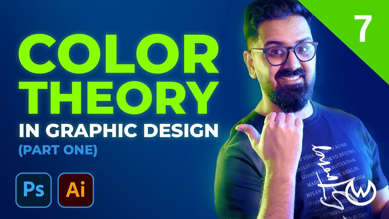
Color Contrast, Bad contrast, Good Contrast in UI/UX | Design Fundamental.
Summary
TLDRThis video script discusses the fundamentals of web and graphic design, focusing on the importance of color contrast and background color in creating engaging designs. The speaker explores techniques to enhance design elements, such as adding contrasting spot colors to make a design pop. Examples of mobile app remixed designs are provided, demonstrating how to create patterns with a limited color palette and improve design possibilities. The script also critiques a specific product design, suggesting improvements in color contrast and element emphasis for better visual appeal.
Takeaways
- 🌟 The video discusses fundamental rules and principles of web design and graphics, emphasizing the importance of color in design.
- 🎨 The script explains the concept of background color and how to use it to create contrast with important elements in a design.
- 🔍 It highlights techniques to make a design less boring, like adding color contrast and spotlighting important elements with different colors.
- 📐 The transcript talks about applying these fundamental rules in mobile app remaking design, showcasing how to create patterns with a limited color palette.
- 🤔 The video script also explores possibilities to improve the design, such as enhancing the 'subscribe' button and making it stand out.
- 💡 The importance of focusing on product names and prices is stressed, as these are key elements that attract interest in a product.
- 🛍️ A detailed example of a product design is given, discussing the use of different colors for text, size, serial numbers, and the 'add to cart' button.
- 🖌️ The script suggests experimenting with color changes to see which combinations work best for the background and text to improve design appeal.
- 🔄 The video mentions the need to consider the overall design and how the use of certain colors can affect the visibility and focus of important elements.
- 📈 It provides insights into the psychology of color contrast and how it can be used to direct the viewer's attention to specific parts of the design.
- 📝 Finally, the script encourages viewers to ask questions in the comments section if they have any, showing an openness to further discussion on the topic.
Q & A
What is the main topic discussed in the video script?
-The main topic discussed in the video script is the fundamentals of web design and graphics design, specifically focusing on the use of color and typography in design.
What are the fundamental rules of NCC mentioned in the script?
-The script does not provide specific details about the fundamental rules of NCC, but it implies that there are certain rules and principles of well-being that are important in the context of design.
How does the script suggest improving a boring design?
-The script suggests adding color contrast or spot colors to improve a boring design, making it more visually appealing and drawing attention to important elements.
What technique is used to highlight important elements in a design?
-The script mentions using the 'sachin' technique, which involves giving a contrasting color to the graphic elements to make them stand out against the background and draw focus.
How can a limited color palette be used to create patterns in design?
-The script suggests that even with a limited color palette, one can create patterns in design by exploring different possibilities and being creative, as demonstrated in the mobile app remake design example.
What is the significance of background color in the design discussed in the script?
-The background color plays a crucial role in the design by providing a canvas for other elements. The script discusses changing the background color to improve the overall design and make important elements stand out.
What are the important elements in a product design that need to be highlighted?
-The important elements in a product design, as mentioned in the script, include the product name, price, description, and any unique features or details that would interest the customer.
How does the script address the issue of color contrast in the design?
-The script discusses the issue of color contrast by suggesting changes to the color scheme, such as using white instead of pink, to improve the visibility and attractiveness of the design.
What is the purpose of using different colors for text in the design?
-The purpose of using different colors for text in the design, as discussed in the script, is to create emphasis, improve readability, and guide the viewer's attention to specific parts of the design.
How can the design be improved by adjusting the color contrast?
-The design can be improved by adjusting the color contrast by ensuring that important elements stand out against the background, using complementary colors effectively, and creating a visually appealing and balanced design.
What is the final recommendation given in the script regarding color choices in design?
-The final recommendation in the script is to experiment with different color contrasts and to choose colors that best highlight the important elements of the design, making sure that the overall design is clean, minimal, and visually appealing.
Outlines

This section is available to paid users only. Please upgrade to access this part.
Upgrade NowMindmap

This section is available to paid users only. Please upgrade to access this part.
Upgrade NowKeywords

This section is available to paid users only. Please upgrade to access this part.
Upgrade NowHighlights

This section is available to paid users only. Please upgrade to access this part.
Upgrade NowTranscripts

This section is available to paid users only. Please upgrade to access this part.
Upgrade NowBrowse More Related Video
5.0 / 5 (0 votes)


