Tutorial Membuat Typography Sederhana Text 3D Effect pada Adobe Illustrator
Summary
TLDRIn this tutorial video, the creator demonstrates how to craft a text effect in Adobe Illustrator. They begin by creating a new document and setting the dimensions. After locking the background layer, they proceed to add a text layer, adjusting its size and font. The creator then modifies the text color and positions it centrally. They duplicate the text and blend it to create a 3D effect, adjusting the opacity and adding shadows for depth. The tutorial concludes with tips on fine-tuning the text effect and adding decorative elements to enhance the design.
Takeaways
- 😀 The video is a tutorial focused on creating text effects in Adobe Illustrator.
- 🖥️ The tutorial begins by creating a new document with specific dimensions of 1287 x 21 inches.
- 🎨 The presenter chooses a medium font size for the text, recommending 300 for viewers.
- 🔵 The background is created using the rectangle tool and a specific color is selected for it.
- 🔒 The background layer is then locked to prevent any accidental movement.
- ✍️ Text is added to the document, with the presenter suggesting to start with a large size for visibility.
- 🌟 To enhance the text effect, the presenter uses a bold font like 'Ton Monster', 'Ad', 'Ujian Board', or 'Strobox', and adjusts the tracking for a tighter fit.
- 🎨 The color of the text is changed to white initially, and then adjusted to a desired color for the final effect.
- 🔄 The presenter duplicates the text object and uses blending techniques to create a 3D effect.
- 🔍 The 'Blend' tool is utilized with specific steps to control the intensity of the 3D effect.
- 🖌️ A shadow effect is added to the text using the pen tool, with a black color and a blur effect applied for realism.
Q & A
What is the main topic of the video tutorial?
-The main topic of the video tutorial is creating text effects using Adobe Illustrator.
How does the tutorial start?
-The tutorial starts by creating a new document with specific dimensions and setting up the canvas size.
What is the recommended font size for the text in the tutorial?
-The recommended font size for the text is not explicitly mentioned, but the presenter uses a very large size for demonstration purposes.
What tool is used to create the background in the tutorial?
-The rectangle tool is used to create the background in the tutorial.
How does the presenter lock the background layer to prevent it from moving?
-The presenter locks the background layer by selecting it and clicking the 'lock' icon in the layers panel.
What is the purpose of creating a new layer for the text?
-Creating a new layer for the text allows the presenter to work on the text separately from the background, making it easier to manage and edit.
What font style is suggested for the text effect?
-The tutorial suggests using a bold and impactful font style like 'ton monster ad', 'ujian board', or 'strobox' for the text effect.
How does the presenter change the color of the text?
-The presenter changes the color of the text by selecting the text object and choosing a desired color from the color picker.
What technique is used to create a 3D effect on the text?
-The 3D effect on the text is created by duplicating the text object, changing its color, and using the 'Blend' tool with the 'Max' option to create intermediate objects.
How does the presenter adjust the opacity of the shadow?
-The presenter adjusts the opacity of the shadow by selecting the shadow object and changing its opacity value in the properties panel.
What is the final step in the tutorial after creating the shadow?
-The final step in the tutorial is to position the shadow and the text objects correctly and to add any additional ornaments or details as desired.
Outlines

Dieser Bereich ist nur für Premium-Benutzer verfügbar. Bitte führen Sie ein Upgrade durch, um auf diesen Abschnitt zuzugreifen.
Upgrade durchführenMindmap

Dieser Bereich ist nur für Premium-Benutzer verfügbar. Bitte führen Sie ein Upgrade durch, um auf diesen Abschnitt zuzugreifen.
Upgrade durchführenKeywords

Dieser Bereich ist nur für Premium-Benutzer verfügbar. Bitte führen Sie ein Upgrade durch, um auf diesen Abschnitt zuzugreifen.
Upgrade durchführenHighlights

Dieser Bereich ist nur für Premium-Benutzer verfügbar. Bitte führen Sie ein Upgrade durch, um auf diesen Abschnitt zuzugreifen.
Upgrade durchführenTranscripts

Dieser Bereich ist nur für Premium-Benutzer verfügbar. Bitte führen Sie ein Upgrade durch, um auf diesen Abschnitt zuzugreifen.
Upgrade durchführenWeitere ähnliche Videos ansehen
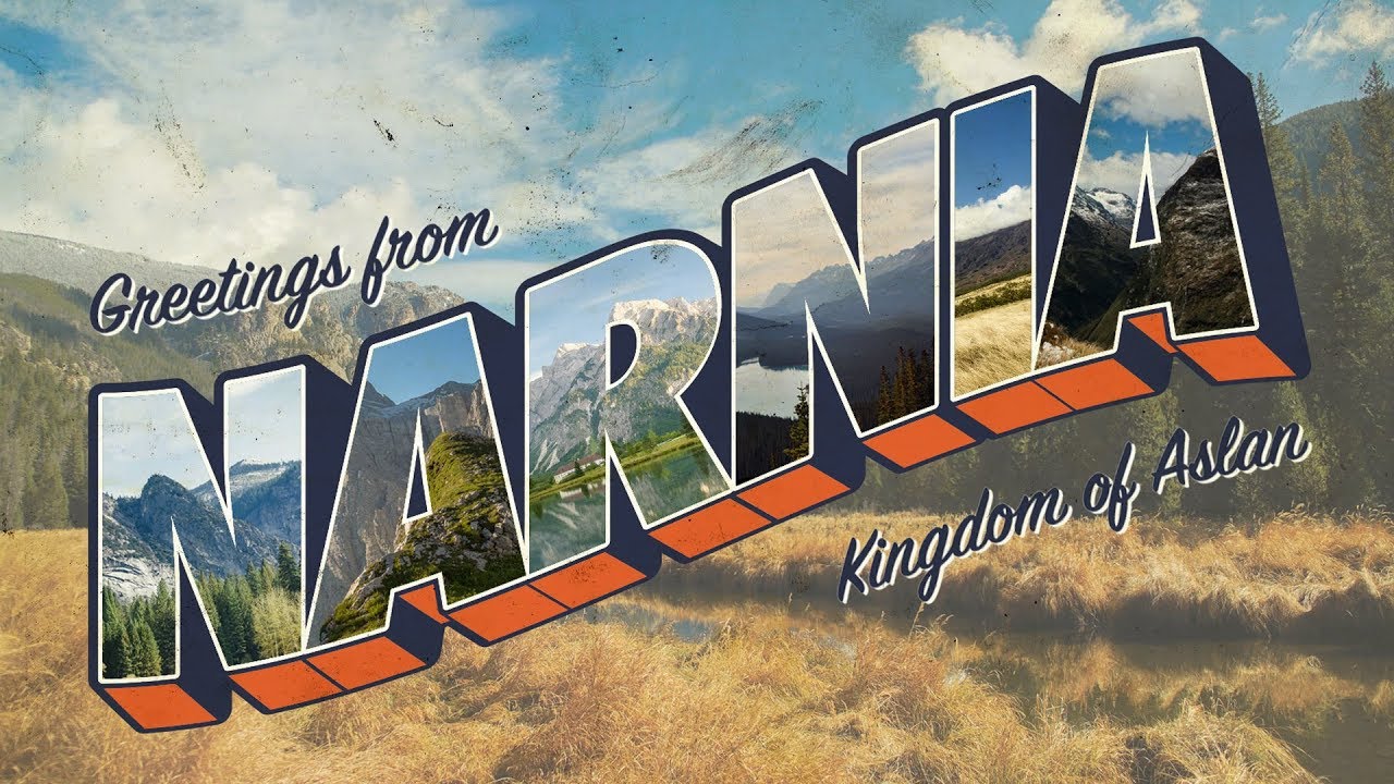
How To Create a Vintage Postcard Design (Illustrator & Photoshop Tutorial)
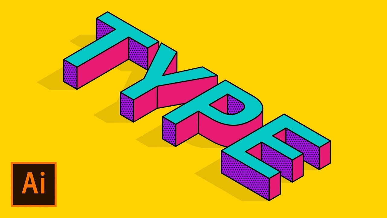
How to Create an Isometric Text Effect in Adobe Illustrator

Text Reveal Effect In Premiere Pro
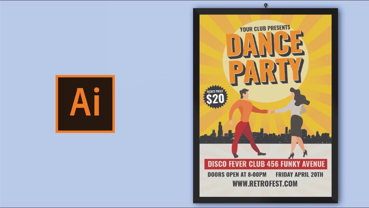
How to create poster design in adobe illustrator
How To Create Pixelated Text Effect in Photoshop [Free File] - Photoshop Tutorials
Cara Install Adobe 2024 TANPA Ribet & Crack!
5.0 / 5 (0 votes)
