[August SAT Math] Standard Deviation - ONE Simple Key To ALL The Questions | Everything You Need
Summary
TLDRThis video tutorial simplifies understanding standard deviation for SAT test-takers by focusing on estimation rather than exact calculations. It explains the concept of standard deviation as a measure of data spread and uses graphs to illustrate how to determine if data sets have low, high, or equal standard deviations. The instructor guides viewers through examples and practice questions, emphasizing the importance of recognizing graph patterns to solve SAT problems efficiently.
Takeaways
- 📚 Standard deviation questions on the SAT are about estimating rather than calculating the exact value of standard deviation.
- 🔍 The key to solving standard deviation problems is understanding the definition, which relates to how spread out the data points are.
- 📈 Estimating standard deviation involves comparing the spread of data points in different sets or graphs without needing the exact numerical value.
- 📊 Three main types of data plots are discussed: bell curve, skewed graph, and double top, each indicating a different level of standard deviation.
- 📉 In a bell curve, data points are centered and not spread out, suggesting a low standard deviation.
- 📊 A skewed graph has a tail, indicating a moderate spread and thus a standard deviation that is neither too high nor too low.
- 🔑 The double top graph shows data points spread out across two peaks, indicating a high standard deviation due to the high spread.
- 📝 When comparing two data sets, if the spread of data points is the same, the standard deviations are also the same, regardless of their positions or values.
- 📋 If given a table instead of a graph, create a graph to visualize and estimate the standard deviation based on the spread of data points.
- 📐 The range of data (max - min) can be easily calculated from tables and is not affected by the spread of data points, unlike standard deviation.
- 🎯 Memorizing the shapes of data plots and their corresponding standard deviations can help quickly solve SAT questions without complex calculations.
Q & A
What is the main topic of the video transcript?
-The main topic of the video transcript is understanding and estimating standard deviations on the SAT, including how to approach questions related to standard deviations without calculating the exact value.
What is the definition of standard deviation mentioned in the transcript?
-Standard deviation, as defined in the transcript, refers to how spread out the data points are, indicating the degree of variation in the data set.
Why is it unnecessary to calculate the exact value of standard deviation on the SAT, according to the video?
-On the SAT, it is unnecessary to calculate the exact value of standard deviation because the questions require an estimation of whether the standard deviation is low, high, the same, or different, based on the spread of the data points.
What are the three main types of data plots discussed in the video for estimating standard deviation?
-The three main types of data plots discussed are the bell curve, the skewed graph, and the double top graph, each indicating a different level of spread and thus a different estimated standard deviation.
How does the bell curve indicate the standard deviation of a data set?
-The bell curve indicates a low standard deviation because the data points are centered around one value and not very spread out.
What does the skewed graph suggest about the standard deviation compared to the bell curve?
-The skewed graph suggests a standard deviation that is somewhere in the middle, as it is not as tightly clustered as the bell curve but has a bit more spread due to the tail at the end.
How does the double top graph compare to the bell curve and skewed graph in terms of standard deviation?
-The double top graph indicates the highest standard deviation because the data points are spread out significantly with two separate peaks, showing a high degree of variation.
What is the significance of the range in the context of the video transcript?
-The range, which is the difference between the maximum and minimum values in a data set, is mentioned as a simpler measure than standard deviation. However, the video focuses on standard deviation as the main topic of discussion.
How does the video suggest estimating standard deviation from a table of data?
-The video suggests that if given a table of data without a graph, one should create a graph to visually estimate the spread of the data points and thus the standard deviation.
What is the strategy for solving SAT questions on standard deviation as outlined in the video?
-The strategy involves understanding the definition of standard deviation, recognizing the shapes of data plots (bell curve, skewed graph, double top), and estimating the spread of data points to determine the level of standard deviation without calculating the exact value.
Outlines

هذا القسم متوفر فقط للمشتركين. يرجى الترقية للوصول إلى هذه الميزة.
قم بالترقية الآنMindmap

هذا القسم متوفر فقط للمشتركين. يرجى الترقية للوصول إلى هذه الميزة.
قم بالترقية الآنKeywords

هذا القسم متوفر فقط للمشتركين. يرجى الترقية للوصول إلى هذه الميزة.
قم بالترقية الآنHighlights

هذا القسم متوفر فقط للمشتركين. يرجى الترقية للوصول إلى هذه الميزة.
قم بالترقية الآنTranscripts

هذا القسم متوفر فقط للمشتركين. يرجى الترقية للوصول إلى هذه الميزة.
قم بالترقية الآنتصفح المزيد من مقاطع الفيديو ذات الصلة

All of SAT Math Explained in 26 Minutes

ISTQB FOUNDATION 4.0 | Tutorial 47 | Test Estimation Techniques | Wide Band Delphi | Extrapolation
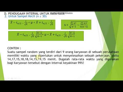
17 pendugaan interval rata rata sampel kecil
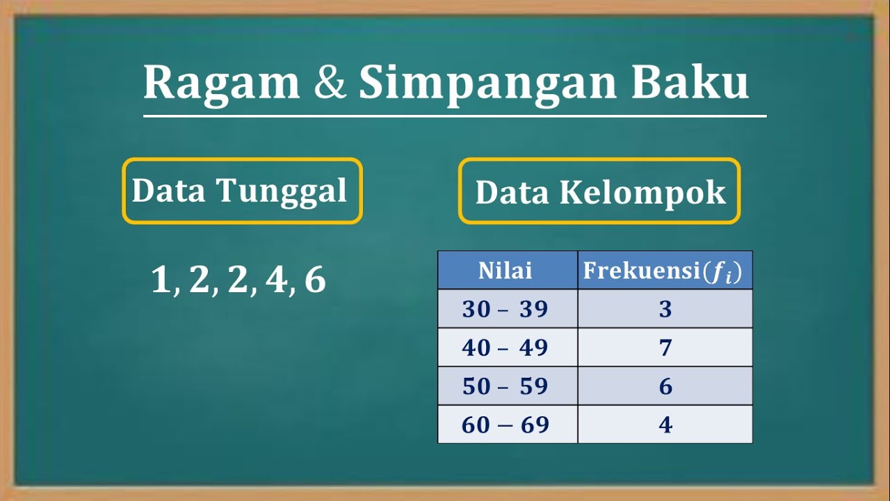
Cara menentukan nilai varian (Ragam) dan Standar deviasi (Simpangan baku) data tunggal dan kelompok
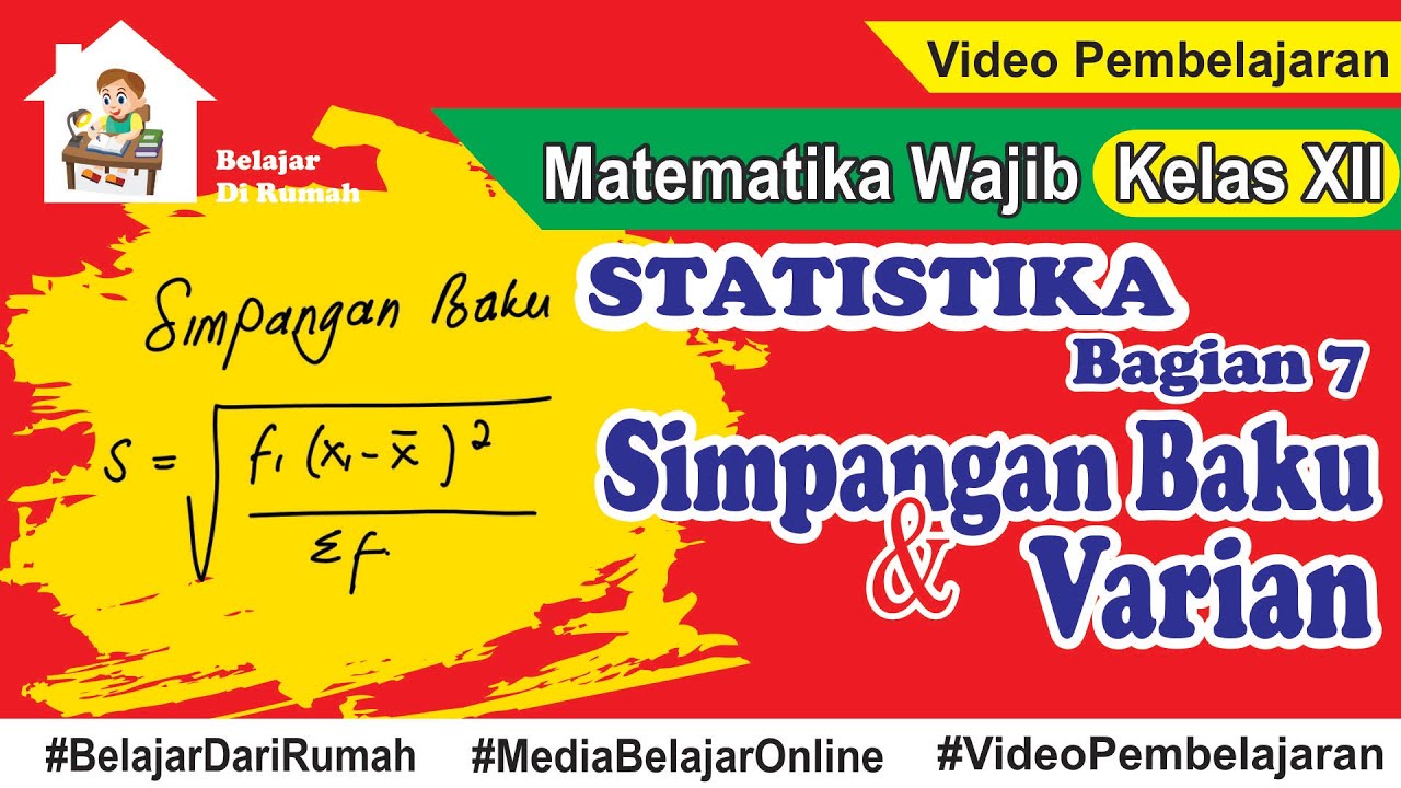
Statistika Bagian 7 - Simpangan Baku dan Varian Data Tunggal dan Data Berkelompok

Menentukan Jangkauan, Simpangan Rata-Rata, Variansi (Ragam), Simpangan Baku dan Koefisiens Variansi
5.0 / 5 (0 votes)
