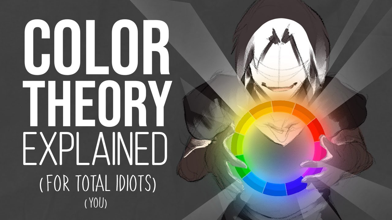
Color theory explained
Summary
TLDRThis video explores the challenges and techniques of mastering color in digital art. The creator delves into color theory, explaining key concepts like hue, value, saturation, and chroma, and highlights the importance of color relativity and temperature. Through personal experiments, mistakes, and expert advice, the video demonstrates how to approach color studies effectively, balance hues, and make deliberate color choices. Practical tips include using fewer hues to maintain consistency, observing light and material interactions, and drawing inspiration from life. Ultimately, the video emphasizes that color mastery is a gradual learning process, blending theory, observation, and practice to create visually compelling artwork.
Takeaways
- 🎨 Understanding color starts with breaking it down into properties like hue, value, and saturation, which help digital artists work more effectively.
- 🌈 Hue is the identity of a color (red, blue, green), while value refers to its lightness or darkness, and saturation/chroma indicates color intensity.
- 🖌️ High chroma colors differ for each hue and value; for example, yellow is high chroma at bright values, red at medium, and blue at dark values.
- 🔍 Color perception is relative: colors appear different depending on surrounding colors, making context more important than absolute values.
- 🔥 Warm colors (reds/yellows) evoke heat, while cool colors (blues) evoke coolness; understanding this helps artists adjust color temperature in paintings.
- ↔️ Walking through color space, like desaturating yellow to reach blue, shows how color transitions can move through grays or along the color wheel.
- ✏️ Practicing color involves careful study and observation, such as doing color studies without the eye-dropper tool to train your perception.
- 🟢 Limiting hue variations and focusing on saturation and value can help achieve consistent tones and make selecting colors easier.
- 💡 Observing light and materials in real life, rather than relying solely on AI or photo references, improves understanding of natural color interactions.
- 🎯 Using deliberate color choices based on mood, lighting, or narrative (e.g., warm light, nostalgic tones) enhances the emotional impact of artwork.
- 📚 Resources like 'Color and Light' by James Gurney and tutorials by artists such as Devin Corwin provide deeper insights into color theory and application.
- 🍔 Practicing with enjoyable subjects, like incorporating favorite characters or objects, can make color studies more engaging and effective for learning.
Q & A
What is the Hue of a color and why is it important for digital artists?
-Hue is the identity of a color and its position on the color wheel (e.g., red, blue, green). It is important because it determines the basic color choice and helps artists maintain consistency and harmony in their work.
How do Value, Saturation, and Chroma differ in describing a color?
-Value describes a color's lightness or darkness. Saturation indicates the intensity or purity of a color. Chroma measures how strong a color is relative to a gray of the same value. High chroma colors are always saturated, but high saturation does not necessarily mean high chroma.
Why is understanding color relativity crucial in art?
-Color relativity shows that colors are perceived differently depending on surrounding colors. Absolute color values matter less than how colors interact with each other in context, which is key for achieving depth, contrast, and mood in artwork.
What is the difference between warm and cool colors?
-Warm colors are closer to red and evoke warmth or heat, while cool colors are closer to blue and evoke coolness. Understanding this distinction helps artists influence the mood and atmosphere of a piece.
How can artists 'walk through color space' to shift from one color to another?
-Artists can gradually shift a color through desaturation and value changes. For example, moving from yellow to blue involves desaturating yellow to gray before adding blue, while moving from yellow to red takes the shortest path along the edge of the color wheel.
What is a practical method to simplify color selection when painting?
-A practical method is to reduce the number of hue variations and focus on adjusting saturation and brightness first. This approach helps maintain a consistent tone and makes it easier to find the desired colors.
Why did the artist struggle with AI-generated reference images?
-AI-generated images often have unrealistic lighting or impossible elements, making it difficult to interpret color relationships accurately. Real-life observation provides more reliable references for learning and applying color theory.
How can 'vibe words' influence color choices in a painting?
-Vibe words like 'nostalgic' or 'sad' help guide color choices by associating colors with emotions or atmosphere, enabling artists to make deliberate decisions about temperature, saturation, and value to convey a specific feeling.
What role does reflected light play in choosing values for a painting?
-Reflected light affects the brightness and readability of objects. Paying attention to it ensures that the painting maintains a realistic sense of depth and light interaction, which is essential for effective value grouping.
Why is practicing color studies important for digital artists?
-Practicing color studies allows artists to observe and understand how hue, value, saturation, and chroma interact in real situations. It builds skill in choosing colors deliberately and improves the ability to convey mood, light, and material properties.
How can using fewer hues improve the overall consistency of an artwork?
-Using fewer hues reduces complexity and allows the artist to focus on adjusting saturation and value, leading to a more harmonious and cohesive color scheme that is easier to manage and visually pleasing.
What is the significance of studying both overcast and direct sunlight conditions in color practice?
-Studying different lighting conditions helps artists understand how light affects color perception, saturation, and chroma. It provides experience in adapting color choices to varied lighting scenarios, enhancing realism and versatility.
Outlines

هذا القسم متوفر فقط للمشتركين. يرجى الترقية للوصول إلى هذه الميزة.
قم بالترقية الآنMindmap

هذا القسم متوفر فقط للمشتركين. يرجى الترقية للوصول إلى هذه الميزة.
قم بالترقية الآنKeywords

هذا القسم متوفر فقط للمشتركين. يرجى الترقية للوصول إلى هذه الميزة.
قم بالترقية الآنHighlights

هذا القسم متوفر فقط للمشتركين. يرجى الترقية للوصول إلى هذه الميزة.
قم بالترقية الآنTranscripts

هذا القسم متوفر فقط للمشتركين. يرجى الترقية للوصول إلى هذه الميزة.
قم بالترقية الآنتصفح المزيد من مقاطع الفيديو ذات الصلة

Art Goals - use neuroscience to make yourself 42% more likely to succeed as an artist

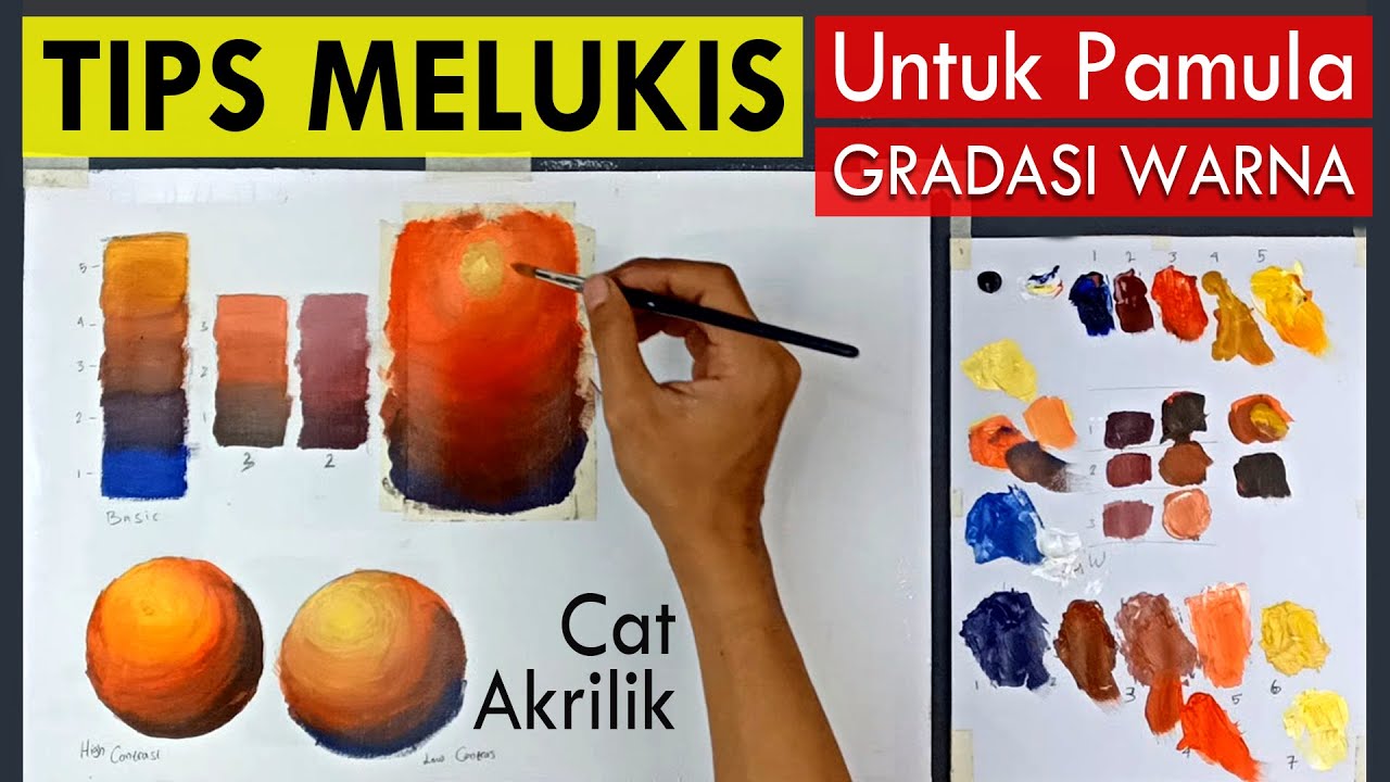
Tips Melukis Untuk Pemula - Cat Akrilik | GRADASI WARNA

Art Teachers HATE this trick | COLOR THEORY | Drawlikeasir

UNITY AND HARMONY | The Principles of Design EXPLAINED!

ARTS 10 / TECHNOLOGY BASED ARTS / QUARTER 2 / MODULE 1 / PART 2

🎞️ 'คิดถึงวิทยา' เป็นหนังสยองขวัญ 💀
5.0 / 5 (0 votes)
