Chapter 5 - Analisa Data melalui Excel | Informatika Booster
Summary
TLDRThis tutorial guides viewers through the basics of Microsoft Excel, focusing on creating tables, using key formulas (SUM, COUNTIF, COUNTIFS, COUNTA), and visualizing data with charts (bar, pie, and stacked bar charts). It also covers the use of pivot tables for data analysis, helping users quickly summarize and filter large datasets. The video encourages hands-on practice with formulas and data manipulation, ensuring viewers can apply their learning effectively in real projects. Whether you're gathering data manually or using tools like Google Forms, this tutorial provides essential skills for mastering Excel.
Takeaways
- 😀 Learn how to create tables in Microsoft Excel and collect data manually or through Google Forms.
- 😀 Understand the usage of the SUM function to automatically add numbers within a data range in Excel.
- 😀 Master the COUNTIF function to count data based on a single condition, like gender.
- 😀 Get to know COUNTIFS for counting data with multiple conditions, such as gender and class.
- 😀 Explore the COUNT function to count the number of rows in a dataset, separate from summing data.
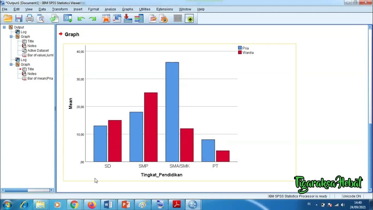
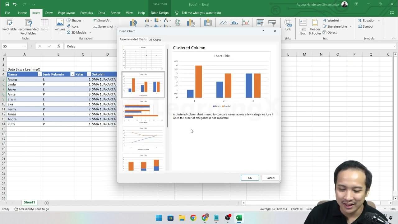
- 😀 Learn how to visualize data using different chart types: bar charts, pie charts, and stacked bar charts.
- 😀 Discover how to modify charts to improve their visual appearance for clearer presentations.
- 😀 Dive into Pivot Tables, which help analyze large datasets by focusing on specific information like student names and class assignments.
- 😀 Learn how to manipulate data within Pivot Tables to refine and filter the data you want to focus on.
- 😀 Practice applying the formulas and charting techniques learned through hands-on projects in Excel.
- 😀 Stay engaged with the learning process by watching the video tutorials and applying the knowledge through real-life data manipulation.
Q & A
What is the main focus of this tutorial?
-The main focus of this tutorial is to teach how to create and manipulate data in Microsoft Excel, using various formulas and visualization techniques like charts and pivot tables.
What are the steps to create a table in Excel?
-The tutorial explains that creating a table in Excel involves gathering necessary data, either manually or through tools like Google Forms. The data is then organized into a table format for further analysis.
What is the purpose of the 'SUM' formula in Excel?
-The 'SUM' formula is used to add up a range of numbers in a table, making it easier to calculate totals without manual addition.
How does the 'COUNTIF' formula work in Excel?
-'COUNTIF' is used to count the number of cells that meet a specific condition or criteria, such as counting the number of males or females in a dataset.
What is the difference between 'COUNTIF' and 'COUNTIFS'?
-'COUNTIF' counts data based on a single condition, while 'COUNTIFS' allows for multiple conditions. For example, 'COUNTIFS' can count the number of males or females in different classes simultaneously.
What does the 'COUNTA' formula do in Excel?
-'COUNTA' counts the number of non-empty cells or rows in a dataset, which helps in determining how many data entries are present in a range.
Why is it important to use visual aids like charts in Excel?
-Visual aids like charts, including bar charts, pie charts, and stacked bar charts, help to present data in a more understandable and visually appealing way, making it easier to analyze trends and patterns.
How can you modify a chart in Excel?
-Excel allows you to modify charts by changing colors, labels, and styles to enhance the visual appeal and make the data easier to interpret.
What is a Pivot Table, and how is it useful?
-A Pivot Table is used to summarize, analyze, and manipulate large datasets in a more focused and organized way. It helps in quickly locating specific data, such as determining which class a student is in, without having to scroll through large datasets.
What should you do after learning the formulas and creating the charts?
-After learning the formulas and creating charts, it is important to practice by modifying the data, applying different formulas, and experimenting with various chart types to gain a deeper understanding of Excel's features.
Outlines

هذا القسم متوفر فقط للمشتركين. يرجى الترقية للوصول إلى هذه الميزة.
قم بالترقية الآنMindmap

هذا القسم متوفر فقط للمشتركين. يرجى الترقية للوصول إلى هذه الميزة.
قم بالترقية الآنKeywords

هذا القسم متوفر فقط للمشتركين. يرجى الترقية للوصول إلى هذه الميزة.
قم بالترقية الآنHighlights

هذا القسم متوفر فقط للمشتركين. يرجى الترقية للوصول إلى هذه الميزة.
قم بالترقية الآنTranscripts

هذا القسم متوفر فقط للمشتركين. يرجى الترقية للوصول إلى هذه الميزة.
قم بالترقية الآنتصفح المزيد من مقاطع الفيديو ذات الصلة
Penyajian Data Statistik Menggunakan SPSS
Chapter 5 - Tutorial Analisa Data Part 1 (COUNT IF)

Grade 6 TLE Q1 Ep 6 Functions and Formulas in an Electronic Spreadsheet Tool
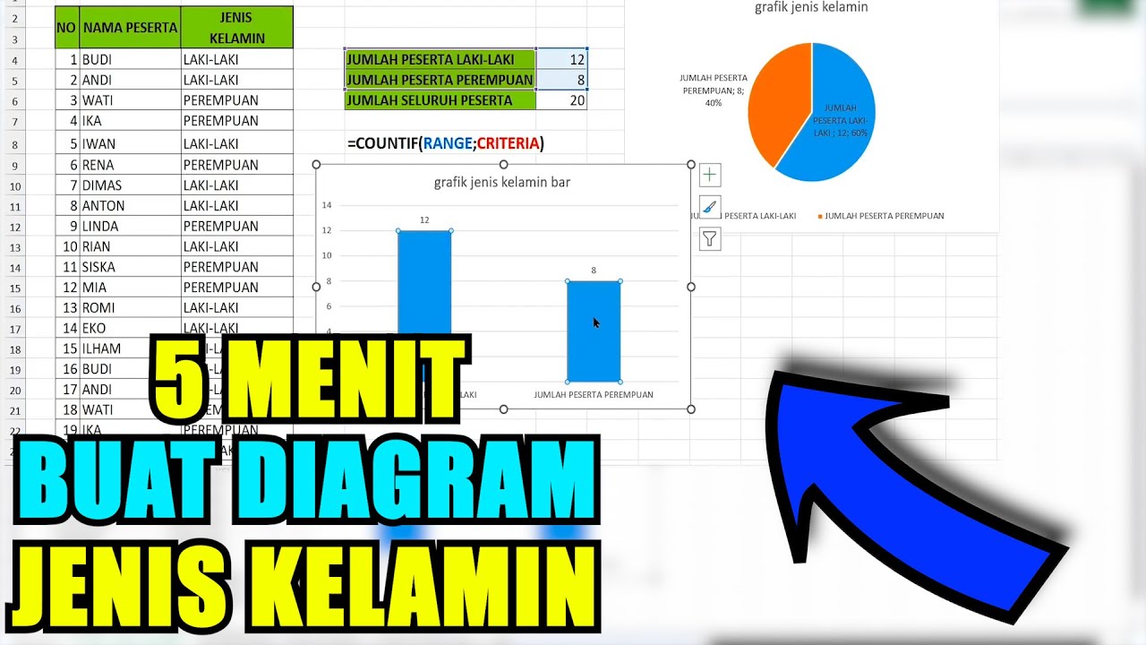
Cara membuat diagram untuk jenis kelamin pada excel paling tepat
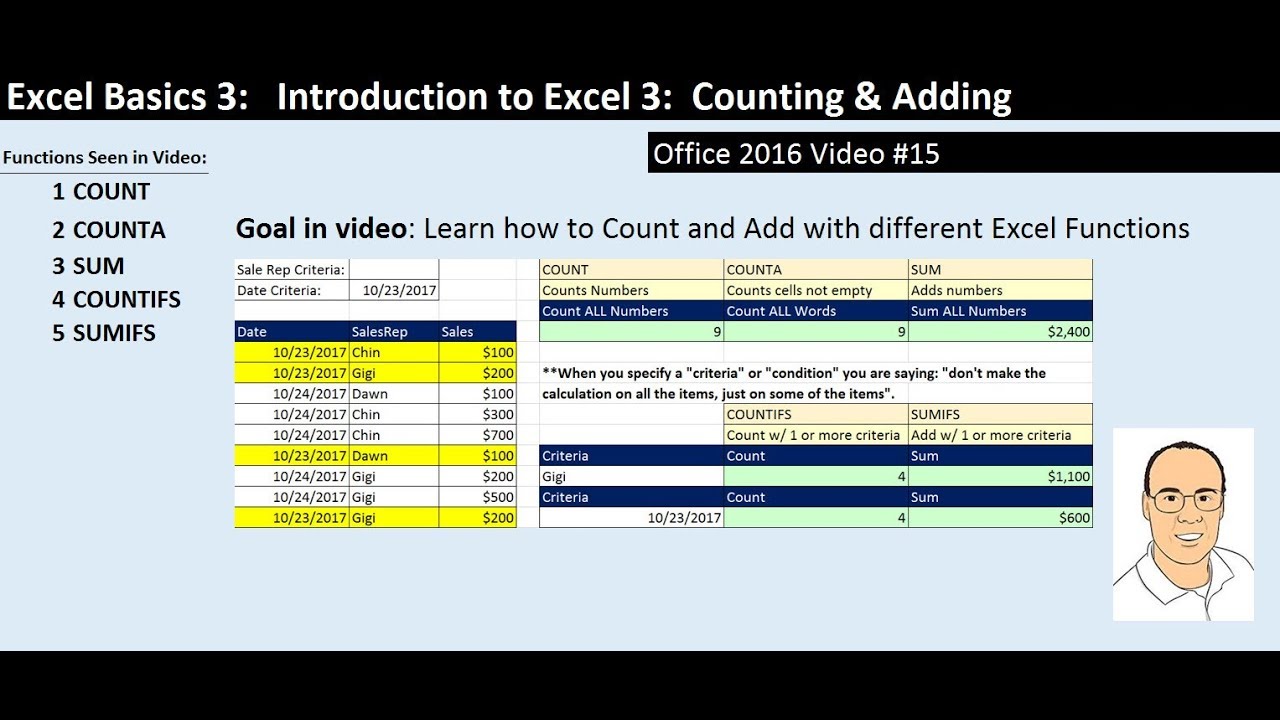
Excel Basics 3: Count & Add with COUNT, COUNTA, SUM, COUNTIFS, SUMIFS Functions (Intro Excel #3)
Tableau Bar Chart Tutorial for Beginners | Learning Tableau | sqlbelle
5.0 / 5 (0 votes)
