The beauty of data visualization - David McCandless
Summary
TLDRThe speaker addresses the issue of information overload by advocating for the use of visual data representation to discern patterns and connections. They present various data visualizations, such as the billion-dollar-a-gram image, which contextualizes large financial figures, and a landscape of global media panic, revealing hidden patterns. The talk highlights the power of visualizing data to alter perspectives, change behaviors, and even enhance personal understanding of complex subjects like politics and health. The speaker concludes by emphasizing the role of information design in solving societal information problems and the beauty of data when presented visually.
Takeaways
- 📊 Visualizing information is a powerful tool to make sense of large amounts of data, revealing patterns and connections that are not immediately apparent.
- 💰 The 'billion dollar a gram' image illustrates the relative scale of financial figures reported in the news, showing how visualization can provide context and meaning to abstract numbers.
- 🌍 A landscape of global media panic visualizes how fears change over time, with patterns emerging from the data that are not obvious from reading news reports alone.
- 🎮 The regular pattern of concern over violent video games corresponds with the release of new games and significant historical events, showing how visualization can uncover hidden temporal patterns.
- 🌐 The phrase 'data is the new oil' is challenged, with the speaker suggesting 'data is the new soil', a fertile ground for creativity and innovation.
- 🌼 Data visualization is like flowers blooming from a fertile medium, transforming raw data into something beautiful and insightful.
- 📈 The speaker's visual CV demonstrates how personal information can be presented in an engaging and visually interesting way.
- 🧠 Exposure to information design has instilled a kind of 'dormant design literacy' in many people, making us all capable of understanding and appreciating visual information.
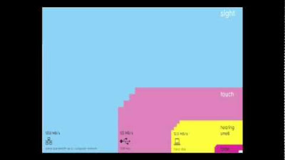
- 👀 The human eye is extremely sensitive to patterns and variations, and visual information is processed effortlessly, making it an effective way to communicate complex ideas.
- 🌍 Absolute figures can be misleading; relative figures connected to other data provide a fuller picture and can change perspectives, as demonstrated with military budgets and the number of soldiers.
- 💡 Visualization can compress knowledge, making it easier to understand and interpret large amounts of data, and can even lead to changes in behavior or mindset.
Q & A
What is the main idea presented in the transcript about dealing with information overload?
-The main idea is that using our eyes to visualize information can help us see patterns and connections, making it easier to understand and focus on what's important. Visualizing data can also make it more engaging and aesthetically pleasing.
What frustration led the speaker to create the 'billion dollar a gram' image?
-The speaker was frustrated with the meaninglessness of reported billion-dollar amounts in the press without context. By creating a visual representation, they aimed to provide a better understanding of these figures.
How does the 'billion dollar a gram' image help in understanding large financial figures?
-The image scales boxes according to reported financial figures and uses colors to represent the motivation behind the money, allowing viewers to see patterns and connections between numbers that would otherwise be scattered across multiple news reports.
What is the significance of the 'landscape of the world's fears' visualization?
-The visualization represents the intensity of certain fears over time as reported in the media, showing how public perception of threats like swine flu, bird flu, and asteroid collisions changes and how real events can overshadow other concerns.
How does the speaker use data visualization to find hidden patterns?
-The speaker uses data visualization to highlight odd regular patterns, such as the annual peaks in concern over violent video games coinciding with the release of new games and significant events like the Columbine shooting.
What is the metaphor used by the speaker to describe the relationship between data and its potential for insights?
-The speaker adapts the metaphor 'data is the new oil' to suggest that 'data is the new soil', a fertile creative medium that can be cultivated to produce new insights and innovations.
How does the speaker's visual CV convey their professional journey?
-The speaker's visual CV uses blocks of color and simple design elements to represent their transition from programming to writing and eventually to design, emphasizing their self-taught approach to design.
What does the speaker suggest about the impact of visual information on our perception and understanding?
-The speaker suggests that visual information is effortless to process and can provide relief in navigating dense information. It can also change our perspective and views, making complex data more accessible and understandable.
How does the speaker use data visualization to explore the relationship between military budgets and GDP?
-The speaker compares absolute military budget figures with GDP to provide a more nuanced view of military spending relative to a country's economic capacity, revealing different insights than looking at raw numbers alone.
What is the purpose of the 'balloon race' visualization of nutritional supplements?
-The 'balloon race' visualization aims to show the relationship between the efficacy of various nutritional supplements, based on the amount of evidence, and their popularity, allowing viewers to quickly assess which supplements are worth investigating.
How does the speaker describe the process of creating a visualization of the political spectrum?
-The speaker describes it as an attempt to understand how political ideas flow from government to society and back, and how visualization can help one see different perspectives and even recognize conflicting viewpoints within oneself.
What role does the speaker see for information design in addressing societal information problems?
-The speaker sees information design as a means to solve information problems such as overload, lack of trust, and skepticism, by providing elegant solutions that can quickly convey clarity and insights.
Outlines
📊 Visualizing Data to Combat Information Overload
The speaker discusses the concept of information overload and suggests that visualizing data can be an effective solution. By using images to represent data, patterns and connections become more apparent, allowing for better understanding and storytelling. An example is given of a 'billion dollar a gram' image, which provides context to large financial figures reported in the news by scaling boxes and using colors to represent motivations behind the money. The visualization helps in seeing the relationship between different financial figures, such as OPEC's revenue, American charity donations, and war costs. The speaker also introduces the idea of an 'information map' as a tool to navigate through data and presents a landscape of the world's fears based on media reports, highlighting patterns like the regular concern over violent video games that peak annually around the release of new games and significant events like the Columbine shooting.
🌱 Data as Fertile Ground for Creative Insights
The speaker, a data journalist, challenges the metaphor that 'data is the new oil' by proposing that data is more like fertile soil. This soil has been enriched by the information and data we've cultivated online, and through networks and connectivity, it's ready for creative harvesting. Visualizations and infographics are likened to flowers blooming from this fertile ground. The speaker shares an example of a dataset showing patterns in Facebook status updates related to breakups, revealing interesting insights about human behavior. The speaker also emphasizes the importance of relative figures and connected data to provide a fuller picture, using examples of military budgets and the number of soldiers to demonstrate how perspectives can change when data is viewed in context.
🌐 The Power of Visual Language in Data Representation
This paragraph delves into the power of combining visual language with the language of the mind, which includes words, numbers, and concepts. The speaker illustrates how this dual approach can enhance understanding and perspective. Examples include a simple question about the largest military budget, which leads to a discussion about the relative size of military spending as a proportion of GDP. The speaker also introduces an interactive visualization tool that allows for dynamic exploration of data, such as filtering nutritional supplements based on evidence and popularity. The paragraph highlights the ability of visualization to compress knowledge, making complex information accessible and interactive.
🌟 Designing Solutions for Information Problems
The speaker concludes by emphasizing the role of design in solving problems, particularly those related to information. They argue that society faces numerous information challenges, such as overload, lack of trust, and skepticism. The speaker shares a visualization of the political spectrum, which helps to understand different worldviews and perspectives. They also discuss the personal impact of designing such a visualization, which required them to acknowledge their own biases. The paragraph wraps up with a final example of how visualization can quickly provide clarity and answers to questions, such as comparing the CO2 emissions of a volcano to those of grounded planes, demonstrating the beauty and utility of well-designed data visualization.
Mindmap
Keywords
💡Information Overload
💡Data Visualization
💡Patterns
💡Relative Scale
💡Information Design
💡Data Journalism
💡Conceptual Visualization
💡Knowledge Compression
💡Interactive Visualization
💡Perspective
💡Information Literacy
Highlights
The speaker suggests that visualizing information can help combat information overload by allowing us to see patterns and connections.
A visual representation of billion-dollar amounts in the press was created to provide context and make sense of large figures.
Different colors in the visualization represent different motivations behind the money, such as fighting, giving, and profiteering.
Visualizations can reveal patterns and connections between numbers that would be scattered across multiple news reports.
Examples given include OPEC's revenue, American charity donations, foreign aid, and the costs of the Iraq and Afghanistan wars.
The visualization of global media panic over time shows the intensity of fears as reported in the media.
Hidden patterns, such as the regularity of concern over violent video games, can be discovered through data visualization.
A gap in media-reported fears in September 2001 is attributed to the real fear caused by the 9/11 attacks.
The speaker argues that data is like fertile soil, with visualizations being the flowers that bloom from it.
Data visualization can reveal patterns in social behaviors, such as the timing of breakups based on Facebook status updates.
The speaker's visual CV demonstrates the idea that exposure to media can instill a kind of design literacy.
The human eye is extremely sensitive to patterns and variations, which can be leveraged in visual information.
Combining visual information with concepts can enhance understanding and change perspectives.
Visualizations can provide a fuller picture by connecting absolute figures to relative data, such as military budgets and GDP.
The speaker created an interactive app that visualizes evidence for nutritional supplements, showing the relationship between efficacy and popularity.
Visualization can be applied to ideas and concepts, such as a political spectrum, to understand different worldviews.
Design is presented as a means to solve information problems, with visualization offering clarity and elegant solutions.
A quick example of visualization answering a simple question: comparing CO2 emissions from the Icelandic volcano to grounded planes.
Transcripts
[Music]
[Music]
[Applause]
it feels like we're all suffering from
information overload or data glut and
the good news is there might be an easy
solution to that and that's using our
eyes more so visualizing information so
that we can see the patterns and
connections that matter and then design
in that information so it makes more
sense or it tells a story or allows us
to focus only on the information that's
important failing that visualized
information can just look really cool so
let's
see this is the billion dollar a gram
and this image arose out of frustration
I had with the reporting a billion
dollar amounts in the press that is
they're meaningless without context 500
billion for this pipeline 20 billion for
this war it doesn't make any sense so
the only way to understand it is
visually and relatively so I scraped a
load of reported figures from various
news outlets and then scaled the boxes
according to those amounts and the
colors here represent the motivation
behind the money so purple is uh
fighting and red is giving money away
and green is profiteering and what you
can see straight away is you start to
have a different relationship to the
numbers you can literally see them but
more importantly you start to see
patterns and connections between numbers
that would otherwise be scattered across
multiple news reports let me point out
some that I really like this is opec's
revenue this green box here 780 billion
a year and this little pixel in the
corner 3 billion that's their climate
change
fund Americans incredibly generous
people over 300 billion a year donated
to charity every year compared with the
amount of foreign aid given by the top
17 industrialized nations at 120 billion
and then of course the Iraq War predict
icted to cost just 60 billion back in
2003 and the mushroom slightly
Afghanistan and Iraq mushroom now to
3,000
billion so now it's great now we have
this texture and we can add numbers to
it as well so we can say well new figure
comes out let's see African debt how
much of this diagram do you think might
be taken up by the debt that Africa owes
to the West let's take a look so there
it is 227 billion is what Africa owes
and the recent financial crisis how much
of this diagram might that figure take
up that what does that cost the world
let's take a look at that douche which I
think is the appropriate sound effect
from that much
money
11,900
billion so by visualizing this
information we turned it into a
landscape that you can explore with your
eyes a kind of map really a sort of
information map when you're lost in
information an information map is kind
of
useful so I want to show you another
landscape now I need to imagine what a
landscape of the world's fears might
look like let's take a look this is
mountains out of mle Hills a timeline of
global media
Panic so I'll label this for you in a
second but the height here I want to
point out is the intensity of certain
fears in as reported in the media let me
Point them out so this swine flu
pink bird
flu s brownish here remember that one
the millennium
bug terrible disaster uh these little
green Peaks are asteroid
collisions and in summer here killer
[Laughter]
wasps so these are what our fears look
like over time in a media um but what I
love and I'm a journalist and what I
love is finding hidden patterns I love
being a data detective and there's a
very interesting and odd pattern hidden
in this data that you can only see when
you visualize it let me highlight it for
you see this line This is a landscape
for violent video games as you can see
there's a kind of odd regular pattern in
the data Twin Peaks every year if we
look closer we see those Peaks occur at
the same month every year why well
November Christmas video games come out
and there may well be an upsurge and
concern about their content but April
isn't a particularly massive month for
um video games why April well in April
1999 was the Columbine shooting and
since then that fear has been remembered
by the media and Echoes through the
group mind gradually through the year
you have retrospectives anniversaries
court cases even copycat shootings all
pushing that fear into the
agenda and there's another pattern here
as well can you spot it see that Gap
there there's a gap and it affects all
the other stor
why is there a Gap there you see where
it starts September 2001 when we had
something very real to be scared
about so I've been working as a data
journalist for about a year and I keep
hearing a
phrase all the time which is this data
is the new
oil and data is a kind of ubiquitous
resource that we can shape to provide
new Innovations and new insights and
it's all around us and it can be mined
very easily and it's not a particular
great metaphor in these times especially
you live around the Gulf of Mexico but I
would perhaps adapt this metaphor
slightly and I would say the data is the
new
soil because for me it feels like a
fertile creative medium you over the
years online we've laid down um a huge
amount of information and data and we
irrigated with networks and connectivity
and it's been worked and tilled by
unpaid workers and governments and all
right I'm kind of milking the metaphor a
little bit but it's it's a really first
fertile medium and it feels like
visualizations infographics data
visualizations they feel like flowers
blooming from this medium but if you
look at it directly it's just a load of
numbers and disconnected facts but if
you start working with it and playing
with it in a certain way interesting
things can appear and and different
patterns can be revealed let me show you
this can you guess what this data set is
what Rises twice a year once in Easter
and then two weeks before Christmas has
a mini Peak every Monday and then
flattens out over the summer I'll take
answers chocolate you might want to get
some chocolate in any other
guesses shopping uh yeah retail therapy
might
help sick cleave yeah you'll definitely
want to take some time off should we
see
so uh information Guru Lee Byron and
myself we scraped 10,000 status Facebook
updates for the phrase break up and
broken up and this was the pattern we
found people clearing out for spring
break uh coming out of very bad weekends
on the Monday being single over the
summer and then the lowest day of the
year of course Christmas Day who would
do
that so there's a Titanic amount of data
out there now
unprecedented uh but if you ask the
right kind of question or you work it in
the right kind of way interesting things
can
emerge so um information is beautiful
data is beautiful I wonder if I could
make my life beautiful and here's my
visual CV I'm not quite sure I've
succeeded pretty blocky colors aren't
that great but I wanted to convey
something to you um you know started as
a programmer and then I worked as a
writer for many years about 20 years in
print online and in advertising and only
recently have I started designing and uh
I've never been to design school I've
never studied arts or anything I just
kind of learned through doing U and when
I started designing an odd I've
discovered an odd thing about myself I
already knew how to
design but it wasn't like I was imedi
amazingly brilliant at it but more like
I was sensitive to the um the ideas of
grids and space and alignment and
typography
it's almost like being exposed to all
this media over the years had instilled
a kind of dormant design literacy in me
um and I don't feel like I'm unique I
feel like every day all of us now are
being blasted by information design it's
being poured into our eyes through the
web and we're all visualizers now we're
all demanding a visual aspect to our
information um and there's something
almost quite magical about visual
information it's it's effortless it
literally pours it in
and if you're in navigating a dense
information jungle coming across a
beautiful graphic or a lovely data
visualization it's a relief it's like
coming across a clearing in the jungle
and I was curious about this so I it led
me to the work of a Danish physicist
called to nor tras and he converted the
bandwidth of the senses into computer
terms so here we go this is your senses
pouring into your senses every second
your sense of sight is the fastest it
has the same bandwidth as a computer
network then you have touch which about
the speed of a USB key and then you have
hearing and smell which is the
throughput of a hard disk and then you
have poor old taste which is like rarely
the throughput of a pocket calculator
and that little square in the corner
0.7% that's the amount we're actually
aware of so a lot of your vision is
pouring the bulk of it is Visual and
it's pouring in it's
unconscious and the eye is exquisitly
sensitive to patterns in variations in
color shapee and pattern it loves them
it calls them beautiful it's the
language of the eye and if you combine
the language of the eye with the
language of the mind which is about
words and numbers and Concepts you start
speaking two languages simultaneously
each enhancing the
other so you have the I and then you
drop in the concepts and that whole
thing it's two languages both working at
the same time so we can use this new
kind of language if you'd like to alter
our perspective or change our views let
me ask you a simple question with a
really simple simp Le answer who has the
biggest military budget it's got to be
America right massive 609 billion in
2008 607 rather so massive in fact that
it can contain all the other military
budgets in the world inside itself
gobble gobble gobble gobble gobble now
you can see Africa's total debt there
and the UK budget deficit for reference
so that might well chime with your view
that America is um a sort of
warmongering military machine out to
overpower the world with its huge
Industrial military complex but is it
true that America has the biggest
military budget because America is
incredibly rich country in fact it's so
massively Rich that it can contain the
four other top industrialized nations
economies inside itself it's so vastly
rich so its military budget is bound to
be enormous so to be fair and to alter
our perspective we have to bring in
another data set that data set is GDP or
what the country is earning who has the
biggest budget as a proportion of GDP
let's have a look that changes the
picture
considerably other countries pop into
view that you perhaps weren't
considering and America drops into eth
and you can also do this with soldiers
who has the most soldiers it's got to be
China of course 2.1 million again
chiming with your view that China has a
militarized regime ready to you know
mobilize its enormous forces but of
course China has enormous population so
if we do the same we see a radically
different picture China drops to 124th
it actually has a tiny Army
when you take other data into
consideration so absolute figures like
the military budget in a connected World
kind of don't give you the whole picture
they're not as true as they could be we
need relative figures that are connected
to other data so that we can see a
fuller picture and then that can lead to
US changing our perspective as Hans
rosling the master my master said um let
the data set change your
mindset and if they can do that maybe it
can also change your behavior take a
look at this one I'm a bit of a health
nut I love kind of like taking
supplements and being fit but I can
never understand what's going on in
terms of evidence there's always
conflicting evidence should I take
vitamin C should we Tak in wheat grass
so this is the visualization of all the
evidence for nutritional supplements
this this kind of diagram is called a
balloon race so the higher up the image
the more evidence there is for each
supplement and the bubbles correspond to
popularity as regards to Google hits so
you can kind of immediately apprehend
the relationship between efficacy and
popularity but you can also if you grade
the evidence sort of do a worth it line
and so supplements above this line are
worth investigating but only for the
conditions listed below and then
supplements below the line are perhaps
not worth
investigating now this image constitutes
a huge amount of work we scraped uh like
1,000 studies from PubMed the biomedical
database and we compiled them and graded
them all and it was incredibly
frustrating for me because I had a book
of 250 visualizations to do for my book
and I spent a month doing this and I'd
only filled two
pages but what it points to is that
visualizing information like this is a
is a form of of knowledge compression
it's a way of squeezing an enormous
amount of information and understanding
into a small
space and once you've curated that data
and once you clean that data and once
it's there you can do cool stuff like
this so I converted this into to an
interactive app so I can now generate
this application online this
visualization online and I can say yeah
brilliant so it's it spawns itself and
then I can say well just show me the
stuff that affects heart health so let's
filter that out so heart has filled out
so I can see if I'm curious about that I
think no no I don't want to take any
synthetics I just want to see plants and
and uh just show me herbs and plants and
we go all the natural ingredients now
this app is spawning itself from the dat
the data is all stored in a Google doc
and it's literally generating itself
from that data so the data is now alive
this is a living image and I can update
in a second new evidence comes out I
just changed a row on a spreadsheet
douche again this the image re recreates
itself so it's cool it's it's kind of
living um but it kind of can go beyond
data and it can go beyond numbers and I
like to apply information visualization
to ideas and
Concepts this this is a visualization of
the political Spectrum an attempt for me
to try and understand how it works and
how the ideas percolate down from
government into society and culture into
families into individuals into their
beliefs and then back round again in a
cycle what I love about this image is
it's it's made up of Concepts it
explores our worldviews and it helps us
was helps me anyway to see what others
think and to see where they're coming
from and it feels just incredibly cool
to do that and what was most exciting
for me designing this was that when I
was designing this image I desperately
wanted this side the left side to be
better than the right side being kind of
journalist left leaning
person but I couldn't because I would
have created a lopsided biased diagram
so in order to really create a full
image I had to honor the perspectives on
the right hand side and at the same time
kind of comfortably recognize how many
of those qualities were actually in me
which is very very annoying and
uncomfortable but not too uncomfortable
because there's
something unthreatening about seeing a
political perspective versus being told
or forced to listen to one it's actually
you're capable of holding conflicting
viewpoints joyously when you can see
them it's even fun to engage with them
because it's
visual so that's sort exciting for me
seeing how data can change my
perspective and change my mind Midstream
beautiful lovely
data
so just to wrap up I wanted to say that
it feels to me that design is about
solving problems and providing elegant
Solutions and information design is
about solving information problems and
it feels like we have a lot of
information problems in our society at
the moment from the overload and
saturation to the breakdown of trust and
reliability and Runway skepticism and
lack of transparency or even just
interestingness I mean I find
information just too interesting it has
a magnetic quality that draws me in so
visualizing information can give us a
very quick solution to those kinds of
problems and even when the information
is terrible the visual can be quite
beautiful and often we can get clarity
or the answer to a simple question very
quickly like this one the recent
Icelandic
volcano uh which was emitting the most
CO2 was it the plains or the volcano the
grounded planes or the volcano so we can
have a look we look at the data and we
see yep volcano emitted 150,000 tons the
ground in plain would emitted 345,000 if
they were in the sky so essentially we
had our first carbon neutral
volcano
yeah
and that is beautiful thank
[Applause]
[Music]
you
تصفح المزيد من مقاطع الفيديو ذات الصلة
5.0 / 5 (0 votes)