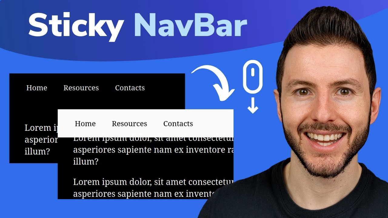
Animate nav on scroll - CSS-only & easy to customize
Summary
TLDRThe video script discusses the process of creating a navigation bar that changes its appearance based on the scroll position of the page. It introduces the concept of using CSS custom properties and the 'animation-timeline' feature to achieve a sticky navigation bar with color shifts and a modern glass morphism style. The tutorial covers the technical aspects of setting up the navigation, making it responsive to scroll events, and customizing it with animations that feel smooth and seamless. The script emphasizes the importance of browser support and provides solutions for different scenarios, ensuring a positive user experience across various platforms.
Takeaways
- 🌟 The video discusses creating a navigation bar that changes its appearance based on scroll position, without using JavaScript.
- 🎨 Customizing the navigation involves using CSS custom properties to easily adjust the color and other stylistic changes.
- 🚀 A 'sticky nav' effect is achieved by using the 'position: sticky' property along with a 'z-index' and 'background-color'.
- 💡 The concept of 'at-supports' is introduced to provide a progressive enhancement approach for animations, ensuring a baseline experience in unsupported browsers.
- 🔄 Keyframes are utilized to animate the navigation bar, with the 'animation' and 'animation-timeline' properties controlling the timing and sequence of the animations.
- 🎨 The 'backdrop-filter' property is used to create a glass morphism effect, adding a blurred background to the navigation bar.
- 📏 The 'width' property is manipulated to change the navigation bar's width, using 'fit-content' to dynamically adjust to its content.
- 🔧 Custom properties are used to control the visibility of the logo and the navigation bar, toggling between 'block' and 'none'.
- 🛠️ The video provides a method for handling non-animatable properties by changing them at the start of the animation using keyframes.
- 🔄 The 'animation-name', 'animation-duration', 'animation-timing-function', and 'animation-fill-mode' properties are key in defining the animation behavior.
- 📈 The video includes a link to a previous video for a deeper dive into CSS animations, scroll behavior, and browser support considerations.
Q & A
What is the main focus of the video?
-The main focus of the video is to teach viewers how to create a customizable navigation bar that changes its appearance, such as color and styling, based on the scroll position of the page.
What design trend is mentioned in the video that the navigation bar can mimic?
-The design trend mentioned in the video is the glass morphism look, which is popular for its translucent and smooth visual effects.
How is the sticky navigation effect achieved without JavaScript?
-The sticky navigation effect is achieved using CSS properties like 'position: sticky', 'z-index', and 'background-color', along with custom properties and animations.
What is the purpose of using an SVG for the logo in this context?
-Using an SVG for the logo makes it easier to shift colors during the scroll-based animation, as the 'fill' attribute of an SVG can be manipulated with CSS.
What is the role of 'animation' and 'animation-timeline' in the script?
-The 'animation' property is used to define the name of the keyframes animation, while 'animation-timeline' is used to control the timing and progression of the animation based on scroll position.
How does the video script address browser compatibility issues?
-The script suggests using the '@supports' rule to check for browser support of certain CSS properties and features. If a browser doesn't support a feature, it provides alternatives or fallbacks to ensure a working navigation bar without advanced effects.
What is the significance of using custom properties in the script?
-Custom properties, denoted with '--', are used to make the code more customizable and easier to maintain. They allow for changes in the animation and styling to be controlled from a central place, making adjustments simpler.
What is the purpose of changing the 'display' property of the logo within the animation?
-Changing the 'display' property of the logo within the animation allows it to disappear at a certain scroll position, creating a seamless and smooth transition to the new navigation style without the logo.
How does the script handle the width of the navigation bar during the animation?
-The script uses the 'width' property and the 'fit-content' value to make the navigation bar adapt to its content's width without causing line wraps. It also uses custom properties to control the width changes during the animation.
What is the role of 'backdrop-filter' in achieving the glass morphism look?
-The 'backdrop-filter' property with a 'blur' effect is used to create the glass morphism look, giving the navigation bar a blurry, translucent appearance that matches the design trend.
What are the final recommendations given in the video for further exploration?
-The video encourages viewers to experiment with the 'animation-timeline' and 'scroll-timeline' features in CSS for creating advanced scroll-based animations and effects without JavaScript, and points to additional resources for a deeper dive into these topics.
Outlines
🎨 Introducing Customizable Navigation Styling
The paragraph introduces the concept of creating a navigation bar that changes its appearance based on the user's scroll position. It discusses the idea of making the navigation customizable and mentions the popular glass morphism look. The speaker sets the stage for a tutorial on how to achieve this effect without using JavaScript, starting with a simpler version and gradually making it more customizable using CSS custom properties.
🚀 Setting Up the Basic Sticky Navigation
This section delves into the initial setup for a basic sticky navigation bar. The speaker explains the process of making the navigation stick to the top of the page as the user scrolls. It covers the use of the 'position: sticky' property, setting the 'z-index', and 'background-color'. The aim is to create a navigation that remains on top and transitions smoothly from one style to another as the user scrolls down the page.
🌈 Adding Color Transitions with Scroll Animation
The speaker describes how to add color transitions to the navigation bar as the user scrolls. The focus is on using keyframes and the 'animation' property in CSS to create a smooth color shift effect. The paragraph details the process of defining the end state of the animation with a box shadow and then using the 'animation' property to apply this style as the user scrolls down the page. The speaker also discusses the use of 'animation-timeline' and 'scroll' to control the timing and position of the color transition.
🎨 Customizing the Animation with CSS Variables
In this part, the speaker talks about enhancing the customization of the navigation bar's color transition using CSS custom properties. The goal is to make it easy for users to modify the animation's start and end points, as well as the color scheme. The paragraph explains how to use 'calc()' with viewport height units ('VH') and custom properties to control the scroll position where the color transition begins and ends. It also touches on browser support and provides solutions for non-supportive browsers.
🚪 Implementing the Glass Morphism Effect
The paragraph discusses the implementation of the glass morphism effect for the navigation bar. This involves making the navigation bar appear as if it's sliding in and out of view with a blurred backdrop. The speaker explains how to achieve this by manipulating the 'backdrop-filter', 'opacity', and 'width' properties. The focus is on creating a modern, aesthetically pleasing effect that enhances the user interface.
🔧 Final Touches and Browser Compatibility
The speaker concludes the tutorial by discussing final adjustments to the navigation bar's appearance and functionality. This includes hiding the logo and adjusting the width of the navigation bar for a better fit. The paragraph also addresses browser compatibility issues, suggesting the use of '@supports' to ensure a fallback experience for browsers that do not support certain CSS features. The speaker encourages viewers to experiment with the code and make the tutorial their own, while providing a link to a deeper dive into CSS animations and scroll-based interactions.
Mindmap
Keywords
💡Navigation
💡Customization
💡Sticky Navigation
💡CSS Custom Properties
💡Glass Morphism
💡Animation Timeline
💡Scroll-linked Animation
💡Viewport Units
💡SVG Logo
💡Performance
💡Browser Support
Highlights
Creating a navigation bar that changes color and style based on scroll position.
Introducing a glass morphism look to the navigation bar for a trendy design.
Achieving the effects without JavaScript, using only CSS.
Customizing the navigation bar using CSS custom properties for easy modification.
Utilizing the 'position: sticky' property in CSS for the navigation bar.
Creating a smooth color transition effect with CSS keyframes and animations.
Adjusting the box shadow to create a sliding effect as the user scrolls.
Using the 'animation-timeline' and 'scroll' properties to control the animation based on scroll position.
Incorporating SVG logos for easier color manipulation within the navigation bar.
Making the navigation bar width dynamic and responsive with 'fit-content'.
Hiding the logo and adjusting the navigation bar width at the start of the scroll with custom properties.
Applying a 'backdrop-filter' for the glass morphism effect on the navigation bar.
Ensuring browser compatibility with custom properties and providing fallbacks for non-supporting browsers.
Creating a toggle for the navigation bar effects for user control.
Using 'animation-name', 'animation-duration', and 'animation-timing-function' to customize the animation behavior.
Adjusting the 'top' property of the navigation bar to create a sliding effect as it sticks to the top of the viewport.
Transforming the navigation bar into a dark theme with opacity adjustments for better visual effects.
Transcripts
hello my FR and friends if you've ever
wanted to make a navigation like this
one that changes depending on where you
are so you go past a certain point it
switches over to a different color or
different styling and take that idea and
maybe tweak it and make it customizable
so you could also do something like this
where it sort of slides in with this
glass morphism look that's very popular
these days and then slides back out as
you get to the top with only one
navigation we don't need multiple ones
in our HTML and we don't even need any
JavaScript for this well if that sounds
interesting you want to know how we can
do all of this you're in the right place
we're going to start by building out
this version cuz it's a little bit
simpler going to take that code step it
up make it very customizable using
custom properties and turn it into
something that allows us to do this
version here instead so if all of that
sounds good you're definitely in the
right place but just before we dive into
it I do want to let you know that I have
new t-shirts there's this one that I'm
wearing right now as well as one for
grid and another one for color space so
you can show off your love for CSS and
let everybody know that you're also a
front and friend if you are interested
there should be a little card thingy on
the video right here and there'll also
be underneath the video as well but what
you're really here for is learning how
we can do the sticky navigation and so
let's dive right into it and take a look
very quickly at the code that uh we're
going to be starting with here very
simple I have a header here which is
where most of our styling is going to go
it's going to us the navigation that we
can see uh right up there uh I have an
SVG as my logo you don't need to have an
SVG as your logo but if you do want it
to shift colors like we're going to be
doing it makes it a lot easier if it is
one if not you could probably do it with
a blending mode or something um but
using an SVG does make it easier and
we'll see how that works when we get to
it and then I just have my nav here with
a ul and all of that and obviously I
also have some styling on here nothing
too fancy I'm not going to Deep dive it
if you want to take a look at my styling
there is a link to the finished code in
the description you will notice also
that I'm using nesting here so I just
have a few things that are nested if
you're not used to nesting this is just
a UL that is inside of my header it is
modern CSS which is what we're going to
be playing with to today which is why I
felt comfortable doing it for this demo
and right now with everything I have set
up all this is doing is giving us a
regular navigation that's just at the
top of the page we want it to stick
first of all so the first thing I'm
going to do is I'm going to come here
and I'm just going to paste this in
where we're getting a position of sticky
with a zed index of a th000 a background
color on it uh and a top of zero so you
can see that has all come in and now
because we have the position sticky
there it's working the Zed index here is
just because if anything else has a
position on it other than the static um
it's the sticky stuff often ends up
behind it so this just makes sure it's
on my top layer I've put a big number
and the background color I need to have
CU it's going to be transparent if not
which means it's kind of awkward so we
can put that back on there now this
first one we're going to be doing is
when we scroll down it's going to shift
and change colors so to be able to do
that what we're going to do is I'm going
to scroll all the way down to be outside
of my selector we can't be inside of
another selector for this to work um
because we're using at Key frames which
have to be on their own they can't be NE
tested uh if you're using regular CSS if
you're using a pre-processor it is not a
problem uh and the key frames here I'm
going to call it sticky nav just like
that uh the real trick here is we just
want to put in these styles that we're
going to have at the end of the
animation and so for now the only thing
I'm going to do is put this box Shadow
on there we're going to tweak this and
change it a little bit more but just to
show you uh as a quick example of how
this works and normally box Shadows
aren't something we want to animate
they're not the best for performance but
because it's link to scroll position I'm
not too worried about the frames per
second or anything on this um and then
we're going to come back up on the
original header up here and we're going
to come we're going to say animation and
on here we're going to do our sticky nav
which is the name of our animation we're
going to say that it is linear because
we don't want we want the timing
function just to be like from here to
here it's based on scroll position and
we're also then going to say that we
want it to be forwards because when the
animation is finished we want it to stay
at the end and if I just do that because
we don't have any timing on here it's
actually already applied which is you
can see there there's a box Shadow
that's on there um and you know what I
was just thinking this isn't going to be
super obvious with just the shadow
because we don't really see it here so
why don't we actually invert things here
a little bit I'm going to move um we
have my color here I'm going to make
this my 100 uh 900 I should say to make
it white and then this is going to go to
100 so we have a dark one there and what
we can also do is invert those two uh at
the end of our animation so if I bring
those down here make that my one make
that my nine let's hit save save so you
can see it's actually we're we're at
this point now we're at the 100% because
the animation has just run and that's
all it's happening if I wanted to I
could even come here and say like 2
seconds hit save and if I refresh the
page it starts dark and you can see it
switches over after 2 seconds but I
don't want it to have a Time on the
animation here instead I want to use
animation timeline and I'm going to
write in View and it it it's going to
work now but it's not perfect but as I
go down down here we can see if we look
up at the top uh it's slowly shifting as
we move all the way down to the bottom
of our page which isn't what we want we
want it to basically stay the same and
then all of a sudden shift over a short
period of time so to be able to do that
what we're doing right now is we're
doing it all in sort of the steps so you
understand how it's working then we're
going to make it a lot easier and less
magic numbering um as we go through this
what we're going to do is after my
animation timeline we're going to come
in with an animation range start and I'm
going to duplicate that one and do an
animation range end here and these just
are for where does the animation start
and end there are ways of passing values
into here but they're kind of backwards
and kind of weird uh if you want to know
more about this I have as I said in the
intro covered animation timeline and
scroll stuff in a lot more detail in a
previous video that really deep Dives
all of this so I'll leave the link to
that down below um and I just realize my
color on this is terrible but it's okay
well we'll get it looking better
later this should stand out not be so
dark I don't know what I did uh but
that's okay um so animation view
timeline uh is good so the start let's
just do for now we're going to say that
it's 100 VH for my viewport height and
let's come here and say 120 viewport
height um and what that means is you can
see it's shifting in this short period
of time right here because it's starting
uh and the starts always an offset so it
basically means once it's at um so like
here if I made this 50 let's just say um
you it's already like halfway done so I
want it to be at 100 to be like we're
we're starting from the top of the page
basically um and then it's going to be
finished here so we have like a 20%
scroll range sort of thing um almost
already it's not quite what I want
though CU ideally I'd want it to start
switching somewhere like around here
once it's already like past this dark
hero type area right so we'd stay dark
stay dark stay dark then switch so this
is where it can feel kind of magic
numbery but I can just boost this number
up more and then make this one even
bigger uh and now until I've scrolled to
about 50% of the way down my page it's
going to stay that and as soon as I hit
that 50% scroll Mark it's going to start
switching and it switches over uh we're
going from 150 to 180 so it takes us
like 30% so the smaller the difference
here if I do that as 160 just means that
shift is going to happen much faster
when it does make that shift right there
there's a few important things that are
happening here
uh cuz I mentioned my logo is changing
colors the reason my logo is changing
color is because I have the fill of
current color and because as I said I
used an SVG here uh you can't use the
SVG as an image here it has to be as an
inline SVG if you do want to manipulate
the fill this way so just so you know um
that's an important thing to take into
account depending on how you're setting
things up if you have an image you could
probably actually it depends on your
colors and stuff so I don't want to say
for sure but you might be able to use
like a differ uh mode or something to
create some interesting effect uh but
ideally if you have an image that's a
different color it'd be kind of weird if
it's shifting anyway so just be careful
with with logo colors but it's following
my current color which is my text color
and my links are also set to inherent so
that's why I can change it on the parent
and everything is Shifting along with it
but otherwise it it's actually working
pretty good um the thing that's kind of
awkward with it when it does this shift
right now uh and as I said we're gaining
the Box Shadow is coming in the Box
shadow I'm not concerned about because
it is just based on scroll position um
but the thing that's really awkward
right now is that we have these sort of
magic numbery setups here and I don't
like that they're magic numbery and I
want to make it easy for people to
modify and to change and what about the
colors and everything else that's going
on I want all of that to be actually
really easy to be able to handle so
that's where custom properties come into
the mix so what i' ideally have is
animation starts after and we could say
like 500 pixel so once we've scrolled
down 500 pixels we're going to start our
animation and then we're also going to
come in with a custom property here
called animation and I guess like
distance like how long maybe we could if
you have a better name for that let me
know um but animation distance and we'll
say 250 so we're going to scroll 500
pixels down the page start my animation
and the animation range of scrolling is
250 pixels the other thing I'm going to
do here and I'm breaking this off on its
own little tangent because people always
ask me about it is I'm going to make
these have an underscore on them just to
indicate these aren't things you find up
in the like the root these are locally
scoped custom properties so I'm sort of
setting them apart a little bit um this
is an idea that Leia veru had it's sort
of like private properties in JavaScript
there's a little bit more to it than
what she was talking about um but I just
like doing this as a way to delimit if
something is a locally scoped property
versus if something is you know I go and
find it in my rout so that's how I'm
setting it up here uh and just why
you'll see me using underscores on them
so how can we use those numbers let's
come down here and on these I'm actually
going to use a Cel so we can say Cel of
100 V VH cuz viewport height and you
could use dvh here if you wanted to as
well Dynamic viewport height um I think
VH is actually very safe to use in this
case but if you wanted the dvh you could
use it as well and with that we're going
to say plus uh 100 VH plus my
VAR and we're just going to copy that
cuz it's faster and paste it in so our
anim starts after and then I'm actually
going to take this one and copy it again
and paste it on this line let's make
this a lot bigger so you can see what
I'm doing uh so we're going to say this
plus my VAR and this one is my animation
distance so that's just you know we're
going from this point to that point
basically and this math will work and if
I hit save on that now we come back to
here as I go down we can see that it's
hitting exactly what I asked it to so
we're scrolling down that distance then
it's going to do the shift and it's
going to go to there uh I'm actually
going to make one change here cuz I
don't like how it looks um my after
color my background here I'm going to
make this Pure
White um and I think that little that
grayed out zone is going to look a
little bit nicer uh and what I like
about this now is I could say okay after
I scroll 900 and I can use pixels here
or I can use viewport units or I can use
whatever I want and just for fun I would
never do this but we could say 900 and
900 so that means if I scroll down we
have to go all the way way down and then
it's a really slow shift or we could
come in here and make this like 50
pixels here so now instead of a really
long transition it's going to be a
really short transition when it does
happen right and that's probably more of
what you're after uh and again this
could be set with viewport viewport
height so after we scroll 50 viewport
height which would be about 50% of the
way down then all of a sudden we're
going to get a nice fast transition to
having the shadow whatever you want we
can play around with those numbers and
we can actually make a lot more of this
customizable as well if you want to you
don't have to to add these all in but I
sort of like having it like this uh
where I'm also saying my Surface color
start surface ends that's the background
colors and then I can also do the same
for my text color start and text color
end and so that just means I need to use
those within what I'm doing down below
but it's just adding all of that
customization here so a really quick
edit there I've just switched all of
those out to those custom properties and
then at the end of my animation I've put
this here um so we have my color and my
background color going to the end values
over here and what I like about that is
it means I don't have to come down here
and make a change I'm controlling the
entire look of what's Happening from
here and I just the more controls I put
as as custom property sort of the more I
like it so we can see that it's still
working except I'm getting uh very
transparent which wasn't uh what I was
after cuz I put a low opacity right
there we can fix that um and play around
with my numbers and there we go that's
looking a little bit better I fixed my
colors up and maybe this can go up to
like 120 pixels or something uh just so
our shift is happening so if you brought
this into a project you could set it all
up here
uh and and everything would be working
uh really good now one thing you'll
notice here is I doing a surface end
start and end I'd find it easier because
I can control it all just through here
uh there would be a way to do this with
a single custom property and you just
change the value of the custom property
down here instead I personally like this
other method more just because I don't
need to go and look for my key frames
after everything is just stored right
here but it would be possible the only
thing is you'd also have to register it
as with like an app property if you
wanted to change the value of the custom
property and have it animated um so yeah
if you've never done that that would
just be another thing that you'd have to
look into it's Houdini at propy it's not
hard to do but I just find this this
much easier and it's also going to help
us a little bit with browser support um
because if a browser doesn't support
this what are we going to do right uh
there's there is a polyfill that I
haven't experimented with in this I you
know the polyfill is a little bit
Limited in what it can do so it would
definitely be worth playing with and
seeing if the polyfill Works uh but I'm
going to suggest is just coming in uh
and you have to decide do you want it to
be a sticky nav or not uh if browsers
don't support this so right now it's
only in chromium browsers but it's over
60% support uh and it's behind a flag in
Firefox I believe I put links to browser
support tables in the bottom um but what
you could do is just come right here and
you could say that at supports and this
would just be
animation timeline of view and then wrap
that entire block let's make this bigger
so we can actually see what I'm doing uh
take this entire thing here and wrap it
within the the at supports and what this
means is uh you know is this supported
or not and if the browser does not
support this then it's not going to run
through this but we will have a sticky
navigation that means the color won't
actually change so if I come and take a
look in Firefox now it's just staying as
a dark navigation everything is working
no broken experience it just doesn't
have that shift going on
or maybe you don't like that you want it
to be at the end State because you know
this only works when it's at the very
top you want it to stay sticky of course
if you don't even want it to stick then
you just move all of this into here
right if I do that then in this one it's
not a sticky nav it just works the same
way it did before so that's obviously an
option whereas here because it is
supported it's working and everything is
fine uh or the other option is you
actually move this sticky nav linear
forwards outside of the supports and I'm
just doing an ALT up and down to move
code around um just in case you didn't
know that shortcut in BS code and as we
saw when we first set this up what this
means is it sees this animation and
there's no time on it so the time is
basically zero so it automatically jumps
to the end and that means we always have
the end state so we always have it like
this and so this is probably going to be
project dependent a little bit in
context dependent on what colors you
prefer do you want it with the light one
I sort of like this with this simple
demo that I made here um but it really
depends on your use case and what you
want uh but browser support is still an
issue with this but I think it's one of
those things that um is as a progressive
enhancement is perfectly fine and
there's different ways that we can
progressively enhance it which is
perfect you can decide on do you just
don't want a sticky nav or do you want
it to be the beginning Styles or do you
want it to always be the end Styles so
with that said let's look at how we can
make this even better so for the better
version I'm actually going to make this
a dark theme and I'll see you in just
one second all right so now we have a
dark Theme website you can see my text
looks better now as well the animated
sticky nav is sticking out because of
the color shift that I did uh both the
first and second version of this the
finished versions will be linked down
below um just in case you want one or
the other um and in this case I don't
really want this to happen we want to
get sort of that new trendy glass
morphism style instead so for this
there's a couple of fun little tricks
and things along the way and we're going
to sort of step it up slowly as we go
through all of this and so for this uh
to get this started the first thing I'm
going to do is the end color I'm I'm
going to make this uh
we're going to do I'm trying to think I
think I want it black still so 5% but
we're going to give it like an opacity
of 02 or something so it's darker you we
it's there but it's it's very dark and
my color at the end is going to stay
light and uh I think we're actually do
light here as well there we go so we
just get like an opacity that's coming
through on
it uh which is going to work better for
the effect that we're going to be after
now the real trick here is when I first
start scrolling I want the nav to go off
with it but when we reach a certain
point I want it to slide in that's the
trick for here and the way we're going
to do that is actually coming down here
to the top and I'm going to show we're
going to later come on and make a toggle
so this could be like a feature that you
could turn on and off if you want um but
I'm just going to come to the top and
make it -5 R uh and the reason for that
is before we have any scrolling it's
going to just be where it is in a normal
flow and then as I scroll it will stick
but and it CHS five cuz it's big enough
that our element will be off the screen
and it's sticking but it's sticking five
REM out of our viewport so we don't
actually see it cuz it's a negative 5
REM just like if I did this at five REM
it's it's sticking but it's it's five
REM down so I'm doing the opposite
negative 5 R and if ever like a little
bit is sticking out you can make this a
bigger value kind of magic numbery but
whatever it's not the end of the world
and it's sticking but it's sticking just
out of our viewport um as we're
scrolling down and that means if it's
sticking here I can actually change
where this Top Value is and again top
isn't normally something you'd want to
animate but I'm not after super buttery
smooth animations now cuz it's scroll
link position um so I don't think it's
not something that's like animating in
in different ways I think it's okay we
could technically translate it in um so
I think using the top here is okay
though so I'm going to say that my top
is now going to be say one REM down and
that means you can see it it already
worked going to start here and it's
there it goes out it sticks and then as
I continue going then it's going to
animate in and slide back in except now
it doesn't look very good so a couple of
other things we're going to do let's
come back up here and then I'm also
going to add in I'm going to do this
within my at supports cuz I don't really
want this on there unless this is
supported but I'm going to add a
backdrop filter on there because that
gives us a little bit of our glass
morphism look uh that we're after and I
think that looks a lot better so we'll
put in that um and again that's just a
backdrop filter of
blur and then the other thing let's come
back up to here and change this color a
little bit just maybe a
05 um would actually be enough opacity
so it just gives us a little bit of a
look to it uh and it blurs out so I
think that's okay uh the other thing is
I don't want it to be as wide and I
actually want the logo to be gone and
these two things that I'm going to do
now aren't really animatable properties
so we sort of need to trick things a
little bit here to pull this one off uh
and to make it look good and the reason
I say that is and let's only put it
here um we'll do the width first because
that one's easier so we're going to say
that the width is fit
content and fit content just means like
go as small as you can go without any
line wraps and if it runs out of room
then it will line wrap um if you want to
make sure there's never any line wraps
you could also use max content but then
you would get horizontal overflow so it
depends which one you want I'm going to
go with fit content just cuz it's
slightly safer and of course I've made
this not mobile friendly um you you know
I'm leaving that one up to you we're
looking at the stickiness right now uh
so there we go that's already looking a
little bit better I guess we could also
come up to here and add a border radius
on all of
this um I'll just do it here border
border radius of 100 VW which means it's
always going to be a pill shape so right
away you can see it's here it's stuck or
it's not stuck it's sitting there it
Scrolls away and then it comes in but
notice how it does this weird shift
right here where the width is kind of
like here it's okay but then it it
basically instantly goes from its full
width like let's I'll show you let's
make this like 300 or 500 pixels or
something really big so the distance
should be long but it's basically like
one it's instantly wide or instantly
narrow and that's because we can't
animate to a fit content um right from
Auto so with can I do this I don't think
I can no same idea we can't go from the
width to a fit content to an auto or
width 100% that's not going to work so
we need to come up with a different way
of doing that uh but I also need to hide
my logo so we're going to do both of
those at the same time because it's a
very similar thing that we're going to
do little wardrobe change Kevin from the
future here I was watching the my edited
version and then realized I did a bit of
a contrived solution here it could be a
lot easier so we're going to look at the
simpler solution uh that I should have
done in the first place uh for get the
that problem um with the sizes and
everything uh to work so what we're
going to do is let's do the we as I said
we'll do both at the same time and what
it basically involves is let's find my
where I have my logo set up here where I
just have the fill and I have a height
on it because it sort of makes sense for
a logo uh I'm going to do a display on
here as well and my display is going to
be a custom property that I'm not going
to have defined which is going to be uh
logo display and I'm just going to do a
comma and actually I put none there but
I want block so what that means is um my
my logo display is set to block by
default because this is an undefined
custom property so just means if the
browser can't find a value for that it's
going to use this as the value and the
reason I want to do that is because then
I can actually switch it within my
animation because we can't I I don't
want to have to have multiple different
animations I want this one animation to
be for everything and so by having as a
custom property that makes it a little
bit easier and I don't even need to
worry about um doing this as a
registered custom property with like an
app property or anything like that
because we're not animating this it's
just going to instantly change right
we're going from block To None instantly
so that's going to be set there and
we're going to do the same thing for the
width where I can come up um and I don't
have a width set anywhere um on my
header right now but we can do the same
thing where on this we can come up with
a width and this one doesn't technically
need to be a custom property cuz the
animation is directly on here uh but it
just makes it a little bit more obvious
what's happening I think so I'm just
going to call this one header width and
the default will just be Auto which it
already is this is the the value or what
we have right now um and we're going to
save that and the reason I'm doing that
is because I want to come down here and
change them there is a catch to this
though and we'll see here um and well we
saw that already with the width where it
wasn't really working properly right cuz
if we have
the uh when we change I can change my
custom properties here so if I did the
header width and we'll do the logo
display as well uh so here I can change
this to be my FIT content like we were
just playing with and then I'm also
going to do my header display and make
that
none and that just means that the my
header display is not working oh not
header display that should be logo
display
sorry and so it's that same problem we
have where it's like halfway through the
animation we're switching from this to
the other one
so instead of doing these here we're
going to do them somewhere else because
we can have different key frames set up
and here I'm going to do a 0% 100%
instead and throw them in there and that
just means that these are going to
switch as soon as the animation starts
and why this is going to work is because
the animation is starting when our logo
is stuck five REM off the top of the
page so because it's happening off the
page it just seems to slide in and
everything is perfectly fine and good uh
and there's a few extra things we could
do here just to make it a little bit
more customizable as well so if we go
all the way back up to here um just like
I have these set as my custom properties
but what we could do is set uh things
here that would be sort of like settings
so again we wouldn't have to jump down
to the other area down below right this
is our settings that we want to keep so
I could say uh logo after animation is
it uh so we could have it stay block or
we could could have it go to Hidden and
then because we have this here what we
could do is we could come down all the
way to inside the animation where I have
the none here and I could have that look
at that other one so this would be my
logo after
animation um or maybe you can come up
with a better name for it we can do the
same thing for the fit content for the
width uh you can do the same thing with
your border radius and and other things
like that so You' sort of pass off all
the different things that would end up
being down there um and I put hidden
here but we want to have it as none um
right so if we do that it should still
work perfectly fine you can see there we
go so it's switching over to this but
only in the second half and I like doing
that as much as possible again so I
don't have to look up here for some
stuff and then go and find a key frames
animation somewhere else the more I'm
controlling here the better so I'd
encourage you to play with this a little
bit make it more of your own you can add
some more customization to it and so if
you did enjoy this video and you'd want
to do a bigger Deep dive into the
different types of things you can do
with the animation timeline and we have
a scroll and a view and there's a lot of
different controls and different things
we can do with it and really fun effects
that we can create without any
JavaScript now which is always very
exciting especially for someone like me
but if you're interested in that that
video is right here for your viewing
pleasure and with that I would like to
thank my enablers of awesome Philip
Andrew Simon Tim and Johnny as well as
all my other patrons for their monthly
support and of course until next time
don't forget to make your corner of the
internet just a little bit more awesome
تصفح المزيد من مقاطع الفيديو ذات الصلة
How make SWIPE LEVEL MENU in Unity?
next.js in urdu - 9 - Navbar Tutorial (Step-by-Step)
CSS Course | CSS Position Property | Complete Web Development Course Beginner to Advance Tutorial 21
Beautiful Animated Nav Bar with React & Framer Motion
#4 Adding a Search Bar — Documentation Website in Framer
Figma To Real Website | Responsive Homepage | HTML, CSS & JavaScript | Part 10
5.0 / 5 (0 votes)