Lecture: Professor Ellen Lupton on Pop Art and Graphic Design
Summary
TLDRThe presentation focuses on pop artist Andy Warhol and Roy Lichtenstein and how their techniques of enlarging halftone dots and Benday dots made visible printing textures usually designed to disappear. It illuminates how Warhol's distinctive ink line was derived from a tracing paper transfer process. It explains Lichtenstein's painstaking method of applying uniform Benday dots with stencils versus gestural artists like Pollock. It shows both artists appropriating commercial art subjects like ads, comic books and celebrities considered 'feminine'. The talk explores how their interrogation of printing processes and commercial imagery was considered subversive yet hugely influential on graphic design.
Takeaways
- 😀 Andy Warhol invented his own distinctive ink drawing style using a blotted line technique
- 👩🎨 Warhol's mother Julia Warhola did lettering for many of his commercial illustrations
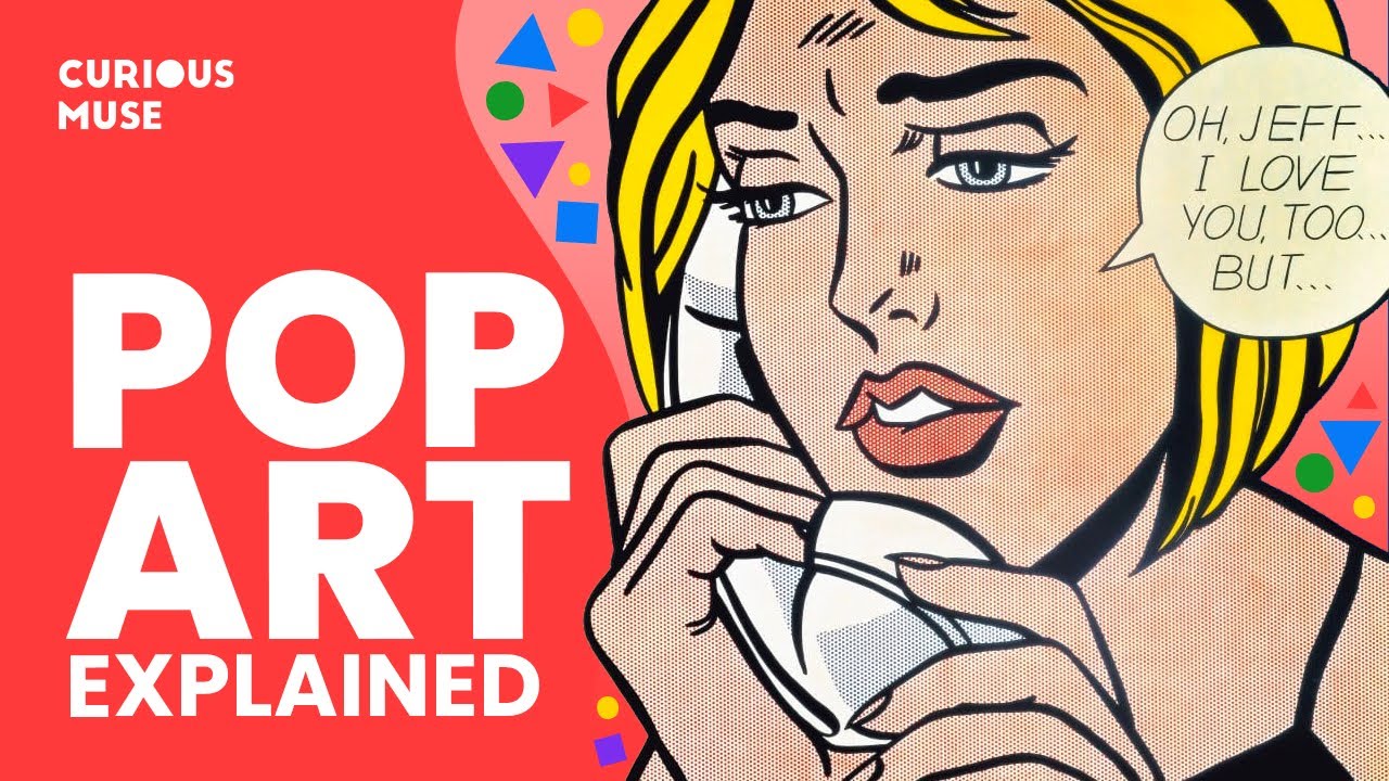
- 🔎 Roy Lichtenstein blew up and exposed the benday dot, making visible this previously overlooked printing technique
- 🖌 Lichtenstein used perforated metal stencils and a toothbrush to mechanically apply uniform dots to his canvases
- 👄 Both Warhol and Lichtenstein featured dramatically enlarged lips in their pop art
- 🌇 Adele Weber used rubber stamp lips to create prints and painted over them, playing with ideas of traces and prints
- 🇺🇸 Jasper Johns flag paintings were things seen but not examined - the graphics of flags rendered in paint
- ✊🏿 Faith Ringgold’s political posters of bleeding and violent American flags confronted laws against desecrating the flag
- 🎨 Ringgold developed a color theory she termed 'black light' using deep, vibrant hues to celebrate black skin
- 👩💻 'Old ladies' working for minimum wage manually produced the benday dots that colored the comic books Lichtenstein appropriated
Q & A
What technique did Andy Warhol invent to create his distinctive ink drawing style?
-Warhol created a process where he would make a drawing on tracing paper and then ink the back of the tracing paper with wet India ink. The tracing paper was then pressed onto a piece of illustration board to create a print, leaving gaps and blobs that became part of his signature style.
How were Ben Day dots used in commercial printing?
-Ben Day dots were used in commercial printing to reproduce illustrations, comic books, maps, and fashion illustrations. They were applied by hand using a complex mechanical contraption to create tone and texture.
How did Roy Lichtenstein differ from pop artists in his use of Ben Day dots?
-Unlike other pop artists who used enlarged halftone dots from photographs, Lichtenstein used uniform benday dots. He had to invent his own method of transferring them to canvas using perforated metal stencils and pressing paint through with a toothbrush.
What was unique about Adele Weber's use of lips in her pop art?
-In a drawing covered in stamped lips, Weber painted a businessman silhouette over the top, symbolically showing lips as a sexualized feminine 'mark' or conquest being covered up and controlled by male authority.
How did symbols like flags feature in pop art and graphic design?
-Pop artists like Jasper Johns used common symbols like flags to explore things seen but not examined. Graphic designers in the 1960s then adopted flag motifs to make stark, printed political posters.
How did Andy Warhol's mother Julia collaborate in his commercial illustration work?
-Julia Warhola worked side-by-side with Andy, sometimes doing ink drawings and lettering for commissions. She received credit under the name 'Andy Warhol's Mother'.
How was photo reproduction used in creating pop art works?
-Many pop artists appropriated images from mass media like newspapers and advertisements and blew them up as a basis for paintings, often preserving and accentuating the halftone dots.
How did Andy Warhol and Roy Lichtenstein represent different approaches to creating pop art?
-Warhol embraced imperfect mechanical reproduction while Lichtenstein invented meticulous manual techniques to create the illusion of perfect mechanical dots and crisp commercial style.
How did graphic designers respond to pop art innovations?
-Graphic designers immediately adopted pop art motifs like blown-up dots into campaigns for products like the 5up soda brand identity.
How did Faith Ringgold's 'Black Light' posters relate to pop art?
-Ringgold's psychedelic color theory for celebrating black skin related to trippy San Francisco rock posters, building on modernist color theory Ringgold learned as an art student.
Outlines
😃 Warhol's signature line drawing technique
Paragraph 1 discusses Andy Warhol's unique line drawing technique he invented as a college student to create a distinctive style. He would make a drawing on tracing paper, ink the back with wet India ink pressed to illustration board to print it. This made prints with missing gaps and blobs that reproduced well. His assistants helped produce the drawings using this technique.
📚 Warhol's early commercial illustration work
Paragraph 2 shows examples of how Warhol applied his signature line drawing technique to commercial works like book covers. He likely also did the lettering on some. The prints have more depth than the final drawings. Other designers integrated his illustrations into designs, like the book cover lettered by his mother Julia Warhola.
👵🏻 Julia Warhola's lettering and collaboration
Paragraph 3 discusses Julia Warhola's lettering work on promotional books Andy Warhol made as gifts for clients. She lettered and illustrated some books like a cookbook with Andy's gourmet food illustrations. She was credited as "Andy Warhol's mother" when his work won awards.
🔎 Making halftone dots and patterns visible in art
Paragraph 4 explores pop artists like Warhol and Lichtenstein using halftone dots and benday patterns, designed to disappear in printing, but made visible. Warhol blew up photographic halftones and Lichtenstein invented ways to apply benday dots. Other earlier graphic design works had experimented with visible dots.
🤓 Understanding benday dots and production
Paragraph 5 dives deep into what benday dots and patterns are, how they were produced for illustrations using an intense hands-on process over a century. It evolved from a complex lithographic technique to a cheaper acetate method done by women minimum wage "dot makers" working for comic color separators.
🎨 Lichtenstein's benday dot technique and reception
Paragraph 6 examines how Lichtenstein developed ways to perfectly reproduce benday dots on canvas using stencils and a toothbrush. This mechanical process is compared to the more respected Jackson Pollock's expressive dripping paint technique as polarity between commercial vs fine art.
👄 Lipstick prints and kissing imagery in pop art
Paragraph 7 analyzes use of lipstick prints and lips as sexual marks and evidence of conquest in pulp fiction and pop art. It traces possible origins of Warhol's repeating lip images to earlier graphic design works like a Herbert Bayer magazine cover.
🇺🇸 Flags - things seen but not examined in pop art
Paragraph 8 discusses Jasper Johns' early pop flags series as recreations of the graphics of a flag, rather than pictures of flags. Later pop artists built on this with prints and posters of flags infused with political messages, exploring commercial reproduction.
🎨 Faith Ringgold's poster works on state violence
Paragraph 9 highlights Faith Ringgold's powerful political posters like The People's Flag Show which led to arrests for using flags. Cooper Hewitt is acquiring these works which build on a history of activist graphic design poster work to spotlight injustice.
🤔 Discussing Lichtenstein's inspiration and methods
Paragraph 10 examines questions on whether Lichtenstein was more inspired by commercial subject matter or stylistic graphic qualities to use dots. The discussion explores his choice of already degraded and feminized source material and how he transformed it through an ironic lens.
💭 Conversations on reviving pop art and its legacy
Paragraph 11 considers whether now is a good time to revitalize pop art given our highly commercialized visual culture. It notes contemporary painters especially create related commentary on media, products and capital, though different than classic pop art.
Mindmap
Keywords
💡commercial art
💡dots
💡lines
💡lips
💡flags
💡mass media
💡photomechanical reproduction
💡graphic design
💡appropriation
💡serial imagery
Highlights
Kelly Montana introduces Ellen Lupton, emphasizing her role in shaping the perception of everyday objects through design.
Ellen Lupton's exploration of Andy Warhol's unique line creation process, which involved a combination of hand processes and mechanical reproduction.
Discussion on Warhol's transition from commercial illustrator to pop artist, highlighting the blend of handcrafted and mechanical elements in his work.
Lupton's insight into the collaborative nature of Warhol's early work, including contributions from his mother, Julia Warhola.
The exploration of halftone dots in Warhol's art, revealing the technique of making visible the typically unseen texture of reproduced images.
Analysis of Roy Lichtenstein's adoption of the Benday dot technique to emulate and critique commercial art aesthetics.
The technical challenge and process behind Lichtenstein's precision in recreating dot patterns to mimic mechanical reproduction.
Comparison between Jackson Pollock and Roy Lichtenstein's Life magazine features, highlighting the differing public perceptions of their art processes.
The impact of pop art on commercial graphic design, with examples such as the 7UP identity redesign that incorporated enlarged dot patterns.
The role of lips as a recurring motif in pop art, symbolizing various themes from femininity to consumer culture.
Jasper Johns' approach to painting flags as objects of everyday life, challenging viewers to see familiar symbols in new ways.
Sturtevant's meticulous recreation of Jasper Johns' flag paintings, questioning the nature of originality and reproduction in art.
The use of the American flag in art as a medium for political expression and critique, as seen in works by Faith Ringgold and others.
Lupton's discussion on the continuous relevance and evolution of pop art themes in contemporary art, particularly in the context of digital media and societal critique.
The lecture's emphasis on the intertwined relationship between art, design, and commercial culture, illustrating how artists like Warhol and Lichtenstein blurred these boundaries.
Transcripts
hi good evening everyone
i'm kelly montana i'm the assistant
curator here at the manila drawing
institute and i'm really thrilled to see
so many of you here with us tonight
before i begin i'd like to remind
everyone to silence or even consider
airplane mode your cell phones please we
are recording this talk and it will be
posted online in the coming weeks
i'm delighted to be hosting this event a
lecture by ellen lupton in conjunction
with our exhibition draw like a machine
pop art 1952-1975
the show is overwhelmingly drawn from
the museum's permanent collection with
key loans from collectors based here in
houston some of whom are with us this
evening
the exhibition galleries will remain
open for a brief period after the talk
ends for anyone that would like to visit
and we are especially grateful that
ellen could travel from maryland to be
here with us tonight there will be time
for a short q a following her
presentation and please hold your
questions until then
and now it is my pleasure to introduce
ellen lupton
ellen is a writer curator educator and
designer
she is the betty cook and william
steinmetz design chair at the maryland
institute college of art in baltimore
and the senior curator of contemporary
design at the cooper hewitt
the smithsonian design museum in new
york
her newest exhibition at the cooper
hewitt is design and healing creative
responses to epidemics
a prolific writer her recent
publications include the co-authored
extra bold a feminist inclusive
anti-racist non-binary field guide for
graphic designers
and her texts mother tongue the script
of julia warhola and how posters work
were especially critical for me in the
exhibition on view this evening i
returned to them time and again
for me the through line in ellen's work
is how she closely attends to the
journey we are all on with the often
overlooked yet often necessary things of
our lives
she unpacks with incredible specificity
why an object or an image makes you feel
joy frustration or total indifference
and her work always assures that you
know it is a person that designed it
they made it with intention and they are
quite literally shaping your world
in short ellen's mind is an exciting one
that i am sure will make you see much of
it anew and i will turn it over to her
please join me in welcoming our guest
ellen lupton
thank you kelly it was so much fun to
see this show
it's a real delight to be here so thank
you
so my my lecture title looks a little
bit like a basic design lesson you know
we start with lines
and then we do dots
but then all of a sudden we're like sex
and politics right that's how it works
so
um
i'm a graphic designer i'm not an art
historian but i love art and i loved
looking at all the
beautiful works on paper with kelly
today
and
everything i do in the field of design
somehow comes back to how things are
made i'm just really interested in that
it often interests me more than what it
means
sorry
right basic design
so we're going to start talking about
these lines and this is from
andy warhol's early career
he was a very successful commercial
illustrator
for the first decade of his career in
new york city and he studied commercial
art at the carnegie institute in
pittsburgh now carnegie mellon
university
[Music]
and when he was in school
he
set upon himself the challenge
to invent his own line
because if you're going to be a
commercial illustrator
you had to have your own line
and i think this gets to some of the
the ironies and
fascinating contradictions in kelly's
show
of how
commercial art
although it was created for reproduction
had at its basis
these hand processes
that even when
the graphic artists were striving for
something more mechanical
there's still these hand processes
at the bottom
and so how did andy warhol
make his very special line
well he
created this process where he would
make a drawing on tracing paper
and then on the back of the tracing
paper he would
ink it with wet india ink
and it was hinged to a nice piece of
illustration board
and then he would press the two things
together
in order to create this print
and so what you see on the left in each
case
is the print the final drawing and what
you see on the right is the
ink original
which oddly enough it has like more
detail and more depth and
and it's fascinating to me that often in
the print
some of the character actually
disappears
um and what he was trying to create was
this very distinctive line that has
little gaps and blobs in it
and another advantage of this method is
that it was very easy to
photomechanically reproduce so in all
the reproduction methods of the era
including today
a pure black line on a white
ground is easiest to print and so to
make his unique line it also had to be
very print friendly
so the line is kind of printed
and it's kind of drawn
and it's kind of there
and it's kind of not there
parts are missing
but they're missing by accident
and it's a kind of wonderfully warholian
design um
and often his assistants would actually
do the inking
and sometimes the entire drawing for him
and this is in the 50s when he was a
commercial illustrator later of course
we know he had a factory but really the
factory started in his townhouse
in manhattan where he lived with his
mother
and where his assistants often helped
him with the drawings
and learned how to do the process that
he invented when he was a college kid
um
and so i found some examples and there
are many where he applied this drawing
style to commercial pieces he did a lot
of book covers which are really
wonderful
and here's one where he likely also did
the lettering
and there's a wonderful integration of
the lettering and the illustration and
the
kind of textured uh background
he did many book covers and you can
buy these for not too much money
it's a kind of fun collector's beginning
collectors pieces if you're into that
um
this one
most likely another designer added the
type
i don't see any evidence in warhol's
work that he knew how to do typography
per se
but it's quite beautifully integrated
into this wonderful drawing and you can
see his
line right his distinctive signature
line he had a couple of other lines as
well but this is the one that he's most
known for and there's wonderful examples
of it in the exhibition which is really
fun to see
he certainly didn't design the book
cover he did the illustration
and another designer would have
reversed it you know created this
dramatic
layout with it
and in this case using this typewriter
type
to
create
that feeling of rawness
and roughness
that goes with the line and there's
always a challenge for graphic designers
working with illustration
is how do you make illustrations look
okay with type
because type is hard and fixed
and has sharp edges and often looks
really bad with illustrations so
kudos to this uncredited designer who
actually did the cover design featuring
the illustration
um
and sometimes we can look inside the
books and see who designed it with andy
warhol
so here's a book cover
um
with with this
image of a piano on the cover
but the
designer has really taken that
illustration and turned it into this
uh you know photo montage essentially
and inside the book
is andy warhol's drawing kind of left
as it is um
[Music]
so really cool
um and and this cover is lettered by
andy warhol's mother
julia warhola
who did much lettering during this
period
there in the townhouse where the studio
was where she and andy lived and where
everybody worked
creating these things
um and that's andy and julia
together a really
whoops
beautiful and moving picture
and he kind of credited her in a way
he would sometimes credit her as andy
warhol's mother
including getting a prize from the art
directors club of new york
which went to andy warhol's mother
so
if you're a mother as i am
it's kind of getting credit
it's kind of being erased yet again
right
um and andy warhol crea during this
commercial period
created these wonderful promotional
books
that were sent out to clients and
friends as christmas gifts and this was
a very common practice for commercial
artists at the time and even today some
of us still do that i'm usually at some
ugly jiff
and always sent on new year's day not
christmas
and this one is entirely illustrated and
lettered
by julia warhola
and this beautiful
cookbook which was commercially produced
and was co-authored with susie frankfurt
features andy warhol's illustrations of
outrageous gourmet food as it was called
at the time and they're really making
fun of these extravagant recipes
and all of the lettering is by julia
warhola
and you could even get it as press type
so if there any survivors of the
pre-digital graphic design industry in
the room
press type was a way to create
typesetting when you didn't have the
money or time to send it out and get
galleys made and cut them up and paste
them on a board
and so this press type actually features
julia warhola's lettering
it is quite cool
and i wish we could still get it but
this is not not easily found
okay let's talk about dots
um
[Music]
so dots are a big feature of pop art
and of course they're a big
feature of commercial graphic design
and andy warhol started
using enlarged dots
in these silk screen paintings the
series called most wanted men from 1964.
and the paintings
were originally an installation on a
building
in the new york world's fair of 1964.
and they were very big and you would see
them from a great distance and you
wouldn't see the dots
and they were painted over almost
immediately they were considered
scandalous
a man wanting men and they're criminals
it could not be
but then andy warhol
made these paintings to show in a
gallery using the exact same screens
and he saw that the dots were big
and looked cool
and it became a big part of his style
and these are halftone dots so taking a
newspaper photograph or any kind of
reproduced photograph and blowing it up
so he made visible this texture
that we that is designed to go away
right that you're not supposed to see
and now you can see it even more it's so
beautiful
and it's a technical process it was
invented in the 1880s and it is all
around us
and we don't see it but andy warhol
helps us see it by making it big
and he was not the first person to do
that of course there were other artists
who had done it
and others who had done it in a
commercial
context and i thank blake gopnik for his
wonderful article what the dots mean in
andy warhol's pop art
for this beautiful
book cover
for arthur rambo's illuminations
designed by
andy warhol's friend ray johnson um
for new directions press which was one
of andy warhol's clients and so he
likely saw it
maybe maybe not but
i love these two beautiful men together
in dots
gorgeous
this is a
much older poster this is from 1934
and it's a poster by zanti shivinsky
who was a
student at the bauhaus
and left germany in the early 30s
to go to italy where he became a very
successful
graphic designer and did fantastic
commercial work for olivetti and many
other
companies but he also did this poster
for mussolini
with dots
and it's quite a striking
use of the halftone
to
illustrate really the theory of fascism
so we have the head of the charismatic
leader
sitting on a body
made up of the masses of the people
right so his power
comes
from the devotion of the math
and
a photographic halftone its unity
comes from the invisible dots right
whose individuality
is erased
in the name of the larger image
and shivinsky in this amazing poster
sort of brings the dot into visibility
many years before andy warhol or ray
johnson but there were others who did it
too and now there's roy lichtenstein
who made a different kind of dot not a
half tone dot
but dots that are all the same size
and this is called a bend a dot
and
wow
more big dots and bend a dots are used
not in photography
but for reproducing illustrations and
particularly comic books
and maps and fashion illustrations
and the bend a dot is designed to
disappear
and it was also invented in the 1880s
and is all around us and yet we do not
see it
but now we see it
because roy lichtenstein made it big
um and so these are two very different
dots with a very different
texture and a different uh impression
upon us
and i you know roy lichtenstein he
really made this his signature
and he made something visible that we
had never noticed before
and in fact he made the word benday dot
like part of conversation right like
don't you walk around and talk to people
about ben day dots well
it's because of roy lichtenstein not
because
you know jack about graphic arts
production right
so
what is it anyway
um
if you do some internet searching as we
are prone to do you will find
definitions like this from the moma
website
incorrectly hyphenated because ben day
was a person
not a hyphenation
and we see some examples under there
some of them are by roy lichtenstein and
they have bende dots
but the others are halftone dots
okay so we got to get serious about this
because they're very different dots
and if you go on grove art online you
learn
again about the guy who used bend a dots
in the 60s right
and not the whole history of like how
this actually has changed
commercial printing
it's his brand right the ben day dot
became
equated with roy lichtenstein
over and over it's fascinating
he owns it
but what went on before so i wanted to
learn more about what really is a
band-aid dot
and i knew i couldn't rely on art
historians for this because they don't
really care about graphic arts
production they care about roy
lichtenstein
so i had to go to the source
which is a guy named legion of andy
who has an obsessive excellent
beautifully footnoted and researched
website that goes on for page after page
after page
about bend a dots and i will not get too
deep in the weeds
but just to show you like bend a dots
have a lot of variety they were created
with this physical screen this physical
invention
that actually required an enormous
amount of hand skill
to apply to drawings
um this
device a contraption
that would be attached to this
lithographic stone at a slight distance
from the uh surface and then a stylus
would press
the greasy inked
dotted piece of celluloid to the stone
and leave an impression
and it was you know quite an involved
technique
that was used for over a hundred years
really in exactly the way that mr
benjamin day junior intended it
um you would mask out the part of the
drawing that didn't get dots
and they weren't just dots they were
lines um
uh and here's a beautiful so all kinds
of you know different textures
some of them emulating the more handmade
stipples of copper plate engraving
and some of them very regular
and in the mid 20th century those
regular dots became more popular because
of the presence of halftone printing
being so ubiquitous
that you really wanted your
ben day dots to look more photographic
and less like old-time print making
and this is what the ben day department
looked like in a engraving studio in
chicago in
1921 so lots of guys hunched over
equipment
working hard
at creating this invisible texture
you could put it on anything
and then by by 1960 the process was
quite a bit different it was done with
layers of acetate and was a different
technical process that anybody who's
really excited can ask me exactly how
that worked because now i know because i
am into legion of andy
the new process was cheaper
and it was mostly done by women whoops
keep going too fast um
and one of the this is for comic book
production uh these studios they were
called color separators and one of the
companies
referred to as employees as
old ladies who worked for minimum wage
and these were the women who are
responsible for translating all of the
colors in a comic book
into ben day dots
so roy lichtenstein didn't know anything
about that
or how to make color separations or how
a comic book was actually produced
he had to invent his own
quasi-mechanical way
to get these dots onto a drawing or onto
a canvas
i never thought about it before
so thank you kelly montana
because now i will never get it out of
my head how did roy lichtenstein get
those dots on the canvas like andy
warhol we know
he just blew up the photograph
and made those dots bigger but roy had
to think of a way to get perfect uniform
dots
onto a canvas
now the people at life magazine were
very interested in this question too and
they published this article
in 1964 is he the worst artist in the
u.s question mark
wow imagine that being your article in
life magazine
and they wanted to know
roy
how do you make the dots
and how do you get these big comic books
to be on the canvas
and so he took them step by step through
the process
and actually showed how to create this
this very famous painting that
where is my image duplicator
um
and so we would start with a little
comic book
and he would make his own sketch
and all the art historians are very into
pointing out that he changed the sketch
and made it better
it was transformation and it's true he
designed it he made it like more crisp
neat beautiful design
and he blew it up with a projector which
was a common way to make things big
um
projector
source material
and then
he masked out
the part of the painting that wasn't
going to get dots and he used a piece of
perforated metal as a stencil
and forced paint
with a toothbrush
through the stencil onto the canvas
some 15 years earlier jackson pollock
also had his own article in life
magazine
and
his process was a little more heroic
right a guy with a cigarette
dripping house paint
on the floor
squatting
versus
roy with a toothbrush
and a stencil on a table what a drag
anyway i had to go look at what
what pollux magazine article looked like
as well really beautiful graphic design
amazing love it with the
freeze you know and there he is looking
so manly against
uh his canvas
but then where are the photographs of
jackson pollock
doing his masculine on the floor
that's what that looks like
okay
at least roy got his own spread right
without any ads
and so the pop artist kind of took
that part the feminized part the mass
media part
and said you know what let's do that
instead
and so
amazing quote
by roy lichtenstein it was almost
acceptable to hang a dripping paint rag
like jackson pollock
everyone was accustomed to this
the one thing everyone hated was
commercial art
um
right so he took the ads which nobody
liked
comic books everybody actually likes
comic books
but not the comic books that roy picked
the romance comic books those were for
girls
ah
um and he really tried to recreate that
texture
um an amazing piece by molly nesbitt
sort of taking apart the different
quality of dots right
how did roy learn to do beautiful dots
so these are kind of rough
these dots are in the exhibition and
it's fabulous to look at them up close i
love this drawing
and these he made by rubbing so he found
a screen that had a nice kind of dot
texture to it
and rubbed it to get that dot feeling
and we can see that in some of his
drawings
but it's not perfect doesn't really look
printed and he really wanted to like
capture that feeling of print
and got a much better effect with these
stencils these perforated
stencils that he could push paint or
graphite through the holes and get more
mechanical dots
which now we know is an extremely
labor-intensive hand process
whether you were doing it as roy
lichtenstein or as an old lady in new
jersey working for a color separator it
was a laborious hand process
so it gets slicker and more perfect
and then he would make collages where he
would have his own uh papers made with
these nice and large dots
to kind of work more
quickly and graphic designers use these
sort of materials too
rub downs and stick-ons that would allow
you to put dots directly on your
illustrations
without having to work with the old
ladies in new jersey
the graphic design world responded
immediately they just loved it they saw
themselves reflected
but in a cool way
and almost immediately we see commercial
graphic design with big dots
this is from 7up 1975.
and that identity was actually created
by thomas miller a designer at morton
goldschall associates in chicago who
created this amazing identity for 7up
that really has his own take on dots so
his dots aren't just bend a dots
blown up they're
electric lights
and they're soda bubbles
they're the uncola
they're so cool
and so another take on the dot
and then of course many artists were
using the enlarged halftone dot which
was you know just often for expedience
because if you had a little tiny picture
that you got from a magazine you want to
make it big the dots are going to get
big
and you can make that beautiful and part
of the aesthetic of your work and i
think the pop artist really opened up
that idea that that availability of
making the dot visible
and having that be acceptable having
that be part of the texture of the thing
and then there were political designers
activists
who were simply doing it out of pure
expediency you know where the newspaper
image
is what you have and it has that texture
of media
emery douglas was the minister of
culture for the black panther party in
the 1960s
and he used these beautiful
ben day dots
and all the cup front covers and back
covers of the black panther magazine
uh and use them to beautiful effect and
and definitely amplifying that texture
of the dot
and letting it be seen letting the
invisible be seen
and this spectacular piece of original
artwork
from the collection of meryl c berman
lets us see emery douglas working
and see how he put together this
mechanical artwork for the black panther
magazine
and he would have used one of these
stick on or rubbed down dot
patterns to fill in his illustration
which is cut out and pasted on acetate
over the mechanical board of the
magazine
using a product such as that
now we have all these as digital
products
which are fun okay lips
i love the lips
in this exhibition
um and this work by adele weber was
really illuminating to me i had not seen
her work before and this little drawing
in the show is really about the size of
a comic book cover
and it is covered with lips
which are rubber stamped onto the
surface
um and then this silhouette of a salary
man is painted on top of it or under it
obliterating the lips
and so this idea of the lips as a kind
of trace and a print
um
a print of uh female conquest of the
sexual mark that a woman puts on another
person
um is a big trope in comic book art and
movies and
you know pulp fiction
um
and her work is
creates these kind of iconic images of
new york work life
and here's some comic books playing with
this trope where you know the lipstick
as a kind of
body print
mechanical print created by this ink
right this sexualized ink on the face
is evidence of infidelity it's evidence
of
sexual conquest it's the signature
right the unique mark
of the um of the woman
and not always a woman
there are beautiful um drawings of of
andy warhol's friend gene swenson in the
exhibition
which make incredible detailed sensual
focus
on the lips of the model
in some cases really taking over the
whole drawing becoming what the drawing
is all about
and andy warhol also did portraits of
his friend otto fenn wearing lipstick
and then there are his amazing images of
marilyn monroe and her lips
and my friend michael dooley who's a
graphic designer did this research
showing the origins of some of andy
warhol's lip fascination
in this magazine cover by herbert beyer
who was a graphic designer from the
bauhaus
one of my fav guys
who came to new york and was an art
director and designer in new york
and andy warhol
maybe saw this maybe traced it
maybe used it as the basis of this
um
this icon that he he drew this over and
over through his career even up until
the 80s this this woman's face uh
repeated
um that may have come from herbert buyer
and this beautiful printed book from
1964 of just the lips
right and the kind of frightening
intensity of the lips
okay flags is my last chapter
this is jasper john's first painting of
a flag
in a period when he was discovering this
idea
of creating paintings of quote things
seen and not looked at
not examined right so we've just been
looking at dots
designed not to be seen not to be
examined but blown up and exposed and
for john's things like a flag or a
letter or a number or a target where
these things that have no scale
you don't have to make a picture of
right it is what it is
um and so he made these paintings
um
it's not a picture of a flag it is a
flag right it is the graphics of a flag
rendered
in his own
materials
and this is a very precise copy by a
fascinating artist named stur tabant and
this is in the show here
where she meticulously recreated
jasper john's and other people's works
using the exact materials that they had
used in the precise scale
so is it a picture of the painting or is
it just the painting right
um
and the flag comes up a lot in the
exhibition uh sometimes as americana
as a trinket right as a little thing
like at a parade
right
a toy
and in the 1960s
many graphic designers made political
posters
based on the flag and i think they were
directly referencing jasper johns and
making the poster simply be a flag
so not interpreting the stars and
stripes as a motif
but really recreating the flag
but infusing it with this political
content
at the scale at the proportion of the
real thing right of the actual flag
this one is
stunning
and in 1969 jasper johns was asked to do
a poster of a flag
um to raise money for the anti-war
effort in a way i think it is less
interesting because it has this big
caption underneath
maybe the gallery owner added that or
something it just seems to take away
from the purity of the idea of the thing
being the thing and not having this edge
around it
this is a poster by faith ringgold from
1970 and she did it
uh advertising
a show
at judson church in new york city called
the people's flag show which was an open
call
unjuried exhibition where any artist
could submit
artwork using the american flag and
contesting
the laws against desecrating the flag
and so she's created a poster
that is the flag that is the shape of
the flag and she's a fascinating amazing
artist who
used graphic design in her work because
it was useful
but also to create low-cost art that
people could buy
and i'm very proud to say that cooper
hewitt is in the process of acquiring
this and several other posters by faith
ring gold
and they make i think a really beautiful
kind of final chapter to this story
about drawing
and reproduction
three of the artists who were exhibited
in this exhibition were arrested
for desecrating the flag
and this was the painting one of the two
paintings that she exhibited in that
show in 1970
the flag is bleeding
and that's faith wrangled in the
exhibition with these artworks around
her
and there's abby hoffman with a
that's a flag
and three artists were arrested
including faith ringgold who became
known as the judson 3
for their
confrontation with the flag
there's another faith wrangled poster
that cooper hewitt is acquiring
it's called united states of attica
and it's about violence against
prisoners in all the states of the of
the u.s
and other violence against black people
by the state
state violence against black people
it's an incredible poster
um and cooper hewitt is really proud to
be acquiring this from faith ring gold
and it speaks to a history of such
posters including this one
this work
led by ida b wells who did this
map studying lynching in the united
states and was used as evidence in
promoting an anti-lynching
law in the u.s congress and senate
so graphic design doing stuff
there's another beautiful poster by
faith ring gold
and it's using these two colors that are
very close in value the purple and green
and it reflected a theory a color theory
that she was developing at the at the
time
that she called black light
and of course that was a psychedelic
kind of term
some of us had black lights in high
school to make things glow and look cool
and so she was she was drawing on that
psychedelic meaning
but she wanted to use these intense
colors deep and dark and jewel-like and
close together to celebrate the beauty
of black skin
and so this poster
here we can see the physicality of how
it's made
with cut paper
the poster is building on this painting
that she did in 1969
also using lettering but in this in this
case it's a oil painting with these very
close and value colors
and she did portraits
in this series i love these where the
figures are cropped like magazine
photographs
or this beautiful portrait of a black
man with these intense rich colors
exploring this this color theory of
black light
and it's a theory not unlike what the
psychedelic poster artists of san
francisco were doing
with their silk screen posters
celebrating the experience of
rock and roll
often using colors that were very close
in value an idea that
was taught by joseph albers in his basic
design classes at yale
where victor moscoso was a student so
this high modern
bauhaus design theory became the basis
of
trippy psychedelic posters
and to see this interpretation of it
with a different register and a
different seriousness and meaning behind
it
i think is a beautiful way to end
the evening thank you
[Applause]
would you like to take some questions
ellen
sure
so just raise your hand i'll bring a mic
around to you
this is uh more of an observation that i
wanted to ask you about but the two
articles about pollock and uh
yeah they were the titles intentionally
referencing each other
well i would i would think so so the
pollock articles from 1949 and the title
was is he the greatest artist in america
and then 15 years later roy's article is
he the worst artist in america i would
think that the good people at life
magazine
were
playing on that and the article about
pollock was you know so popular and so
upsetting to people you know my
six-year-old could do that
right it just enraged people
that that would be considered
art but also was obviously fascinating
and world changing
and pop art enraged people too
and your six-year-old couldn't do it
because it's actually really hard
harder than it looks and i have to say i
never really thought about how did roy
lichtenstein make his paintings
and it is really it's quite a challenge
to make things look like a machine made
them and he would go in and retouch the
dots if they weren't right
and
the replicator one whatever it's called
duplicator
you can see how he's added um let me
just get to it
well i don't remember where it is but he
actually adds like paints highlights on
the eyes
which i i don't think it's legitimate
yeah i have to
follow up on that lichtenstein
yeah
kind of observations
was the origin of his
kind of work really
where he was inspired by
aesthetics and style of
commercial graphics such as comic books
therefore
kind of
the subject matter of comic books and
advertisements just followed suit
through that or was he
really
you know inspired by
you know kind of statements that
commercial work was saying about society
and he was trying to show like a lot of
the work with like the
romance comic books about women and
their relationship with men and
just to be consistent you know if that
was he was reading he was inspired or
the advertisements
that
the dot the ben day dot was just
something that seemed to suit
what he was seeing and was inspired by
by what the subject matter was so was it
style before
the subject or did they go together or
was he really just interested by what
all the
media was
communicating about society and then as
a result that's
where the style came from
i mean i think it has to be both
if he was just interested in the subject
matter
he would have had a different result
and i think
he understood the subject matter to be
debased
right that it wasn't serious
even comic book people
didn't like these comics
you know
so they were already like out of date
and um
seen as the decline of the art of comics
right they were the worst comics ever
and those are the ones that he picked
or like the washing machine
um
right nobody likes the washing machine
this is not anybody's idea of a good
time
so he's choosing something you know
feminized which immediately makes it not
cool
right this is women's stuff
and
um
it's hard for me to imagine that he
likes the subject matter or that he even
never did any laundry for that matter
right he probably had the privilege of
other people doing his laundry
but you know so he's making fun of this
culture
but also
enjoying it right
and the irony is that people loved those
comic book paintings
people that maybe didn't like the comics
themselves loved the paintings they were
just you know i love these paintings
yeah
um this might be like kind of a bloated
question but uh do you think that right
now is like a good time for
um like pop art to um
i guess kind of be like revitalized uh
because like for like example like with
warhol um
a lot of his paintings were of like
celebrities and like advertisements
you know since we're constantly on like
on our phones now
like hundreds of advertisements like
every day so like wouldn't it be
um
interesting to see like new artists uh
take that and
i don't know
bring it back
i think so i think artists are bringing
it back
i think um
there's incredible richness and
figurative painting
especially african-american painters
portrait painters and figurative
painters
i wouldn't call them pop artists
but i think there's a way in which pop
art never died it sort of brought the
image back and
allowed it to be
interrogated as media and as a product
of
society and not like a window onto the
world but
you know something processed and
mediated and
subject to capital and monetization and
all that so
i think pop art is being revived
like i like your question thanks
i was
struck by that a lot of the source
material they're looking at actually
seems to be from it's not contemporary
to when they're working it's actually
seems to be about 20 years before um
just looking at you know andy warhol
looking at the life mag at the magazine
from the 1940s
um these ads don't necessarily look you
know they look like they come from
the jackson pollock 1940s magazine i'm
just i'm curious if you have any if you
have any thoughts of that and if that's
something you you saw as well for
example linkedin science comics or those
contemporary to when he was i think they
were contemporary it's just that they
weren't
they weren't the comic at the edits
essence so like even comic book artists
there was a great article by adam gopnik
about this
but that even the comic book artists who
had to do those romance comics
all dreamed of getting another job
and the other job was doing superhero
comics
so like these were
i think the reason they look like
they're out of date it's because
they were they were what teenage girls
read they weren't the hardcore
comic art that people were the comic
aficionados were
committed to
okay good all right thank you very much
it was super fun dots
[Applause]
you
5.0 / 5 (0 votes)