FACADE DESIGN TIPS - 5 Design Principles Every Architect Follows #home #decor #tips
Summary
TLDRThis video script delves into the foundational principles of architecture, debunking the myth of unrestricted creativity. It outlines five key principles—hierarchy, contrast, symmetry, visual rhythm, and negative space—that architects adhere to for functional and aesthetically pleasing designs. The script uses examples to illustrate how these principles guide the eye and create visual interest, emphasizing their timeless relevance in architectural design.
Takeaways
- 🏛 Architecture is often misconceived as purely creative and free-form, but it actually follows specific guidelines and rules to ensure functionality and aesthetic appeal.
- 👀 Rule one: Hierarchy is crucial in design; the facade should have a dominant element that draws the eye and establishes importance among other elements.
- 🎨 Rule two: Contrast is used to introduce visually stimulating elements that contradict each other yet complement the overall design.
- 📏 Rule three: Symmetry in architecture does not mean identical elements on both sides but rather a balance and complementarity that ties the design together.
- 🎶 Rule four: Visual rhythm can be achieved through repetitive elements that guide the eye and highlight certain aspects of the design without being overwhelming.
- 🕊️ Rule five: Negative space is a powerful concept that, despite implying a lack, allows other elements to stand out and capture attention.
- 🌟 Proportions, color, and scale are tools architects use to create a visual hierarchy and make certain elements stand out in a design.
- 🚪 The example of a protruding balcony and a wood box demonstrates how elements can work together to create a clean and visually appealing facade.
- 🌆 Vertical openings on a horizontal balcony can break monotony and add interest to a facade, as shown in the provided example.
- 🪵 Wood elements and overhangs can be used to create a sense of symmetry and unity in a facade, even when the design is not traditionally symmetrical.
- 📐 Wood slats as shading systems not only provide functional benefits but also contribute to the visual rhythm and aesthetic of the facade.
- 🤖 These design principles have been enduring and are expected to continue influencing architectural and everyday design.
Q & A
What is a common misconception about architecture?
-A common misconception is that architecture is a purely creative field where architects can design freely without constraints. In reality, even the most creative architects follow certain guidelines and rules to create functional and visually appealing buildings.
Why is hierarchy important in facade design?
-Hierarchy is important because it helps guide the viewer's eye to the most important element of the facade. It creates a focal point, making one element stand out as the primary focus, while other elements are secondary.
How can visual hierarchy be achieved in a building facade?
-Visual hierarchy can be achieved through variations in proportions, color, and scale. For example, a protruding balcony or a contrasting element like a wood box can draw attention and establish a clear hierarchy.
What role does contrast play in architectural design?
-Contrast introduces elements that contradict each other, adding visual stimulation. It can break the monotony of a flat or long facade by using masses that are pushed backward or pulled forward, or by incorporating vertical elements in a predominantly horizontal design.
Can symmetry be achieved without identical elements on both sides of a facade?
-Yes, symmetry in architecture doesn't require identical elements on both sides. It can be achieved by having elements that complement or 'talk to' one another, creating a balanced and harmonious facade.
What is meant by 'visual rhythm' in architectural design?
-Visual rhythm refers to the use of repetitive elements to guide the viewer's eye through the design. When used correctly, it can highlight certain aspects of the facade and create a pleasing aesthetic.
How can negative space be powerful in facade design?
-Negative space, or the intentional absence of elements, allows other features to stand out and become the focal point. It creates a sense of balance and can draw attention to key aspects of the design, like a prominent glass corner.
What are the benefits of incorporating wood slats in facade design?
-Wood slats can serve multiple purposes in facade design: they act as shading systems, bring visual movement to the facade, and add a rhythm that is both functional and aesthetically pleasing.
Why is it important to maintain a balance and order in architectural design?
-Maintaining balance and order ensures that a building's design is functional, visually appealing, and harmonious. It prevents the design from becoming chaotic or overwhelming, making it more pleasing to the viewer.
Will these design principles continue to be relevant in the future?
-Yes, these design principles have been used for centuries and are expected to remain relevant as they form the foundation of creating balanced, functional, and aesthetically pleasing architecture.
Outlines

此内容仅限付费用户访问。 请升级后访问。
立即升级Mindmap

此内容仅限付费用户访问。 请升级后访问。
立即升级Keywords

此内容仅限付费用户访问。 请升级后访问。
立即升级Highlights

此内容仅限付费用户访问。 请升级后访问。
立即升级Transcripts

此内容仅限付费用户访问。 请升级后访问。
立即升级浏览更多相关视频

Do you have what it takes to get into Cybersecurity in 2024

Are children really more creative than adults? | Elisabeth McClure | TEDxAarhus
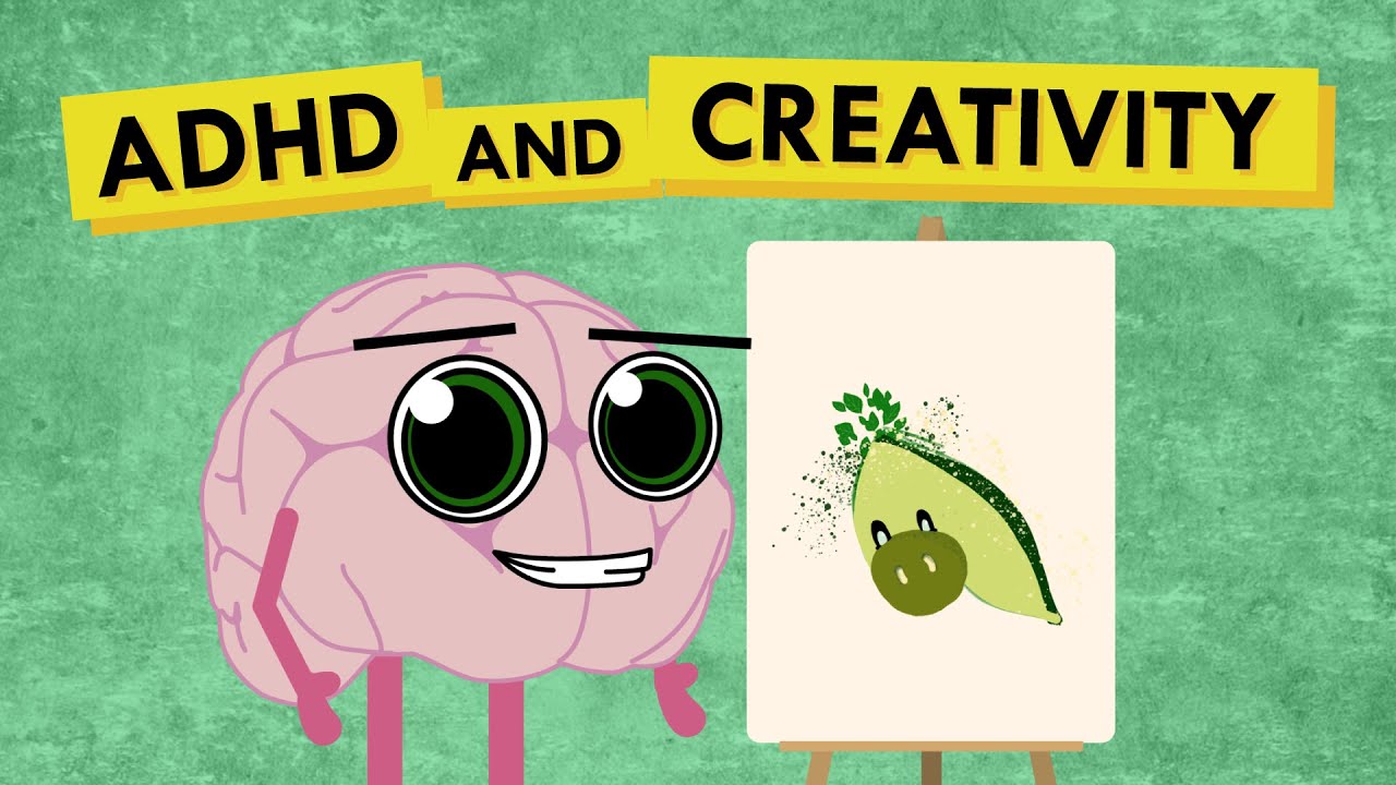
Does Having ADHD Make You More Creative?

The Mathematics of Creativity | Why Genius Follows a Formula
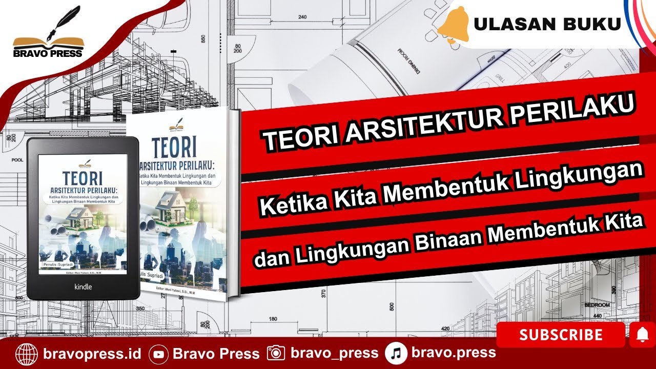
TEORI ARSITEKTUR PERILAKU Ketika Kita Membentuk Lingkungan dan Lingkungan Binaan Membentuk Kita

Backend Developer Roadmap 2024 | خارطة تعلم تطوير تطبيقات الباك اند
5.0 / 5 (0 votes)
