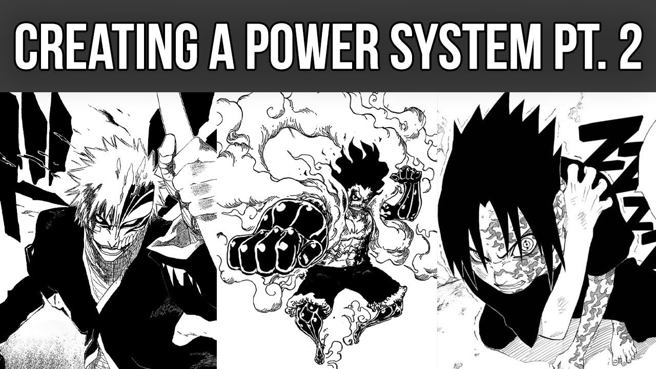
Readability: How To Create GOOD PAGE FLOW In Your Manga Panels And Pages
Summary
TLDRThis video from 'Monitor Comics' dives into the concept of 'page flow' in comics and manga, explaining how the reader's eye moves across the page for a smooth narrative transition. It discusses the 'Z' shape eye line, the Gutenberg diagram, and the importance of using horizontal panels to avoid blockage. The video also touches on the history of page layouts, from the grid format of the golden age to modern techniques in manga that emphasize action and focal points. Tips on using line of sight and speech bubbles to guide readers are provided, emphasizing the goal of creating an unnoticed, natural reading experience.
Takeaways
- 🎨 The channel 'Monitor Comics' focuses on creating comics and manga, covering various topics including comic effects, art programs, and creating shonen manga.
- 🔗 The video suggests checking out other useful videos in the top right-hand YouTube card section and mentions commissions for custom drawings.
- 📚 The video revisits the topic of page layout, specifically discussing 'page flow'—the natural progression of a reader's eye across a comic or manga page.
- 👀 'Eye line' is defined as the order in which our eyes comprehend textual information, typically left to right and top to bottom in English.
- ✅ For effective page flow, the script recommends aiming for a Z-shaped eye line to minimize confusion and ensure smooth transitions between panels.
- 📚 The 'Gutenberg diagram' is introduced as a psychological concept that guides reading from left to right, top to bottom, and is used in design beyond just comics.
- 📉 The script explains the strength values of different sections within the Z pattern, identifying the top left as the strongest and the bottom right as the terminal area.
- 🚫 The concept of 'panel blockage' is discussed, cautioning against placing similarly sized panels next to each other which can confuse readers.
- 🈲 The video advises against using too many square or vertical panels due to potential confusion, recommending long horizontal panels for better legibility.
- 📚 The 'T rule' in manga suggests a balance of vertical and horizontal panels to maintain readability, avoiding an overwhelming number of one type.
- 🎭 The video touches on the history of page flow, from the grid format of the golden and silver age of comics to modern多样化 panel usage.
- 🎥 It mentions the influence of cinematography on manga, with long horizontal panels allowing for high-speed action scenes or drawn-out serious moments.
Q & A
What is the main focus of the 'Monitor Comics' channel?
-The 'Monitor Comics' channel focuses on creating comics and manga, covering topics such as choosing comic effects, selecting art programs, and creating shonen manga.
What is the concept of 'page flow' in comic and manga creation?
-Page flow refers to the way a reader's eye moves across a comic or manga page, ensuring a smooth transition from one panel to the next with minimal confusion.
What is the 'eye line' in the context of page layout?
-The 'eye line' is the order in which our eyes comprehend textual information, typically left to right and top to bottom in English, and is crucial for effective page flow.
How does the 'Gutenberg diagram' relate to page flow in comics and manga?
-The Gutenberg diagram is a psychological concept that describes the left-to-right, top-to-bottom reading pattern, which designers use to effectively design web pages and is applied in comic and manga layouts to guide the reader's eye.
What is the significance of the 'Z pattern' in creating effective page flow?
-The 'Z pattern' is a visual guide that helps in arranging the panels and elements on a page to ensure the reader's eye follows a smooth and logical path, enhancing comprehension and engagement.
How can panel placement affect page flow and what is 'blockage'?
-Panel placement can influence page flow by creating 'blockage', which occurs when similarly sized panels placed next to each other confuse the reader's natural reading path, making it unclear how to proceed.
Why are horizontal panels considered advantageous for legibility in comic and manga pages?
-Horizontal panels are advantageous for legibility because they bisect the page, providing a clear break point and eliminating confusion on how to read the panel, making the reading path more intuitive.
What is the 'T rule' in manga panel layout and why is it important?
-The 'T rule' suggests that for every two or so vertical panels, a horizontal panel should be included to preserve legibility. It helps maintain a clear and easy-to-follow reading path in manga.
How have comic book page layouts evolved from the golden and silver age to modern times?
-Page layouts have evolved from the traditional nine-panel grid format to more diverse and dynamic panel arrangements, including diagonal panels and skewed grids, to better convey action and emotion.
What is a 'focal point' in comic and manga page design and why is it important?
-A 'focal point' is the main area of action or interest on a page. It is important because it guides the reader's attention and helps maintain the flow of the narrative without causing confusion or distraction.
How can 'intentional line of sight' be used to improve page flow in comics and manga?
-The 'intentional line of sight' uses elements like character body movements, background composition, and speech bubble placement as guides to lead the reader through the page, creating a comfortable and engaging reading experience.
Outlines

此内容仅限付费用户访问。 请升级后访问。
立即升级Mindmap

此内容仅限付费用户访问。 请升级后访问。
立即升级Keywords

此内容仅限付费用户访问。 请升级后访问。
立即升级Highlights

此内容仅限付费用户访问。 请升级后访问。
立即升级Transcripts

此内容仅限付费用户访问。 请升级后访问。
立即升级5.0 / 5 (0 votes)


