TOP 10 TIPS FOR ENVIRONMENT ART (FEATURING YOUR ART!)

Tyler Edlin
22 Apr 202316:19

Summary

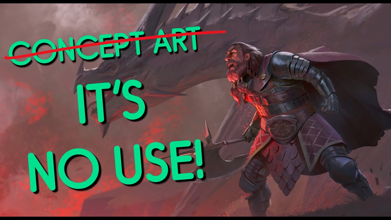
TLDRIn this episode, Tyler Edlund shares valuable environment design tips for visual and concept artists. He critiques artwork from the community with a Pokémon theme, highlighting key design principles like visual hierarchy, rule of odds, depth of field, and balance. Tyler emphasizes the importance of structure, lighting, and scale, offering detailed feedback on submissions. He announces a new community challenge inspired by 'The Legend of Zelda: Breath of the Wild,' encouraging artists to submit their themed artwork by May 20th. Join the Discord for more details and to participate in future challenges.

Takeaways

  • 🎨 The video is a tutorial on environment design tips for visual development artists, concept artists, and anyone looking to improve their design and painting skills in creating scenes.
  • 🌟 The episode features Pokemon-themed art from the community and announces the next themed challenge, which is related to the game 'Breath of the Wild'.
  • 👤 The speaker, Tyler Edlund, is a professional in art and design, with a passion for Nintendo and video games, and he shares his expertise in teaching and critiquing art.
  • 🎮 Tyler critiques the visual design of the recent Pokemon games 'Scarlet and Violet', noting the lack of texture and imaginativeness in their environments.
  • 📸 He compares the Pokemon games to other RPGs like 'Nino Cooney' and 'Dragon Quest 11', which have more detailed and creative visuals and design.
  • 🏆 The community challenge involves reimagining scenes from 'Pokemon Scarlet and Violet', encouraging artists to improve upon the original game's visuals.
  • 📐 Tyler emphasizes the importance of design principles such as the rule of odds, visual hierarchy, and depth of field in creating compelling environment designs.
  • 🌞 He discusses the need for balance in exposure, suggesting that too much saturation and brightness can be overwhelming and advises on creating a sense of depth with lighting.
  • 🌳 Tyler points out issues with scaling in environment design, using examples to show how incorrect scale can disrupt the viewer's perception of a scene.
  • 🔄 The video stresses the significance of unity and balance in design, suggesting that too much symmetry can be as problematic as too much asymmetry.
  • 🛠️ Lastly, Tyler advises artists to focus on structure when designing environments, highlighting the importance of planning and sketching before adding details.

Q & A

  • What is the main theme of the video?

    -The main theme of the video is providing environment design tips for visual development artists, concept artists, and anyone looking to improve their sense of design and painting for scenes, with a special focus on a Pokemon theme.

  • Who is the host of the video?

    -The host of the video is Tyler Edlund, a professional artist and designer who also does a lot of teaching.

  • What specific Pokemon games are mentioned as having lacking visuals?

    -The specific Pokemon games mentioned are Pokemon Scarlet and Violet.

  • What two other RPG games are mentioned as having excellent visual design?

    -The two other RPG games mentioned are Ni no Kuni and Dragon Quest 11.

  • What is the first principle of environment design highlighted in the video?

    -The first principle of environment design highlighted in the video is the 'rule of odds,' which involves using an odd number of repeating elements for a visually pleasing composition.

  • What does Tyler emphasize about visual hierarchy in environment design?

    -Tyler emphasizes that visual hierarchy is crucial in environment design, as it determines which elements are prioritized and emphasized in a scene, guiding the viewer's focus.

  • What tip is given regarding depth of field in environment design?

    -The tip given regarding depth of field is to use out-of-focus elements in the foreground to help create a sense of depth, and to further emphasize depth by managing the edges and shapes around the main viewer.

  • What is one issue Tyler identifies in Corgi's submitted artwork?

    -One issue identified in Corgi's submitted artwork is the excessive overlap of elements, which creates visual congestion and detracts from the overall clarity of the scene.

  • How does Tyler suggest balancing light and shadow in a scene?

    -Tyler suggests balancing light and shadow by desaturating colors, lowering brightness, and strategically placing shadows to frame the main elements and create a more harmonious and visually balanced scene.

  • What are two key tips Tyler provides for improving environment scenes?

    -Two key tips Tyler provides are ensuring proper scaling of elements to maintain realism and using lighting effectively to separate components and create depth in the scene.

  • What does Tyler recommend for achieving a sense of unity and balance in a design?

    -Tyler recommends creating asymmetry within a symmetrical framework, breaking up repetitive shapes, and strategically placing elements to guide the viewer's eye and create a cohesive, balanced design.

  • What structural advice does Tyler give for starting and finishing an environment scene?

    -Tyler advises blocking out the perspective, drawing a grid, and planning the structure with perspective to ensure consistency and avoid structural issues that can undermine the effectiveness of the scene.

  • What is the theme of the next community challenge mentioned in the video?

    -The theme of the next community challenge is 'Breath of the Wild,' inspired by the new game 'Tears of the Kingdom.'

  • What is the due date for the next community challenge submissions?

    -The due date for the next community challenge submissions is May 20th.

Outlines

00:00

🎨 Introduction and Theme Announcement

Tyler Edlund introduces the video, focusing on environment design tips useful for visual development artists, concept artists, or anyone interested in improving their design and painting skills for scenes. The episode features viewer art with a Pokémon theme and a challenge announcement at the end. Tyler briefly discusses his love for Nintendo, video games, art, and design, despite his limited history with the Pokémon franchise. He critiques the visuals of Pokémon Scarlet and Violet for their lack of texture and imagination, prompting the Discord community to reimagine and improve these environments.

05:00

🖼️ Example of Good Design: Arnie's Artwork

Tyler showcases Arnie's colorful artwork as an example of good environment design. He praises the use of the rule of odds, visual hierarchy, and depth of field. The main character is emphasized through framing and value structure, creating a visually pleasing layout. Tyler suggests further enhancing the depth of field and highlights the importance of triangulation in design.

10:01

🌳 Overlapping Elements in Corgi's Artwork

Corgi's artwork is used to illustrate the principle of maximizing overlaps in environment design. Tyler notes that while the visual path through the picture is effective, the overlapping elements create a congested appearance. He suggests spacing out elements strategically to improve clarity and depth. Tyler emphasizes the importance of balancing light and shadow and demonstrates how to adjust exposure and saturation for better visual impact.

15:01

🏙️ Scaling and Lighting in Justin's Artwork

Justin's cityscape artwork highlights issues with scale and lighting. Tyler explains how inaccuracies in scale, such as oversized trees, can disrupt the scene's realism. He advises using atmosphere to separate elements and create depth. Tyler also suggests adding details like docks, boats, and roadways to enhance the environment's continuity and sophistication. He recommends observing lighting references to avoid a flat appearance and achieve better light and shadow balance.

🌟 Unity and Balance in Kau's and Tabor's Artworks

Kau's and Tabor's visually striking artworks demonstrate the importance of unity and balance in design. Tyler appreciates the symmetry but suggests breaking up symmetrical elements to create more interest. He advises toning down certain aspects to emphasize key features, using lighting to frame important elements, and adding wildlife or other details to enhance the scene. The balance of elements is crucial for a cohesive and engaging environment.

📐 Importance of Structure in Ashton's and Super Arts' Artworks

Tyler discusses the importance of structure in environment design, using Ashton's and Super Arts' artworks as examples. He stresses the need for solid perspective and consistent structure to avoid inconsistencies that can undermine the artwork. Tyler recommends blocking out perspective, creating grids, and doing thumbnail sketches to ensure a strong foundation. Proper planning and drafting are essential for creating compelling scenes.

🎮 Next Challenge Announcement: Breath of the Wild Theme

Tyler announces the next community challenge, themed around The Legend of Zelda: Breath of the Wild. With the upcoming release of Tears of the Kingdom, he encourages viewers to create art inspired by the new game. The challenge deadline is May 20th, and submissions can be posted in the Discord link provided. Tyler expresses his excitement and invites the community to celebrate the franchise together through their art.

Mindmap

Keywords

💡Environment Design

Environment Design refers to the process of creating the visual aspects of a setting, which can include landscapes, buildings, and other elements that make up a scene. In the video, it is the central theme, as the host discusses various tips and principles for improving one's skills in this area, particularly in the context of painting scenes for visual development artists and concept artists.

💡Visual Hierarchy

Visual Hierarchy is a design principle that establishes a clear order of importance among the elements in a composition, guiding the viewer's eye to the most important parts first. The video emphasizes its importance in environment design, using it as a criterion to evaluate and improve the submitted artworks, such as in Arnie's piece where the main character is clearly emphasized.

💡Rule of Odds

The Rule of Odds is a design principle suggesting that odd numbers of repeating elements are more visually pleasing than even numbers. The video mentions this rule as a good practice in environment design, exemplified by Arnie's artwork where an odd number of characters is used to create a balanced and interesting scene.

💡Depth of Field

Depth of Field is a photographic term that describes the range of distance within a scene that appears acceptably sharp. In the context of the video, it is used to discuss how out-of-focus elements in the foreground can enhance the sense of depth in a painting, as recommended by the host for Arnie's artwork.

💡Maximizing Overlaps

Maximizing Overlaps is a composition technique where elements in a scene overlap each other to create a sense of depth and complexity. The video uses this concept to critique Corey's artwork, suggesting that while overlaps are good, too many can lead to visual congestion and a lack of clear visual path.

💡Balancing Light and Shadow

Balancing Light and Shadow is crucial in creating a realistic and visually appealing scene. The video discusses the importance of not overwhelming a scene with too much light or too many saturated colors, as seen in Temu's artwork, and instead recommends finding a balance to create depth and focus.

💡Unity and Balance

Unity and Balance refer to the harmonious arrangement of elements in a design, ensuring that no single element dominates to the detriment of the overall composition. The video praises Kau's artwork for its balance but suggests adding more asymmetry for a less predictable and more dynamic scene.

💡Structural Help

Structural Help implies providing assistance or guidance in establishing a solid foundation or structure for a design. The host uses this term to advise artists on the importance of planning and sketching the structure of their environment designs before adding details, as seen in the critique of Ashton's and Super Art's pieces.

💡Pokemon Theme

The Pokemon Theme refers to the specific aesthetic and design elements associated with the Pokemon franchise. In the video, the host uses this theme as a basis for a challenge, encouraging artists to reimagine scenes from the Pokemon Scarlet and Violet games, highlighting the need for improvement in the game's visuals.

💡Breath of the Wild Theme

Breath of the Wild Theme is the theme for the next community challenge announced in the video, which is based on the popular Nintendo game 'The Legend of Zelda: Breath of the Wild'. The host invites artists to create artwork inspired by the game, showing the video's connection to Nintendo's style and the broader context of video game art.

Highlights

Introduction to environment design tips for visual development and concept artists.

Special episode featuring Pokemon-themed art and a community challenge announcement.

Discussion on the visual shortcomings of recent Pokemon games, 'Scarlet and Violet'.

Comparison of Pokemon visuals with other RPG games like 'Nino Cooney' and 'Dragon Quest 11'.

Emphasis on the importance of visual hierarchy in environment design.

Use of the rule of odds and creating a dynamic scene with visual triangles.

Advice on maximizing overlaps in environment design to create depth.

The significance of exposure and balancing light and shadow in scene design.

Critique on the lack of visual hierarchy causing visual confusion in design.

Importance of scaling elements correctly to maintain scene credibility.

Suggestion to use lighting to enhance depth and separate elements in a scene.

Recommendation for creating continuity and depth in environment scenes.

Highlighting the importance of unity and balance in design composition.

Tips on using structure as a fundamental starting point for environment design.

Announcement of the next community challenge with a 'Breath of the Wild' theme.

Encouragement for artists to participate in the challenge and celebrate the franchise.

Transcripts

play00:00

hello folks and welcome today we're

play00:01

going over some environment design tips

play00:03

these will be great for visual

play00:05

development artists for concept artists

play00:07

or for anyone looking to improve their

play00:09

sense of design and painting when it

play00:12

comes to painting scenes this particular

play00:14

episode is going to be special because

play00:16

I'm going to be featuring your art and

play00:17

we're going to have a Pokemon theme also

play00:20

stay to the end and I'll announce the

play00:22

next themed challenge we'll have and

play00:25

these are of course all over at the

play00:27

Discord link below

play00:28

[Music]

play00:41

alright so I'm Tyler Edlund I love

play00:43

Nintendo I love video games I love Art

play00:46

and Design I do it professionally I also

play00:48

do a lot of teaching

play00:50

I don't have some big history with the

play00:53

Pokemon franchise itself I dive into

play00:55

some of the games with my kids but I do

play00:57

enjoy them nonetheless but I did notice

play00:59

with the recent releases scarlet and

play01:01

violet that the visuals were kind of

play01:03

lacking both in in regards to their

play01:06

technical presence and even some of

play01:09

their the imaginativeness with them as

play01:11

well as you can see here are two

play01:13

screenshots from the game it's all right

play01:17

right it doesn't get your creative

play01:18

juices going uh the first one it looks a

play01:22

little better than the second one here

play01:23

but but again it lacks texture they

play01:26

overall feel pretty bland there is again

play01:29

a technical aspect with these with and

play01:31

I'm not going to get into that for this

play01:33

particular video and that's why I task

play01:35

the Discord members with the challenge

play01:37

this month it's like what ideas could

play01:39

you have to reimagine or to improve some

play01:43

of the scenes and environments from

play01:45

Pokemon scarlet and violet so we're

play01:47

gonna really look at that

play01:48

um and as you know like yeah it's it's

play01:50

not always just about style because I do

play01:53

think if Pokemon is a stylized game it

play01:56

is for children but I think there's a

play01:58

way to do that well there's a way to do

play02:00

that better here are just two

play02:01

screenshots from two other awesome RPG

play02:05

games that are very similar

play02:07

stylistically to the Pokemon franchise

play02:09

both Nino Cooney and Dragon Quest 11.

play02:12

they were awesome they were amazing a

play02:15

lot of creativity went into them in

play02:18

every little texture every little ounce

play02:19

of design especially ninokuni that game

play02:22

is top brass when it comes to design and

play02:25

Aesthetics uh but who's really surprised

play02:28

by that it was co-created with Studio

play02:31

Ghibli as well as the popular Japanese

play02:33

developer level five and of course

play02:35

Dragon Quest 11 is a very old very long

play02:38

franchise you know from Square Enix and

play02:41

it again it does the stylized Aesthetics

play02:44

very well so with that said let's get

play02:46

into the art some of these will be

play02:47

examples of what to do and some of these

play02:49

will be example of what to avoid

play02:53

first up we have this awesome amazing

play02:55

colorful piece from my good pal Arnie

play02:58

bill in here and this is a great example

play03:01

of what to do the first awesome thing is

play03:03

using the rule of odds right like there

play03:07

is a lot of repeating elements

play03:11

we have like various types of characters

play03:13

again a nice simple odd amount of them

play03:15

often work very well it's a very nice

play03:18

safe choice to do the other awesome

play03:20

aspect that I like and again an awesome

play03:23

principle environment design would be

play03:25

visual hierarchy this is high up on my

play03:28

list of very important things so if we

play03:30

look at the three elements

play03:33

right like which one's being prioritized

play03:35

it's very clear in what is being

play03:37

emphasized here and and that's the key

play03:39

is emphasis that would be this main

play03:41

character down here it's not only Being

play03:43

Framed within this Frame like we could

play03:46

literally see in our eye the human eye

play03:48

always goes to an object in a window

play03:51

that's being framed like that visually

play03:52

speaking and of course the value

play03:55

structure most important the values are

play03:56

very high so yeah having rule of odds

play03:59

and visual hierarchy is very important

play04:01

for environment designers

play04:04

the other awesome aspect that I like

play04:06

about this is the depth of field not

play04:08

only do we get the cactuses out of focus

play04:10

in the foreground and it helps again

play04:12

really sell that sense of depth so much

play04:15

that I'd actually probably encourage him

play04:17

to go a little bit further with these

play04:18

shapes with some of these shapes or

play04:20

edges around that main viewer like again

play04:23

the mountain far in the background I

play04:24

think that's going to really help

play04:26

further emphasize that depth of field

play04:29

another little bonus tip that I like

play04:31

that Arnie did is not only does he have

play04:33

rule of odds visual hierarchy and depth

play04:35

of field but they're actually making a

play04:37

nice little kind of Trifecta of a design

play04:41

like when you can triangulate almost

play04:43

anything in a particular scene surely

play04:45

it's a way of creating interest because

play04:47

triangles are Dynamic right as a shape

play04:50

so when you kind of break things down

play04:52

visually into shapes and there's a lot

play04:55

of visual triangles in this particular

play04:57

scene it makes for a very

play05:00

pleasing layout personally I would have

play05:03

just closed the arch but again I think

play05:05

it's a wonderful piece thank you Arnie

play05:07

alright so similarly here up next for my

play05:10

next big tip uh would be from Corgi uh

play05:13

thank you Corey for submitting your work

play05:14

I think this is awesome first and

play05:16

foremost and it does show a lot of

play05:19

awesome qualities that we looked at with

play05:20

Arnie's but I do think this is a great

play05:23

opportunity to to show another major

play05:25

principle and element when it comes to

play05:27

creating environment design and that is

play05:29

to maximize overlaps now this is

play05:33

overlapping them almost maybe maxed out

play05:35

too much so we have to have a little bit

play05:37

of a reservation when it comes to that

play05:39

so for example we have like a nice

play05:41

visual path through this picture again

play05:43

I'm always a huge fan of that it's a tip

play05:45

in itself but it's getting a little

play05:48

congested with how these things are

play05:51

overlapped in place see like this is

play05:53

overlap this is overlap this that piece

play05:54

is overlapping that it's overlapping

play05:56

this right it basically this whole area

play05:59

here is a big cluster of information and

play06:03

not to say that is wrong because it's

play06:04

not wrong but I personally would

play06:06

recommend probably to space things out a

play06:09

little and pardon me for my quick little

play06:11

mock-up here uh it's a little rough but

play06:14

just to kind of get the point across you

play06:15

know we move some of the trees out right

play06:17

over to here we blew these up

play06:20

have them break that boundary out of the

play06:23

frame and then of course we can really

play06:25

emphasize this nice little Archway here

play06:28

personally I never had the time to move

play06:30

the character I wouldn't align the

play06:33

character because that would make a

play06:34

tangent which is kind of a tip in itself

play06:36

and when you have things aligned in

play06:39

certain odd ways in the scene that makes

play06:41

a form of tangent I'd probably just

play06:43

offset the character have it be right

play06:45

there you know but overall I think just

play06:48

getting again a little bit of a sense of

play06:50

atmosphere in there and to space out

play06:52

strategically how and where things are

play06:55

overlapped will certainly help your

play06:56

scenes

play07:00

with these two pieces I want to

play07:01

demonstrate the importance of exposure

play07:04

and balancing light and Shadow again

play07:06

these are both really awesome creative

play07:07

scenes they're fill of color full of

play07:09

life and energy I love that but I would

play07:13

say maybe they go a little too far with

play07:15

that so like let's look at temu's piece

play07:18

here first right it is

play07:21

loud visually it's very loud very high

play07:24

intense yellows Blues it's all maxed out

play07:27

in terms of saturation and intensity the

play07:30

chroma is so I would say like a little

play07:33

bit of balance with that desaturating

play07:36

that lower the brightness a little bit

play07:38

then strategically play some shadows and

play07:41

seeing help frame their image so for

play07:43

example this is on the foreground if we

play07:45

were to make this whole area here kind

play07:47

of in Shadow that would help frame and

play07:49

create a sense of depth and

play07:52

this is kind of what I meant by that so

play07:54

again I simplified some of the shapes in

play07:56

the background that just kind of helps

play07:58

communicate some of that visual noise

play08:01

adding this whole area in Shadow to

play08:04

start to emphasize

play08:06

the main characters here and as well as

play08:08

the Psyduck it's it's all about balance

play08:11

so again it's a little less saturated

play08:12

it's a little less intense overall and

play08:16

similarly with with this piece it's the

play08:18

same thing it's it's getting hit by this

play08:19

very intense white basically everywhere

play08:22

and it's blowing out all the highlights

play08:25

in the scene

play08:27

but again unlike Arnie's the other thing

play08:29

that this suffers from is a lack of

play08:31

visual hierarchy right that's kind of

play08:33

the issue here is is we got like a path

play08:36

right or if we follow that that that

play08:38

water or the river I and I think that's

play08:40

good right visual paths are good but

play08:43

what exactly is being emphasized around

play08:45

that visual path here is it these sets

play08:48

of rocks is it this area right here is

play08:51

it the Sun and mountains in the

play08:52

background again it really could be any

play08:55

of these or maybe none of those all the

play08:57

same and why I pick those specific

play08:59

things because light and attention is

play09:01

being deliberately brought to all of

play09:04

those components so again you would want

play09:06

to ask yourself when designing a

play09:08

particular scene what do I want to

play09:10

emphasize and how can I balance that

play09:12

picture to express that so when there's

play09:15

a lack of visual hierarchy in a scene it

play09:18

creates visual confusion I don't know

play09:20

what I'm supposed to focus on here and I

play09:22

didn't necessarily fix that I did want

play09:24

to primarily use this to again it's

play09:26

about balancing EXP closure and I think

play09:28

just bringing a lot of that down right

play09:30

kind of taking a lot of the white out of

play09:32

it Reserve whites for really high

play09:34

speculars on metals and things but like

play09:36

just bring those colors down a little

play09:38

bit then choose what you want to

play09:39

emphasize and position the elements

play09:41

around your scene to help Express that

play09:46

all right these two awesome pieces this

play09:48

one from zuriarat sorry I've probably

play09:50

been uh butchered your name and this one

play09:52

right here from Justin art from the city

play09:54

location in Charlotte one of my favorite

play09:56

locations Again underdone by the game I

play09:59

think we can get an awesome lesson out

play10:00

of these and that would be scaling and

play10:02

lighting see I love

play10:05

um what Justin's doing here but there

play10:07

are issues with with scale and I feel

play10:09

lighting could really help push that

play10:11

forward one big tell of this with scale

play10:14

and when scale is often a scene it can

play10:17

entirely take the viewer out of it and

play10:19

discredit the entire scene if we look at

play10:22

the tree in the background here right

play10:23

it's like that big so if that tree was

play10:25

in the city it's going to be that big

play10:27

absolutely dwarfing the buildings so

play10:30

what you would typically see in a in a

play10:32

city of course would be trees much lower

play10:34

to the ground spread out like that and

play10:37

it just goes to show you that these are

play10:38

very giant trees that do feel at a scale

play10:41

now in regards to lighting I feel

play10:43

separating elements and components like

play10:46

this Tree in this foreground with the

play10:48

use of extra atmosphere back here it's

play10:50

going to help create a better sense of

play10:52

visual depth as well as using the

play10:55

elements in this city to really like

play10:58

buildings and and the lights in there to

play11:00

really push that that lightness but I do

play11:02

think like bringing that component and I

play11:04

didn't even go all the way with it you

play11:05

know adding the lights and stuff will

play11:07

add a nice sense of life to that city as

play11:10

well from a design standpoint I would

play11:13

recommend both of these artists to

play11:15

create a sense of

play11:18

continuity and depth with these

play11:20

environments meaning like what would you

play11:22

see on a port city like this you'd

play11:24

probably see docks at the bottoms lots

play11:26

of little boats zipping about I do think

play11:29

that could help these quite a bit maybe

play11:31

there could be added suburbs with

play11:33

smaller buildings and neighborhoods

play11:35

around the buildings Justin's could

play11:38

certainly benefit from something another

play11:39

thing that Justin did really well here

play11:41

was adding roads going to and from that

play11:43

City and I think if this had you know

play11:46

roads coming in and out of it it'd feel

play11:48

a lot more natural and sophisticated as

play11:50

well because we need roadways to get to

play11:52

our cities all right

play11:54

awesome stuff Justin I would probably

play11:55

move the focal point a little further in

play11:57

and then just do a lot more observation

play12:00

in terms of lighting it does have a very

play12:01

flat sort of look to it maybe that's

play12:03

what you were going for but remember

play12:05

even at night there's going to be

play12:06

Moonlight there's going to be a direct

play12:08

light a key light and a scene that's

play12:10

going to create a sense of light and

play12:12

Shadow this just has no light and Shadow

play12:13

and that's what I'd recommend to study

play12:15

and to get reference of of course when

play12:16

it comes to painting a scene

play12:19

all right our next two pieces here from

play12:21

Kau again sorry if I mispronounced that

play12:24

and

play12:26

and Tabor here

play12:28

awesome these are these are very

play12:30

visually striking I think they add a lot

play12:32

of character and depth that the game

play12:35

could have really used if I mean if this

play12:37

game was filled with art and

play12:40

environments that had this level of love

play12:42

and passion I feel the game would have

play12:44

been a lot better if it could have

play12:45

pulled that off these are absolutely

play12:48

fantastic and I think for my next set of

play12:50

tips here I'd really like to show the

play12:52

importance of unity and balance in a

play12:56

design like look at how we're saying

play12:58

this this scene is so well balanced

play13:00

maybe even to a fault in some situations

play13:03

so what I mean by that is like if you

play13:06

draw a line down the middle a lot of the

play13:08

big elements are really just framed out

play13:11

symmetrically there are some

play13:13

asymmetrical elements like the tree and

play13:15

the character and I think it's wonderful

play13:16

for that but I think going like a little

play13:18

bit further with that would have really

play13:20

helped this so like maybe again breaking

play13:22

up one of the cloud shapes so it's not

play13:24

the same on both perhaps pushing the

play13:26

silhouette of this main structure frame

play13:29

framing it behind a big cloud

play13:31

like that that will help emphasize that

play13:33

and then maybe pulling back a little

play13:35

more of these clouds on this side

play13:38

to help break it or separate it from

play13:41

that right side a little bit more but

play13:43

other than that I mean this is absolute

play13:44

stunning I love it I think having a few

play13:47

more birds or a few wild Pokemon in the

play13:49

background surely would have added to

play13:51

that as well but again it's awesome

play13:54

nonetheless and I love this I love the

play13:56

lighting here and don't and be patient

play14:00

here with my quick little mock-up on

play14:01

this because it is roughing in the areas

play14:03

it doesn't look as nice but what I would

play14:05

have done with this is maybe tone back a

play14:08

little bit of these waterfalls so that

play14:10

the ones that you do keep you can create

play14:11

a better sense of emphasis with again

play14:13

that will help a sense of unity with

play14:16

that so wait for example I took away

play14:18

some waterfalls here and I think adding

play14:20

some waterfalls or or taking some away

play14:22

to add some here to create a little bit

play14:24

of a a slight emphasis here so that our

play14:27

eye could travel here and here and to

play14:29

push the lighting along that path will

play14:31

also really help that also if you're

play14:33

keeping the Charizard character entirely

play14:35

in Shadow framing that character with

play14:38

some Direct light on a canyon right

play14:40

behind it is again a great way to

play14:42

emphasize that which will ultimately

play14:44

really balance the piece out so yeah

play14:46

it's it's a give and take process right

play14:49

and we have to be our our best editor at

play14:51

the end of the day when it comes to

play14:52

things if we just keep throwing all of

play14:54

our great ideas into any kind of

play14:56

environment scenes then we could

play14:58

overwhelm the viewer potentially all

play15:01

right and for my last tips today for

play15:04

these environments we have Ashton's and

play15:06

super Arts these are great they have a

play15:09

lot of potential but surely they need

play15:11

structural help so for anyone that

play15:14

struggles on how to start or even end an

play15:17

environment always go back to your

play15:18

structure the structure is fundamentally

play15:20

the most important part to any scene

play15:22

design

play15:24

block out your perspective draw your

play15:26

perspective again and again make a grid

play15:29

I got videos on that if you need it

play15:31

because again there's inconsistencies

play15:33

and lack of structure that really would

play15:35

fumble you know some pictures like this

play15:38

no matter how many hours you put into it

play15:39

so take the time and just plan do

play15:42

thumbnail sketching and of course draft

play15:45

your structure with perspective all

play15:47

right

play15:49

and guys for my next Community challenge

play15:53

it's going to be breath of the Wild

play15:55

theme we're already on the Nintendo

play15:56

train

play15:57

the new tears of the Kingdom's coming up

play15:59

I'm stoked as heck I've already started

play16:01

working on my fan art piece here so

play16:04

let's all come together here and really

play16:05

celebrate this franchise and do some art

play16:08

that's simply inspired by the new game

play16:10

alright this will be due May 20th and

play16:14

you can post them in the Discord link

play16:16

below thank you guys and I'll catch you

play16:18

next time

Rate This

5.0 / 5 (0 votes)

相关标签
Environment DesignArt TipsConcept ArtPokemonCommunity ArtChallengeVisual DevelopmentGame DesignCreative TechniquesArt Critique
您是否需要英文摘要?