Penyajian Data Kelas 7 - Menyajikan Data Dalam Tabel dan Diagram | Jenis Diagram | Statistika
Summary
TLDRIn this educational video, Kak Titi introduces young learners to the concept of data and its presentation. The video explains the types of data (quantitative and qualitative) and methods of data collection such as interviews, surveys, and observations. It focuses on various ways to present data, including tables, pictograms, bar charts, line graphs, and pie charts, using practical examples. The video is designed to help students understand and apply these concepts with clear, step-by-step explanations for each type of data presentation.
Takeaways
- 😀 Data is defined as information or facts obtained from observations, which can be in the form of numbers, symbols, or the observed state of an object.
- 😀 Data can be categorized into two types: quantitative data (numeric or numerical) and qualitative data (non-numeric or categorical).
- 😀 Data collection methods include interviews (direct questioning of respondents), questionnaires (structured questions on the research topic), and observation (directly observing the object under study).
- 😀 After data collection, data should be presented in either tables or diagrams to facilitate understanding.
- 😀 A frequency distribution table is used to display data in a tabular format, such as presenting student grades in a mathematics test.
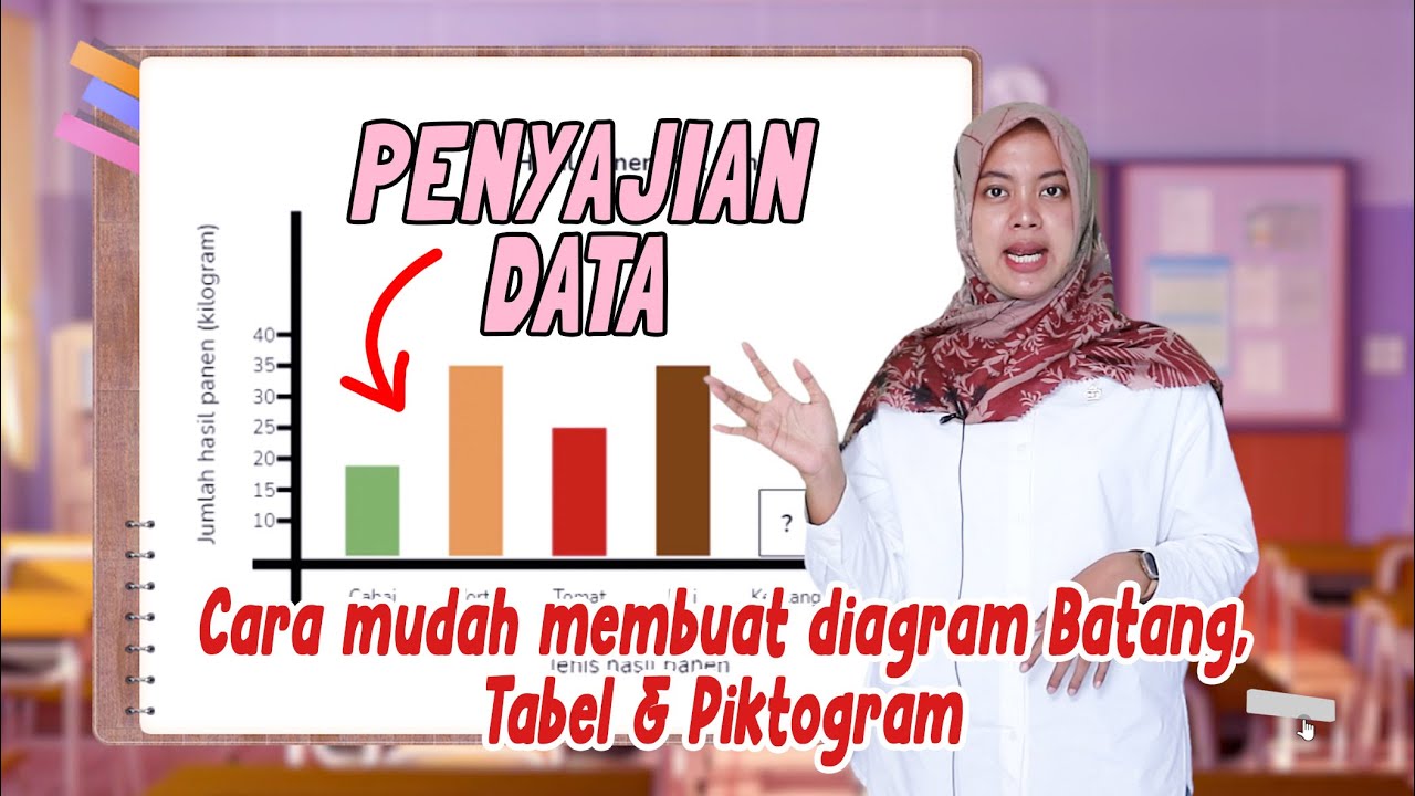
- 😀 Diagrams are graphical representations of data, and they come in different forms, including pictograms, bar diagrams, line diagrams, and pie charts.
- 😀 A pictogram uses images to represent data, such as using a blue book icon to represent 10 students visiting the library on a specific day.
- 😀 A bar diagram represents data with vertical or horizontal bars, where the length of the bar corresponds to the quantity being represented, like showing students' favorite foods.
- 😀 A line diagram connects data points with a line to show trends over time, such as representing the weights of students over a period.
- 😀 A pie chart divides a circle into segments that represent proportions of a whole, and the data can be shown as percentages or degrees, like representing the subjects students prefer based on survey results.
Q & A
What is data, and how is it collected?
-Data is information or facts obtained from observation. It can be collected through methods like interviews, surveys (using questionnaires), and direct observations of objects or phenomena.
What are the two types of data discussed in the video?
-The two types of data are quantitative data, which consists of numbers or figures, and qualitative data, which is not represented by numbers.
What is the first method of data collection mentioned in the video?
-The first method of data collection mentioned is through interviews, where data is gathered by directly asking respondents questions.
How does the video explain the process of presenting data in a table?
-The video explains that presenting data in a table involves organizing it into columns for different categories (like values and frequency), and then counting the occurrences of each value to fill the table.
What are the different types of diagrams used to present data?
-The video covers several types of diagrams: pictograms (picture diagrams), bar charts, line graphs, and pie charts.
What is a pictogram, and how is it used to represent data?
-A pictogram is a diagram that uses images or symbols to represent data. For example, in the video, a blue book represents 10 students, and a pink book represents 5 students, which helps visually convey the data.
What is the purpose of using a bar chart to present data?
-A bar chart presents data in the form of rectangular bars, either vertical or horizontal, with equal width. The height or length of the bar represents the frequency of each category, making it easier to compare different data points.
How are line graphs used to represent data?
-Line graphs are used to show data trends over time or in relation to a continuous variable. Data points are plotted and then connected with lines to illustrate changes or patterns.
What is the method for creating a pie chart from the data?
-To create a pie chart, data is first converted into percentages or degrees. Each section of the pie chart represents a different category, with the size of the slice proportional to the amount of data in that category.
How do you convert data into degrees to create a pie chart?
-To convert data into degrees for a pie chart, you divide the number of occurrences for each category by the total number of data points, and then multiply by 360° to get the corresponding angle for each slice.
Outlines

此内容仅限付费用户访问。 请升级后访问。
立即升级Mindmap

此内容仅限付费用户访问。 请升级后访问。
立即升级Keywords

此内容仅限付费用户访问。 请升级后访问。
立即升级Highlights

此内容仅限付费用户访问。 请升级后访问。
立即升级Transcripts

此内容仅限付费用户访问。 请升级后访问。
立即升级浏览更多相关视频

KONSEP DASAR PECAHAN || MENGENAL BILANGAN PECAHAN || MATEMATIKA SD-SMP
Cara Membuat dan Membaca PENYAJIAN DATA - DIAGRAM BATANG, TABEL dan PIKTOGRAM

Laporan Hasil Wawancara

Trik Mudah Cara Berhitung Cepat - JURUS 5

Mengenal Kata Ganti Kepemilikan (Possessive Pronoun & Adjective) untuk Pemula

"Paragraf Argumentasi" - Bahasa Indonesia
5.0 / 5 (0 votes)
