Statistika 05 | Distribusi Frekuensi dalam Statistika | Frequency Distribution | Belajar Statistika
Summary
TLDRThis video is the fifth part of a series on basic statistics, focusing on descriptive statistics and frequency distributions. It explains the concept of organizing data into classes, calculating frequencies, and visualizing the data through methods like histograms, frequency polygons, and cumulative frequencies. The video also demonstrates how to build frequency distribution tables, compute class limits, and utilize Python programming for data visualization. It covers essential topics, including class width, midpoint, relative frequency, and cumulative frequency, making statistical concepts accessible through practical examples and Python-based tools for visualizing data.
Takeaways
- 😀 Descriptive statistics focuses on summarizing and describing data to understand its characteristics.
- 📊 Frequency distribution organizes data into classes based on intervals and counts the occurrences within each class.
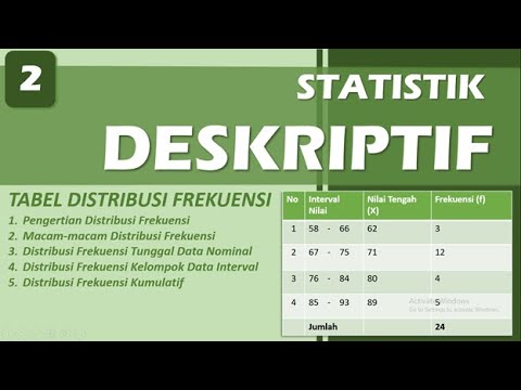
- 📝 A frequency distribution table typically includes columns for classes and frequencies, with each class having a lower and upper class limit.
- 🔢 Data can be grouped into classes without overlap between adjacent classes, ensuring clear boundaries.
- 💡 The width of each class, or class width, must be the same across all classes in a frequency distribution table.
- 💥 Frequency represents the number of data points within each class, which helps in understanding the distribution of the data.
- 🔢 The class limits for each group can be determined by using the smallest data value and adding the class width incrementally.
- 🧮 The midpoint of a class can be calculated by averaging the lower and upper class limits, which helps represent the center of the class.
- 📈 Relative frequency compares the frequency of each class to the total number of data points, giving a sense of proportion.
- 🔄 Cumulative frequency is the accumulation of frequencies from previous classes, helping identify data distribution trends.
- 📉 Data visualization techniques such as histograms, frequency polygons, and ogives (cumulative frequency graphs) are used to represent frequency distributions graphically.
Q & A
What is the main focus of descriptive statistics?
-The main focus of descriptive statistics is to summarize and describe the features of a data set, including measures of central tendency, variability, and distribution.
What is frequency distribution in statistics?
-Frequency distribution is a way to organize data by grouping it into classes or intervals and then counting how many data points fall within each class. It helps in understanding the distribution and patterns of data.
What are the key components of a frequency distribution table?
-A frequency distribution table typically includes at least two columns: one for the class intervals (or classes) and another for the frequency of data points within each class.
What is meant by 'class width' in frequency distribution?
-Class width refers to the range of values that each class or interval in a frequency distribution can cover. It is calculated by subtracting the lower limit of one class from the lower limit of the next class.
What is the role of the lower and upper class limits in a frequency distribution?
-The lower class limit is the smallest value in a class interval, while the upper class limit is the largest value in the class. These limits define the range of values included in each class.
What is the importance of ensuring that class intervals do not overlap?
-Ensuring that class intervals do not overlap is essential to avoid ambiguity in data classification. Each data point should only belong to one class, making the frequency distribution clear and accurate.
How do you calculate the mid-point of a class interval?
-The mid-point of a class interval is calculated by adding the lower and upper limits of the class and then dividing the sum by two.
What is relative frequency, and how is it calculated?
-Relative frequency represents the proportion of data points that fall into a specific class. It is calculated by dividing the frequency of a class by the total number of data points (sample size).
What does cumulative frequency represent in a frequency distribution?
-Cumulative frequency represents the running total of frequencies from the start up to the current class. It shows the number of data points that fall within or below a given class interval.
What is the difference between a histogram and a bar plot?
-A histogram is used to visualize continuous data grouped into class intervals, where the bars are adjacent to one another without gaps. A bar plot, on the other hand, is used for categorical or discrete data, with gaps between the bars.
Outlines

此内容仅限付费用户访问。 请升级后访问。
立即升级Mindmap

此内容仅限付费用户访问。 请升级后访问。
立即升级Keywords

此内容仅限付费用户访问。 请升级后访问。
立即升级Highlights

此内容仅限付费用户访问。 请升级后访问。
立即升级Transcripts

此内容仅限付费用户访问。 请升级后访问。
立即升级浏览更多相关视频
DISTRIBUSI FREKUENSI - STATISTIK DESKRIPTIF | BAB 2
Statistik Deskriptif

Statistika 06 | Visualisasi Data dalam Statistika | Data Visualization | Belajar Statistika
KONSEP DASAR STATISTIKA DAN DISTRIBUSI FREKUENSI

What is a Frequency Distribution in Statistics?
Statistics For Data Analytics | Complete Syllabus | Data Science | Statistics Tutorial | Part 1
5.0 / 5 (0 votes)
