Designing a Brand Identity In 8 HOURS. How did I do? π
Summary
TLDRIn this video, the designer takes on the challenge of creating a full brand identity, including a logo, guidelines, business cards, and mock-ups, for a company called 'folio' in under a day. The process involves mood boarding, mind mapping, sketching, refining in Illustrator, and using tools like Gen C and Assets 4D to streamline the workflow. The video demonstrates the intense effort and creative strategies employed to achieve a high-quality brand identity within a tight deadline.
Takeaways
- π The challenge is to design a full brand identity, including logo, guidelines, business cards, and mock-ups, in less than a day, a process that typically takes around a month.
- π The speaker emphasizes the importance of understanding the client's needs and the target audience, which in this case is a portfolio website called 'folio' aimed at creative professionals.
- π¨ The design process begins with mood boarding using Miller note to gather visual inspiration and establish a color scheme and brand atmosphere.
- π Mind mapping is highlighted as a crucial step often overlooked, which helps in connecting different ideas and creating unexpected connections for new design concepts.
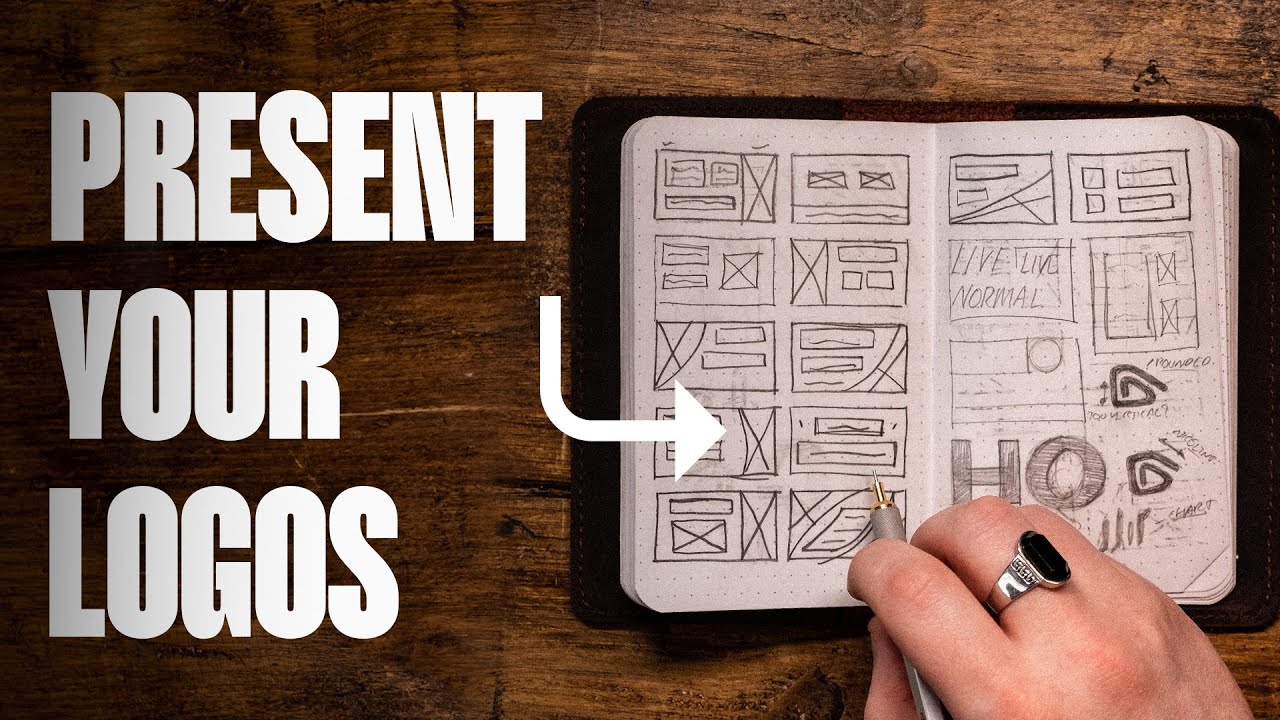
- βοΈ Sketching on an iPad using Procreate is preferred for speed, allowing for quick iteration of ideas and refinement of the 'folio' wordmark.
- π Attention to detail in typography is critical, with adjustments to letter spacing, line thickness, and optical balancing to ensure the logo is consistent and visually appealing.
- π The inclusion of a star in the logo design serves as a unique brand visual, blending vintage and modern elements, and potentially doubling as an icon when combined with the letter 'F'.
- π¨ A color scheme is developed with a focus on a distinctive purple hue, chosen for its historical significance and association with creativity and superiority.
- π The use of a brand guidelines template in Figma expedites the creation of brand guidelines, incorporating the finalized logo, colors, fonts, and usage do's and don'ts.
- π Business cards are designed using a template and personalized with the brand's elements, demonstrating how the logo and colors translate to physical materials.
- π The project is managed and tracked using Gen Z, a tool that streamlines client communication, project proposals, and payments, which sponsored the video.
Q & A
What is the main challenge the speaker is undertaking in the video?
-The speaker is attempting to design a complete brand identity, including a logo, brand guidelines, business cards, and mock-ups, all within a single day, a task that typically takes around a month.
What tool does the speaker mention for managing freelance design projects?
-The speaker mentions 'gen C' as a tool that helps freelance designers work with their clients, including customizable project proposals, a client briefing system, project communication, and payments all in one place.
What is the name of the company for which the brand identity is being designed?
-The company's name is 'folio', which is a portfolio website designed to be a professional platform that does not use generative AI to scan the website for data modeling.
What is the unique aspect of the 'folio' brand that the speaker emphasizes?
-The unique aspect of 'folio' is that it does not use generative AI to scan the website and does not allow generative AI to use the images uploaded by users for data modeling.
What is the purpose of mind mapping in the brand identity design process according to the speaker?
-Mind mapping is used to connect different imagery in word form to create new ideas. It allows the speaker to create unexpected connections and transform verbal connections into imagery.
What tool does the speaker use for creating mood boards?
-The speaker uses 'Milanote' for creating mood boards, which allows taking images from the web and organizing them into boards to establish a color scheme and vibe for the brand.
What is the significance of the color purple in the brand identity design?
-The color purple is chosen for the brand identity because it represents creativity and a superior type of Instagram. Historically, purple was difficult to create and was associated with royalty, adding a sense of exclusivity and prestige.
What is the importance of creating 'do's and don'ts' in brand guidelines?
-The 'do's and don'ts' in brand guidelines are crucial to ensure that the client does not misuse or misrepresent the brand's design. It serves as a 'Bible' for maintaining the integrity of the brand's visual identity.
How does the speaker plan to create the business card design?
-The speaker plans to use a template downloaded from Envato or the InDesign store, and then bring it into Canva to make it editable for the client, ensuring it aligns with the brand identity.
What is the speaker's final step in the brand identity design process?
-The final step is to go back to 'gen C' to show the client the completed work, create a cover image, upload it, wait for approval, and once approved, upload the final files to complete the project.
What does the speaker conclude about the quality of work produced under time constraints?
-The speaker concludes that while it is possible to complete a brand identity design in one day, the quality of work could be significantly better if given more time, such as a week or a month.
Outlines
π Rapid Brand Identity Design Challenge
The speaker embarks on a challenge to design a comprehensive brand identity, including guidelines, business cards, and mock-ups, for a company called 'folio' within a single day. This is a stark contrast to the usual month-long process due to the absence of client meetings and back-and-forth communication. The company 'folio' is described as a portfolio website that differentiates itself by not utilizing generative AI and protecting user-uploaded images from data modeling. The speaker introduces 'gen C', a tool aimed at assisting freelance designers with project management and payments, and uses it to receive the design brief for the challenge.
π¨ Creative Process and Initial Sketching
The video script details the initial steps of the design process, which include mood boarding using Miller note to gather inspiration and establish a color scheme and vibe for the brand. The speaker emphasizes the importance of understanding the target audience and the brand's unique selling points. Sketching begins on an iPad using a specific brush in Procreate, focusing on creating a unique typographic aesthetic for the logo. The design process involves iterative refinement, with the speaker highlighting the importance of consistency in typography and making design decisions based on the brand's target audience.
π Refining the Logo and Color Scheme Development
The speaker describes the refinement process of the logo, which includes adjusting the thickness of lines and the counters within the letterforms for optical balance. A color scheme is developed using a unique purple, inspired by its historical significance and association with creativity and superiority. The process involves using a color generator to create a cohesive palette that aligns with the brand's desired Instagram-like yet professional image. The speaker also discusses the importance of creating an icon that can be used across various platforms and maintaining the integrity of the design through brand guidelines.
π Finalizing Brand Guidelines and Deliverables
The final stages of the brand identity design are outlined, including the creation of brand guidelines using a template from assets 4D, which expedites the process. The speaker discusses the importance of 'do's and don'ts' in brand guidelines to protect the integrity of the design. The creation of a business card is also detailed, using a template and customizing it within Canva for client editing capabilities. The project concludes with the submission of the work to the client via gen C, emphasizing the efficiency of the tool in securing payments and approvals. The speaker reflects on the challenge, noting the potential for higher quality work with more time, and promotes gen C as a valuable resource for freelance designers.
Mindmap
Keywords
π‘Brand Identity
π‘Logo
π‘Mood Board
π‘Mind Mapping
π‘Typography
π‘Refinement
π‘Brand Guidelines
π‘Mock-ups
π‘Business Card
π‘Gen Z
π‘Gensy
Highlights
The challenge of designing a complete brand identity, including logo, guidelines, business cards, and mock-ups, in less than a day is presented.
The usual process for brand identity takes around a month with multiple stakeholders and back-and-forth communication.
The client's brief involves creating a logo for 'Folio', a portfolio website with a unique selling point of not utilizing generative AI for data modeling.
Introduction of Gen C, a tool designed to assist freelance designers with project management, client briefing, and payment.
The use of MURAL for creating mood boards to establish a color scheme and vibe for the brand identity.
Mind mapping as a crucial step in connecting different ideas to generate new concepts for the brand identity.
The importance of researching and gathering information as the foundation for a strong brand identity design.
Utilizing an iPad for sketching and lettering the word 'folio' to explore typography and unique aesthetic combinations.
The iterative process of refining the logo design, focusing on consistency and optical balancing in typography.
Incorporating a star element in the logo to represent a blend of vintage and modern branding, and its potential as an icon.
The use of purple in the color scheme to convey creativity and a sense of superiority, aligning with the brand's Instagram-like appeal.
Creating brand guidelines using a Figma template from Assets 4D to expedite the process and maintain consistency.
The necessity of including 'do's and don'ts' in brand guidelines to preserve the integrity of the brand identity.
Mock-up creation to visualize how the brand identity will appear in real-world applications, despite time constraints.
Designing a business card using a template and Canva for client editability, showcasing adaptability in the design process.
The reflection on the quality of work produced under time pressure versus the potential with more time for refinement.
Jency's role in streamlining the freelance design process, offering an invite for those interested in improving their workflow.
A call to action for viewers to subscribe, share, and comment on the video, emphasizing community engagement.
Transcripts
I've got a question can you design a
brand identity a whole one in less than
a day and we'll just talk about the logo
I'm talking about the full thing the
full shebang brand guidelines business
cards mock-ups can you do that in less
than a day for context I normally spend
around a month that's about as much time
as I spend normally it can go a bit
further along than that on one client
identity and it's not only me that's
working on them the reason why it takes
so long is because normally we're
meeting with them which we're not doing
today we're strategizing with their
brand so we don't just design branding
and then just give it to them there's
normally a lot of back and forth maybe
they like the design maybe they don't
maybe the direction is correct maybe
it's not maybe we have difference of
opinion well today I'm going to take on
a whole brand identity in one day that's
consolidating hours and hours into one
day which is eight hours of work I
better get cracking
so first of all I had to find a client I
couldn't reuse a real client as I it
would be a nightmare it would just make
me too stressed you guys today are my
clients and this is the brief that you
gave me you wanted me to design a logo
for a company called folio which is a
portfolio website this is where I sort
of Instagram meets professional
portfolios uniqueness of folio comes
from the fact that it doesn't use
generative Ai and it will not allow
generative AI to scan the website and to
use the images that you upload for data
modeling so I use the sponsor of today's
videos app gen C to do this genci is a
new free tool that helps freelance
designers work with their own clients
and get paid on time including fully
customizable project proposals a
built-in client briefing System project
communication files and payments all in
one place I can send new project
proposals choose to use Pavements to
make sure I get paid pick the briefing
option to get a proper brief from the
client and set up all the details from
Project price timings and deliverables I
can even add a project I'm already
working on with a client it's pretty
great it's invite only and I've got the
invite code to get you in so Naomi went
ahead and put the Jency brief up I saw
it and I got cracking the first thing I
do is move body
because this was a portfolio website
designed around creative professionals
it has to cater towards creative
professionals and not the mass Market
that's the first thing in my head who is
this for from there I knew that I could
go a bit crazy with the design I could
go a little bit pretentious as well for
move body I use Miller note and it was
fun I felt the pressure though I only
had eight hours to do this Miller note
is a great tool it allows you to take
images from the web put them in give
yourself a mood board you can create
boards within boards to have board
section A lot of these images were put
in there to give me sort of a color
scheme but also to give me a certain
Vibe I hate the word but it's a Vibe
it's like an atmosphere around the brand
what what's the tone of it so what I'm
doing is I'm trying to find images that
really speak towards it but you got the
figma logo there I'm going to shove that
in because I don't mind having a few
logos in my mood board the color scheme
of the airpods pro here is nice I can
just shove these straight into Miller
note right here
I can add many others if I so desire
I've got this idea in my head already of
having folio in a wide type oh now this
is the one I like the fact that it's all
kind of different so it feels like
diverse I like this too it's got Amazon
Vibes too but it's quite friendly I
don't know if I want to be too friendly
with this though it doesn't really make
sense I want it to kind of be modern but
I also like this Hutch Hutch is pretty
cool the what I'm doing is I'm taking
inspiration from other folk who've done
this everything's like a remix for
instance here I don't care about the
color scheme too much but the way that
the letters work you know you've got the
H as just the letter it's kind of like
the medium logo oh that's an idea medium
where is that now the medium logo is
pretty cool I'll take a screenshot of
this bring that in like folio is kind of
folded what if we had this idea where it
was folded this whole process took about
an hour just researching getting all of
this information in the second step
after mood boarding is mind mapping this
is the biggest step that people forget
now obviously I had to be quick I'm on
the clock here
I have a skillshare original class all
about this but mind mapping is
essentially a way of you connecting
different imagery that's in word form
together to create new ideas mind
mapping allows me to create connections
with things that you wouldn't expect and
that's the beauty of it you can create
verbal connections and make them into
imagery so for instance folio
like we've got the social media aspect
to it so it's like Instagram like
licensing for images maybe something I'm
gonna write is it's like
old school
before AI or like before computers like
if it is safe it's a safe place
ownership is a big one essentially I'm
going to just go in and out of the move
board and my node and see where we come
up to and hopefully I'll have something
that I really like you might be
surprised there's like only eight hours
to go in the Working Day and I'm
actually spending a lot of time doing
all the research stuff but this is what
I needed to do this is what gives me the
foundation I always look at it like a
pyramid you've got the foundation of
what you need which is all the
information at the top is the smallest
part which is the design the end result
very concise but a lot of work goes into
it from this pyramid once I feel like
I've got enough fuel inspiration gas in
the tank enough information to go ahead
I very quickly just brought out my iPad
normally I would do sketching on paper
recently I've been doing it more and
more in just normal paper and using
tracing paper to refine but because
we're on the clock using the iPad
I just start lettering out the word
folio a lot in a certain brush which I'm
going to link down below which you can
get for procreate I'm looking at the way
the letters communicate with each other
and see what we can do to create a more
unique aesthetic I find it's always
easier to create a unique aesthetic with
typography than in icons because there's
a lot more shapes happening in
typography that'll make a lot more sense
and you can connect them in Crazy
different ways so I had this one idea
where the letter O is quite wide and I
really like the look of it but I also
had different ones with the letter F I
had to make sure that it didn't look
like Fender I didn't want anything to
look like the fender logo although it is
a nice noodle logo
during this point I don't really care
how bad the logos look normally no one
sees these but because I'm recording I
get a little bit nervous of people
seeing them you don't ever have to show
your clients these in most cases this is
for your own benefit and for me doing
this it helps see what works and doesn't
work so I just carry on creating shape
after shape feeling the pressure though
I could do this all day I need to stop I
need to actually make a decision this is
what Bob Ross would say the decision
time I like to write on my work a lot so
I was in red pen just scripping out bits
that I didn't like and I was
highlighting things that I did like but
it's not just personal preference it's
just what I thought would work well for
the brand and for the age group for the
target audience of it I ended up on that
first idea that I really liked though
the why tractor I love the combination
of having the arm of the F at the top
come across with folio to flowed really
well and I also like the wide tracked
O's but there was something still off on
it so I decided to take it out and do
some refinement which is where where I
said you copy it upscale it Trace over
it and get rid of any mistakes this
process normally takes me the longest
amount of time because I'm having to go
through all these my new details that I
know about typography which I'm going to
make a video on soon there's a lot of
illusions that are happening so from
overshooting to how thick certain
crossbars should be even looking at the
counters of the O there was something
wrong but I kept going and I really like
this idea of where it was going but
there was one little thing in the design
that I think really solidified it for me
which was the star and I don't know why
I put it in there it doesn't really make
much sense branding wise because it
seemed vintage and it also seemed modern
it was kind of like an amalgamation
between like the NASA logo and something
old the star really just jumped out with
me as being one of the brand visuals in
my mind I also knew that the F could be
Consolidated down with the star to
create an icon which was one of the big
things of this we didn't want to just
have the Stars icon although we could do
we could just blow up the stuff and put
the F inside it there's so many
different ways of doing it I wanted to
have this way of keeping the F around
when it was in a fave con or when it was
in an app icon so I kept going I kept
noodling around with it refining it down
and the time is ticking and I'm getting
a bit worried at this point
the next step is the choice and make
another choice and say yes I'm going to
put this into illustrator this is the
refinement stage I bring the logo into
illustrator for my iPad this is why I
start to refine it a bit more normally
this takes a lot longer especially with
type so if you can spot some mistakes in
the end logo let me know I start
gridding it up by that I'm bringing
guides on the X height the Ascender
height the descender height and
everything else and I start lining
things up if you want to know more about
how I do this essentially I'm just
reusing elements of the design I've got
the stem of the F which is the big thick
part and I'm just copying that over in
fact I start with the L that's right the
L I reuse that thickness all over
because if the thickness of that album
is any thinner in any other parts where
it shouldn't be it's going to look a bit
crazy and not look good great logo
design is all about consistency when I
get to the f I notice there's some
problems the bar at the top the arm
looks a bit too thick but it's the exact
same thickness even though I've shoved
it down so I have to do some Optical
balancing to make it look good A lot of
the time when you sketch a logo and then
you bring it in to refine it it looks
terrible because you haven't refined it
enough refining is all about the minute
details and make that crossbar a little
bit thinner and I like the design it's
going well but there is still a few
issues with the oh the o doesn't look
crazy so I do some balancing with them
if I draw some perfect O's on perfect
circles or ellipses then it's not going
to look like a it's going to look like a
perfect circle kind of strange isn't it
I know isn't really A Perfect Circle at
all so although it's wide I go ahead and
I play with the counter the counter is
the bit that's missing inside of the O
that's the typographic tip it looks cool
it's got a serif Vibe and it works so
well it's kind of like a mashup between
serif and really clean modern typography
that's tracked widely it looks like
something that would be on a spaceship
which if you don't know my goal is to
design something that will be in space
so I'm stoked about this at this point
I'm checking Jency because jensy allows
me to see what the client needs it gives
me the deliverables and also I'm looking
at the time frame I haven't got long
left so we've gone to gen Z I can see
what the client has asked for in this
case it's near me so the client has
picked out these images here which have
a sort of taste that I'm going for
within this design so when I first
started the project this is what I got
and this is very much in line with what
I'm looking for here the tiger audience
I'm seeing that I need to also refine
this create an icon and do brand
guideline time is running out
so I first need to go ahead and create a
color scheme now there's one color that
I really liked that sort of sparked the
idea of creativity but also a superior
type of Instagram that's what I was
going for and that is purple or purple
if you don't know purple was a very hard
color to create back in the medieval
times
[Music]
they had to do it in a crazy way I think
it was dead things that they did it or
like seashells certain type of seashell
I don't know
[Music]
but only royalty could get purple so
purple's a great Color Purple is even
better though so I use this purple
really like it and I wanted to come up
with a different color scheme so I
brought that hex code of the electric
Indigo into coolers to generate some
real quick colors normally I would just
spend more time in Adobe Illustrator
because I wouldn't be sweating like I am
trying to get this finished so there's
me creating some color schemes and I
really like this sort of yellow it's a
very dark saturated yellow and I put
that in as well I could start to see
this thing happening now this thing
started to look really good
now with only a few hours on the clock
I've got to do one of the most longest
and tedious parts of the process I have
to also create the brand guidelines that
takes forever normally however I've got
a little trick up my sleeve for this I
have this website called assets 4D where
we upload amazing design resources
premium design resources made by us to
help you and I've got this template
called the brand guidelines template
this is a figma template with loads of
components I've decided instead of
creating folio's brand guidelines by
scratch I'm going to do it within this
template sort of start going in to figma
and I start editing I bring in the logo
the cool thing about the brand allies
template is it's super easy to put in
your logos and it will apply it
everywhere double click delete paste in
found this on the web it's not what I
wanted same with the global colors I
added the global colors the global fonts
as well all the way through now I
thought I could be a little bit Sleazy
and finish this even earlier by using
chat GPT to create some of the
copywriting within the guidelines
however I haven't subscribed to it so I
don't have access because it was busy so
with not much time for me to start
messing around I start putting in the
work I bring in the logo I start to
bring in some imagery I delete a few
boards too because some of those boards
don't need to be in there this is more
of a mini one I don't know if that's a
cop out but that's just
the biggest one was the do's and don'ts
these are huge and I'm surprised not
many people do them when you're
designing a logo it's not good enough
for you to design it the client can ruin
it and you are the one to stop them from
doing that by giving them this Bible
which is the brand guidelines this is
what's going to stop them from messing
around with your design especially
because that company's owner probably
doesn't do design himself they need
someone else to know what not to do good
design is about what knowing what not to
do rather than what to do so I added in
the do's and don'ts or just the Downs
really the dudes are pretty
self-explanatory don't stretch don't add
a stroke don't manipulate it don't
rotate it don't kiss it don't sit on it
things like that with all that done I
needed to start writing some text in
chat GPT wasn't helping me out today for
a real client project obviously I would
not use chat GPT because there's a lot
of information that I would put in let
me know in the comments if you want to
see more about that so I started adding
in some information it seemed a bit Bare
Bones but that's what I could do The
Next Step was to create some mock-ups
sometimes you would put the mock-ups
into the brand guidelines I kind of did
it a bit backwards but I wanted to do it
like this it seems like the best choice
but before mock-ups I had to create a
business card now there's a cool
template that I downloaded from envato
or I got it from the InDesign store
there's no need for me to create a new
template for a business card as it's
very self-explanatory business cards are
kind of just standardized so I use this
template and my plan was to bring it
into canva afterwards save it as a PDF
bring it into canva because a lot of
designers don't know that you can just
essentially bring in a PDF to canva
decide what's editable set it as a
template and then the client can then
edit it it's great for social media
posts but canva didn't like it because I
couldn't upload the main font which is
Rock grotesque I've been using this font
for everywhere recently it's great from
here I added all the information to the
markups really quickly and easily I
could see the Finish Line it was so
close and before you know it I am
essentially complete all that's left is
for me to go back to gentsy and to
essentially show them what I've done I
created a cover image very basic of just
the business cards uploaded it I waited
for approval and I got approved I don't
think they were biased maybe they were
after that I got the invitation to
upload the files I did so I got paid not
really now the great thing about this
whole project is that it showed me that
I can do something in one day if I
really put my mind to it but it's never
going to be as good the saying goes you
can have it done right or done right now
I can't help but feel how different and
how good this brand concept could have
been if I gave myself I don't know a
week or even the month now with Jency
sponsoring this video they're great if
you want to go and get an invite click
the link down below it's invite only and
if you're a freelance designer who
struggles to get paid get contract
signed get NDA signed and it just takes
way too much of your time then jensy is
for you honestly it's a lifesaver if you
enjoyed this video then stick around by
pressing the red subscribe button and
share this that's how people get to find
these videos is by you guys sharing them
with other people like and let me know
what you think if you have an idea in
the comments and I'll catch you in the
next video see you soon goodbye
Browse More Related Video
5.0 / 5 (0 votes)