Color Theory and Wes Anderson's Style — Sad Characters in a Colorful World

StudioBinder
7 Sept 202009:00

Summary

TLDRThis video script explores Wes Anderson's unique approach to color theory in filmmaking. Despite his films' vibrant and saturated colors, they often contrast with dark themes, creating a unique visual storytelling style. Anderson's use of primary colors, high saturation, and bright hues, combined with whimsical settings and serious subject matter, challenges traditional color associations and adds depth to his characters' emotional journeys. The script encourages filmmakers to consider color's emotional impact and its potential to enhance narrative complexity.

Takeaways

  • 🎨 Color Theory in Film: Wes Anderson is known for using bright, saturated colors that contrast with his films' often dark themes, creating a unique visual style.
  • 🌈 HSB Analysis: Anderson's work is characterized by the use of primary colors with high saturation and brightness, which pop on screen and contribute to the whimsical aesthetic.
  • 🔴 Red Symbolism: The color red is frequently used in Anderson's films, often associated with characters experiencing trauma or arrested development.
  • 🎭 Storybook Aesthetic: Anderson's films have a childlike perspective, using vibrant colors to depict serious issues, which can create a bipolar effect for the audience.
  • 🎬 Contrasting Tones: The use of bright colors in dark scenes adds a layer of complexity, making the audience reconcile the humor and light with the underlying darkness.
  • 👦 Childlike Perspective: Anderson's storytelling often comes from a child's point of view, which is reflected in the whimsical and colorful worlds he creates.
  • 📚 Character Connection to Color: Characters in Anderson's films are often linked to a single color, which can symbolize their emotional state or personal journey.
  • 🎥 Color Palette Shifts: Changes in color palette in Anderson's films can signal a shift in tone or highlight a transition in the narrative.
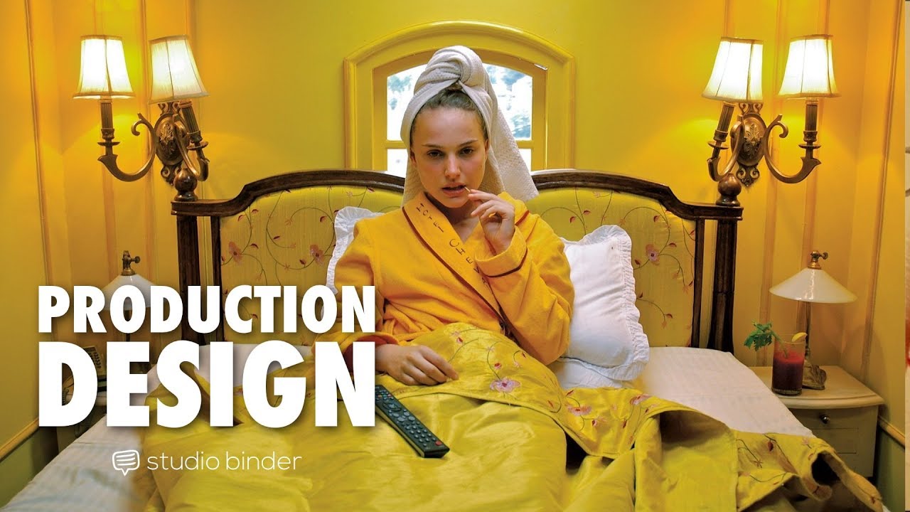
  • 🏰 'The Grand Budapest Hotel': An example of Anderson's use of vivid colors and whimsy to depict a world that, despite its similarities to ours, grapples with death and war.
  • 🎬 Emotional Repression: Many of Anderson's characters suppress their emotions, living in beautiful, colorful worlds that contrast with their internal struggles.
  • 📝 Color Palette Design: When designing characters, consider the colors that can represent their emotional journey or state of mind, as seen in Anderson's films.

Q & A

  • What is the significance of color theory in filmmaking according to the script?

    -Color theory in filmmaking is crucial as it helps set the tone and mood of a scene. Bright and saturated colors are often used for a happy tone, while dark and desaturated colors are used for more serious or grounded scenes.

  • How does Wes Anderson's use of color differ from traditional color theory?

    -Wes Anderson complicates traditional color theory by using vibrant and saturated colors that are often at odds with the dark or serious subject matter of his films, creating a unique contrast.

  • What are the three components of the HSB color model mentioned in the script?

    -The HSB color model stands for Hue, Saturation, and Brightness. Hue refers to the color family, Saturation refers to the intensity of the color, and Brightness is how light or dark a color is.

  • Why does the script mention that Anderson's worlds are bright and colorful but just a facade?

    -Despite the bright and colorful appearance of Anderson's films, they often deal with dark subject matter, indicating that the vibrant colors serve as a contrasting facade to the underlying themes.

  • How does the script describe the use of color in 'The Grand Budapest Hotel'?

    -In 'The Grand Budapest Hotel', the script describes the use of vivid colors and a whimsical world, creating a stark contrast to the serious issues like death and war that the characters face.

  • What is the significance of the color red in Wes Anderson's films?

    -Red is a recurring color in Anderson's films and is often associated with characters who have experienced trauma or are in a state of arrested development, such as Chaz in 'The Royal Tenenbaums'.

  • How does the script suggest using color to associate with characters in one's own films?

    -The script suggests considering what colors can be associated with characters to represent their emotional states or personal issues, as seen with the use of red for characters with trauma in Anderson's films.

  • Why does Wes Anderson use colors typically associated with happiness or cartoons for his serious stories?

    -Anderson uses hopeful colors in depressing scenes to find humor in dark places, creating a bipolar tone that reflects the contrast between the whimsical worlds and the serious issues his characters face.

  • What effect does the script say the combination of bright colors and dark subject matter has on the audience?

    -The combination forces the audience to reconcile the darkness with humor and light, creating a bipolar effect that enhances the storytelling and emotional impact.

  • How does the script relate Wes Anderson's films to a childlike perspective?

    -The script relates Anderson's films to a childlike perspective by mentioning the whimsical worlds, the storybook-like aesthetic, and the characters dealing with childhood traumas.

  • What advice does the script give for designing color palettes in filmmaking?

    -The script advises filmmakers to consider the central truth of their story and not be afraid to show how lively and colorful the world can be, even when dealing with serious or bleak subject matter.

Outlines

00:00

🎨 Color Theory in Wes Anderson's Films

This paragraph explores the unique use of color theory by filmmaker Wes Anderson, who often juxtaposes bright, saturated colors with dark and serious subject matter. The video script delves into Anderson's style, starting with an introduction to HSB (Hue, Saturation, Brightness)—the foundational elements of color. It highlights Anderson's preference for primary colors and high saturation, which makes his films visually striking. The paragraph also discusses how Anderson uses color to reflect the emotional states and narratives of his characters, even when those colors seem at odds with the underlying themes of death, trauma, and arrested development. The summary emphasizes the complexity of Anderson's approach to color, which contributes to the distinctive aesthetic and emotional impact of his films.

05:01

🌈 The Bittersweet Aesthetic of Wes Anderson

The second paragraph examines the contrast between the whimsical, colorful worlds of Wes Anderson's films and the serious, often tragic themes they contain. It discusses how Anderson uses color to create a 'bipolar effect,' where humor and light coexist with darkness and depression. The script points out that characters in red often have unresolved traumas, and their color associations can change in significant moments, as seen with Chas Tenenbaum. The paragraph also touches on the use of color to evoke a childlike perspective and the importance of considering color palettes when designing characters. It concludes with a call to action for filmmakers to explore color theory to enhance their storytelling, with a reference to a blog post for further reading on the subject.

Mindmap

Keywords

💡Color Theory

Color theory is the study of how colors are perceived and how they can be combined to create different effects. In the video, it's used to discuss how Wes Anderson uses color to contrast with the themes of his films. Bright and saturated colors are often associated with happiness, whereas dark and desaturated colors suggest a more serious or grounded tone. Anderson complicates this by using vibrant colors to depict dark themes, challenging traditional color theory.

💡HSB

HSB stands for Hue, Saturation, and Brightness, which are the three components of color. In the context of the video, it is described as the 'DNA of color'. Wes Anderson is noted for his use of primary colors with high saturation to make them pop, and brightness to create a light and colorful world. The script uses HSB to explain how Anderson's color choices contribute to the visual style of his films.

💡Primary Colors

Primary colors are the basic colors that cannot be created by mixing other colors. In the video, it is mentioned that Wes Anderson gravitates towards primary colors like reds and yellows. These colors are used in his films to create a vibrant and visually striking aesthetic, which contrasts with the darker themes often present in the narratives.

💡Desaturated Colors

Desaturated colors are colors with less intensity, often appearing more muted or dull. The script notes that when Anderson uses a desaturated color palette, it usually signifies a shift in tone within the film. This technique is used to subtly convey changes in mood or theme without explicitly stating them.

💡Contrast

Contrast in the video refers to the juxtaposition of elements, such as colors or themes, to create a more impactful visual or narrative effect. Anderson's films use a high contrast between bright, childlike colors and dark, serious subject matter. This contrast is a key part of his unique storytelling and visual style.

💡Whimsy

Whimsy is a quality of being playful, fanciful, or capricious. The video describes Anderson's films as having a whimsical world, filled with vivid colors and eccentric characters. This whimsical aesthetic is a signature of his style, even when dealing with serious or dark themes.

💡Bipolar Tone

Bipolar tone in the video refers to the coexistence of two contrasting emotional states, such as humor and darkness, within the same narrative. Anderson's films are noted for finding humor in dark places and using hopeful colors in depressing scenes, creating a unique and complex emotional landscape.

💡Storybook World

A storybook world is a term used in the video to describe the fantastical, often childlike environments that Anderson creates in his films. These worlds are characterized by their bright colors and imaginative settings, which serve to highlight the contrast with the serious issues faced by the characters.

💡Character Association with Color

The video discusses how certain characters in Anderson's films are associated with specific colors, which can symbolize their personalities or the issues they face. For example, characters who wear red often have traumas they are trying to overcome, as seen with Chaz in 'The Royal Tenenbaums'.

💡Childlike Perspective

A childlike perspective refers to the viewpoint or approach that is innocent, imaginative, and unjaded. The video explains that Anderson's films are told from this perspective, which allows for the coexistence of whimsy and serious issues within the same narrative space.

💡Repressed Emotions

Repressed emotions are feelings that are held back or not expressed. In the context of the video, it is mentioned that many of Anderson's characters suppress their emotions, which adds to the complexity of their personalities and the narratives of the films. This repression is contrasted with the vibrant and colorful worlds they inhabit.

Highlights

Wes Anderson's use of color theory often contrasts with the dark subject matter of his films, creating a unique visual style.

HSB (Hue, Saturation, Brightness) is the foundation of color theory, with Anderson favoring primary colors and high saturation.

Desaturated color palettes in Anderson's films usually indicate a shift in tone.

The brightness in Anderson's films is used to create a facade of vibrancy that masks darker themes.

Anderson's films are characterized by a childlike perspective, even when dealing with serious issues.

The film 'Grand Budapest Hotel' exemplifies Anderson's use of vivid colors and whimsical worlds despite the presence of death and war.

Wes Anderson's characters are often associated with a single color, which can symbolize their emotional state or personal issues.

The color red in Anderson's films is frequently linked to characters with unresolved trauma or arrested development.

Characters in Anderson's films who wear red are often seen struggling to overcome past traumas.

The color palettes in Anderson's films can be used to understand the emotional journey of the characters.

Anderson's films find humor in dark places, using hopeful colors in depressing scenes to reflect a bipolar tone.

The contrast between the funeral scene in 'The Darjeeling Limited' and the flashback of the father's funeral highlights the use of color to convey emotion.

Wes Anderson's characters often repress their emotions, living in beautiful worlds filled with wonder but dealing with serious issues.

The films of Wes Anderson encourage viewers to reconcile darkness with humor and light, creating a unique cinematic experience.

Anderson's storytelling often comes from a childlike perspective, even when set in whimsical worlds with serious underlying issues.

The blog post on color theory delves deeper into Anderson's and other filmmakers' color palettes to create unique cinematic experiences.

The discussion on color palettes in films invites viewers to consider how hues and saturation can communicate unexpected themes or emotions.

Transcripts

play00:00

♪ ♪

play00:05

Many filmmakers have a pretty good utilization of color theory.

play00:11

Bright and saturated for a happy tone.

play00:16

Or dark and desaturated for something more grounded.

play00:21

But there's one filmmaker who chooses to blur the lines

play00:24

between joy and darkness.

play00:26

"- She and her infant son would be killed two years later by the Prussian grippe.

play00:29

An absurd little disease."

play00:31

"- Cut!

play00:33

Cut!

play00:34

Not enough smoke and the snow was too loud, we'll go again right away.

play00:38

Making movies."

play00:41

While on the surface Wes Anderson's movies look vivid and vibrant.

play00:44

The colors are often actually at odds with the subject matter.

play00:48

So, why does Wes Anderson complicate our ideas of color theory so much?

play00:53

Let's dive into his style.

play00:55

♪ Directing Techniques - Intro ♪

play01:10

Remember to subscribe and click the bell icon

play01:12

to stay in the loop for more filmmaking videos.

play01:17

First, let's talk HSB.

play01:20

The DNA of color.

play01:22

It stands for Hue, Saturation and Brightness.

play01:27

Hue refers to the color family.

play01:30

Wes Anderson gravitates towards primary colors, like reds.

play01:34

And yellows.

play01:36

Saturation refers to the intensity of the color.

play01:41

Anderson typically uses a high saturation

play01:43

so that these primary colors really pop.

play01:47

When he does switch to a desaturated color palette

play01:49

he usually marks a shift in tone.

play01:59

Lastly, brightness.

play02:02

Which is how light

play02:04

or dark a given color is.

play02:10

His worlds are bright and colorful,

play02:12

but that's just the facade.

play02:14

"- Why'd you try to kill yourself?

play02:15

- Don't press him right now.

play02:17

- I wrote a suicide note."

play02:20

What's not obvious is the effect of combining these colors

play02:23

with Anderson's dark subject matter.

play02:25

♪ ♪

play02:32

"- I'm going to kill myself tomorrow."

play02:34

♪ ♪

play02:42

"- Is it dark?

play02:44

- Of course, it's dark.

play02:45

It's a suicide note."

play02:47

And yes, it is dark.

play02:49

Though it may seem light.

play02:51

"- Can we read it?

play02:52

- No.

play02:54

- Can you paraphrase it for us?"

play02:56

♪ ♪

play03:01

Anderson is a storybook world

play03:03

colored it in this way to give it a childlike perspective.

play03:07

But this aesthetic carries over to his live-action films as well.

play03:12

Let's look at the "Grand Budapest Hotel".

play03:15

"- A picturesque elaborate

play03:16

and once widely celebrated establishment."

play03:19

Throughout the film,

play03:20

we're exposed to vivid colors and a whimsical world.

play03:26

Even though these characters live in a world similar to our own.

play03:30

Compete with death.

play03:31

"- Wrap this stiff in a tablecloth. We're gonna bury him at sea."

play03:33

And war.

play03:39

This isn't reality after all.

play03:44

"- What kind of bird are you?"

play03:48

For Wes Anderson, whimsy feels right at home.

play03:51

"- I'm a raven."

play03:54

But the themes of his films would seem to be at odds with his color choices.

play03:57

"- I'm on Mescaline. I've been spaced out all day.

play04:00

- Did you say you're on Mescaline?"

play04:03

This combination shouldn't work, right?

play04:05

"- Here I come.

play04:10

- What was that?

play04:13

- Eli just crashed his car into the front of the house.

play04:15

- Oh my God."

play04:17

♪ ♪

play04:20

Much like storybook characters

play04:22

Wes Anderson's characters are often connected to a single color.

play04:25

"- Where are we?"

play04:26

Musee Gustave is purple.

play04:29

Suzu is pink.

play04:31

Chaz is red.

play04:33

Let's look at that last color - red.

play04:37

It comes up a lot in Wes Anderson's film's.

play04:41

The crew in "Life Aquatic" wear red beanies.

play04:44

The brothers in "The Darjeeling Limited" drive a red car.

play04:48

In "Rushmore", Max wears a red hat.

play04:50

"- I like your hat.

play04:52

- Oh, thank you."

play04:53

Chaz and his sons in "The Royal Tenenbaums" wear red tracksuits.

play05:00

But let's look deeper at the characters themselves.

play05:03

They all have issues progressing past a regressed adolescent state.

play05:07

Chas Tenenbaum suffers from immense trauma from his father

play05:10

leaving his family at a young age.

play05:13

"- Do you still love Mom?

play05:14

- Yes very much, but your mother's asked me to leave

play05:16

and I must respect her position on the matter."

play05:18

And his wife tragically died in a plane crash.

play05:25

"- Ari, fire alarm! Let's go!"

play05:29

As a result, Chaz is overprotective.

play05:32

"- Hey, are you listening to me? - Yes, I am.

play05:35

I think you're having a nervous breakdown.

play05:38

I don't think you recovered from Rachel's death."

play05:42

Chaz is in a state of arrested development,

play05:44

which is why he comes across as childish throughout the film.

play05:47

"- Four minutes, 48 seconds.

play05:49

We're all dead, burnt to a crisp."

play05:52

All these characters who wear red have some kind of trauma

play05:55

they're trying to overcome.

play05:56

And in Chaz's case,

play05:57

the only time we see him shed his red palette

play05:59

is when his chance to finally reconcile with his father.

play06:02

Already passes.

play06:06

So when designing color palettes for your characters

play06:09

consider what colors you can associate them with?

play06:14

♪ ♪

play06:18

Wes Anderson's films are not afraid to deal with serious subject matter.

play06:23

But why does he use colors associated with happy tails or cartoons

play06:27

for such serious stories?

play06:29

"- Was he a good dog?

play06:33

- Who's to say.

play06:35

But he didn't deserve to die."

play06:42

His films find the humor in these dark places.

play06:46

"- Don't point that gun at him.

play06:47

He's an unpaid intern."

play06:50

So using hopeful colors in depressing scenes

play06:52

make sense for the bipolar tone.

play06:59

Consider the contrast in the funeral scene from "The Darjeeling Limited".

play07:03

A young boy has died,

play07:04

but the scene is punctuated by bright whites and golds.

play07:08

People grieve openly and celebrate the boy's life.

play07:11

It's a stark contrast to the flashback we get in the next scene

play07:14

where the brothers are on their way to attend their father's funeral.

play07:18

They're dressed in black.

play07:19

And we don't even see the funeral.

play07:22

"This isn't going to work.

play07:23

Let's put the cover back on."

play07:25

Many of Wes Anderson's characters repress their emotions,

play07:28

which is a shame because they live in such beautiful worlds filled with wonder.

play07:34

So consider the central truth of your next film.

play07:37

If things are meant to be bleak

play07:39

then be bleak.

play07:46

But don't be afraid to show how lively

play07:48

and filled with color the world can be.

play07:52

His characters often deal with childhood traumas.

play07:55

In this way, his films are told from a childlike perspective.

play08:00

They take place in these whimsical worlds,

play08:02

but there are still serious issues amongst all the bright colors.

play08:06

It creates a bipolar effect

play08:08

where we as the audience

play08:09

are forced to reconcile the darkness

play08:11

with humor and light.

play08:14

Make sure to read our blog post on color theory

play08:16

where we dive deeper into Wes Anderson

play08:18

and other filmmakers color palettes

play08:20

to create unique cinematic experiences

play08:22

and how you can too.

play08:24

Links in the description.

play08:25

♪ ♪

play08:30

What are your favorite color palettes from other films?

play08:33

Why do you think the hues and saturation work

play08:35

as well as they do?

play08:36

Do they communicate something unexpected?

play08:40

To stay in the loop, subscribe and enable notifications.

play08:43

♪ ♪

Rate This

5.0 / 5 (0 votes)

Related Tags
Wes AndersonColor TheoryFilmmakingCinematic StyleHSB ColorPrimary ColorsEmotional ContrastChildlike PerspectiveWhimsical WorldsSerious ThemesStorybook Aesthetic