Typeface vs Font: What is the Difference Between Them?
Summary
TLDRIn this video, Nona Blackburn from Envato Tuts+ clears up the common confusion between 'font' and 'typeface.' While the terms are often used interchangeably, they are not the same. A typeface is a collection of characters with shared design features (like Helvetica), whereas a font is a specific member of that typeface family, such as Helvetica Regular or Helvetica Bold. The confusion arose with desktop publishing, where operating systems presented users with a 'font' menu. While the distinction matters to typography experts, everyday communication is about clarity, not precision. The video encourages viewers to understand the difference without overcomplicating things.
Takeaways
- 😀 The terms 'font' and 'typeface' are often used interchangeably but they are not the same.
- 😀 A typeface refers to a family of characters that share common design features.
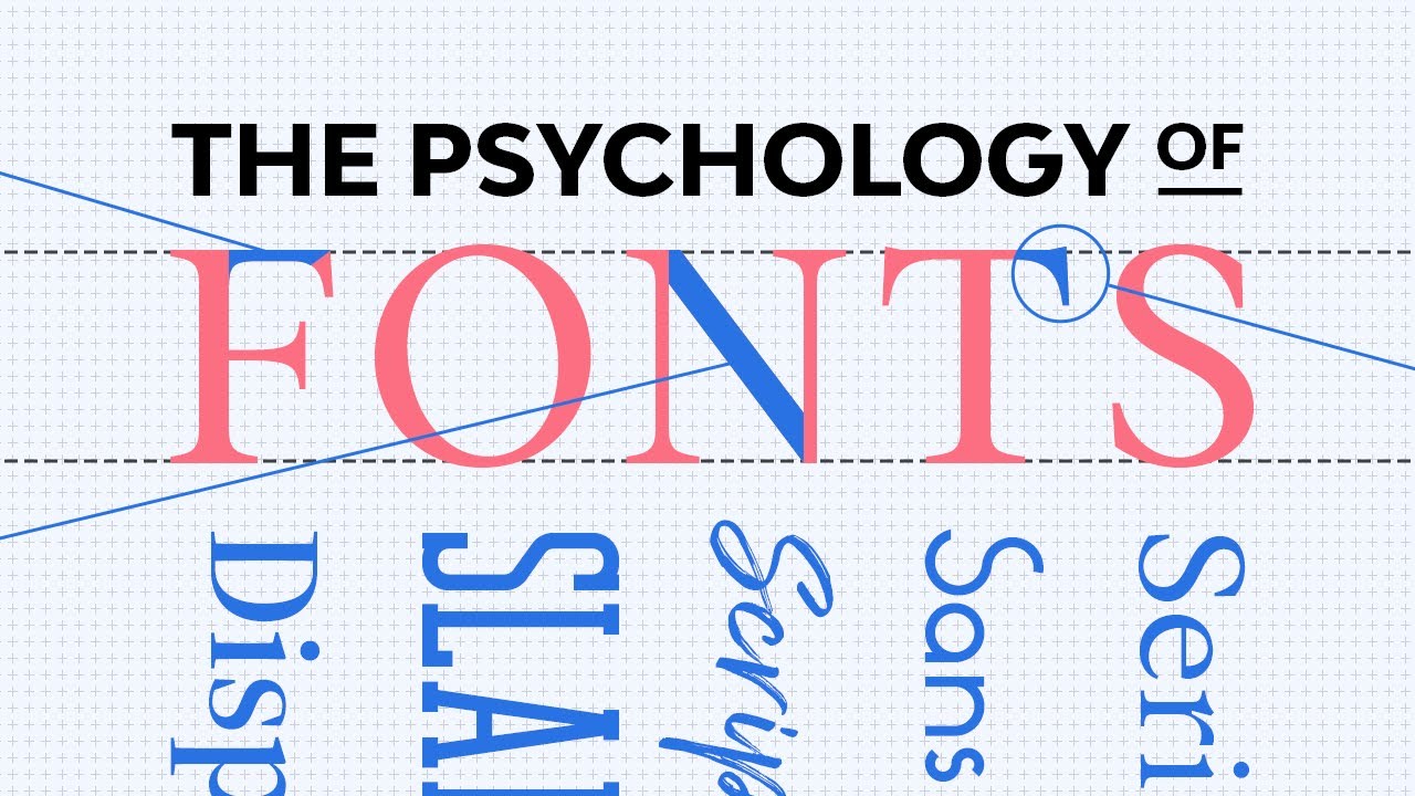
- 😀 Helvetica and Times New Roman are examples of typefaces, each with its own set of design features.
- 😀 A typeface includes multiple fonts, which differ in weight, style, size, and effect.
- 😀 The Helvetica typeface, for instance, includes 51 different fonts, like Helvetica Light, Helvetica Regular, and Helvetica Bold.
- 😀 Think of a typeface as a family, with each font being an individual member of that family.
- 😀 The confusion between 'font' and 'typeface' arose with the rise of desktop publishing and the way operating systems and applications present font menus.
- 😀 The distinction between font and typeface still matters to experts, such as graphic designers and typographers.
- 😀 Language and terminology evolve over time, often driven by common usage rather than expert opinions.
- 😀 When communicating with non-experts, it's okay to use the terms interchangeably as long as clarity is maintained.
- 😀 The primary goal of communication is to be understood, not to complicate matters with technical terms.
Q & A
What is the main difference between a font and a typeface?
-A typeface refers to the design of characters that share common features, while a font is a specific weight, style, size, or effect within that typeface. For example, Helvetica is a typeface, and Helvetica Light, Helvetica Regular, and Helvetica Bold are individual fonts within that typeface.
How did the terms 'font' and 'typeface' become confused?
-The confusion began with the rise of desktop publishing and operating systems. Users were presented with a 'font menu' rather than a 'typeface menu,' which blurred the distinction between the two terms.
Why is understanding the difference between font and typeface important?
-The distinction is important for clarity and precision, especially for those in design fields like graphics, typography, or type design. However, the terms are often used interchangeably in everyday language, so it may not always matter in casual conversation.
What is an example of a typeface, and how many fonts does it include?
-Helvetica is an example of a typeface. It includes 51 fonts, each representing different weights, styles, sizes, and effects.
Can you explain the analogy of a typeface being like a family?
-In the analogy, the typeface is compared to a family, where each individual font is a member of that family. For instance, Helvetica is the family, and Helvetica Light, Helvetica Regular, and Helvetica Bold are individual fonts within that family.
Do experts in typography treat the difference between font and typeface as significant?
-Yes, experts in typography, type design, or graphic design typically maintain the distinction between font and typeface as important, as it helps maintain clarity and precision in communication.
Why does the speaker suggest we should avoid being overly strict with terminology?
-The speaker suggests avoiding being overly strict because language and terminology evolve over time, often driven by common usage. It's more important to communicate clearly and be understood than to insist on precise terminology, especially when speaking to non-experts.
What is the speaker's advice when discussing fonts and typefaces with someone who isn't an expert?
-The speaker advises that, when talking to someone who isn't an expert or who uses the terms interchangeably, you should avoid insisting on the technical distinction. Instead, use the terminology they understand, as effective communication is the key.
How has the evolution of desktop publishing influenced the usage of font and typeface terms?
-Desktop publishing and the advent of user-friendly software created a situation where people are typically presented with a font menu instead of a typeface menu. This shift led to the terms becoming interchangeable for many users.
What does the speaker think about the language of typography changing over time?
-The speaker acknowledges that language and terminology change over time, often due to widespread common usage rather than expert recommendations. This change is natural and reflects how language evolves.
Outlines

This section is available to paid users only. Please upgrade to access this part.
Upgrade NowMindmap

This section is available to paid users only. Please upgrade to access this part.
Upgrade NowKeywords

This section is available to paid users only. Please upgrade to access this part.
Upgrade NowHighlights

This section is available to paid users only. Please upgrade to access this part.
Upgrade NowTranscripts

This section is available to paid users only. Please upgrade to access this part.
Upgrade NowBrowse More Related Video


5.0 / 5 (0 votes)