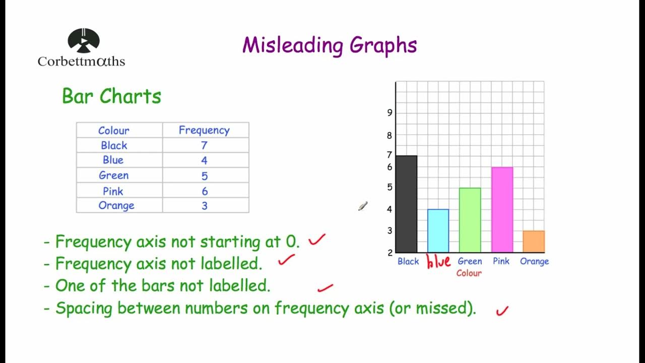
Master IB Biology IA Graphs: Visual Data Analysis Explained by an Examiner | Part 10/12
Summary
TLDRThis instructional video provides detailed guidance on creating accurate and professional graphs for scientific data analysis. Key points include the importance of graphing processed data, using proper titles, labeling axes with units and uncertainties, and interpreting error bars for statistical significance. The speaker emphasizes the need for clarity, precision, and correct graph types such as bar graphs for group comparisons and line graphs for time-based data. The video also stresses the importance of analyzing trends and using appropriate terminology in data explanations to ensure students avoid common mistakes and improve their data presentation skills.
Takeaways
- 😀 Never graph your raw data; always use processed data, including averages, standard deviations, and standard errors.
- 😀 Graph titles must be specific and descriptive, clearly identifying both the independent and dependent variables (e.g., 'Effect of temperature on plant growth').
- 😀 The X-axis should represent the independent variable (e.g., time, temperature), and the Y-axis should represent the dependent variable (e.g., mass, growth rate).
- 😀 Include units and uncertainty for both the X and Y axes whenever applicable.
- 😀 Error bars are essential to interpret data variability: overlapping bars indicate no significant difference, while non-overlapping bars suggest statistical significance.
- 😀 When using bar graphs, make sure to include error bars, titles, units, and uncertainty.
- 😀 Line graphs are best for showing changes over time, with time typically on the X-axis.
- 😀 Scatter plots are suitable for displaying data points and finding trends through best-fit lines.
- 😀 Pie charts should be used for genetic data, such as in Punnett square results, to show proportions.
- 😀 Histograms are ideal for showing frequencies of data points within specific ranges.
- 😀 Always include an analysis paragraph under your graph, explaining the trends and statistical significance of the results.
Q & A
Why should raw data never be graphed in scientific reports?
-Raw data should never be graphed because it is unprocessed and may not accurately represent the relationships you're studying. Instead, processed data like averages, standard deviations, and standard errors should be used to create clearer, more reliable graphs.
What is the importance of having a clear and specific title for your graph?
-A clear and specific title is crucial as it immediately informs the viewer of the independent and dependent variables being studied, ensuring that the graph's purpose and context are understood at a glance.
What are the typical labels for the X and Y axes in scientific graphs?
-The X-axis represents the independent variable, such as time or temperature, while the Y-axis represents the dependent variable, such as mass or growth rate. Both axes should include the variable name, units, and uncertainties.
How do error bars help in interpreting data from graphs?
-Error bars visually indicate the uncertainty or variability in the data points. By observing whether error bars overlap, you can assess whether the differences between data sets are statistically significant.
What should you do if the error bars of two data sets do not overlap?
-If the error bars do not overlap, it suggests that the data points are significantly different from each other. This indicates that the observed difference is statistically significant.
When should you use a bar graph versus a line graph?
-Use a bar graph when comparing distinct groups, and use a line graph when analyzing changes over time. For time-based data, the X-axis should always represent time, and line graphs are more suitable for showing trends over time.
Why are pie charts rarely used in scientific graphs?
-Pie charts are rarely used outside of specific contexts like genetics, where proportions (such as in Mendelian inheritance) are being compared. They are less suitable for representing continuous data or trends.
What is the role of statistical significance in data analysis?
-Statistical significance helps determine whether the observed differences in data are due to a real effect or just random variation. It is essential for interpreting the reliability of results and drawing conclusions from experimental data.
What types of data are best represented by scatter plots?
-Scatter plots are ideal for displaying data that is not grouped into categories and shows individual data points. They are often used in experimental studies where the relationship between two continuous variables is being examined.
What should be included in the paragraph under a graph?
-The paragraph should explain the trends shown in the graph, including whether the relationship is positive or negative, and analyze the statistical significance of the results, particularly through the interpretation of error bars.
Outlines

This section is available to paid users only. Please upgrade to access this part.
Upgrade NowMindmap

This section is available to paid users only. Please upgrade to access this part.
Upgrade NowKeywords

This section is available to paid users only. Please upgrade to access this part.
Upgrade NowHighlights

This section is available to paid users only. Please upgrade to access this part.
Upgrade NowTranscripts

This section is available to paid users only. Please upgrade to access this part.
Upgrade Now5.0 / 5 (0 votes)


