Marketing Color Psychology: What Do Colors Mean and How Do They Affect Consumers?
Summary
TLDRIn this engaging video, Michael Odor explores the fascinating world of color psychology, detailing how colors can evoke emotions and influence design. He discusses primary, secondary, and tertiary colors, explaining the importance of color mixing and saturation. Viewers learn about various color harmonies—complementary, analogous, monochromatic, and more—highlighting their emotional impacts. The video also delves into the meanings of individual colors, such as yellow's association with optimism and blue's connection to trust. With practical insights on choosing colors for effective visual communication, this guide equips creators to enhance their designs using the power of color.
Takeaways
- 😀 Colors can evoke specific emotions and associations, making them powerful tools in visual communication.
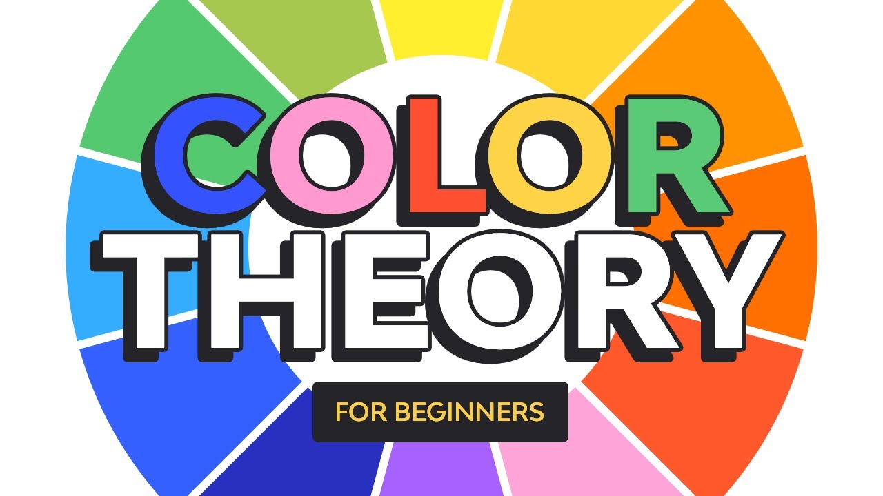
- 🟡 The three primary colors—red, blue, and yellow—cannot be created by mixing other colors and serve as the foundation for all other colors.
- 🟢 Secondary colors are created by mixing two primary colors, while tertiary colors come from mixing primary and secondary colors.
- 🎨 Understanding color nuances—pure colors, tints, shades, and tones—is crucial for effective design.
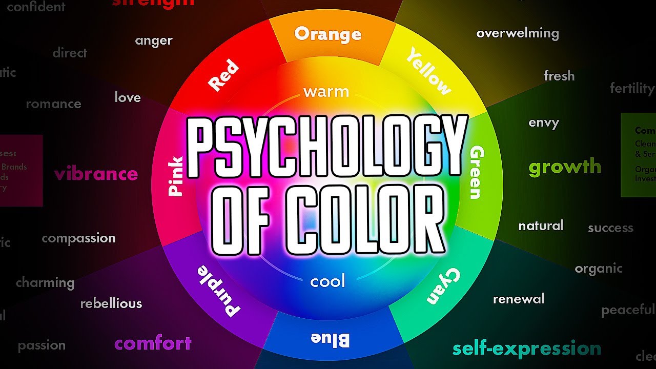
- 🔥 Warm colors (red, orange, yellow) convey energy and excitement, while cool colors (blue, green, purple) evoke calm and serenity.
- 🔄 Complementary color schemes use opposing colors on the color wheel for striking contrasts, best used in an 80/20 ratio.
- 🌈 Analogous color schemes involve colors next to each other on the wheel, providing a harmonious look.
- ⚖️ Monochromatic schemes utilize variations of a single color, offering a unified appearance.
- 💡 Triadic color schemes consist of three evenly spaced colors on the wheel, ensuring vibrant contrast.
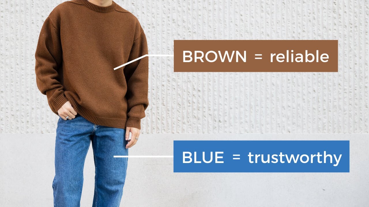
- 🌍 Each color carries distinct meanings; for instance, green symbolizes nature and eco-friendliness, while blue signifies trust and calmness.
Q & A
What is color psychology and why is it important?
-Color psychology is the study of how colors influence perceptions and behaviors. It's important in visual communication and marketing as it helps convey brand personality and emotions.
What are the three primary colors?
-The three primary colors are red, blue, and yellow. They cannot be created by mixing other colors.
What are secondary and tertiary colors?
-Secondary colors are created by mixing two primary colors, while tertiary colors result from mixing a primary color with a secondary color.
How can color nuances affect visual marketing?
-Color nuances, such as tints (adding white), shades (adding black), and tones (adding gray), can alter the perception of a color, affecting how a brand message is received.
What is the difference between warm and cool colors?
-Warm colors (like red, yellow, and orange) evoke feelings of warmth and energy, while cool colors (like blue, green, and violet) are associated with calmness and cleanliness.
What are complementary colors and how should they be used?
-Complementary colors are opposite each other on the color wheel. When used, one color should dominate (e.g., an 80/20 split) to avoid overwhelming the viewer.
What is an analog color scheme?
-An analog color scheme uses colors that are next to each other on the color wheel, creating a harmonious and calming effect.
How can monochromatic color schemes be effective?
-Monochromatic schemes utilize different shades, tones, and tints of a single color, providing a cohesive look, though they might lack contrast.
What does the color yellow symbolize?
-Yellow typically symbolizes creativity, optimism, and liveliness, but darker shades can convey negative feelings.
Why is blue the most preferred color among consumers?
-Blue is associated with intelligence and trust, making it a popular choice for corporate branding and websites.
Outlines

This section is available to paid users only. Please upgrade to access this part.
Upgrade NowMindmap

This section is available to paid users only. Please upgrade to access this part.
Upgrade NowKeywords

This section is available to paid users only. Please upgrade to access this part.
Upgrade NowHighlights

This section is available to paid users only. Please upgrade to access this part.
Upgrade NowTranscripts

This section is available to paid users only. Please upgrade to access this part.
Upgrade NowBrowse More Related Video
5.0 / 5 (0 votes)
