My Personal Do's and Don'ts of Pixel art! (How I make pixel art!)
Summary
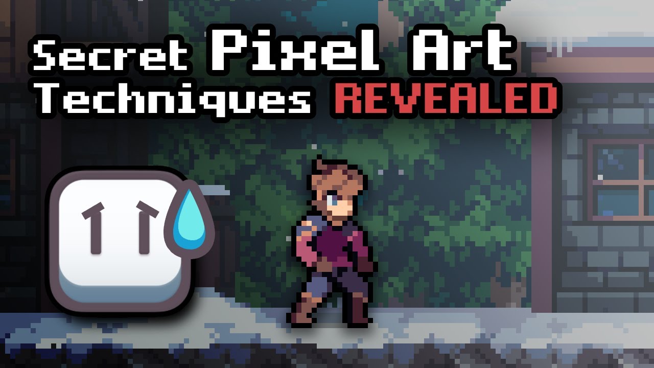
TLDRThis video offers essential do's and don'ts for beginners in pixel art, emphasizing the importance of rules while recognizing the subjective nature of art. Key tips include using hue shifting for vibrant palettes, practicing anti-aliasing in moderation, and avoiding excessive colors to maintain clarity. The video also highlights the significance of correct linework, shading techniques, and using dark colors for outlines. With a focus on simplicity and limited canvas size, the content aims to guide aspiring pixel artists in creating polished and effective artwork.
Takeaways
- 😀 Use hue shifting for vibrant palettes; make colors warmer as brightness increases and cooler as it decreases.
- 😀 Employ anti-aliasing judiciously; overusing it can make art look blurry.
- 😀 Stick to a limited color palette of 2 to 25 colors for clarity and cleanliness.
- 😀 Apply easing in and out for animations to create a sense of acceleration and life.
- 😀 Maintain pixel-perfect lines and curves to avoid 'jaggies' and overlaps.
- 😀 Choose dark colors instead of black for outlines to enhance aesthetic appeal.
- 😀 Ensure contrast between shades to improve visibility and readability of your art.
- 😀 Shade with a sense of form to give objects a three-dimensional appearance.
- 😀 Only outline exterior lines when necessary; not everything requires outlining.
- 😀 Use simple flat colors and avoid gradients, soft brushes, or blur tools for authentic pixel art.
Q & A
What is the primary purpose of the video?
-The video aims to compile useful do's and don'ts for beginners in pixel art, providing guidelines that the creator wishes they had when starting.
Why is hue shifting important in pixel art?
-Hue shifting helps create more vibrant and colorful palettes by making colors warmer as brightness increases and cooler as it decreases.
What is the recommended approach to anti-aliasing in pixel art?
-Anti-aliasing should be used sparingly; overusing it can make artwork look blurry and convoluted.
How many colors are typically recommended for a pixel art palette?
-It's recommended to use a limited palette of around 2 to 25 colors to keep the artwork clean and organized.
What does easing in and out do for animations?
-Easing in and out makes animations appear more natural by changing the speed of movement, giving a sense of acceleration.
What are jaggies and how can they be avoided?
-Jaggies are misplaced pixels that disrupt the flow of lines. To avoid them, ensure segments of lines are uniform in pixel count.
What is the effect of using black for outlines in pixel art?
-Using very dark versions of colors instead of black for outlines results in a more aesthetically pleasing and realistic appearance.
Why is contrast important in pixel art?
-Contrast helps ensure that shades are distinguishable, enhancing clarity and readability in the artwork.
What is pillow shading and why should it be avoided?
-Pillow shading occurs when highlights and shadows are applied as if the light source is directly in front, which can create a flat, unrealistic look.
What is the recommended canvas size for creating pixel art?
-A small canvas size is recommended to maintain focus on individual pixels and ensure the pixel art remains recognizable.
Outlines

This section is available to paid users only. Please upgrade to access this part.
Upgrade NowMindmap

This section is available to paid users only. Please upgrade to access this part.
Upgrade NowKeywords

This section is available to paid users only. Please upgrade to access this part.
Upgrade NowHighlights

This section is available to paid users only. Please upgrade to access this part.
Upgrade NowTranscripts

This section is available to paid users only. Please upgrade to access this part.
Upgrade NowBrowse More Related Video

ASSUMPTIONS OF ART

5 Tips Mudah Buat Foto Light Painting

How To Make Pixel Art In Blender - The Complete Guide

Dengue Fever Treatment (Dengue Hemorrhagic Fever) Symptoms, Rashes, Diagnosis, Management Lecture

ILLEGAL Pixel-Art Techniques - (Aseprite, Krita, Photoshop) Pixel Art Tutorial

Nilai Estetis Karya Seni Rupa
5.0 / 5 (0 votes)