Perbedaan Pensil Warna Faber Castell Classic dan Watercolour
Summary
TLDRIn this video, the creator reviews Faber-Castell's classic color and watercolor pencils, addressing common questions about their differences. They compare the appearance, texture, and performance of both pencil types, demonstrating color swatches and blending techniques. The video aims to guide viewers on which type to choose based on their needs, showcasing the potential of each pencil for various art projects. It also includes a unique demonstration of watercolor pencils on HVS paper, despite not being the ideal surface, to satisfy viewer curiosity.
Takeaways
- 🎨 The video is a comparison review between Faber-Castell watercolor and classic color pencils.
- 🔍 The main difference between watercolor and classic color pencils is indicated by the starting number of their codes: 3 for classic and 4 for watercolor.
- 🖌️ Watercolor pencils are designed to be softer and blend easily with water, while classic color pencils are harder and more solid.
- 📝 The script demonstrates color swatches of primary colors and others to show the difference between the two types of pencils, both with and without water.
- 🍊 For hard pressure, the classic color pencil shows maximum color saturation, while watercolor pencils leave more texture on the paper.
- 🏼 The video specifically addresses the question of how the 'skin color' pencil (330) performs in both classic and watercolor versions.
- 💧 When water is applied, watercolor pencils produce more intense and direct colors, but they also show more paper texture.
- 🎨 The blending technique using white color is more effective with watercolor pencils, resulting in a smoother and more polished look.
- 📄 The video also includes a demonstration of using watercolor pencils on HVS paper, which is not recommended due to the paper's tendency to wrinkle with water.
- 🌟 The final takeaway is that both classic and watercolor pencils can produce good results, but the choice depends on personal preference and the desired effect in artwork.
Q & A
What is the main purpose of the video review mentioned in the script?
-The main purpose of the video review is to compare Faber-Castell watercolor pencils with the classic color pencils to help viewers understand the differences and make an informed choice based on their needs.
How can you identify the difference between Faber-Castell classic color pencils and watercolor pencils by their codes?
-The classic color pencils are identified by codes starting with the number 3, while watercolor pencils have codes starting with the number 4.
What is the primary visual difference between classic color pencils and watercolor pencils according to the script?
-The primary visual difference is that watercolor pencils are designed to be less hard and more prone to softening when wet, as they are meant to be used with water, whereas classic color pencils are harder and more solid.
What is the demonstration method used by the script's speaker to show the color intensity of the pencils?
-The speaker demonstrates color intensity by applying hard pressure to the paper with the pencils to show the maximum color output.
How does the script describe the texture of the paper when using classic color pencils versus watercolor pencils?
-The script describes the classic color pencils as producing a smoother and more even texture on the paper, while watercolor pencils leave more visible paper pores and a less smooth texture.
What is the script's advice on blending with white color using classic color pencils versus watercolor pencils?
-The script suggests that blending with white color is more effective with watercolor pencils, as it results in a smoother and more refined blend, whereas classic color pencils may not blend as effectively.
Why does the script's speaker not recommend using watercolor pencils on HVS paper?
-The speaker does not recommend using watercolor pencils on HVS paper because the paper is not designed for watercolor and will wrinkle when wet, which can affect the layering and overall quality of the artwork.
What is the script's recommendation for the best paper to use with watercolor pencils?
-The script recommends using paper specifically designed for watercolor with watercolor pencils, as it allows for better color saturation, multiple layering, and prevents the paper from wrinkling.
What are the two main ways people use colored pencils according to the script?
-The two main ways people use colored pencils are either without applying water or by applying water to the pencils.
What is the final message the script's speaker wants to convey to viewers who are confused about choosing between classic color pencils and watercolor pencils?
-The final message is that both classic color pencils and watercolor pencils can produce good results, and the choice depends on the individual's needs and how they apply the tools they have.
Outlines

This section is available to paid users only. Please upgrade to access this part.
Upgrade NowMindmap

This section is available to paid users only. Please upgrade to access this part.
Upgrade NowKeywords

This section is available to paid users only. Please upgrade to access this part.
Upgrade NowHighlights

This section is available to paid users only. Please upgrade to access this part.
Upgrade NowTranscripts

This section is available to paid users only. Please upgrade to access this part.
Upgrade NowBrowse More Related Video

REVIEW WATERCOLOR PAPER | joyko watercolor pad , Artemedia watercolor paper, Canson watercolor pad
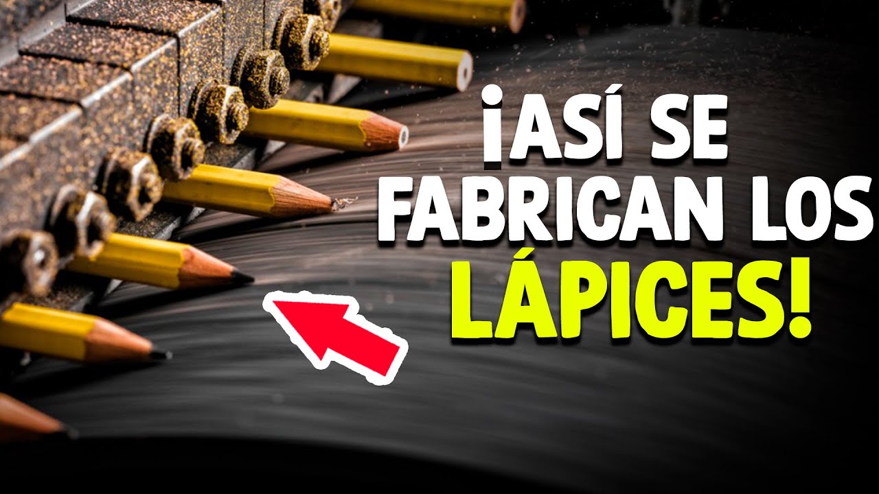
Cómo Se Fabrican Los Lápices? [Proceso En Fábrica]

How to EDIT like a PRO 🔥
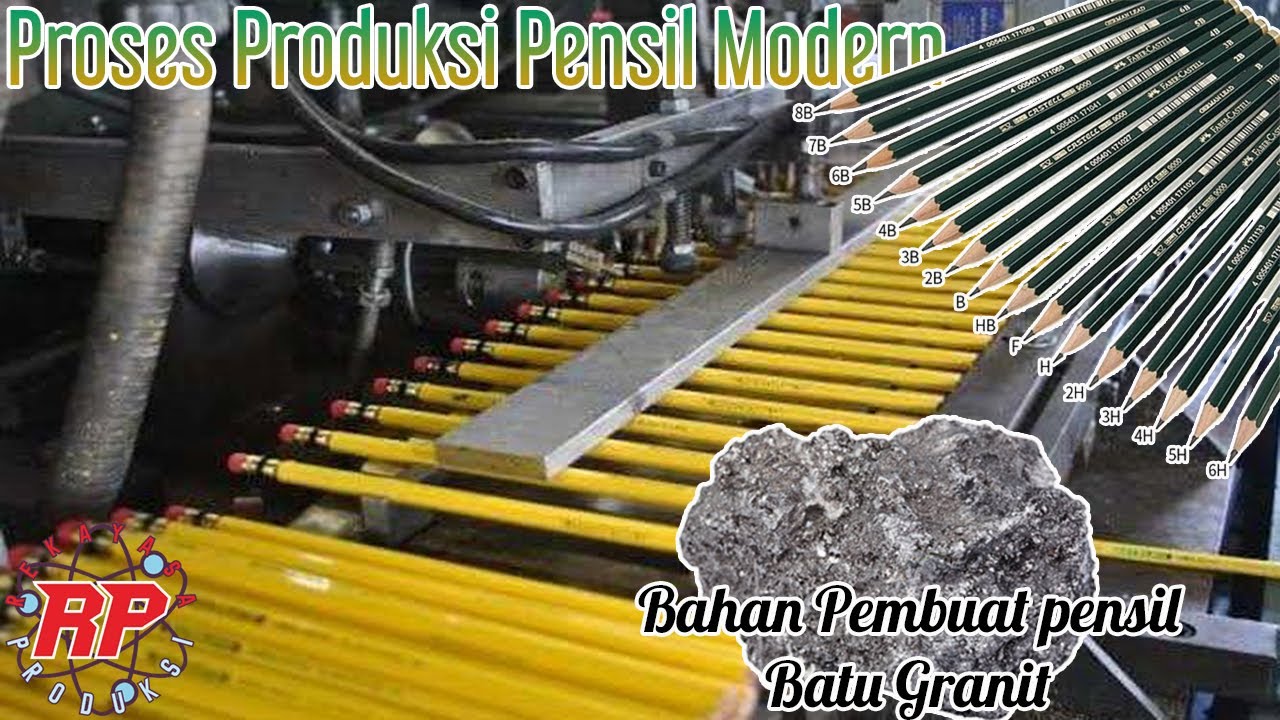
THIS IS THE PROCESS OF MAKING A PENCIL FROM RAW MATERIALS TO BECOME THE PRODUCT WE KNOW

Top 3 Mixed Media Sketchbooks!

"Referensi, Bahan, Teknik, dan Teknologi dalam Menggambar" - Seni Rupa
5.0 / 5 (0 votes)