Analisis Korelasi#STIE GICI
Summary
TLDRIn this tutorial, the speaker explains correlation analysis in statistics, focusing on the relationship between two variables. Key concepts include the definition of independent (X) and dependent (Y) variables, and the types of correlation: positive, negative, and perfect. Practical examples demonstrate how to use scatter plots and tools like Excel and SPSS to analyze data, including how advertising costs can influence sales. The tutorial provides step-by-step instructions on creating scatter plots and calculating correlation coefficients to determine the strength and direction of relationships in data. Overall, it makes correlation analysis accessible and easy to implement for students and professionals alike.
Takeaways
- 😀 The script introduces the concept of statistical correlation and how it measures the strength of relationships between variables.
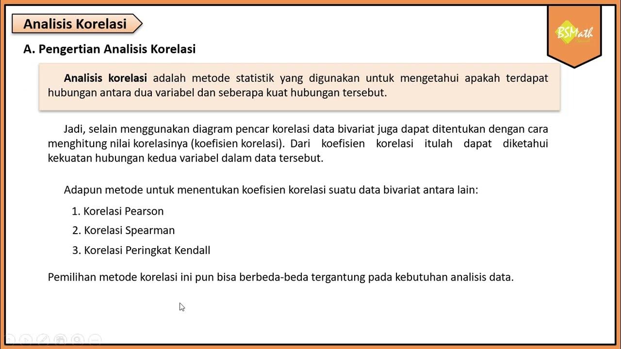
- 😀 Correlation analysis helps identify whether a relationship exists between two variables, classified as either positive, negative, or perfect.
- 😀 Variables are categorized into two types: independent (X) and dependent (Y). The independent variable (X) is not influenced by other variables, while the dependent variable (Y) is.
- 😀 Positive correlation occurs when both variables move in the same direction, either both increasing or both decreasing.
- 😀 Negative correlation means when one variable increases, the other decreases, and vice versa.
- 😀 Perfect correlation implies that any change in one variable corresponds to an exact change in the other, either positively or negatively.
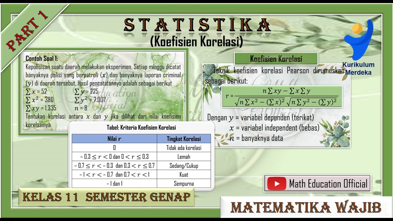
- 😀 The strength of the correlation can be assessed using the correlation coefficient (r), which ranges from 0 to 1. A higher value indicates a stronger correlation.
- 😀 Scatter plots are effective tools for visualizing the correlation between two variables, helping to identify trends and relationships.
- 😀 In Excel, creating scatter plots and calculating correlation is simple, involving a few steps like inserting the data, selecting a scatter chart, and calculating the correlation coefficient.
- 😀 The correlation coefficient can be interpreted: values closer to 1 indicate a strong positive correlation, and values closer to -1 indicate a strong negative correlation.
- 😀 SPSS can also be used for statistical analysis and generating correlation results, providing a similar approach to Excel but with more advanced options for data handling.
Q & A
What is the main topic discussed in the video?
-The main topic of the video is correlation analysis in statistics, specifically how to analyze the relationship between two variables using correlation methods.
What are the two types of variables in correlation analysis?
-The two types of variables in correlation analysis are the independent variable (also called the 'free variable'), which is not affected by other variables, and the dependent variable, which is influenced by the independent variable.
How is the independent variable symbolized in research?
-The independent variable is typically symbolized by 'X' in research.
What is the significance of the dependent variable in correlation analysis?
-The dependent variable, symbolized by 'Y', is the variable whose value depends on the changes in the independent variable (X).
What are the three types of correlation discussed in the video?
-The three types of correlation are: positive correlation, where both variables increase or decrease together; negative correlation, where one variable increases while the other decreases; and perfect correlation, where the variables are directly and consistently related.
What does a perfect positive correlation look like in a scatter plot?
-In a scatter plot, a perfect positive correlation appears as a series of points forming a straight line that slopes upward from left to right, indicating that as one variable increases, the other does too.
How do you interpret a correlation coefficient of 0.98?
-A correlation coefficient of 0.98 indicates a very strong positive relationship between the two variables, meaning as one variable increases, the other is likely to increase as well.
What method was used in the video to calculate correlation using Excel?
-In the video, the 'CORREL' function in Excel was used to calculate the correlation coefficient between two sets of data, such as advertising costs and sales.
What is a scatter plot and how is it useful in correlation analysis?
-A scatter plot is a type of chart used to display the relationship between two variables. It visually shows whether a correlation exists and the direction (positive or negative) of that relationship.
What is the difference between using Excel and SPSS for correlation analysis?
-Both Excel and SPSS can be used to perform correlation analysis, but Excel is more accessible and straightforward for simple tasks, while SPSS offers more advanced statistical capabilities, including more detailed outputs and visualizations.
Outlines

Этот раздел доступен только подписчикам платных тарифов. Пожалуйста, перейдите на платный тариф для доступа.
Перейти на платный тарифMindmap

Этот раздел доступен только подписчикам платных тарифов. Пожалуйста, перейдите на платный тариф для доступа.
Перейти на платный тарифKeywords

Этот раздел доступен только подписчикам платных тарифов. Пожалуйста, перейдите на платный тариф для доступа.
Перейти на платный тарифHighlights

Этот раздел доступен только подписчикам платных тарифов. Пожалуйста, перейдите на платный тариф для доступа.
Перейти на платный тарифTranscripts

Этот раздел доступен только подписчикам платных тарифов. Пожалуйста, перейдите на платный тариф для доступа.
Перейти на платный тарифПосмотреть больше похожих видео


5.0 / 5 (0 votes)
