Inside Burger King’s New Logo Strategy | WSJ Rebrand
Summary
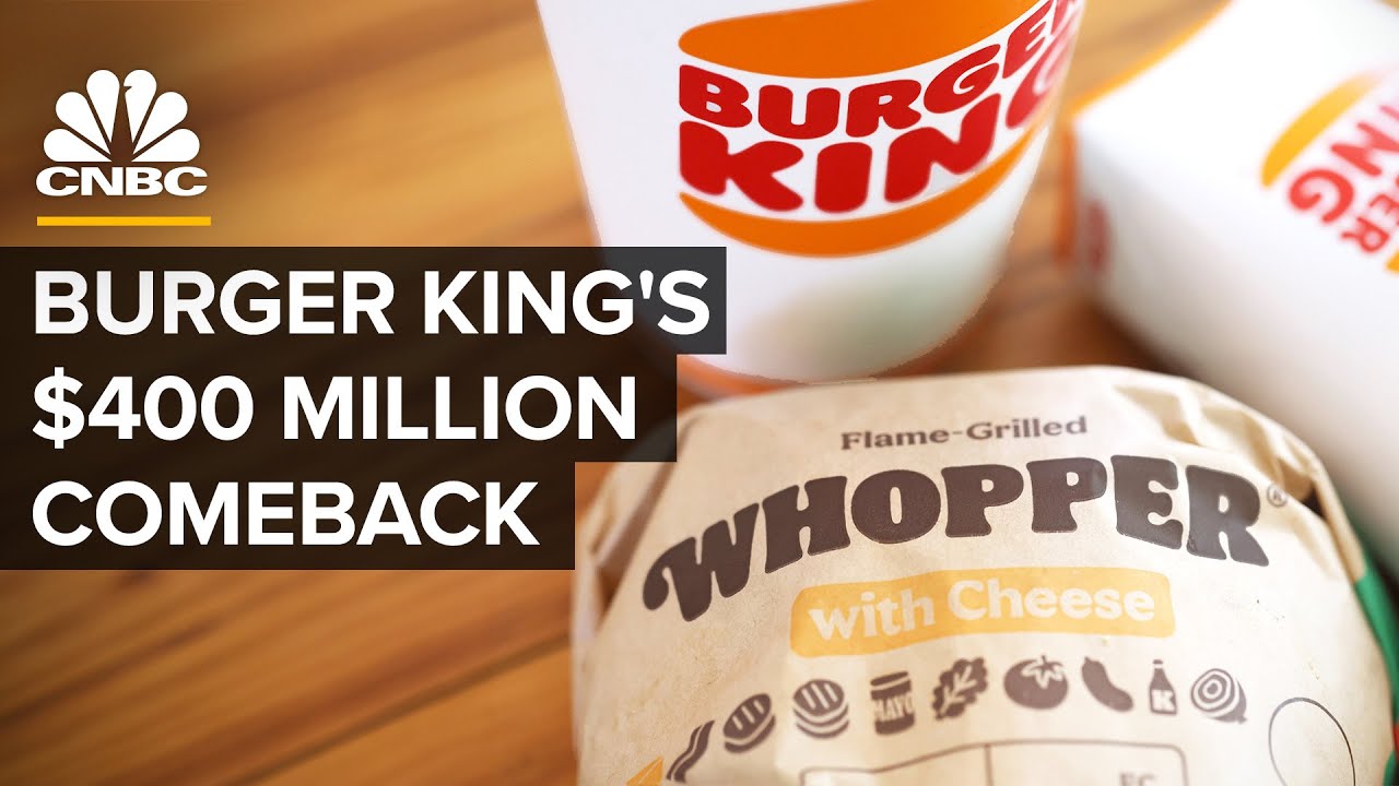
TLDRIn 2021, Burger King launched its first logo rebrand in over 20 years, aiming to refresh its image amid declining market presence. The new logo, designed to resemble a burger and featuring colors reflecting real ingredients, emphasizes quality and sustainability. Branding expert Debbie Millman noted its nostalgic yet modern appeal. Despite ongoing challenges like outdated restaurants and operational inefficiencies, Burger King is investing $400 million to revitalize its brand and locations. Consumer reactions have varied, highlighting the logo's clean aesthetic while the company reports stabilizing sales, yet acknowledges the need for further improvements in franchisee profitability.
Takeaways
- 😀 Burger King rebranded its logo in 2021 for the first time in over 20 years.
- 🎨 The new logo emphasizes simplicity and nostalgia, inspired by earlier designs.
- 🍔 The design aims to communicate the quality of the food, with colors reflecting actual ingredients.
- 📉 Burger King faced declining sales and dropped from the second to the third largest burger chain in the U.S. behind Wendy's.
- 🏢 Outdated restaurants and complex menus contributed to Burger King's tarnished reputation.
- 💔 Two of Burger King's largest franchisees filed for bankruptcy, indicating operational challenges.
- 💵 The company plans to close up to 400 U.S. locations by the end of 2021 as part of restructuring efforts.
- 🌱 In 2021, Burger King banned 120 artificial ingredients from its menu to improve product quality.
- 📈 The company announced a $400 million investment to boost advertising and modernize around 800 U.S. restaurants.
- 🗣️ Initial consumer reactions to the new logo have been mixed, with some seeing it as a retro throwback and others noticing a shift towards health-conscious branding.
Q & A
What is the significance of Burger King's rebranding in 2021?
-The rebranding is significant as it marks Burger King's first logo change in over 20 years, aiming to communicate the quality of its food and align with current design trends.
What design elements were prominent in the old Burger King logo from 1999?
-The old logo featured gradients and artificial colors that were popular in the 1990s, with shiny and round designs.
What key strategic imperative drove the 2021 redesign of the Burger King logo?
-The redesign aimed to communicate the quality of the food, with colors corresponding to actual ingredients like buns and tomatoes.
How does the new logo reflect current logo design trends?
-The new logo embraces a flatter design with a lack of shine, aligning it with contemporary trends seen in logos of other brands.
What inspired the new Burger King logo?
-The new logo was inspired by two of Burger King's previous logos, aiming to evoke nostalgia while modernizing the brand.
What challenges was Burger King facing prior to the rebrand?
-Before the rebrand, Burger King faced challenges like dropping sales ranks, outdated restaurants, overly complex menus, and slow operations.
What changes has Burger King made to its menu and product offerings?
-Burger King has reformed its products, banned 120 artificial ingredients, and updated its menu to focus on healthier options.
What was the financial commitment made by Burger King in 2022 for advertising and restaurant updates?
-In 2022, Burger King announced a $400 million investment to boost advertising and update around 800 U.S. restaurants.
How are franchisees involved in the rebranding process?
-Franchisees decide if and when to invest in the new branding changes, which is why many locations still feature the old logo.
What initial impact has the rebrand had on Burger King's performance?
-Early indications suggest that the rebrand has helped stabilize same-store sales and improve franchisee profitability, although there is still work to be done.
Outlines

Этот раздел доступен только подписчикам платных тарифов. Пожалуйста, перейдите на платный тариф для доступа.
Перейти на платный тарифMindmap

Этот раздел доступен только подписчикам платных тарифов. Пожалуйста, перейдите на платный тариф для доступа.
Перейти на платный тарифKeywords

Этот раздел доступен только подписчикам платных тарифов. Пожалуйста, перейдите на платный тариф для доступа.
Перейти на платный тарифHighlights

Этот раздел доступен только подписчикам платных тарифов. Пожалуйста, перейдите на платный тариф для доступа.
Перейти на платный тарифTranscripts

Этот раздел доступен только подписчикам платных тарифов. Пожалуйста, перейдите на платный тариф для доступа.
Перейти на платный тариф5.0 / 5 (0 votes)


