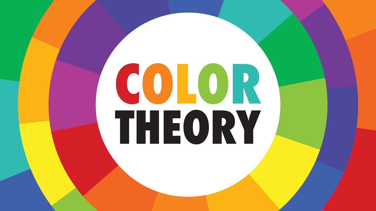
Art Teachers HATE this trick | COLOR THEORY | Drawlikeasir
Summary
TLDRThe video introduces the fundamentals of color theory, guiding viewers through concepts like hue, value, and saturation. The creator uses various artwork examples to explain how color choices impact the mood and harmony of a piece, demonstrating techniques like monochromatic schemes, analogous colors, and complementary contrast. A focus is also placed on the importance of color context and aerial perspective to enhance the overall composition. The video aims to equip both digital and traditional artists with practical knowledge to improve their use of color in art while promoting a new art calendar and magazine.
Takeaways
- 🎨 Colour theory is essential to understanding how to use colours effectively in art, whether for backgrounds, humans, comics, or other forms of media.
- 🔵 The first colour that comes to mind for the mast of the ship is 'blue' or 'bluish hue.'
- 🟡 Hue refers to the type of colour, such as red, green, or blue. Value is the brightness of the colour, and saturation measures the intensity of the colour.
- 🖍️ Artists often mistakenly choose the most intense colours for their work, but balance between intense and muted colours is key for better results.
- 🖼️ Monochromatic schemes (using one hue in various values and saturations) and analogous schemes (using hues next to each other on the colour wheel) create harmony and soothing effects in artwork.
- 🔄 Complementary contrasts (colours opposite on the colour wheel) create vibrant but tricky compositions, while triad schemes (using three evenly spaced colours) can make artwork more dynamic.
- 🌳 The aerial perspective technique, where colours in the background shift toward blue and become lighter and less saturated, makes artworks feel more integrated and realistic.
- 👥 Colour context is important: the same colour can look different based on its surrounding colours, as seen with skin tones in contrast to the background.
- 🖼️ Artists should plan their colour schemes before starting to paint, thinking about the overall mood they want to create using the colour wheel.
- 📚 The speaker offers a calendar featuring some of their best artworks, combined with a making-of magazine that details the process behind each artwork.
Q & A
What is the significance of the 'blue' color in the quiz at the start of the video?
-The 'blue' color was used to introduce the concept of color and ease viewers into the subject of color theory, highlighting how colors can be interpreted differently based on individual perception.
What are the three basic elements of color theory mentioned in the video?
-The three basic elements of color theory mentioned are Hue (the actual color, like red, blue, green), Value (the brightness or darkness of the color), and Saturation (the intensity of the color).
Why do digital artists often make mistakes with highly saturated colors?
-Digital artists often mistakenly think that intense colors are always better, using the most saturated hues, but this can lead to unbalanced or garish artwork. Understanding when to use softer, less saturated colors is crucial for achieving harmony.
What is a monochromatic color scheme, and how is it used in art?
-A monochromatic color scheme uses variations of a single hue by adjusting its brightness (value) and saturation. It creates harmonious and often soothing artwork, as seen in the artist’s older blue-toned works.
What is the difference between analogous and complementary color schemes?
-Analogous color schemes use colors that are next to each other on the color wheel, creating harmony and softness, while complementary color schemes use colors that are opposite on the wheel, creating contrast and visual interest.
What is 'aerial perspective' and how does it affect colors in artwork?
-'Aerial perspective' refers to the phenomenon where objects in the background appear more blueish and less saturated as they get farther away. This technique helps create depth and makes the environment feel more realistic.
How does color context affect how we perceive colors in a painting?
-Color context refers to how surrounding colors influence the perception of a specific color. For example, a red color can appear more intense or dull depending on the colors around it, like how skin tones seem darker on a white background.
What role does saturation play in creating harmonious or contrasting color schemes?
-Saturation plays a key role in determining the intensity of a color. More saturated colors are bold and intense, while less saturated colors are softer. Understanding how to balance these elements can create harmony or deliberate contrast in an artwork.
Why is planning your color scheme before painting important?
-Planning your color scheme beforehand helps ensure your artwork has a consistent mood and balance. Using tools like the color wheel allows artists to make informed choices about which hues, values, and saturation levels will work best together.
What is the purpose of the artist's cheat sheet mentioned at the end of the video?
-The cheat sheet is designed to provide viewers with basic information on color theory, offering a quick reference guide to the key concepts covered in the video, such as hue, saturation, value, and color schemes.
Outlines

Этот раздел доступен только подписчикам платных тарифов. Пожалуйста, перейдите на платный тариф для доступа.
Перейти на платный тарифMindmap

Этот раздел доступен только подписчикам платных тарифов. Пожалуйста, перейдите на платный тариф для доступа.
Перейти на платный тарифKeywords

Этот раздел доступен только подписчикам платных тарифов. Пожалуйста, перейдите на платный тариф для доступа.
Перейти на платный тарифHighlights

Этот раздел доступен только подписчикам платных тарифов. Пожалуйста, перейдите на платный тариф для доступа.
Перейти на платный тарифTranscripts

Этот раздел доступен только подписчикам платных тарифов. Пожалуйста, перейдите на платный тариф для доступа.
Перейти на платный тарифПосмотреть больше похожих видео

COLOR THEORY BASICS: Use the Color Wheel & Color Harmonies to Choose Colors that Work Well Together

Beginning Graphic Design: Color

Color Theory for Noobs | Beginner Guide

The Basics of Color Theory for Beginners | Canva Live

Bingung Color Theory? Tonton video ini.

Color Theory in Fashion: How to Style Color ☆
5.0 / 5 (0 votes)
