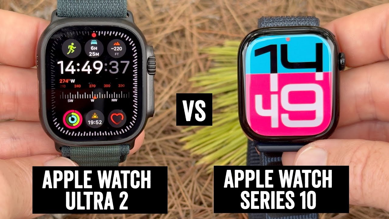
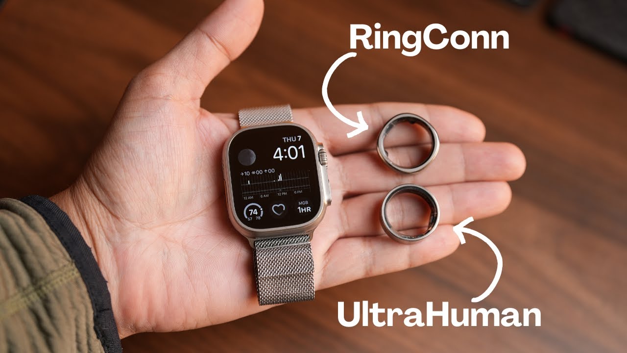
Apple Watch Ultra 2 Review: A Surprising Productivity Device
Summary
TLDRIn this video, the reviewer shares their three-week experience with the Apple Watch Ultra 2, highlighting the benefits of its larger screen size, which enhances app usage and typing ease. They discuss the device's design, comparing it to the Series 7, and appreciate the new modular Ultra watch face and orange accents. Sponsored by Surfshark, the video also covers the watch's improved screen brightness, the practicality of the action button, and the impressive battery life. The reviewer explores complications and the new double-tap feature in watchOS 10.1, concluding that the Ultra is a significant upgrade from their previous Series 7 watch.
Takeaways
- 😀 The user has been using the Apple Watch Ultra 2 for three weeks and is enjoying the experience, especially the larger screen size.
- 📱 The bigger screen makes it easier to use different apps and type, reducing the need to switch to an iPhone.
- 🏞️ The design of the Ultra 2 is similar to the original Ultra, with no significant changes, but the user appreciates the new look compared to the Series 7.
- 🏋️♂️ The Ultra is larger and thicker than the Series watch, but the user finds it comfortable and well-suited to their big hands.
- 🔋 The battery life of the Ultra 2 is excellent, providing all-day use without needing mid-day charging.
- 🌞 The screen brightness on the Ultra 2 is significantly improved, making it highly readable even in direct sunlight.
- 🎨 The user is using the new modular Ultra watch face and the ultra blue color theme to embrace the tech look of the watch.
- 🛠️ The Action button on the Ultra is a great addition, providing quick access to shortcuts and functions.
- 💬 Siri and dictation on the Ultra 2 are much improved with the S9 chip, offering faster and more accurate responses.
- 📊 The user has set up various complications on the watch face for quick access to weather, calendar, music control, and task management.
Q & A
What is the main difference the user noticed when switching from the Series 7 to the Apple Watch Ultra 2?
-The main difference the user noticed was the bigger screen size, which makes it easier to use different apps and type on it, reducing the need to switch to the iPhone frequently.
How does the design of the Apple Watch Ultra 2 compare to the original Apple Watch Ultra?
-The design of the Apple Watch Ultra 2 is the same as the original Apple Watch Ultra; they are indistinguishable when placed side by side.
What was the user's initial concern about the size of the Apple Watch Ultra 2?
-The user was initially concerned that the Apple Watch Ultra 2 would be too big and heavy compared to the regular series watch, but found it to look good and not feel heavy on the wrist.
What is the user's opinion on the color options for the Apple Watch Ultra 2?
-The user finds the color options limited, as it only comes in a silver titanium look with orange accents, but appreciates the aesthetic appeal of the design.
Which watch face and complications is the user currently using on the Apple Watch Ultra 2?
-The user is using the new modular Ultra watch face with the ultra blue color theme and small hour, minute, and second clock complications.
How does the user utilize the action button on the Apple Watch Ultra 2?
-The user has set up a shortcut called 'Action Cut' for the action button, which adapts to different contexts and provides various options depending on the situation.
What is the user's experience with the battery life of the Apple Watch Ultra 2?
-The user finds the battery life of the Apple Watch Ultra 2 to be excellent, providing all-day battery life and not requiring charging halfway through the day.
How does the S9 chip impact the functionality of the Apple Watch Ultra 2?
-The S9 chip enables on-device Siri, making Siri queries faster and more responsive, and improves the accuracy of dictation on the watch.
What is the user's take on the new double-tap feature in watchOS 10.1?
-The user appreciates the convenience of the double-tap feature for quick actions like answering phone calls and controlling music playback but finds it limiting as it does not have a third-party API for app integration.
How does the user view the Apple Watch Ultra 2 as a productivity device?
-The user sees the Apple Watch Ultra 2 as a productivity device, using it for tasks like controlling music playback, answering calls, responding to texts, and managing tasks without needing the iPhone.
Outlines

Этот раздел доступен только подписчикам платных тарифов. Пожалуйста, перейдите на платный тариф для доступа.
Перейти на платный тарифMindmap

Этот раздел доступен только подписчикам платных тарифов. Пожалуйста, перейдите на платный тариф для доступа.
Перейти на платный тарифKeywords

Этот раздел доступен только подписчикам платных тарифов. Пожалуйста, перейдите на платный тариф для доступа.
Перейти на платный тарифHighlights

Этот раздел доступен только подписчикам платных тарифов. Пожалуйста, перейдите на платный тариф для доступа.
Перейти на платный тарифTranscripts

Этот раздел доступен только подписчикам платных тарифов. Пожалуйста, перейдите на платный тариф для доступа.
Перейти на платный тарифПосмотреть больше похожих видео

Likes and Dislikes After 2 Weeks With the OnePlus Watch 2R

Apple Watch 10 vs Ultra 2 vs SE: Which Should You Buy?

Ultrawides Are The Best for Productivity and Here Are 5 Reasons Why

Apple Watch Ultra 2 vs Apple Watch Series 10: Every single difference explained!

Apple Watch Ultra 2! HONEST One-Year Long Term Review!

Apple Watch Ultra Vs Smart Rings | My Experience With Ultrahuman Ring Air and Ringconn Gen1/2 |
5.0 / 5 (0 votes)
