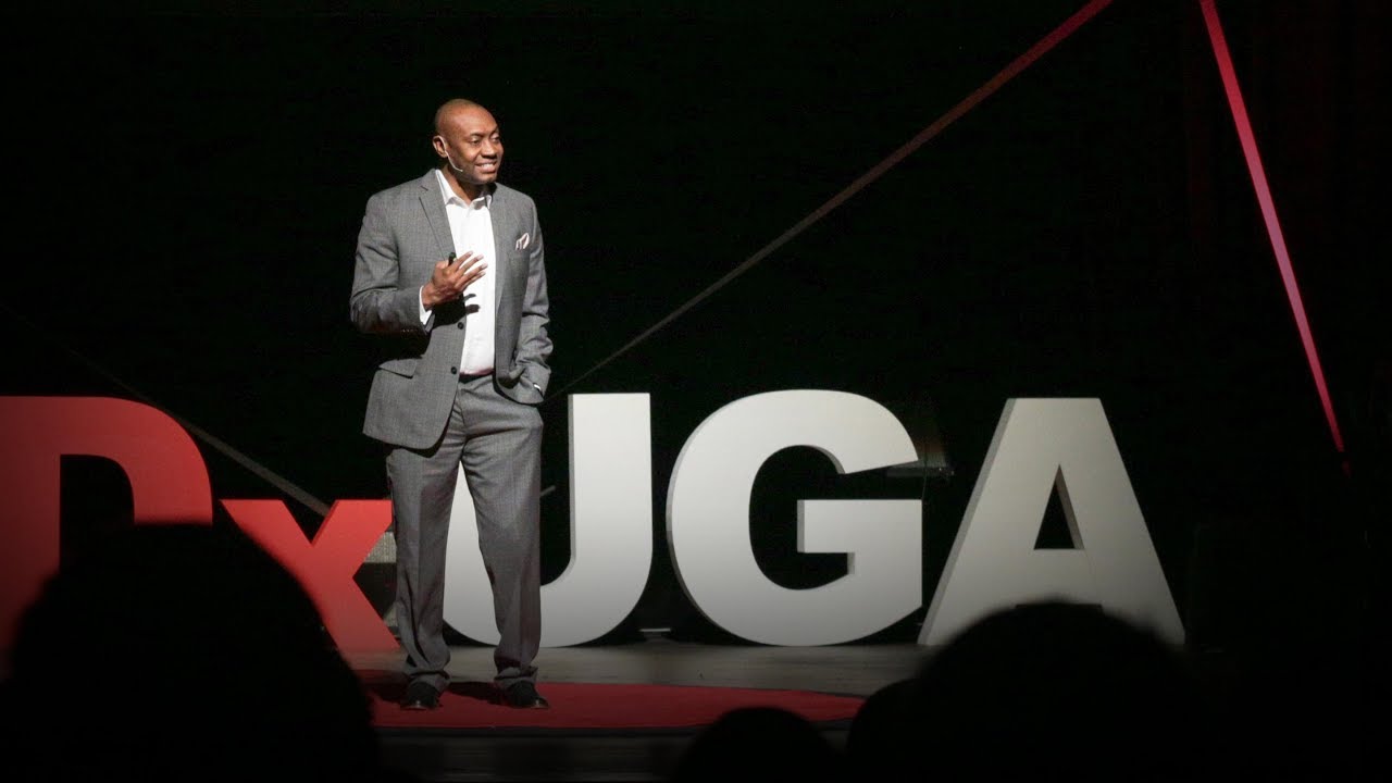
3 ways to spot a bad statistic | Mona Chalabi

TED
17 Apr 201711:45

Summary

TLDRThis talk addresses the skepticism surrounding statistics, particularly those from government sources. The speaker emphasizes the importance of discerning reliable numbers and provides tools to evaluate them. They critique the overconfidence in polling data and suggest hand-drawn visualizations to communicate uncertainty. The talk also stresses the need to see oneself in the data and to question how it was collected, advocating for a nuanced understanding of statistics to inform public policy and debate.

Takeaways

  • 🧐 **Skepticism in Numbers**: The speaker encourages skepticism towards numbers, especially those from government sources, to discern reliable from unreliable statistics.
  • 📊 **Questioning Statistics**: The discussion highlights the importance of questioning statistics like unemployment rates, which are often distrusted by a significant portion of the population.
  • 🌐 **Impact of Distrust**: Distrust in government economic data can lead to societal divisions and affect public policy, as people's relationships with these numbers can vary greatly.
  • 📉 **The Need for Objectivity**: There's a call for the use of statistics to move beyond emotional anecdotes and measure societal progress in an objective manner.
  • 🚫 **Critique of Elitism**: Some view government statistics as elitist or rigged, not reflecting everyday realities, leading to a debate on their validity and utility.
  • 📈 **The Role of Data in Policymaking**: Good data is essential for creating fair policies; without it, it's challenging to address issues like discrimination, healthcare, and immigration.
  • ❓ **Spotting Bad Statistics**: The speaker shares three key questions to ask when evaluating statistics: visibility of uncertainty, personal relevance in the data, and the method of data collection.
  • 📋 **Uncertainty in Data**: The importance of recognizing and communicating uncertainty in data is emphasized, suggesting that data visualizations should reflect this to avoid misleading interpretations.
  • 👁️ **Seeing Yourself in the Data**: Data should be relatable and relevant to individuals, prompting a deeper understanding of how it affects different segments of society.
  • 🔍 **Methodology Matters**: The way data is collected is critical, and understanding methodologies can help identify potential biases or inaccuracies in the data.

Q & A

  • What is the speaker's overall goal in the talk?

    -The speaker's goal is to provide tools to help people distinguish between reliable and unreliable statistics. They want to encourage skepticism but also emphasize the importance of government data for informed decision-making.

  • Why does the speaker believe it's important to be skeptical of statistics?

    -The speaker argues that skepticism is crucial because numbers, especially those reported in the media or by private companies, can be misleading or manipulated. Being skeptical allows people to critically evaluate the accuracy and reliability of the statistics.

  • How does the speaker differentiate between private and government statistics?

    -The speaker explains that private companies may not prioritize accuracy and may present statistics in a way that benefits their agenda. In contrast, government statistics, while also subject to scrutiny, are generally collected impartially by civil servants and cover a much larger data set.

  • What is the problem with polling accuracy, according to the speaker?

    -The speaker points out several issues with polling accuracy, including the difficulty in obtaining a representative sample, people's reluctance to answer polls, and the possibility of respondents lying. Polling has become less reliable due to the diversity of modern societies.

  • Why does the speaker criticize how data is often visualized?

    -The speaker criticizes data visualizations for overstating certainty. They argue that sleek charts can make statistics seem more objective than they really are, which can numb people's critical thinking and make them accept the data without question.

  • What three questions does the speaker recommend asking to spot bad statistics?

    -The three questions are: 1) Can you see uncertainty in the data? 2) Can you see yourself in the data? 3) How was the data collected?

  • What does the speaker mean by asking 'Can you see uncertainty in the data?'

    -This question encourages people to assess whether the data accounts for variability or imprecision. The speaker argues that some visualizations make data appear more precise than it is, and it's important to recognize the uncertainty behind numbers.

  • What is the importance of asking 'Can I see myself in the data?'?

    -This question is about making sure that the data reflects personal or societal realities. It encourages people to question whether broad averages or generalizations match their own experiences or the experiences of others.

  • Why is understanding how data was collected crucial?

    -The methodology behind data collection can greatly impact the results. The speaker emphasizes that knowing how data was gathered—whether through a reliable process or not—helps determine the accuracy and reliability of the statistics.

  • What example does the speaker use to illustrate misleading data collection?

    -The speaker uses a poll that claimed 41% of Muslims in the US support jihad. Upon further examination, it turned out the majority defined 'jihad' as a personal struggle, not violent action. The poll also had methodological flaws, such as being an opt-in poll and having a very small sample size.

Outlines

00:00

📊 The Importance of Questioning Statistics

The speaker begins by acknowledging the skepticism some people have towards statistics, suggesting that it's healthy to question numbers, especially those from the government. They highlight the distrust in economic data, with a significant portion of Americans, and Trump supporters in particular, expressing doubt. The speaker emphasizes the need for discerning reliable numbers from unreliable ones and discusses the societal divides that stem from differing relationships with government statistics. They argue for the necessity of accurate statistics for policy-making and societal progress, while also advocating for critical engagement with these numbers.

05:00

📈 The Pitfalls of Data Visualization and Polling

In this section, the speaker critiques the use of political polls and their impact on public trust, arguing that they often overstate certainty and mislead the public. They discuss the inaccuracies in polling, such as the failure to capture diverse populations and the reluctance of people to participate honestly. The speaker also addresses the issue of data visualization, suggesting that charts can sometimes numb critical thinking. They propose hand-drawn visualizations as a more transparent method to communicate the imprecision of data, and they use examples like flu season probabilities and swimming pool fecal accidents to illustrate their point.

10:03

🗳️ Understanding Data Collection and Its Impact

The final paragraph delves into the importance of understanding how data is collected, arguing that it's as crucial as how it's communicated. The speaker uses an example of a poll suggesting a high percentage of Muslims supporting jihad, critiquing the methodology and highlighting how the definition of 'jihad' varied among respondents. They discuss the potential biases in opt-in polls and contrast them with government statistics, which are generally more reliable due to their larger sample sizes and impartiality. The speaker concludes by urging the audience not to dismiss numbers but to continually scrutinize them to ensure informed public policy decisions.

Mindmap

Keywords

💡Statistics

Statistics refers to the numerical data used to analyze, measure, and understand various aspects of society. In the video, the speaker emphasizes the importance of being skeptical yet informed about the statistics we encounter, especially those reported by the government or media.

💡Uncertainty

Uncertainty highlights the idea that not all numbers or statistics are precise. The speaker argues that showing uncertainty in data, such as through hand-drawn visualizations, helps people better understand the imprecision behind seemingly concrete numbers like political polls.

💡Polling

Polling is the process of gathering data to predict outcomes, often in politics. The speaker is critical of political polls, stating that they can be misleading due to sampling errors, societal diversity, and people’s reluctance to provide accurate responses.

💡Averages

Averages are a statistical measure often used to summarize data. The speaker explains that averages can be misleading, using examples like the average number of 'fecal accidents' in pools, which may not accurately represent the true distribution of incidents.

💡Data visualization

Data visualization refers to the graphical representation of data to make it easier to understand. The speaker warns that sleek, professional charts can create a false sense of certainty, while hand-drawn or imprecise visualizations may better convey the uncertainties in the data.

💡Government statistics

Government statistics are numerical data collected and published by government agencies. The speaker stresses their importance in forming fair public policies and criticizes moves to eliminate certain types of data collection, such as statistics on racial inequality.

💡Alternative facts

Alternative facts refer to distorted or misleading information that people use instead of objective data. The speaker highlights the current problem of 'alternative facts' dominating public discourse, causing people to mistrust or reject well-established statistics.

💡Representation in data

Representation in data means ensuring that the data reflects the experiences and perspectives of different groups in society. The speaker discusses how people can feel excluded from national statistics because averages do not always represent personal experiences, making it important to ask if one sees themselves in the data.

💡Methodology

Methodology refers to the process used to collect and analyze data. The speaker emphasizes that understanding how data is collected, such as whether a poll was opt-in or representative, is essential for assessing the validity of statistics.

💡Bias in statistics

Bias in statistics occurs when data is collected or presented in a way that favors certain outcomes or perspectives. The speaker illustrates this with an example of a poll about Muslims supporting jihad, where misreporting and selective presentation of results led to a distorted interpretation.

Highlights

The importance of being skeptical about statistics and learning to discern reliable numbers.

The difference between distrusting private company claims and questioning government statistics.

The high level of distrust in economic data among certain demographics, including Trump supporters.

The societal divide that starts to make sense when understanding people's relationships with government numbers.

The necessity of statistics for making sense of society and measuring progress objectively.

The argument that statistics are elitist and may not reflect everyday life experiences.

The current trend towards 'alternative facts' and the dismissal of statistics as a common ground for debate.

Legislative moves in the US to eliminate certain government statistics, such as those measuring racial inequality.

The critical role of data in observing and addressing discrimination, as well as in formulating fair policies.

The need to move beyond blindly accepting or rejecting government numbers and to learn how to spot bad statistics.

The challenges faced in a statistical department of the United Nations, particularly in data accuracy.

The idea that making numbers more accurate involves enabling more people to question them.

Three key questions to help spot bad statistics: seeing uncertainty, recognizing oneself in the data, and understanding data collection methods.

The impact of political polls on trust in numbers and media, and the inaccuracy of using polls to predict electoral outcomes.

The overstatement of certainty in data visualizations and the importance of communicating uncertainty.

The concept of averages and how they can be misleading, illustrated through a hand-drawn visualization of swimming pool fecal accidents.

The importance of seeing oneself in the data and understanding how statistics relate to personal experiences.

The significance of the axes in data visualization and how changing the scale can alter the story told by the data.

The importance of scrutinizing the data collection methods and the potential issues with opt-in polls.

The contrast between government and private statistics, with the former being more reliable due to larger sample sizes and impartiality.

The call to not give up on numbers but to question them critically to avoid making public policy decisions in the dark.

Transcripts

play00:12

I'm going to be talking about statistics today.

play00:15

If that makes you immediately feel a little bit wary, that's OK,

play00:18

that doesn't make you some kind of crazy conspiracy theorist,

play00:21

it makes you skeptical.

play00:22

And when it comes to numbers, especially now, you should be skeptical.

play00:26

But you should also be able to tell which numbers are reliable

play00:29

and which ones aren't.

play00:30

So today I want to try to give you some tools to be able to do that.

play00:34

But before I do,

play00:35

I just want to clarify which numbers I'm talking about here.

play00:38

I'm not talking about claims like,

play00:39

"9 out of 10 women recommend this anti-aging cream."

play00:42

I think a lot of us always roll our eyes at numbers like that.

play00:45

What's different now is people are questioning statistics like,

play00:48

"The US unemployment rate is five percent."

play00:50

What makes this claim different is it doesn't come from a private company,

play00:53

it comes from the government.

play00:55

About 4 out of 10 Americans distrust the economic data

play00:58

that gets reported by government.

play01:00

Among supporters of President Trump it's even higher;

play01:02

it's about 7 out of 10.

play01:04

I don't need to tell anyone here

play01:06

that there are a lot of dividing lines in our society right now,

play01:09

and a lot of them start to make sense,

play01:11

once you understand people's relationships with these government numbers.

play01:14

On the one hand, there are those who say these statistics are crucial,

play01:18

that we need them to make sense of society as a whole

play01:20

in order to move beyond emotional anecdotes

play01:23

and measure progress in an [objective] way.

play01:25

And then there are the others,

play01:27

who say that these statistics are elitist,

play01:29

maybe even rigged;

play01:30

they don't make sense and they don't really reflect

play01:32

what's happening in people's everyday lives.

play01:35

It kind of feels like that second group is winning the argument right now.

play01:38

We're living in a world of alternative facts,

play01:40

where people don't find statistics this kind of common ground,

play01:43

this starting point for debate.

play01:45

This is a problem.

play01:46

There are actually moves in the US right now

play01:48

to get rid of some government statistics altogether.

play01:51

Right now there's a bill in congress about measuring racial inequality.

play01:55

The draft law says that government money should not be used

play01:58

to collect data on racial segregation.

play01:59

This is a total disaster.

play02:01

If we don't have this data,

play02:03

how can we observe discrimination,

play02:05

let alone fix it?

play02:06

In other words:

play02:07

How can a government create fair policies

play02:10

if they can't measure current levels of unfairness?

play02:12

This isn't just about discrimination,

play02:14

it's everything -- think about it.

play02:16

How can we legislate on health care

play02:18

if we don't have good data on health or poverty?

play02:20

How can we have public debate about immigration

play02:22

if we can't at least agree

play02:23

on how many people are entering and leaving the country?

play02:26

Statistics come from the state; that's where they got their name.

play02:29

The point was to better measure the population

play02:31

in order to better serve it.

play02:33

So we need these government numbers,

play02:34

but we also have to move beyond either blindly accepting

play02:37

or blindly rejecting them.

play02:38

We need to learn the skills to be able to spot bad statistics.

play02:41

I started to learn some of these

play02:43

when I was working in a statistical department

play02:45

that's part of the United Nations.

play02:47

Our job was to find out how many Iraqis had been forced from their homes

play02:50

as a result of the war,

play02:51

and what they needed.

play02:53

It was really important work, but it was also incredibly difficult.

play02:56

Every single day, we were making decisions

play02:58

that affected the accuracy of our numbers --

play03:00

decisions like which parts of the country we should go to,

play03:03

who we should speak to,

play03:04

which questions we should ask.

play03:06

And I started to feel really disillusioned with our work,

play03:08

because we thought we were doing a really good job,

play03:11

but the one group of people who could really tell us were the Iraqis,

play03:14

and they rarely got the chance to find our analysis, let alone question it.

play03:18

So I started to feel really determined

play03:20

that the one way to make numbers more accurate

play03:22

is to have as many people as possible be able to question them.

play03:25

So I became a data journalist.

play03:26

My job is finding these data sets and sharing them with the public.

play03:30

Anyone can do this, you don't have to be a geek or a nerd.

play03:34

You can ignore those words; they're used by people

play03:36

trying to say they're smart while pretending they're humble.

play03:39

Absolutely anyone can do this.

play03:40

I want to give you guys three questions

play03:42

that will help you be able to spot some bad statistics.

play03:45

So, question number one is: Can you see uncertainty?

play03:49

One of things that's really changed people's relationship with numbers,

play03:52

and even their trust in the media,

play03:54

has been the use of political polls.

play03:56

I personally have a lot of issues with political polls

play03:59

because I think the role of journalists is actually to report the facts

play04:02

and not attempt to predict them,

play04:04

especially when those predictions can actually damage democracy

play04:07

by signaling to people: don't bother to vote for that guy,

play04:10

he doesn't have a chance.

play04:11

Let's set that aside for now and talk about the accuracy of this endeavor.

play04:15

Based on national elections in the UK, Italy, Israel

play04:19

and of course, the most recent US presidential election,

play04:22

using polls to predict electoral outcomes

play04:24

is about as accurate as using the moon to predict hospital admissions.

play04:28

No, seriously, I used actual data from an academic study to draw this.

play04:32

There are a lot of reasons why polling has become so inaccurate.

play04:36

Our societies have become really diverse,

play04:38

which makes it difficult for pollsters to get a really nice representative sample

play04:42

of the population for their polls.

play04:43

People are really reluctant to answer their phones to pollsters,

play04:46

and also, shockingly enough, people might lie.

play04:49

But you wouldn't necessarily know that to look at the media.

play04:52

For one thing, the probability of a Hillary Clinton win

play04:54

was communicated with decimal places.

play04:57

We don't use decimal places to describe the temperature.

play05:00

How on earth can predicting the behavior of 230 million voters in this country

play05:04

be that precise?

play05:06

And then there were those sleek charts.

play05:08

See, a lot of data visualizations will overstate certainty, and it works --

play05:12

these charts can numb our brains to criticism.

play05:15

When you hear a statistic, you might feel skeptical.

play05:17

As soon as it's buried in a chart,

play05:19

it feels like some kind of objective science,

play05:21

and it's not.

play05:22

So I was trying to find ways to better communicate this to people,

play05:25

to show people the uncertainty in our numbers.

play05:28

What I did was I started taking real data sets,

play05:30

and turning them into hand-drawn visualizations,

play05:33

so that people can see how imprecise the data is;

play05:36

so people can see that a human did this,

play05:38

a human found the data and visualized it.

play05:40

For example, instead of finding out the probability

play05:42

of getting the flu in any given month,

play05:44

you can see the rough distribution of flu season.

play05:47

This is --

play05:48

(Laughter)

play05:49

a bad shot to show in February.

play05:51

But it's also more responsible data visualization,

play05:53

because if you were to show the exact probabilities,

play05:56

maybe that would encourage people to get their flu jabs

play05:59

at the wrong time.

play06:00

The point of these shaky lines

play06:02

is so that people remember these imprecisions,

play06:05

but also so they don't necessarily walk away with a specific number,

play06:08

but they can remember important facts.

play06:10

Facts like injustice and inequality leave a huge mark on our lives.

play06:14

Facts like Black Americans and Native Americans have shorter life expectancies

play06:19

than those of other races,

play06:20

and that isn't changing anytime soon.

play06:22

Facts like prisoners in the US can be kept in solitary confinement cells

play06:26

that are smaller than the size of an average parking space.

play06:30

The point of these visualizations is also to remind people

play06:33

of some really important statistical concepts,

play06:36

concepts like averages.

play06:37

So let's say you hear a claim like,

play06:39

"The average swimming pool in the US contains 6.23 fecal accidents."

play06:43

That doesn't mean every single swimming pool in the country

play06:46

contains exactly 6.23 turds.

play06:48

So in order to show that,

play06:50

I went back to the original data, which comes from the CDC,

play06:53

who surveyed 47 swimming facilities.

play06:55

And I just spent one evening redistributing poop.

play06:57

So you can kind of see how misleading averages can be.

play07:00

(Laughter)

play07:01

OK, so the second question that you guys should be asking yourselves

play07:05

to spot bad numbers is:

play07:07

Can I see myself in the data?

play07:09

This question is also about averages in a way,

play07:12

because part of the reason why people are so frustrated

play07:14

with these national statistics,

play07:16

is they don't really tell the story of who's winning and who's losing

play07:19

from national policy.

play07:20

It's easy to understand why people are frustrated with global averages

play07:24

when they don't match up with their personal experiences.

play07:26

I wanted to show people the way data relates to their everyday lives.

play07:30

I started this advice column called "Dear Mona,"

play07:32

where people would write to me with questions and concerns

play07:35

and I'd try to answer them with data.

play07:36

People asked me anything.

play07:38

questions like, "Is it normal to sleep in a separate bed to my wife?"

play07:41

"Do people regret their tattoos?"

play07:43

"What does it mean to die of natural causes?"

play07:45

All of these questions are great, because they make you think

play07:48

about ways to find and communicate these numbers.

play07:50

If someone asks you, "How much pee is a lot of pee?"

play07:53

which is a question that I got asked,

play07:55

you really want to make sure that the visualization makes sense

play07:58

to as many people as possible.

play08:00

These numbers aren't unavailable.

play08:01

Sometimes they're just buried in the appendix of an academic study.

play08:05

And they're certainly not inscrutable;

play08:07

if you really wanted to test these numbers on urination volume,

play08:10

you could grab a bottle and try it for yourself.

play08:12

(Laughter)

play08:13

The point of this isn't necessarily

play08:15

that every single data set has to relate specifically to you.

play08:18

I'm interested in how many women were issued fines in France

play08:21

for wearing the face veil, or the niqab,

play08:23

even if I don't live in France or wear the face veil.

play08:25

The point of asking where you fit in is to get as much context as possible.

play08:29

So it's about zooming out from one data point,

play08:31

like the unemployment rate is five percent,

play08:34

and seeing how it changes over time,

play08:35

or seeing how it changes by educational status --

play08:38

this is why your parents always wanted you to go to college --

play08:41

or seeing how it varies by gender.

play08:43

Nowadays, male unemployment rate is higher

play08:45

than the female unemployment rate.

play08:47

Up until the early '80s, it was the other way around.

play08:50

This is a story of one of the biggest changes

play08:52

that's happened in American society,

play08:54

and it's all there in that chart, once you look beyond the averages.

play08:57

The axes are everything;

play08:58

once you change the scale, you can change the story.

play09:01

OK, so the third and final question that I want you guys to think about

play09:04

when you're looking at statistics is:

play09:06

How was the data collected?

play09:09

So far, I've only talked about the way data is communicated,

play09:12

but the way it's collected matters just as much.

play09:14

I know this is tough,

play09:15

because methodologies can be opaque and actually kind of boring,

play09:19

but there are some simple steps you can take to check this.

play09:21

I'll use one last example here.

play09:24

One poll found that 41 percent of Muslims in this country support jihad,

play09:28

which is obviously pretty scary,

play09:29

and it was reported everywhere in 2015.

play09:32

When I want to check a number like that,

play09:34

I'll start off by finding the original questionnaire.

play09:37

It turns out that journalists who reported on that statistic

play09:40

ignored a question lower down on the survey

play09:42

that asked respondents how they defined "jihad."

play09:44

And most of them defined it as,

play09:46

"Muslims' personal, peaceful struggle to be more religious."

play09:50

Only 16 percent defined it as, "violent holy war against unbelievers."

play09:55

This is the really important point:

play09:57

based on those numbers, it's totally possible

play09:59

that no one in the survey who defined it as violent holy war

play10:02

also said they support it.

play10:04

Those two groups might not overlap at all.

play10:06

It's also worth asking how the survey was carried out.

play10:09

This was something called an opt-in poll,

play10:11

which means anyone could have found it on the internet and completed it.

play10:15

There's no way of knowing if those people even identified as Muslim.

play10:18

And finally, there were 600 respondents in that poll.

play10:21

There are roughly three million Muslims in this country,

play10:23

according to Pew Research Center.

play10:25

That means the poll spoke to roughly one in every 5,000 Muslims

play10:28

in this country.

play10:29

This is one of the reasons

play10:30

why government statistics are often better than private statistics.

play10:34

A poll might speak to a couple hundred people, maybe a thousand,

play10:37

or if you're L'Oreal, trying to sell skin care products in 2005,

play10:40

then you spoke to 48 women to claim that they work.

play10:43

(Laughter)

play10:44

Private companies don't have a huge interest in getting the numbers right,

play10:47

they just need the right numbers.

play10:49

Government statisticians aren't like that.

play10:51

In theory, at least, they're totally impartial,

play10:53

not least because most of them do their jobs regardless of who's in power.

play10:57

They're civil servants.

play10:58

And to do their jobs properly,

play11:00

they don't just speak to a couple hundred people.

play11:03

Those unemployment numbers I keep on referencing

play11:05

come from the Bureau of Labor Statistics,

play11:07

and to make their estimates,

play11:08

they speak to over 140,000 businesses in this country.

play11:12

I get it, it's frustrating.

play11:14

If you want to test a statistic that comes from a private company,

play11:17

you can buy the face cream for you and a bunch of friends, test it out,

play11:20

if it doesn't work, you can say the numbers were wrong.

play11:23

But how do you question government statistics?

play11:25

You just keep checking everything.

play11:27

Find out how they collected the numbers.

play11:28

Find out if you're seeing everything on the chart you need to see.

play11:32

But don't give up on the numbers altogether, because if you do,

play11:35

we'll be making public policy decisions in the dark,

play11:37

using nothing but private interests to guide us.

play11:39

Thank you.

play11:41

(Applause)

Rate This

5.0 / 5 (0 votes)

Связанные теги
StatisticsSkepticismData AnalysisGovernment DataMedia TrustPoll AccuracyData VisualizationPublic PolicyHealthcareImmigration
Вам нужно краткое изложение на английском?