3 Simulasi Penyajian Data
Summary
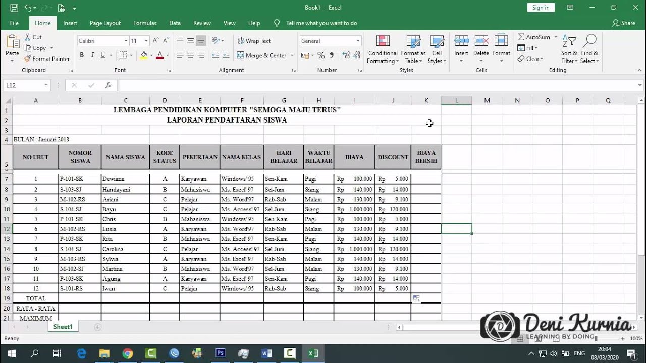
TLDRThis video provides a comprehensive guide on how to simulate, organize, and present student score data in Excel. It covers determining maximum and minimum scores, calculating class intervals, and using formulas like MAX, MIN, IF, and COUNTIF to categorize and count frequencies. The tutorial also explains creating cumulative frequencies and visualizing data using histograms, frequency polygons, and pie charts, emphasizing clarity and interpretability. Practical tips include rounding class widths, formatting Excel cells, and adjusting chart designs for readability. Viewers are encouraged to experiment with intervals, categories, and chart styles to effectively communicate data insights in educational or research contexts.
Takeaways
- 😀 Use Excel formulas to calculate maximum and minimum values for data sets to facilitate analysis.
- 😀 Determine class intervals by finding the range (difference between max and min values) and dividing by the number of classes.
- 😀 For data visualization, aim for 5-10 class intervals to simplify interpretation while maintaining accuracy.
- 😀 To calculate class width, divide the data range by the number of chosen classes. Adjust the width if needed.
- 😀 The IF function in Excel can categorize data into intervals based on specific conditions, making analysis easier.
- 😀 Use the COUNTIF function in Excel to count the number of entries within each category or interval.
- 😀 Ensure that the class intervals cover all the data, from the minimum to the maximum score, without missing any values.
- 😀 When using pie charts, limit the number of categories to avoid confusion. Use contrasting colors for better clarity.
- 😀 Pie charts are best suited for datasets with fewer categories (2-4), as too many sections can overwhelm the viewer.
- 😀 For cumulative frequency graphs (polygon charts), sum the frequencies from previous classes to create a running total.
- 😀 In Excel, you can easily transfer and format charts from one program to another (e.g., from Excel to Word) for presentation.
Q & A
What is the main objective of the video tutorial?
-The main objective of the video is to demonstrate how to simulate and present data using Excel, focusing on how to simplify and visualize data for better interpretation by teachers or researchers.
How is the maximum and minimum value of the data determined in Excel?
-In Excel, the maximum value is determined using the 'MAX' function, while the minimum value is determined using the 'MIN' function. These functions help identify the highest and lowest values in the dataset.
What is the recommended number of classes (intervals) to use when presenting data?
-The recommended number of classes is between 5 and 10, as this range helps to visualize and interpret the data effectively without having too few or too many intervals.
How do you calculate the class width or interval size in Excel?
-The class width is calculated by subtracting the minimum value from the maximum value and then dividing the result by the number of classes. This gives the width or size of each interval.
Why is it important to determine the class width before setting intervals?
-Determining the class width helps ensure that all data points are categorized correctly into intervals that are easy to interpret. It ensures that the intervals are evenly distributed and that data fits within the specified ranges.
What Excel function is used to categorize data into intervals?
-The 'IF' function is used in Excel to categorize data into intervals. It checks if a value falls within a specified range and assigns a category based on that range.
How can you calculate the frequency of data falling into specific categories in Excel?
-The 'COUNTIF' function is used to calculate the frequency of data that falls into specific categories. It counts the number of cells that meet a certain condition or criteria within a range.
What type of chart is recommended for visualizing frequency distributions in this tutorial?
-The tutorial recommends using histograms (bar charts) for visualizing frequency distributions, as they effectively display the distribution of data within specified intervals.
What is the recommended use of pie charts in data visualization according to the video?
-Pie charts are recommended for datasets with fewer categories (2-4 categories) because having too many slices in a pie chart can make it confusing. The use of contrasting colors is also advised for better clarity.
How should intervals be adjusted when using pie charts or other diagrams?
-When using pie charts or other diagrams, it’s important to ensure the intervals cover the entire range of data, from the minimum to the maximum values. The intervals should be adjusted carefully to avoid any gaps or overlaps in the data.
Outlines

このセクションは有料ユーザー限定です。 アクセスするには、アップグレードをお願いします。
今すぐアップグレードMindmap

このセクションは有料ユーザー限定です。 アクセスするには、アップグレードをお願いします。
今すぐアップグレードKeywords

このセクションは有料ユーザー限定です。 アクセスするには、アップグレードをお願いします。
今すぐアップグレードHighlights

このセクションは有料ユーザー限定です。 アクセスするには、アップグレードをお願いします。
今すぐアップグレードTranscripts

このセクションは有料ユーザー限定です。 アクセスするには、アップグレードをお願いします。
今すぐアップグレード関連動画をさらに表示

Mengubah data tunggal menjadi data berkelompok dengan MS Excel

Excel Tutorial - What is Excel used for?

STATISTIKA - Penyajian Data dengan SPSS untuk Pemula
Pembahasan Soal UKK Akuntansi 2019/2020 - Soal 2 Spreadsheet

Ringkasan Praktek Bab 6

Pengolahan Data Dasar Ms. Excel Part 2 - Informatika Kelas 7 SMP/ MTs
5.0 / 5 (0 votes)
