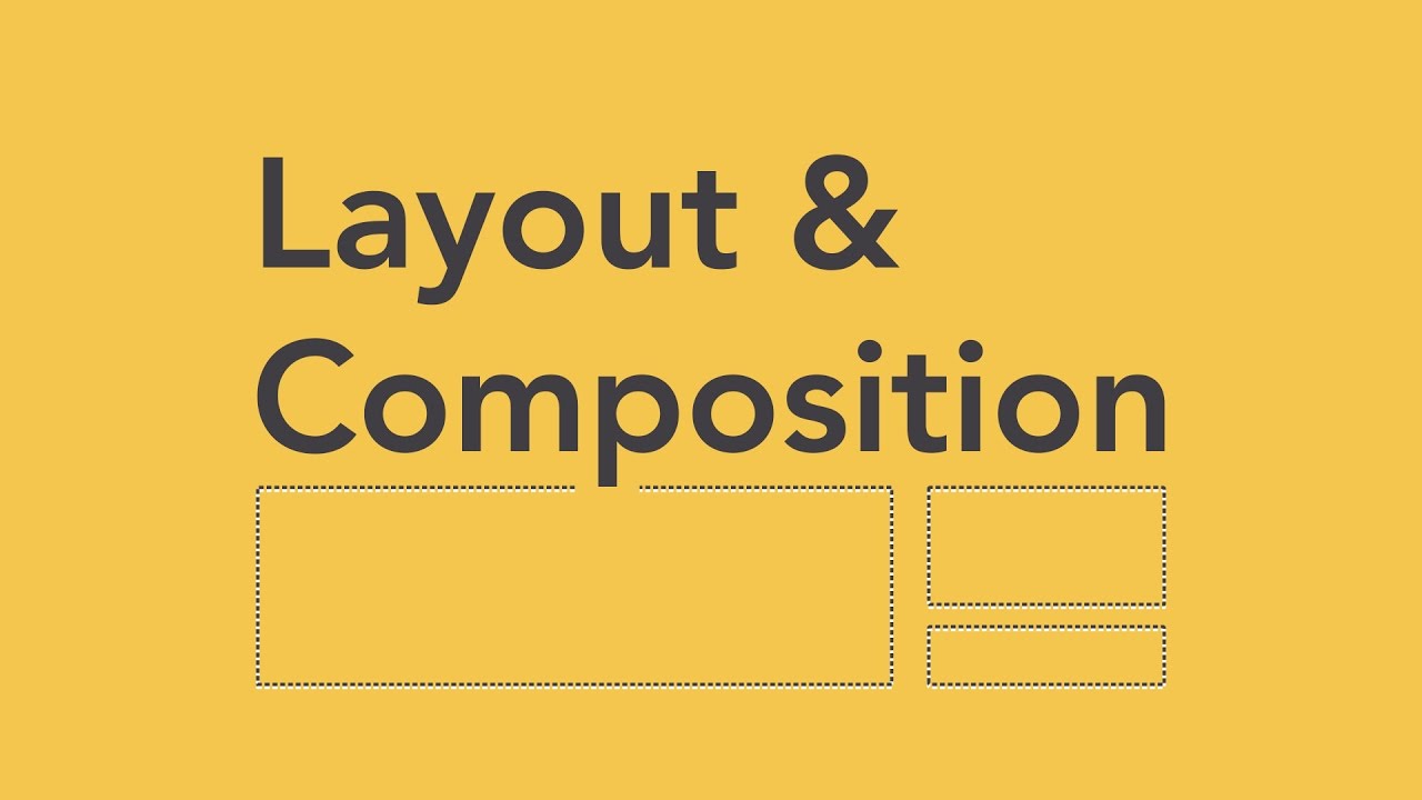
Complete Layout Guide
Summary
TLDRThis video introduces fundamental layout design principles: focal point, white space, and hierarchy. Focal points draw attention, regardless of their position in the layout, while white space provides visual rest, enhancing clarity and engagement. Hierarchy prioritizes elements to guide viewers, ensuring an effective design journey. Through real-world examples, the speaker illustrates how these principles create appealing and functional designs, contrasting successful layouts with ineffective ones. Mastering these basics empowers designers to balance creativity with usability, leading to impactful visual communication.
Takeaways
- 🎨 Understand the importance of layout principles to enhance creative expression without limiting creativity.
- 🔍 A focal point directs the viewer's attention and can be positioned off-center for more engaging designs.
- 📸 The rule of thirds is a critical guideline in photography that can also apply to layout design for increased interest.
- 🌌 White space serves as a visual rest area, allowing other elements to breathe and improving overall composition.
- 🎶 Just like music dynamics, effective layouts need a balance of loud and quiet elements for impact.
- 📊 Hierarchy prioritizes the most important elements in a design, ensuring clarity and ease of navigation.
- 🗺️ Effective orientation in layouts, such as maps, helps users find their bearings and understand where to go.
- 🖋️ Headlines should stand out more than body copy to establish a clear visual hierarchy.
- 🌐 Examples from well-designed websites highlight how focal points, white space, and hierarchy work together effectively.
- 🚫 Neglecting basic design principles can lead to confusing and ineffective layouts, as seen in a poorly designed website example.
Q & A
What are the three key principles of layout discussed in the video?
-The three key principles of layout discussed are focal point, white space, and hierarchy.
What is meant by 'focal point' in design?
-The focal point is the center of interest in a layout where the viewer's eye is drawn, which may not necessarily be at the center of the composition.
How can the rule of thirds enhance a composition?
-The rule of thirds suggests placing important elements along grid lines or at their intersections, which creates a more balanced and interesting composition.
What role does white space play in design?
-White space, or quiet areas of visual rest, allows other elements room to breathe, making designs easier to navigate and more aesthetically pleasing.
Why is hierarchy important in layout design?
-Hierarchy helps prioritize the most important elements, ensuring that key information stands out and is easily discernible, avoiding confusion in the layout.
Can you provide an example of how focal point and hierarchy work together?
-In a website layout, the main image might serve as the focal point, while the headline is given a larger font size to establish visual hierarchy, making it clear what the viewer should focus on.
What are some common mistakes designers make regarding these principles?
-Common mistakes include overcrowding designs, neglecting white space, and failing to establish a clear focal point or hierarchy, leading to confusing or unattractive layouts.
How does the speaker suggest improving design awareness?
-The speaker suggests training your eye to recognize these principles in existing designs and understanding why skilled designers made their choices.
What is the impact of using too much visual noise in a layout?
-Too much visual noise can overwhelm the viewer, making it difficult to identify the focal point and undermining the effectiveness of the design.
How does the Pantone website serve as an example of poor design principles?
-The Pantone website lacks a clear focal point and has excessive visual elements that compete for attention, illustrating the failure to adhere to focal point, white space, and hierarchy.
Outlines

このセクションは有料ユーザー限定です。 アクセスするには、アップグレードをお願いします。
今すぐアップグレードMindmap

このセクションは有料ユーザー限定です。 アクセスするには、アップグレードをお願いします。
今すぐアップグレードKeywords

このセクションは有料ユーザー限定です。 アクセスするには、アップグレードをお願いします。
今すぐアップグレードHighlights

このセクションは有料ユーザー限定です。 アクセスするには、アップグレードをお願いします。
今すぐアップグレードTranscripts

このセクションは有料ユーザー限定です。 アクセスするには、アップグレードをお願いします。
今すぐアップグレード関連動画をさらに表示


5.0 / 5 (0 votes)
