Wealth Inequality in America
Summary
TLDRThis script highlights the stark contrast between Americans' perceptions of wealth distribution and the actual reality. A survey shows that 92% of Americans believe wealth should be more equitably distributed, but in truth, the wealthiest 1% own a disproportionate share of the nation's wealth. The video emphasizes the growing wealth gap, with the top 1% taking home nearly a quarter of the national income, while the bottom 80% have very little. The speaker calls for a recognition of these inequalities and suggests that achieving a fairer distribution is possible without fully embracing socialism.
Takeaways
- 😀 A Harvard Business professor and economist surveyed over 5,000 Americans about wealth distribution in the U.S.
- 😀 Most Americans believe wealth should be more equally distributed, with 92% supporting a more equitable system.
- 😀 There is a stark difference between people's perceptions of wealth distribution and the actual distribution in the U.S.
- 😀 The wealthiest 1% of Americans own 40% of the country's wealth, a fact that most Americans are unaware of.
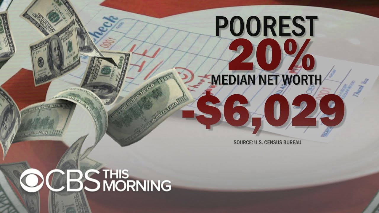
- 😀 The bottom 80% of Americans collectively own only 7% of the nation's wealth.
- 😀 The actual wealth distribution is highly skewed, with the richest Americans holding an overwhelming portion of the wealth.
- 😀 The ideal wealth distribution envisioned by most Americans would provide a healthier middle class and more equitable distribution.
- 😀 When reducing U.S. wealth to 100 individuals, the top 1% would hold an astounding portion, leaving the majority with very little.
- 😀 The gap between the wealthiest Americans and the poorest is growing, with the top 1% nearly tripling their income share since 1976.
- 😀 CEO compensation is vastly disproportionate compared to the average worker, with CEOs making hundreds of times more per hour than the average worker earns in a month.
- 😀 The study highlights the need for a more realistic understanding of the wealth distribution and the growing inequality in America.
Q & A
What was the purpose of the study conducted by the Harvard Business professor and economist?
-The purpose of the study was to ask over 5,000 Americans how they thought wealth was distributed in the United States and to compare their perceptions with the actual distribution of wealth.
What did the study reveal about Americans' perception of wealth distribution?
-The study revealed that most Americans believed wealth was more evenly distributed across five groups: the top, middle, and bottom quintiles. However, their perception was far from the actual distribution.
What did the majority of respondents consider to be the ideal wealth distribution in the U.S.?
-92% of respondents believed that the ideal wealth distribution should be more equitable than they thought it was, with a more balanced sharing of wealth across the population.
How does the actual distribution of wealth in the U.S. compare to people's perceptions?
-The actual distribution of wealth is starkly different from perceptions. The bottom 40% of Americans barely own any wealth, while the top 1% hold a disproportionate amount—nearly 40% of the nation's wealth.
What did the study use to help illustrate the disparity in wealth distribution?
-The study used a symbolic chart representing 100 Americans to illustrate how wealth would be distributed in a more understandable way. This helped highlight the extreme disparities in wealth.
What was the significance of reducing the U.S. population to 100 people in the study?
-Reducing the population to 100 people simplified the representation of wealth distribution, making it easier for viewers to grasp the severe imbalances and understand the contrast between perception and reality.
How did the ideal wealth distribution differ from the actual distribution?
-In the ideal distribution, wealth was more evenly spread out, with the wealthiest individuals being about 10 to 20 times wealthier than the poorest. The actual distribution, however, showed extreme concentration of wealth, with the top 1% owning nearly 40% of the nation's wealth.
What was the top 1%'s share of wealth, and how does it compare to the bottom 80%?
-The top 1% of Americans own nearly 40% of the country's wealth, while the bottom 80% only own 7% of the wealth. This highlights the extreme wealth inequality in the U.S.
What does the script suggest about the growing wealth inequality in the U.S. over the past few decades?
-The script suggests that wealth inequality has worsened in the past 20 to 30 years, with the top 1%'s share of national income nearly tripling, from 9% in 1976 to around 25% today.
What is the script's stance on whether CEOs deserve such high compensation compared to average workers?
-The script questions whether it is justifiable for CEOs to earn 380 times more than the average employee, implying that such vast pay disparities are disproportionate and potentially unfair.
Outlines

このセクションは有料ユーザー限定です。 アクセスするには、アップグレードをお願いします。
今すぐアップグレードMindmap

このセクションは有料ユーザー限定です。 アクセスするには、アップグレードをお願いします。
今すぐアップグレードKeywords

このセクションは有料ユーザー限定です。 アクセスするには、アップグレードをお願いします。
今すぐアップグレードHighlights

このセクションは有料ユーザー限定です。 アクセスするには、アップグレードをお願いします。
今すぐアップグレードTranscripts

このセクションは有料ユーザー限定です。 アクセスするには、アップグレードをお願いします。
今すぐアップグレード関連動画をさらに表示
Americans know wealth inequality is a problem, but what does it look like?

Why it's harder to earn more than your parents

Benarkah Orang Miskin Tambah Miskin dan yang Kaya Tambah Kaya?

PBS Study - Land of the Free, Home of the Poor

Tony Dokoupil talks with white Americans about racism

You Are Not Middle Class - The Income Distribution of India - FutureIQ
5.0 / 5 (0 votes)
