Which is the best chart: Selecting among 14 types of charts Part II

365 Data Science
3 Sept 201808:10

Summary

TLDRThis video explores various chart types—bar, pie, doughnut, line, area, treemap, bridge, scatter plots, and histograms—detailing when to use each and when to avoid them. It highlights how treemaps visualize hierarchical data, bridge charts show cumulative effects, scatter plots reveal patterns between variables, and histograms display data distributions. The emphasis is on selecting the right chart for clear and intuitive data representation. The video concludes by recommending Tableau for superior data visualization compared to traditional tools like Excel.

Takeaways

  • 📊 Treemap charts help to visualize hierarchical data by showing how parts contribute to the whole, particularly useful for comparing divisions and products within a company.
  • 🚫 Treemap charts are not ideal for data without clear categories or sub-categories, and they aren't suitable for tracking changes over time.
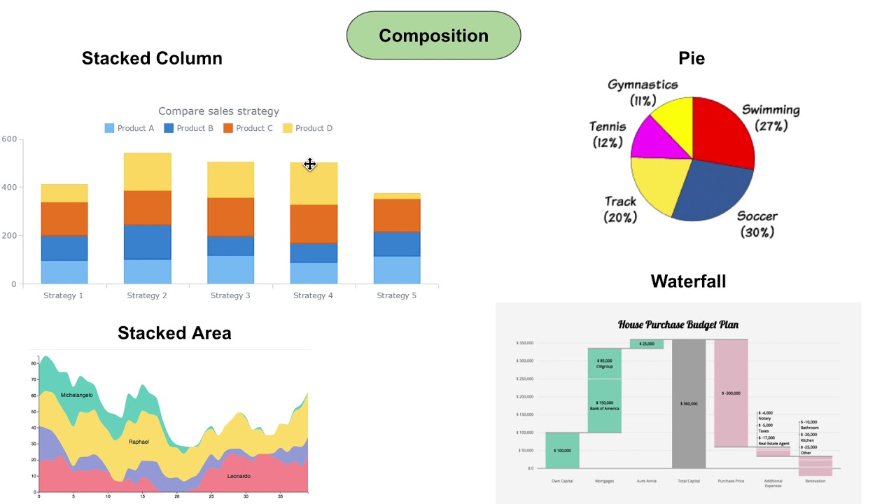
  • 📈 Bridge (waterfall) charts are great for showing cumulative changes in value between two periods or stages, often used in finance to visualize the effects of different variables on a final outcome.
  • 🚫 Avoid bridge charts if the data doesn't have intermediary steps or segments, as simpler charts might work better.
  • 🔵 Scatter plots show relationships between two variables and can indicate patterns, such as positive or negative correlations.
  • 🚫 Scatter plots should not be used for non-bi-dimensional data, categorical data, or when tracking changes over time.
  • 📉 Histograms show the frequency distribution of data within specific ranges (bins), which is helpful to visualize where observations are concentrated.
  • 🚫 Multi-column histograms should be avoided if the data involves multiple categories, as they can be confusing.
  • 🛠 The video emphasizes the importance of selecting clear and intuitive chart types over overly complex visualizations.
  • 📈 Tableau is highlighted as a leading data visualization tool in the corporate world, surpassing traditional tools like Excel.

Q & A

  • What is a Treemap chart and when is it used?

    -A Treemap chart visually splits the sum of a whole into hierarchies and displays internal breakdowns within those hierarchies. It is used when there are categories and sub-categories, such as divisions within a company and their respective products, to show their relative contributions to a whole, like total revenue.

  • When should Treemap charts be avoided?

    -Treemap charts should be avoided when the data cannot be divided into categories and sub-categories. Additionally, they are not suitable for tracking development over time.

  • What is a Bridge (Waterfall) chart and what are its primary use cases?

    -A Bridge or Waterfall chart shows the cumulative effect of positive and negative values on a starting and ending value. It is used to visualize changes between two periods or to illustrate how several factors contribute to an overall result, such as showing the contributions of various divisions to revenue changes.

  • When should Bridge charts not be used?

    -Bridge charts should not be used when the data lacks intermediary steps or segments between the starting and ending values. In such cases, a different type of chart is more appropriate.

  • What is a Scatter Plot and when is it useful?

    -A Scatter Plot is used to display relationships between two variables by plotting data points on two axes. It is particularly useful for identifying patterns, such as the relationship between house size and house price, or determining if two variables are uncorrelated.

  • What are the limitations of Scatter Plots?

    -Scatter Plots should not be used if the data is not bi-dimensional or if the objective is to track changes over time. They are also not suitable for categorical data and are intended for numerical data.

  • What is a Histogram and when should it be used?

    -A Histogram is a chart that groups continuous data into bins to show the frequency of observations within each bin. It is best used to display the distribution of data, such as the distribution of house prices within certain ranges.

  • When should Histograms be avoided?

    -Histograms should be avoided when the data includes multiple categories or variables. Multi-column histograms can become cluttered and difficult to interpret if the data is too complex.

  • Why is it important to choose the right chart type for data visualization?

    -Choosing the correct chart type ensures that data is presented clearly and intuitively, allowing viewers to easily interpret the information without confusion. Complex charts that require extensive explanations defeat the purpose of data visualization.

  • What are some common mistakes when creating visualizations?

    -Common mistakes include using complex charts for simple data, applying charts to data types they are not suited for (e.g., using Treemaps for non-categorical data), and overloading charts with unnecessary details that confuse the viewer.

  • Why is Tableau mentioned in the script, and how does it compare to Excel for data visualization?

    -Tableau is highlighted as one of the most popular data visualization tools in the corporate world due to its ability to handle complex datasets and create clear, professional visualizations. It is considered superior to traditional tools like Excel for these tasks.

Outlines

00:00

📊 Introduction to Treemap Charts

This paragraph introduces treemap charts, emphasizing that they are underutilized but highly effective for visualizing hierarchical data. Treemap charts split a whole into hierarchies and show the breakdown of each category. They are useful for displaying how divisions and their products contribute to a company’s total revenue. However, they are not suitable for data that isn't organized hierarchically or for tracking changes over time.

05:01

📈 Overview of Bridge (Waterfall) Charts

Bridge charts, also known as waterfall charts, originated in consulting and are used to show how various positive and negative values cumulatively affect a starting and ending value. They are particularly useful for illustrating changes between two periods or displaying the impact of multiple variables on a single output, such as how different factors influence a company’s operating profit. However, they are unsuitable for data without intermediary steps or segments.

🔬 Understanding Scatter Plots

Scatter plots are statistical charts that plot data points across two axes to reveal patterns or relationships between variables. This paragraph explains how scatter plots are useful for observing correlations, like the relationship between house price and size. However, they require at least two dimensions and are not suitable for time-based data or categorical data.

📊 Histogram Charts and Their Usage

This section focuses on histogram charts, which group continuous data into bins to show the distribution of a variable, such as house prices. Histograms are valuable for visualizing data concentration. However, caution is advised when dealing with multiple categories, as multi-column histograms can become cluttered and difficult to interpret.

🔍 Conclusion and Key Takeaways

The final paragraph summarizes the video by reiterating the importance of knowing when to use various charts—bar, pie, doughnut, line, area, treemap, bridge, scatter plot, and histogram—and when to avoid them. It emphasizes that clear and intuitive visualizations are crucial for effective communication, and introduces Tableau as a superior tool for creating visualizations compared to traditional tools like Excel.

Mindmap

Keywords

💡Treemap chart

A treemap chart is a hierarchical visualization tool used to display data organized into categories and subcategories. It visually represents the contribution of each element within a hierarchy to the whole, with each section sized proportionally to the data it represents. In the video, treemaps are shown as an effective way to present company revenue, splitting it into divisions and products to show how each contributes to the total revenue.

💡Bridge chart

Also known as a waterfall chart, a bridge chart displays the cumulative impact of a sequence of positive and negative values on a starting and ending point. The video describes its origins in consulting and how it is used to show how different factors influence a change between two periods, such as tracking revenue changes from 2017 to 2018 across divisions. Bridge charts are helpful in visualizing step-by-step impacts on financial figures like revenues and operating profits.

💡Scatter plot

A scatter plot is a graph used to show relationships between two numerical variables, plotting data points along the x and y axes. The video highlights how scatter plots help identify patterns, like the positive correlation between house size and price. They are useful when exploring relationships between two sets of data, but unsuitable when dealing with categories or time-based data.

💡Histogram chart

A histogram is a graphical representation of the distribution of numerical data. It organizes data into bins, showing how frequently values fall within each range. The video uses an example of house prices to illustrate how histograms show the concentration of observations within specific price brackets. Histograms are ideal for displaying continuous data and summarizing its distribution.

💡Categories and subcategories

Categories refer to distinct groups or divisions in a dataset, while subcategories are further breakdowns within those groups. In the video, categories and subcategories are mentioned in the context of treemap charts, where company revenue is divided into divisions (categories) and products (subcategories). The hierarchical organization allows for clearer insight into each division's and product's contribution to overall revenue.

💡Revenue

Revenue refers to the total income generated by a company from its operations, often used in financial reporting. In the video, revenue is a central metric, particularly when discussing treemap and bridge charts. For instance, treemap charts show how revenue is distributed across company divisions, while bridge charts track changes in revenue from year to year or its relationship with operating profit.

💡Operating profit

Operating profit is the income remaining after deducting the cost of goods sold (COGS), operating expenses, and depreciation and amortization (D&A) from total revenue. In the video, a bridge chart is used to explain how operating profit can be calculated by visualizing each step (revenues minus COGS, operating expenses, and D&A), showing the cumulative effect of these factors on the final profit.

💡Consulting

Consulting refers to providing expert advice to businesses or organizations, especially on improving performance or solving complex issues. The video mentions that bridge charts originated in the consulting industry, where consultants from firms like McKinsey introduced them as a tool for explaining financial changes and impacts to clients. This context links the bridge chart's popularity with its use in business decision-making.

💡Pattern recognition

Pattern recognition is the ability to detect trends, relationships, or regularities in data. The video emphasizes the importance of pattern recognition when using scatter plots, where relationships between variables can be identified. For example, the video shows how scatter plots can reveal the positive correlation between house size and price, helping users make data-driven insights.

💡Time tracking

Time tracking refers to the ability to visualize how data evolves over time. The video contrasts different chart types, highlighting that treemaps and scatter plots are unsuitable for tracking time-based data. In contrast, bridge charts are recommended for showing changes between two periods, such as visualizing how revenue shifted from one year to the next.

Highlights

Introduction to different types of charts: bar, pie, doughnut, line, and area charts.

Introduction to Treemap charts, which allow splitting data into hierarchies and showing internal breakdowns.

Treemap charts are ideal for visualizing the weight of divisions in relation to total revenue, and the contribution of products within each division.

Treemap charts should be avoided when data cannot be divided into categories or sub-categories, or when tracking development over time.

Bridge charts (waterfall charts) are popular in consulting and show the cumulative effect of positive and negative values on a starting and ending value.

Use bridge charts to compare periods, such as showing how different divisions contribute to a revenue change between two years.

Bridge charts can also demonstrate how different factors influence a variable, like the steps from revenue to operating profit.

Avoid using bridge charts if the data does not involve intermediary steps or segments.

Scatter plots are used to show patterns or relationships between two variables, such as house size and price.

Scatter plots are not suitable for non-bi-dimensional data, and should not be used for categorical or time-based data.

Introduction to histogram charts, which show the frequency of observations of a given variable, like house prices in different ranges.

Histograms are great for visualizing the distribution of continuous data into bins, providing insight into where data is concentrated.

Avoid using histograms when working with multiple categories or variables, as multi-column histograms can become cluttered.

Clear and intuitive visualizations are key; avoid complex charts that require a detailed legend or explanation.

Tableau is highlighted as a superior tool for data visualization, especially compared to traditional tools like Excel.

Transcripts

play00:01

Alright, perfect.

play00:03

In this video we discussed when to use bar, pie, doughnut, line and area charts.

play00:11

Now we are ready to continue where we left off.

play00:14

Treemap charts One type of chart that is not used as often

play00:19

as it should be is the Treemap chart.

play00:23

Here is what a Treemap looks like.

play00:25

It allows us to split the sum of the whole into hierarchies and then show an internal

play00:31

breakdown of each of these hierarchies.

play00:35

When to use Treemap charts The company we have been looking at so far

play00:39

has three divisions.

play00:41

And each of them has its own products.

play00:44

This is the perfect way to provide information about the weight divisions have with respect

play00:50

to the firm’s total revenue.

play00:52

At the same time it shows how much each product contributes to the revenue of its division.

play00:59

Very informative, right?

play01:01

When to avoid Treemap charts As you can imagine it is quite difficult to

play01:06

apply treemap charts to a context that is not the one we just described.

play01:13

Treemap charts are not suitable when the data we are working with is not divisible into

play01:18

categories and sub-categories.

play01:19

Moreover, we can’t use treemap charts if we want to track development over time.

play01:27

Bridge chart Bridge, also known as waterfall charts, take

play01:32

their origins from consulting.

play01:34

Several decades ago top tier “24/7 at your service” consultants at McKinsey popularized

play01:41

this type of visualization among their clients.

play01:45

And ever since, the popularity of bridge charts has continued to rise.

play01:50

Bridge charts are made of bars showing the cumulative effect of a series of positive

play01:56

and negative values impacting a starting and an ending value.

play02:01

Here’s an example.

play02:04

When to use bridge charts There are two major use cases of bridge charts.

play02:09

Both are very interesting and intuitive.

play02:12

First, we can use this type of visualization whenever we would like to bridge the difference

play02:18

between two periods.

play02:20

So, in our example from earlier, the company registered different revenues in 2018 compared

play02:27

to 2017, right?

play02:29

The starting period for this chart is the end of 2017 or 2018.

play02:35

The ending period is the end of 2018.

play02:39

With a simple bar chart, we would just see an increase of 6 million.

play02:44

The bridge chart gives us additional information – how different divisions contributed to

play02:51

this increase.

play02:52

In fact, the revenues of two of the divisions increased, while the other one didn’t.

play02:58

In a similar fashion, a bridge chart can show us how one variable was influenced by a series

play03:04

of factors to obtain a specific output.

play03:07

Let’s provide an easy to understand example, which is heavily used in finance.

play03:13

The company’s revenues were equal to 109 million $ in 2018, right?

play03:19

What if we would like to create a visualization showing how revenues are related to operating

play03:25

profits?

play03:26

We have the necessary information knowing the intermediary steps in between.

play03:31

Here’s the equation we will use.

play03:34

Operating Profit = Revenue – Cost of goods sold – Operating expenses – D&A.

play03:46

There are three intermediary steps between revenues and operating profit.

play03:51

A bridge chart allows us to show the impact of each of these steps.

play03:56

Very nice, right?

play03:59

When to avoid bridge charts When we deal with data that does not involve

play04:04

intermediary steps or segments, we will have to use a different type of chart.

play04:11

Simple as that.

play04:12

Scatter plots A scatter plot is a type of chart that is

play04:16

often used in the field of statistics and data science.

play04:20

It consists of multiple data points plotted across two axes.

play04:26

Each variable depicted in a scatter plot would have multiple observations.

play04:31

If a scatter plot includes more than two variables, then we would use different colours to signify

play04:38

that.

play04:39

When use scatter plots A scatter plot chart is a great indicator

play04:44

that allows us to see whether there is a pattern to be found between two variables.

play04:50

See the example we have here?

play04:52

The x-axis contains information about house price, while the y-axis indicates house size.

play05:01

There is an obvious pattern to be found - a positive relationship between the two.

play05:07

The bigger a house is, the higher its price.

play05:10

On the other hand, house size and the age of the person who bought a house are two uncorrelated

play05:18

variables, and a scatter plot helps us see that easily.

play05:22

So, this can be a very useful type of chart whenever we would like to see if there is

play05:28

any relationship between two sets of data.

play05:32

When to avoid scatter plots We can’t use scatter plots when we don’t

play05:37

have bi-dimensional data.

play05:40

In our example, we need information about both house prices and house size to create

play05:46

a scatter plot.

play05:47

A scatter plot requires at least two dimensions for our data.

play05:53

In addition, scatter plots are not suitable if we are interested in observing time patterns.

play05:59

Finally, a scatter plot is used with numerical data, or numbers.

play06:04

If we have categories such as 3 divisions, 5 products, and so on, a scatter plot would

play06:11

not reveal much.

play06:14

Histogram charts The last type of chart we will consider here

play06:18

is the histogram chart.

play06:19

A series of bins showing us the frequency of observations of a given variable.

play06:26

The definition of histogram charts is short and easy.

play06:29

Here’s an example.

play06:31

An interviewer asked 267 people how much their house cost.

play06:37

Then a histogram was used to portray the interviewer’s findings.

play06:41

Some prices were in the range between $117-217k, many more in the range $217-$317k, and the

play06:53

rest of the houses were classified in more expensive bins.

play06:57

Here’s what the histogram looks like.

play07:00

When to use histograms Histograms are great when we would like to

play07:03

show the distribution of the data we are working with.

play07:07

This allows us to group continuous data into bins and hence, provide a useful representation

play07:14

of where observations are concentrated.

play07:17

When to avoid histograms Be careful when the data you are working with

play07:22

contains multiple categories or variables.

play07:26

Multi-column histograms are to be avoided when they look like this.

play07:31

Conclusion In this video, we were able to provide a great

play07:35

summary of the different types of charts you will need when working with data.

play07:40

In addition, you learned something which is even more important:

play07:45

When to use these charts and When to avoid using them

play07:49

Clear and intuitive visualizations should be the main focus.

play07:54

There is no point in using sophisticated types of charts that must be packaged with a translator

play07:59

or a 5-page legend.

play08:02

We are confident you understand that and will be able to create stunning and crystal-clear

play08:07

graphs right away.

play08:08

Tableau is one of the most popular tools for data visualization in the corporate world.

play08:09

Follow this link to learn what makes Tableau superior than traditional tools like Excel.

Rate This

5.0 / 5 (0 votes)

関連タグ
Data VisualizationCharts GuideBusiness AnalyticsTreemap ChartsBridge ChartsScatter PlotsHistogramsVisual InsightsFinanceTableau
英語で要約が必要ですか?