CSS Tips And Tricks I Wish I Knew Before
Summary
TLDRIn this informative video, the presenter shares essential CSS tips for front-end developers. They demonstrate how to use 'clip-path' for custom shapes, 'perspective' for 3D effects, 'aspect-ratio' for maintaining proportions, 'filters' for quick visual effects, and various pseudo-classes for efficient styling. The video also covers input styling, text cursor color customization, and video caption styling, offering practical examples and encouraging viewers to explore CSS for creative web design.
Takeaways
- 📌 The 'clip-path' CSS property allows for creating custom shapes by clipping the visible area of an HTML element.
- 🔄 With 'clip-path', you can animate elements by changing properties like the radius on hover effects.
- 📐 For more complex shapes, the 'Polygon' value in 'clip-path' can be used, with points representing positions on the x and y-axis.
- 🔍 To create custom clip paths, SVG paths can be utilized after being extracted from design tools like Figma.
- 🌐 The 'perspective' property in CSS helps in adding 3D effects to HTML elements, simulating a view from an angle in 3D space.
- 🔄 Using 'perspective' along with 'transform' can create a sense of depth and rotation on different axes.
- 📐 The 'aspect-ratio' property maintains the proportional relationship between an element's width and height, which is useful for responsive design.
- 🎨 CSS 'filters' offer quick visual effects like blur, grayscale, brightness, and contrast adjustments that can be applied to various elements.
- 🔍 The ':focus' pseudo-class can be used to customize or remove the outline that appears on an input element when it's selected.
- 🖊️ The 'caret-color' property lets you change the color of the text cursor in an input field.
- 🔑 The 'is', 'where', 'not', and 'has' pseudo-classes can simplify CSS selectors, making it easier to style specific elements without deep nesting.
- 🎬 Styling video captions with CSS is possible using the 'cue' pseudo-element, allowing for customization of background color and font size.
Q & A
What is the purpose of the 'clip-path' CSS property?
-The 'clip-path' property in CSS is used to create custom shapes by defining the visible area of an HTML element. It allows for the clipping of an element into various shapes, such as circles or polygons, and can be animated for interactive effects.
How does the default radius value of 'clip-path' work?
-The default radius value of 'clip-path' is 50%, which means it will be half of the given size of the element. For instance, if the width and height of an element are set to 500 pixels, the default radius for a circular clip would be 250 pixels.
Can you provide an example of how to use the 'clip-path' property with a hover effect?
-Yes, you can increase the radius of the clipping path on hover to create an expanding effect. For example, setting the 'clip-path' to a circle with a radius of 50% and then changing it to 100% on hover will make the element appear to fill its container as the user hovers over it.
What is a CSS clip-path generator and how can it be used?
-A CSS clip-path generator is an online tool that allows you to create and customize clip paths for your designs. You can use it to select presets or create your own shapes by defining points on the x and y-axes, which can then be copied and pasted into your CSS code.
How can you apply a 3D effect to HTML elements using CSS?
-To apply a 3D effect, you can use the 'perspective' CSS property on the parent element. This property allows you to create a sense of depth by adjusting the distance from which the element is viewed, making it appear as though it's in a three-dimensional space.
What is the difference between rotating an element on the Z-axis and applying perspective?
-Rotating an element on the Z-axis simply spins it around its central point without creating a 3D effect. Applying perspective, on the other hand, changes the viewer's angle, making the element appear three-dimensional and allowing for effects such as foreshortening when rotated on the X or Y-axis.
What is the 'aspect-ratio' CSS property and how does it work?
-The 'aspect-ratio' property in CSS defines the proportional relationship between the width and height of an element. It allows you to maintain the correct proportions even when the element's size changes, such as in responsive designs. For example, setting the aspect ratio to '16 / 9' will ensure that the width is always 16 times the height, regardless of the actual size.
How can CSS filters be used to create quick visual effects?
-CSS filters can be applied to elements to create various visual effects such as blurring, turning images grayscale, adjusting brightness and contrast, and more. They are useful for creating hover effects, hiding sensitive content, or applying stylistic changes to elements without the need for additional images or complex CSS.
What is the purpose of the 'focus' pseudo-class in CSS?
-The 'focus' pseudo-class is used in CSS to apply styles to an element when it is in focus, typically after a user clicks on it. It can be used to remove the default outline that appears around an element when focused, or to change its appearance, such as changing the border color or adding a shadow.
How can you change the color of the text cursor in an input field using CSS?
-You can change the color of the text cursor in an input field by using the 'caret-color' property in CSS and specifying the desired color value.
What are the 'where', 'not', and 'has' pseudo-classes in CSS and how can they be used?
-The 'where', 'not', and 'has' pseudo-classes in CSS are used for more specific targeting of elements. 'Where' is used to style elements based on the presence of other elements within the same parent. 'Not' is used to exclude specific elements from being styled. 'Has' is used to style elements based on the presence of a specific child element. They can save time and reduce complexity in your CSS by allowing more precise control over styling.
How can you add and style captions for a video using HTML and CSS?
-To add captions to a video, you use the '<track>' element within the '<video>' element, specifying the type as 'captions' and linking to a subtitle file. To style the captions, you can use the 'cue' pseudo-element in CSS to change properties such as background color, font size, and text color.
Outlines

Dieser Bereich ist nur für Premium-Benutzer verfügbar. Bitte führen Sie ein Upgrade durch, um auf diesen Abschnitt zuzugreifen.
Upgrade durchführenMindmap

Dieser Bereich ist nur für Premium-Benutzer verfügbar. Bitte führen Sie ein Upgrade durch, um auf diesen Abschnitt zuzugreifen.
Upgrade durchführenKeywords

Dieser Bereich ist nur für Premium-Benutzer verfügbar. Bitte führen Sie ein Upgrade durch, um auf diesen Abschnitt zuzugreifen.
Upgrade durchführenHighlights

Dieser Bereich ist nur für Premium-Benutzer verfügbar. Bitte führen Sie ein Upgrade durch, um auf diesen Abschnitt zuzugreifen.
Upgrade durchführenTranscripts

Dieser Bereich ist nur für Premium-Benutzer verfügbar. Bitte führen Sie ein Upgrade durch, um auf diesen Abschnitt zuzugreifen.
Upgrade durchführenWeitere ähnliche Videos ansehen

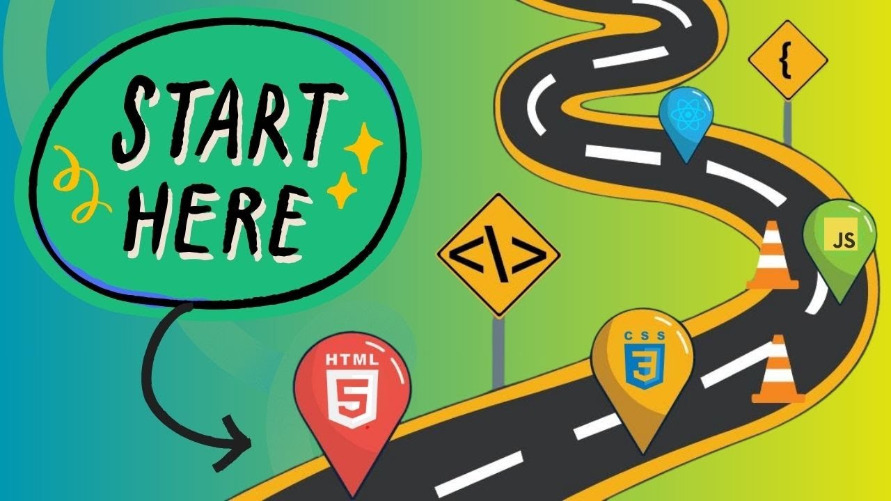
Lộ trình học Thiết kế Web - Frontend (HTML + CSS + JAVASCRIPT) cho người mới bắt đầu

4 Months Full Stack Developer Roadmap + Project Ideas | Sagar Chouksey
The Ultimate 2025 Front-End developer Roadmap
1. All About Web Developer
Java Full Stack Vs Python Full Stack Vs JS Full Stack [Telugu] | MERN Stack | Vamsi Bhavani
What is front-end?
5.0 / 5 (0 votes)
