Estatística Descritiva Univariada Quantitativa - Boxplot
Summary
TLDRThis video script provides an in-depth look at the descriptive univariate statistics, focusing on the box plot. It explains how the box plot graphically represents five measures of central tendency and helps assess data symmetry and distribution. The script also covers how to identify outliers using the interquartile range and explains the significance of the box plot in visualizing data asymmetry.
Takeaways
- 📊 The script introduces the concept of a Box Plot, a graphical representation used in descriptive univariate statistics.
- 📈 A Box Plot displays five key measures of central tendency for a given variable in a single graphic.
- 🔍 It helps to assess the symmetry and distribution of data, as well as identify outliers.
- 📉 The 'whiskers' or 'bigodes' of the Box Plot represent the range of data, excluding outliers.
- 📝 The script explains how to calculate the interquartile range (IQR), which is the distance between the first and third quartiles.
- 📋 The Box Plot's quartiles (Q1, median, Q3) are used to divide the data into different parts, aiding in data analysis.
- 📐 The script describes how to calculate the lower and upper limits for outliers, using the formula Q1 - 1.5*IQR and Q3 + 1.5*IQR.
- 📈 The Box Plot is a useful tool for visualizing data symmetry and can indicate whether the distribution is skewed to the left or right.
- 📊 The script provides examples of how to interpret different Box Plot shapes, such as symmetrical and positively or negatively skewed distributions.
- 🔎 It emphasizes the importance of the Box Plot in quickly conveying multiple pieces of information about a dataset.
Q & A
What is the main topic of the video script?
-The main topic of the video script is about explaining the Box Plot, a graphical representation used in descriptive univariate statistics.
What does the Box Plot represent?
-The Box Plot represents various statistical measures in a single graphical representation, including median, quartiles, and potential outliers.
What are the five measures of position represented in a Box Plot?
-The five measures of position represented in a Box Plot are the minimum value, first quartile (Q1), median (Q2), third quartile (Q3), and maximum value.
What is the significance of the 'whiskers' in a Box Plot?
-The 'whiskers' in a Box Plot are the lines extending from the box, representing the range of the data outside the quartiles. They help identify potential outliers.
How are the 'fences' or limits for outliers calculated in a Box Plot?
-The 'fences' or limits for outliers are calculated by taking the value of the first quartile (Q1) and subtracting 1.5 times the interquartile range (IQR) for the lower limit, and taking the value of the third quartile (Q3) and adding 1.5 times the IQR for the upper limit.
What does the position of the median within the Box Plot indicate?
-The position of the median within the Box Plot indicates the central tendency of the data. If the median is in the middle of the box, it suggests a symmetric distribution.
What is the interquartile range (IQR) and how is it calculated?
-The interquartile range (IQR) is the difference between the third quartile (Q3) and the first quartile (Q1), representing the spread of the middle 50% of the data.
How can a Box Plot help in identifying the symmetry of data distribution?
-A Box Plot can help in identifying the symmetry of data distribution by comparing the lengths of the whiskers and the position of the median. If the whiskers are of equal length and the median is in the middle, the distribution is likely symmetric.
What does positive asymmetry in a Box Plot indicate?
-Positive asymmetry in a Box Plot indicates that the distribution is skewed to the right, with a longer 'whisker' on the right side and the median potentially shifted towards the lower values.
What does negative asymmetry in a Box Plot indicate?
-Negative asymmetry in a Box Plot indicates that the distribution is skewed to the left, with a longer 'whisker' on the left side and the median potentially shifted towards the higher values.
Why are Box Plots considered useful in descriptive statistics?
-Box Plots are considered useful in descriptive statistics because they provide a quick graphical summary of the central tendency, dispersion, and skewness of the dataset, as well as potential outliers, all in one visual representation.
Outlines

Dieser Bereich ist nur für Premium-Benutzer verfügbar. Bitte führen Sie ein Upgrade durch, um auf diesen Abschnitt zuzugreifen.
Upgrade durchführenMindmap

Dieser Bereich ist nur für Premium-Benutzer verfügbar. Bitte führen Sie ein Upgrade durch, um auf diesen Abschnitt zuzugreifen.
Upgrade durchführenKeywords

Dieser Bereich ist nur für Premium-Benutzer verfügbar. Bitte führen Sie ein Upgrade durch, um auf diesen Abschnitt zuzugreifen.
Upgrade durchführenHighlights

Dieser Bereich ist nur für Premium-Benutzer verfügbar. Bitte führen Sie ein Upgrade durch, um auf diesen Abschnitt zuzugreifen.
Upgrade durchführenTranscripts

Dieser Bereich ist nur für Premium-Benutzer verfügbar. Bitte führen Sie ein Upgrade durch, um auf diesen Abschnitt zuzugreifen.
Upgrade durchführenWeitere ähnliche Videos ansehen
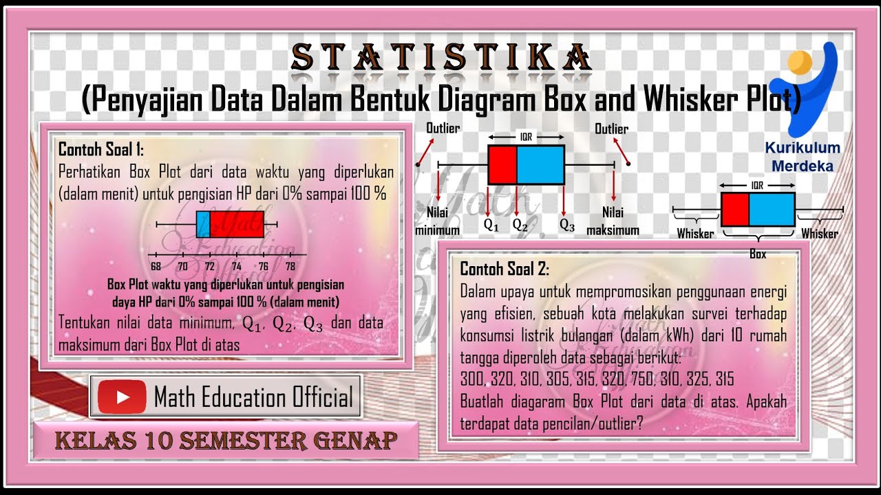
Penyajian Data Dalam Bentuk Box and Whisker Plot Box Plot
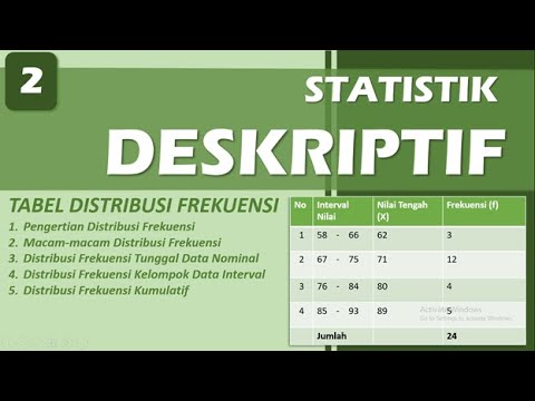
DISTRIBUSI FREKUENSI - STATISTIK DESKRIPTIF | BAB 2
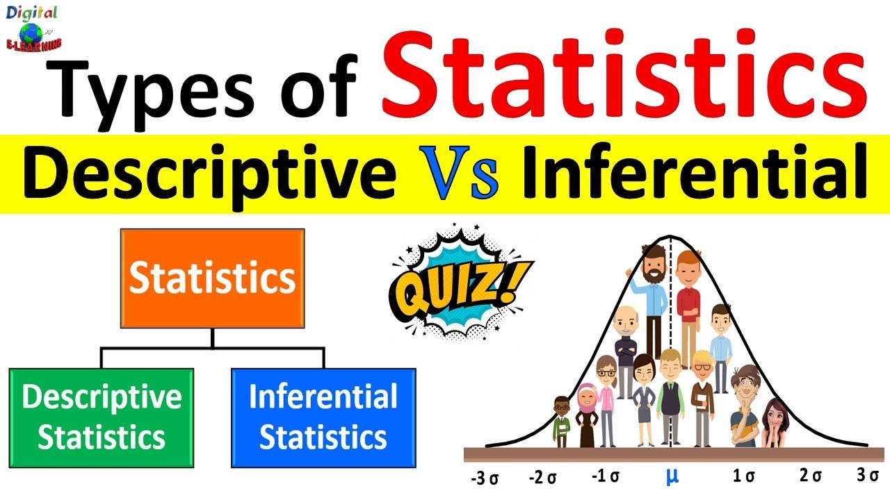
Descriptive Statistics vs Inferential Statistics | Measure of Central Tendency | Types of Statistics

Metode Penelitian Antropologi (Kualitatif)
PENGERTIAN ILMU STATISTIK - STATISTIKA EKONOMI | BAB 1
What is the difference between Descriptive Statistics and Inferential Statistics?
5.0 / 5 (0 votes)
