The Evolution Of Data Visualization | Dustin Cabral | TEDxBryantU
Summary
TLDRDustin Cabral shares his journey from retail to becoming a data visualization expert. He emphasizes the power of data visualization as a storytelling tool, recounting historical examples, like John Snow's cholera map and Napoleon's march, while also explaining its modern-day applications. Cabral encourages people to use free tools like Tableau and Power BI to visualize their own data, showcasing personal examples, such as tracking his children's growth. He concludes by challenging the audience to embrace data visualization in their lives and to create their own stories using data.
Takeaways
- 🎙️ Dustin Cabral is a storyteller who specializes in data visualization, teaching thousands of students and creating dashboards for companies.
- 📊 His journey in data visualization began after being introduced to Tableau by his wife, which led him to a full-time career in analytics and data visualization.
- 🗺️ Data visualization is a powerful storytelling tool, helping people better see and understand the data around them, whether through tables, graphs, or maps.
- 📜 Data visualization is not new; it has roots going back 20,000 years with the Ashango bone, used as a tallying stick in central Africa.
- 💡 Notable historical examples of data visualization include Jon Snow’s cholera outbreak map and Charles Menard’s visualization of Napoleon's 1812 Russian campaign.
- 💻 The digital age has transformed data visualization with innovations like the personal computer, internet, and tools like Tableau and Power BI, making data analysis faster, more accessible, and easier to automate.
- 📈 Cabral encourages the democratization of data visualization through free tools and accessible data, empowering individuals to analyze their own data.
- 👶 Cabral humorously shares personal data visualization projects, like tracking his children's growth and feeding habits, to show how data can be applied in everyday life.
- 💼 His professional career includes building a team of analysts at Staples, consulting with Cleartelligence, and contributing to the broader data visualization community.
- 🚀 Cabral challenges the audience to start creating their own data visualizations, emphasizing that everyone is a storyteller with the power to use data.
Q & A
Who is the speaker and what is the main topic of the presentation?
-The speaker is Dustin Cabral, and the main topic of his presentation is the evolution of data visualization.
What are some of the roles Dustin Cabral identifies as part of his storytelling journey?
-Dustin Cabral identifies himself as a storyteller through public speaking, teaching data visualization courses, creating analytic dashboards, running a YouTube channel focused on Power Wheels racing and Nerf gun battles, and reading to his sons.
How did Dustin Cabral get introduced to data visualization tools like Tableau?
-Dustin was introduced to Tableau by his wife while working at Staples. He immediately became fascinated by the tool, leading him to quit his job and work as a full-time Tableau developer at EMC Dell.
What historical periods does Dustin mention in the evolution of data visualization?
-Dustin mentions several historical periods: prehistory (30,000 to 10,000 BC), ancient history, the modern era (Renaissance to Industrial Revolution), and the digital age.
What example does Dustin provide from prehistory related to data visualization?
-Dustin talks about the Ishango Bone from 20,000 years ago in Central Africa, which was used as a tallying stick, representing one of the earliest forms of data visualization.
Who was John Snow, and what contribution did he make to data visualization?
-John Snow was an English physician who mapped cholera cases in London in the 1850s, identifying the source of the outbreak from a water pump. This visualization is considered a foundational event in epidemiology.
What does Dustin highlight as major advancements in data visualization during the digital age?
-During the digital age, Dustin highlights the personal computer, the internet, and various free tools like Tableau and Power BI as major advancements, making data visualization more accessible and faster than ever.
How does Dustin relate data visualization to everyday life?
-Dustin explains that data visualization is used daily by people, such as when checking the weather, tracking Amazon deliveries, or monitoring health metrics on a smartwatch.
What personal example does Dustin share to demonstrate the power of data visualization?
-Dustin shares a personal project called the 'Callum Tracker 5000,' where he tracked his son Callum’s growth and feeding patterns using data visualization. This project provided him with insights about his son's eating habits and development.
What challenge does Dustin offer to the audience at the end of his talk?
-Dustin challenges the audience to create something using data visualization. He encourages them not to overthink it but to explore storytelling through data and realize they can be storytellers too.
Outlines

Dieser Bereich ist nur für Premium-Benutzer verfügbar. Bitte führen Sie ein Upgrade durch, um auf diesen Abschnitt zuzugreifen.
Upgrade durchführenMindmap

Dieser Bereich ist nur für Premium-Benutzer verfügbar. Bitte führen Sie ein Upgrade durch, um auf diesen Abschnitt zuzugreifen.
Upgrade durchführenKeywords

Dieser Bereich ist nur für Premium-Benutzer verfügbar. Bitte führen Sie ein Upgrade durch, um auf diesen Abschnitt zuzugreifen.
Upgrade durchführenHighlights

Dieser Bereich ist nur für Premium-Benutzer verfügbar. Bitte führen Sie ein Upgrade durch, um auf diesen Abschnitt zuzugreifen.
Upgrade durchführenTranscripts

Dieser Bereich ist nur für Premium-Benutzer verfügbar. Bitte führen Sie ein Upgrade durch, um auf diesen Abschnitt zuzugreifen.
Upgrade durchführenWeitere ähnliche Videos ansehen

Fuzzing XSS Sanitizers for Fun and Profit | Tom Anthony

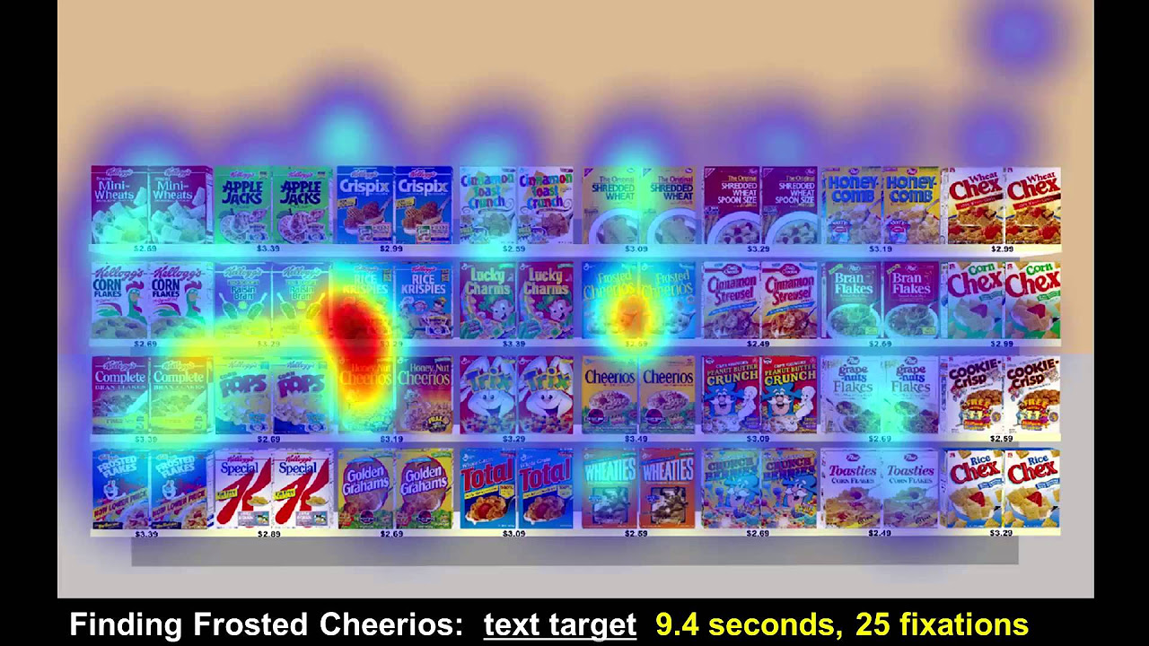
How stores track your shopping behavior | Ray Burke | TEDxIndianapolis

How To Change Your BAD Habits (Easy Method)

How to Grow Taller

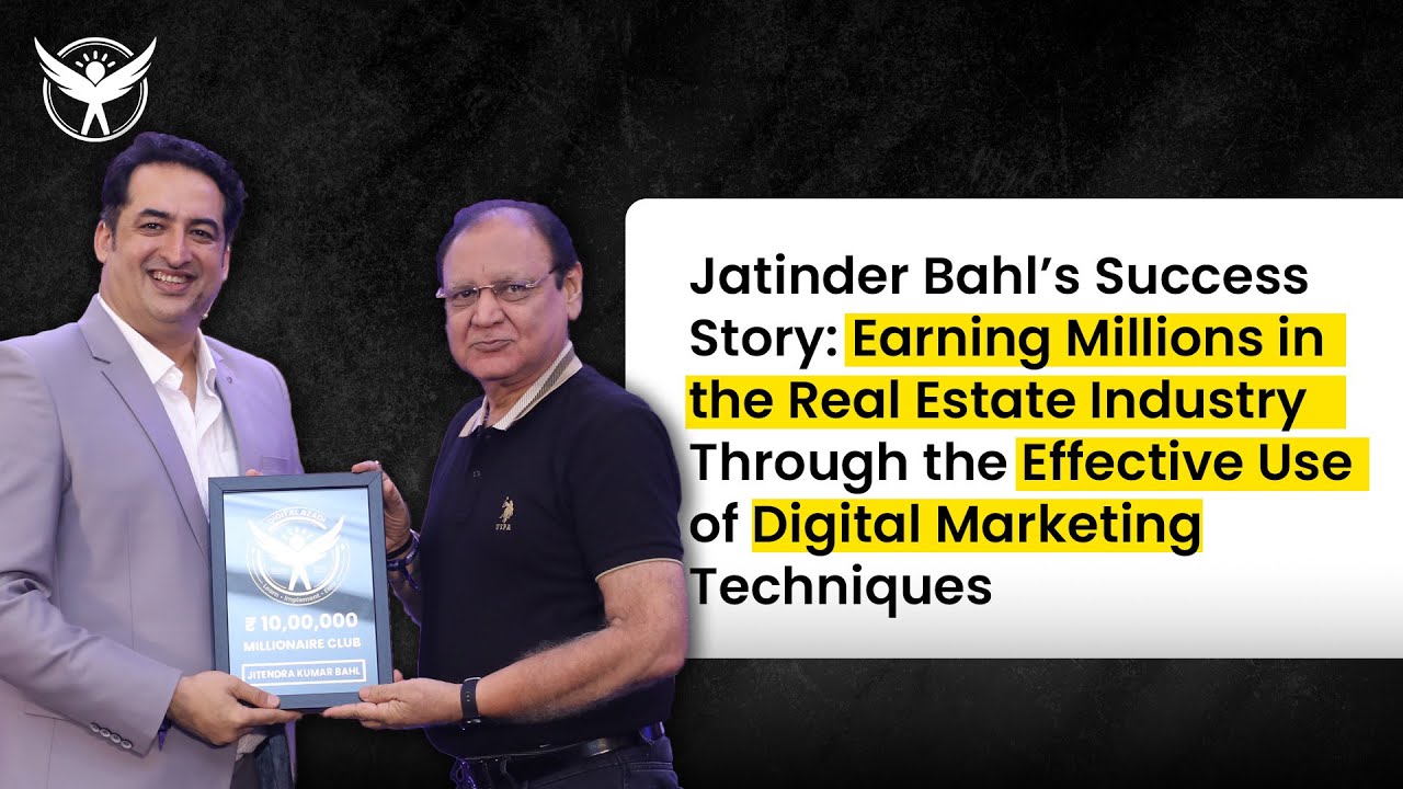
Earning Digitally At 68 Years Of Age : Digital Marketing Proves Age No Bar | Digital Azadi

Ibu ini Kelola 7 Cabang Toko Retail Lokal Berkonsep Spiritual Company
5.0 / 5 (0 votes)
