Membuat UI DESIGN yang simple dengan FIGMA - Belajar Figma Bareng (2/3)
Summary
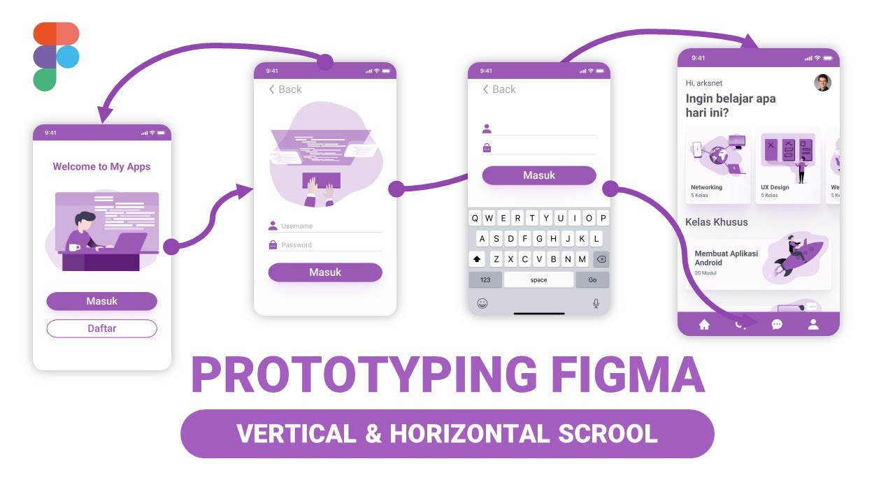
TLDRThe video script discusses the design and development process of a prototype login interface, emphasizing user experience and visual elements. It covers the customization of keyboard input, smart animations, and the layout adjustments for clarity and ease of use. The script also touches on the collection of various keyboard designs, the importance of color schemes, and the incorporation of icons and components to enhance the overall user interface. The conversation hints at a collaborative effort to refine the design, suggesting a focus on aesthetics and functionality in app development.
Takeaways
- 😀 The script discusses creating a prototype for a login interface with three speech faces that will personalize the keyboard.
- 🔒 It mentions the need to input a VT-2 password, indicating a security feature for the login process.
- 📱 The script refers to a smart animation in Figma for the login mechanism, suggesting the use of design tools for prototyping.
- 🛠️ There is a discussion about the keyboard component being ready to use, indicating a modular approach to the design process.
- 🎨 The script talks about changing the color scheme, specifically mentioning the use of a darker primary color for contrast.
- 📝 It describes the process of editing and arranging components, such as a card for a homepage design, to improve the user interface.
- 📱 The script mentions the use of an iPhone 8 for design purposes, indicating the importance of mobile responsiveness.
- 🎭 There is a mention of creating a categorized design for a networking website, suggesting a structured approach to the user interface.
- 🖼️ The script discusses the use of icons and avatars within the design, emphasizing the visual elements of the user interface.
- 🌐 It mentions the integration of Google services, such as 'Ok Google,' for voice command functionality within the app.
- 🔄 The script includes instructions for editing and categorizing components, indicating a dynamic and customizable user experience.
Q & A
What is the main focus of the discussion in the script?
-The main focus of the discussion is the design and development process of a prototype, specifically the login feature with a keyboard interface and various design elements.
What is the concern regarding the keyboard input in the login feature?
-The concern is that the keyboard might cover the input field when a user types, which could lead to a poor user experience due to visibility issues.
What is the 'Smart animation' mentioned in the script?
-The 'Smart animation' seems to be a feature or tool within Figma, which is likely used to create dynamic and interactive elements in the design.
What does the term 'TPS' refer to in the context of the script?
-In the script, 'TPS' likely refers to 'Text Personalization System' or a similar concept, which is a component used in the design process.
What is the purpose of the 'components' discussed in the script?
-The purpose of the components is to create reusable design elements that can be easily manipulated and integrated into the prototype for consistency and efficiency.
What is the significance of the 'iPhone 8' in the script?
-The iPhone 8 is mentioned as the device to use for designing the homepage of the application, indicating the importance of designing for specific screen sizes and resolutions.
What is the 'card' component mentioned in the script?
-The 'card' component seems to be a UI element used in the design, possibly for displaying information in a structured and visually appealing way.
What does the term 'shadow' refer to in the context of the design?
-In the context of the design, 'shadow' refers to the visual effect used to give depth and dimension to elements, enhancing the overall aesthetic of the interface.
What is the 'icon' discussed in the script and its purpose?
-The 'icon' discussed in the script is a graphical representation used in the user interface to represent functions or actions, aiming to improve user interaction and visual appeal.
What is the 'category' feature mentioned for organizing the design?
-The 'category' feature is a method of organizing different design elements or components into groups, making it easier to manage and navigate the design process.
Outlines

هذا القسم متوفر فقط للمشتركين. يرجى الترقية للوصول إلى هذه الميزة.
قم بالترقية الآنMindmap

هذا القسم متوفر فقط للمشتركين. يرجى الترقية للوصول إلى هذه الميزة.
قم بالترقية الآنKeywords

هذا القسم متوفر فقط للمشتركين. يرجى الترقية للوصول إلى هذه الميزة.
قم بالترقية الآنHighlights

هذا القسم متوفر فقط للمشتركين. يرجى الترقية للوصول إلى هذه الميزة.
قم بالترقية الآنTranscripts

هذا القسم متوفر فقط للمشتركين. يرجى الترقية للوصول إلى هذه الميزة.
قم بالترقية الآنتصفح المزيد من مقاطع الفيديو ذات الصلة

Membuat Prototyping & Interactions di Figma - Belajar Figma Bareng (3/3)

3.7 Design Thinking Prototype

#1 THIẾT KẾ FORM LOGIN | CHƯƠNG TRÌNH QUẢN LÝ KHÁCH SẠN

UI/UX Design vs Product Design

Chapter 2: Introduction UI & UX, Honey Comb UX, dan UXD

O que é UX/UI Design ? Entenda de fato a diferença entre UI Design e UX Design
5.0 / 5 (0 votes)
