Intro to Linear Regression
Summary
TLDRThis video introduces the concept of linear regression as a tool for understanding data relationships. It explores the hypothesis that attractive professors may receive better evaluations, using a study from the University of Texas. The script guides viewers through data collection, scatterplot analysis, and the creation of a regression line to predict and interpret the correlation between beauty and teaching evaluations. It also cautions about potential pitfalls such as omitted variable bias and the importance of considering multiple variables for a more accurate analysis.
Takeaways
- 📚 The video introduces the concept of linear regression as a tool for understanding data.
- 🤔 It poses a hypothetical question about whether good-looking professors receive better student evaluations, suggesting a possible bias in academia.
- 📈 The script explains the process of collecting data on both beauty scores and teaching evaluations to test the hypothesis.
- 📊 A scatterplot is used to visualize the relationship between beauty scores and evaluation scores, indicating a potential trend.
- 🔍 The video discusses the use of linear regression to analyze the data, aiming to find a line that best fits the scatterplot and summarizes the relationship.
- ↗️ The upward slope of the regression line in the example suggests a positive association between looks and evaluation scores.
- 🔮 Linear regression provides a method to predict outcomes based on a single variable, such as predicting a professor's evaluation score from their beauty score.
- ❓ The script raises questions about the reliability of predictions and the importance of considering other variables that might influence the results.
- 🔄 It highlights the potential for spurious correlations, such as the possibility that course difficulty, rather than beauty, is the actual driver of evaluation scores.
- 🧐 The importance of considering confounding variables like skill, race, sex, and language proficiency is emphasized to isolate the effect of beauty on evaluations.
- 📚 The video promises future content on multiple regression, which will allow for a more nuanced analysis that accounts for multiple variables.
- 🎓 The data used in the example comes from a real study conducted at the University of Texas, adding credibility to the discussion.
Q & A
What is the main topic of the video series?
-The main topic of the video series is to introduce and explain the concept of linear regression as a tool for understanding data.
What is the initial hypothesis discussed in the video?
-The initial hypothesis discussed is that good-looking professors might receive better evaluations from students due to their appearance.
How would one collect data to test the hypothesis about professors' looks and evaluations?
-One would collect data by having students rate the professors' looks on a scale from 1 to 10 to get an average beauty score and then retrieve the professors' teaching evaluations from a set number of students.
What is the purpose of using a scatterplot in this context?
-The purpose of using a scatterplot is to visualize the relationship between two variables simultaneously—in this case, the professors' beauty scores and their evaluation scores.
What does the trend observed in the scatterplot suggest about the relationship between beauty and evaluations?
-The trend observed in the scatterplot, with an upward slope, suggests a positive association between beauty scores and evaluation scores, meaning that on average, better-looking professors tend to get better evaluations.
What is the term used for the straight line drawn through the data cloud in a scatterplot to summarize the data?
-The term used for the straight line drawn through the data cloud is 'linear regression.'
What does the slope of the linear regression line indicate about the relationship between looks and evaluation scores?
-The slope of the linear regression line indicates the direction of the relationship between looks and evaluation scores. An upward slope suggests a positive association, while a downward slope would indicate a negative association.
How can the linear regression line be used to make predictions?
-The linear regression line can be used to make predictions by taking a beauty score and reading off the corresponding predicted evaluation score from the line.
What are some potential pitfalls or confounding factors when using linear regression to draw conclusions?
-Some potential pitfalls include relying on a single variable to make predictions, overlooking the influence of a third variable that might be driving the observed association, and not accounting for other important variables that could affect both beauty ratings and evaluation scores.
What is the term used to describe the mistaken belief that correlation implies causation?
-The term used to describe the mistaken belief that correlation implies causation is 'spurious correlation.'
How can multiple regression help in understanding the effect of beauty on evaluations?
-Multiple regression can help by allowing researchers to measure the impact of beauty on teacher evaluations while accounting for other variables that might confound the association, thus providing a clearer understanding of the effect of beauty alone.
Outlines

هذا القسم متوفر فقط للمشتركين. يرجى الترقية للوصول إلى هذه الميزة.
قم بالترقية الآنMindmap

هذا القسم متوفر فقط للمشتركين. يرجى الترقية للوصول إلى هذه الميزة.
قم بالترقية الآنKeywords

هذا القسم متوفر فقط للمشتركين. يرجى الترقية للوصول إلى هذه الميزة.
قم بالترقية الآنHighlights

هذا القسم متوفر فقط للمشتركين. يرجى الترقية للوصول إلى هذه الميزة.
قم بالترقية الآنTranscripts

هذا القسم متوفر فقط للمشتركين. يرجى الترقية للوصول إلى هذه الميزة.
قم بالترقية الآنتصفح المزيد من مقاطع الفيديو ذات الصلة
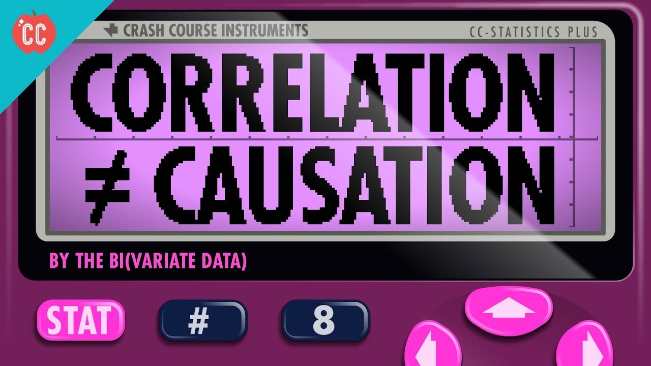
Correlation Doesn't Equal Causation: Crash Course Statistics #8

10 Curve Fitting Part2 NUMERIK

KULIAH STATISTIK - ANALISIS REGRESI
Data Mining 09 - Korelasi & Analisa Regresi (1/2)
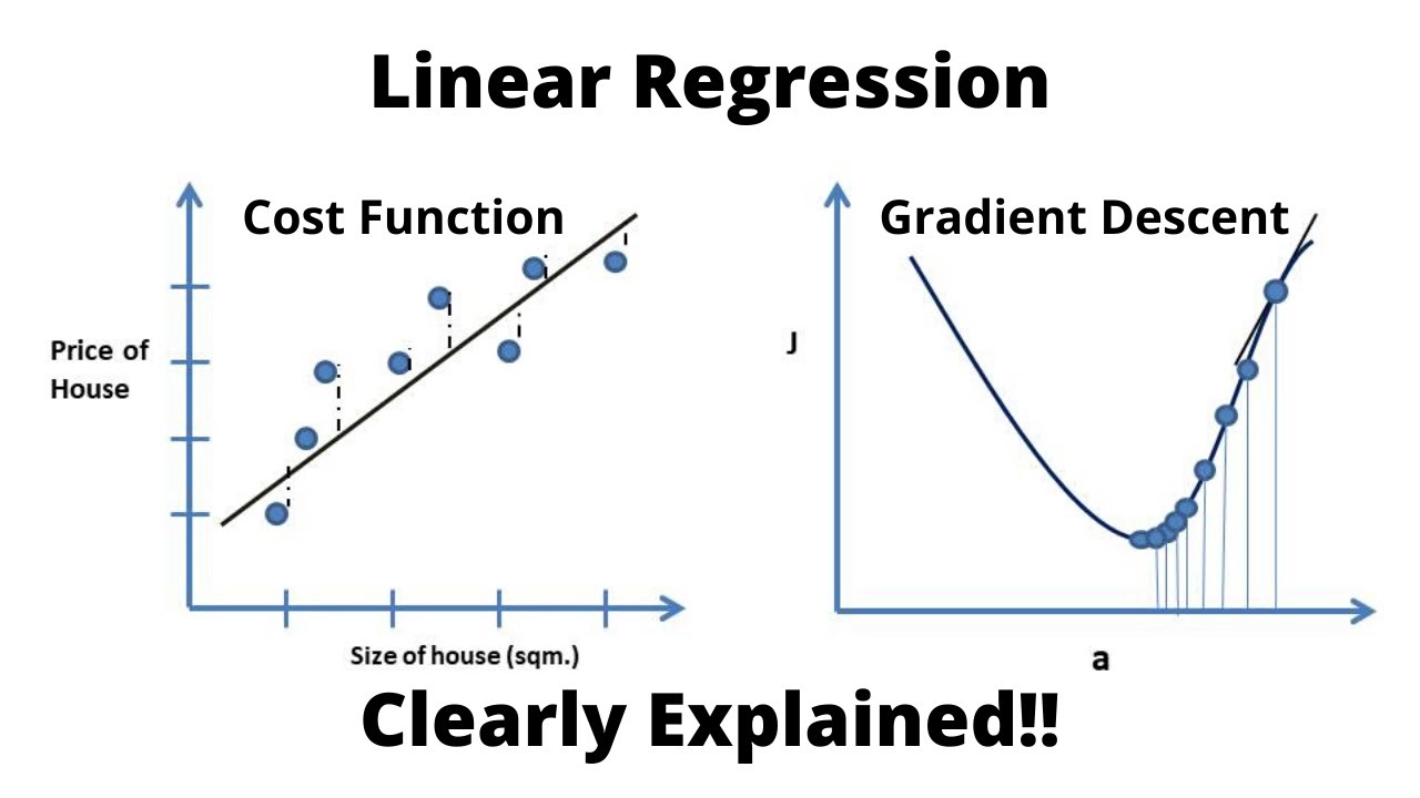
Linear Regression, Cost Function and Gradient Descent Algorithm..Clearly Explained !!
STATISTICA parte 2.3 : correlazione e regressione
5.0 / 5 (0 votes)
