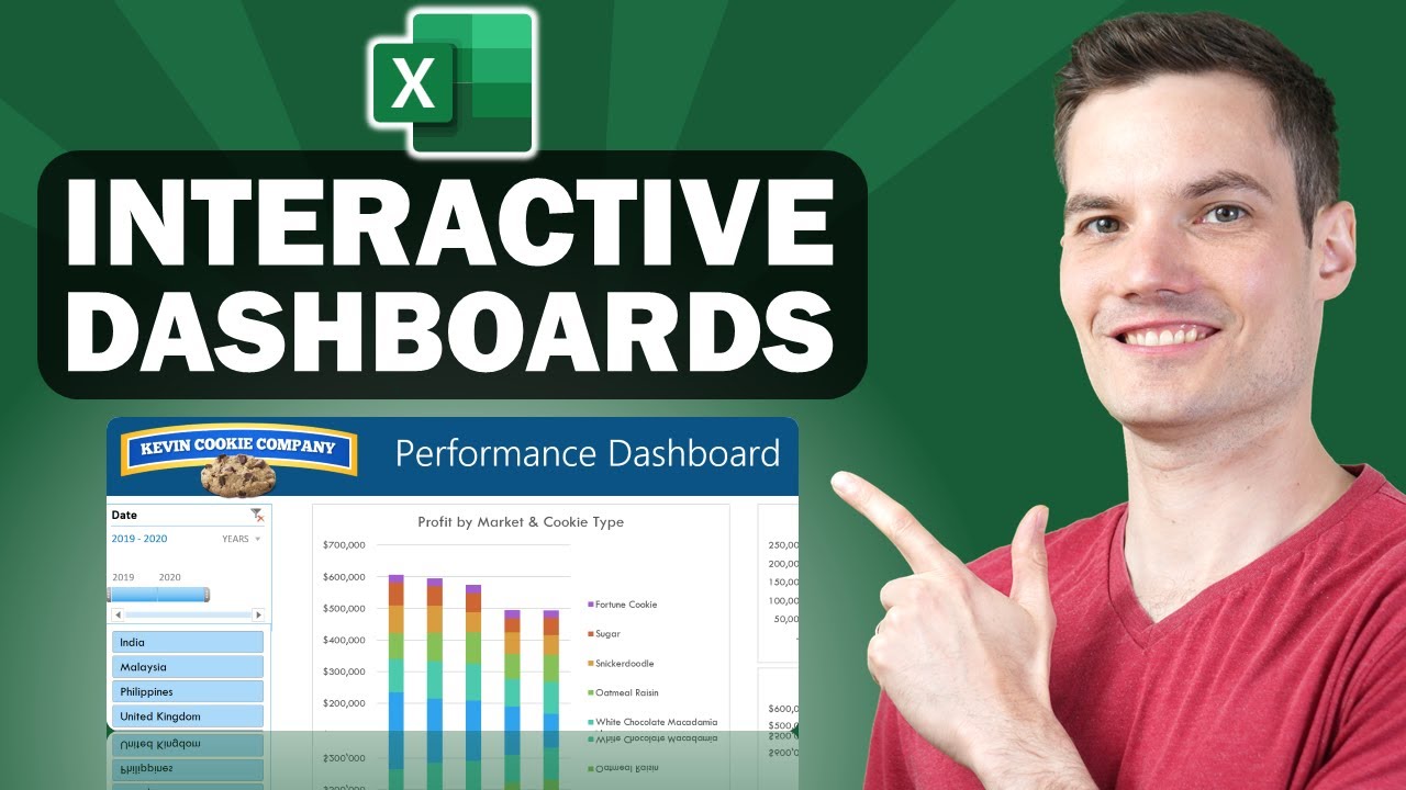
Cross Filter and Highlight Excel Charts like Power BI
Summary
TLDRThis tutorial demonstrates how to replicate Power BI’s cross-filtering functionality in Excel using Power Pivot and pivot charts. By linking slicers to multiple pivot tables, users can interactively filter and highlight data across charts. The guide covers setting up Power Pivot, writing custom measures, formatting pivot tables, and aligning charts. Additionally, an alternate method using formulas for users without Power Pivot is provided. The result is a dynamic Excel dashboard that mimics the interactivity of Power BI, offering a visual and engaging way to explore data.
Takeaways
- 😀 Power Pivot in Excel allows you to simulate the cross-filtering feature found in Power BI, where selecting an item in one chart filters and highlights corresponding items in other charts.
- 😀 Excel does not have a built-in way to cross-filter charts, but the process can be replicated using slicers and Power Pivot's relationships.
- 😀 A slicer provides interactivity by allowing users to select items (e.g., brands), which will then filter data across charts and tables.
- 😀 The data must be formatted into tables (e.g., ‘Brands’ and ‘Data’) before loading into Power Pivot for further manipulation.
- 😀 Power Pivot enables you to create relationships between different tables, with the option to make them inactive, which is crucial for setting up cross-filtering in charts.
- 😀 To achieve the cross-filtering effect, you need to write custom measures, such as total gross profit and selected brand, using DAX (Data Analysis Expressions).
- 😀 Once the relationships and measures are set up in Power Pivot, you can create Pivot Tables that will react to slicer selections, even when the relationship between tables is inactive.
- 😀 Pivot charts can be added to the Pivot Tables to visualize the data, allowing for dynamic filtering based on slicer selections.
- 😀 Formatting is important in this setup; custom number formats and alignment help ensure that charts and tables look cohesive and professional.
- 😀 If you don’t have Power Pivot, a similar result can be achieved using regular pivot tables and formulas that replicate the functionality of Power Pivot’s DAX measures.
Q & A
What is the main feature of Power BI that the tutorial aims to replicate in Excel?
-The tutorial aims to replicate Power BI's cross-filtering and highlighting feature, where selecting an item in one chart filters and highlights related data across other charts.
Can this technique be used in Excel versions without Power Pivot?
-Yes, the tutorial provides an alternative method using formulas for users who do not have Power Pivot, allowing them to achieve similar results with regular pivot tables.
What is the purpose of the 'slicer' in the tutorial?
-The slicer provides interactivity, allowing users to filter data in the charts based on selected criteria, such as a specific brand or category, and apply this filter across multiple charts.
How does Power Pivot help in creating the cross-filtering effect in Excel?
-Power Pivot helps by allowing the creation of inactive relationships between tables, enabling the use of DAX (Data Analysis Expressions) measures to filter and highlight data across multiple pivot tables and charts.
What role do measures play in the tutorial?
-Measures in Power Pivot are used to calculate specific values, such as total gross profit and the gross profit for a selected brand. These measures are key to applying the cross-filtering effect between charts.
How do you create the 'Selected Brand' measure in Power Pivot?
-The 'Selected Brand' measure is created using the `CALCULATE` function along with `USERELATIONSHIP`, which activates the inactive relationship between the 'Brands' and 'Data' tables for filtering based on the selected brand.
What types of charts are used in this tutorial?
-Bar charts are used to display the gross profit data by brand and product category, as they provide more space for long labels and are easier to format for this purpose.
Why is the slicer placed over the vertical axis of the brand chart?
-The slicer is aligned over the vertical axis of the brand chart to make it appear as though it is part of the chart, creating a more seamless and interactive experience for the user.
What are the key steps involved in setting up the slicer and pivot tables?
-Key steps include inserting a slicer for the 'Brand' field, linking it to the pivot tables through 'Report Connections,' and creating pivot charts based on the data model to display the filtered results.
How does the tutorial address the lack of Power Pivot in some Excel versions?
-For versions without Power Pivot, the tutorial provides an alternative approach using regular pivot tables and formulas to achieve the same cross-filtering and highlighting effect as Power Pivot.
Outlines

هذا القسم متوفر فقط للمشتركين. يرجى الترقية للوصول إلى هذه الميزة.
قم بالترقية الآنMindmap

هذا القسم متوفر فقط للمشتركين. يرجى الترقية للوصول إلى هذه الميزة.
قم بالترقية الآنKeywords

هذا القسم متوفر فقط للمشتركين. يرجى الترقية للوصول إلى هذه الميزة.
قم بالترقية الآنHighlights

هذا القسم متوفر فقط للمشتركين. يرجى الترقية للوصول إلى هذه الميزة.
قم بالترقية الآنTranscripts

هذا القسم متوفر فقط للمشتركين. يرجى الترقية للوصول إلى هذه الميزة.
قم بالترقية الآنتصفح المزيد من مقاطع الفيديو ذات الصلة

Learn Excel Pivot Tables in 10 Minutes - A complete beginner's tutorial

📊 How to Build Excel Interactive Dashboards

Chapter 5 - Tutorial Analisa Data Part 3 (Pivot Table) | Informatika Booster

Learn 80% of Data Analysis in Excel in Just 12 Minutes

How to Analyze Data with Pivot Tables in Excel

Excel Pivot Table EXPLAINED in 10 Minutes (Productivity tips included!)
5.0 / 5 (0 votes)
