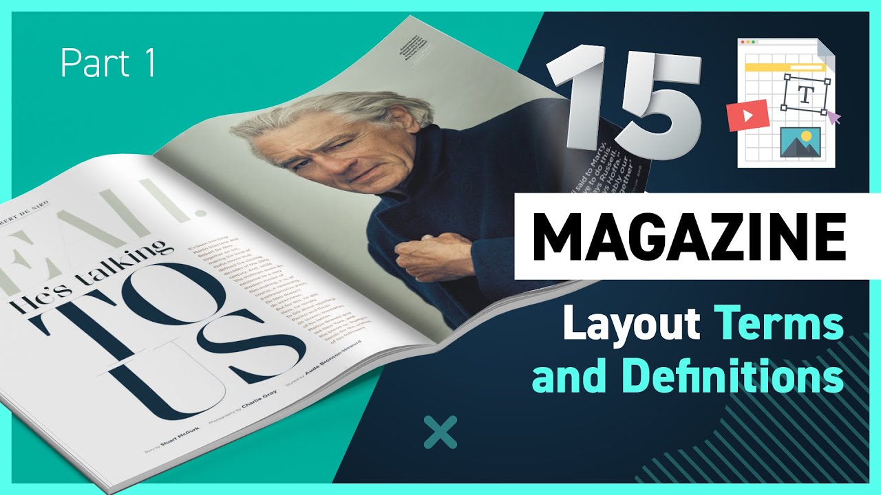
Anatomy of a Magazine Layout Part 2 - 20 More Terms and Definitions
Summary
TLDRIn this video, the speaker delves into the art of magazine layout design, sharing key principles and techniques used by top editorial designers. Topics covered include image placement, the importance of bleed, typography in columns, and maintaining readability. The video also highlights the role of negative space, side stories, and visual unity in creating cohesive and professional spreads. With practical examples, the speaker emphasizes flexibility in applying design rules, offering viewers valuable insights into creating impactful, elegant magazine layouts. A Milanote board with design examples and additional resources are also provided for further learning.
Takeaways
- 😀 Understanding the importance of captions and credits for images in editorial design, including where to place them and how to credit photographers and illustrators.
- 😀 📏 The concept of 'bleed' in print design is crucial when placing images, ensuring that they extend 3mm beyond the final print size to prevent unwanted borders.
- 😀 🖼️ Consistency in image style, whether it's illustrations or photography, ensures visual unity within a magazine spread.
- 😀 🌐 Double truck spreads, or run-around images, allow for creative text integration with large images, enhancing perspective and depth.
- 😀 🖼️ Photo packages are groups of images that can be arranged in a row or stacked together, adding variety and visual interest to a page.
- 😀 📐 Understanding the 'safe zone' and 'creep' is key to avoiding important elements from being too close to the spine or edges of the page, ensuring legibility.
- 😀 🖋️ Body copy readability is prioritized by using columns, maintaining appropriate gutter space between them to prevent accidental jumping of lines.
- 😀 📊 Sidebars or box-outs are smaller articles or side stories within the main content, requiring clear separation to highlight them as distinct elements.
- 😀 🎨 Lines, such as down rules or eye lines, guide the reader's eye and visually unify different parts of a spread, enhancing design flow.
- 😀 🧘♀️ Negative space (white space) is essential for balancing the design, ensuring elements don't feel cramped, and making the page feel elegant and luxurious.
Q & A
What is the importance of captions in magazine design?
-Captions are essential for providing context to images and crediting the artists involved, such as photographers or illustrators. While they can be written individually for each image, a common practice is to combine them together and refer to the images as 'left', 'right', or 'bottom' to streamline the design.
What does 'bleed' refer to in magazine design?
-Bleed refers to the area of a design that extends beyond the final trim size of the magazine. It ensures that images or designs reach the edge of the page without leaving unwanted white space. Typically, a 3mm margin is added outside the trim line to ensure a clean edge after printing.
How does the concept of 'negative space' affect magazine layouts?
-Negative space, or white space, is crucial for giving a design balance and preventing it from feeling cluttered. It allows the elements within the layout to breathe, guides the reader's eye, and enhances readability, making the overall design feel more elegant and luxurious.
What are 'double truck' images in magazine design?
-'Double truck' images span across two pages in a magazine spread, creating a seamless visual experience. These images can either be in the background with text overlaid or integrated in creative ways with text to add depth and perspective to the layout.
What is a 'photo package' in editorial design?
-A photo package refers to a cluster of images grouped together in a column, row, or stacked format. This technique is often used to tell a visual story or highlight different aspects of a subject, ensuring cohesion within the spread.
Why are margins important in magazine layout design?
-Margins, especially inner margins called 'creep', are critical for ensuring text and important design elements do not get too close to the edge or spine of the magazine. The margins help maintain readability and avoid losing important content during the binding process.
What role do columns and gutters play in magazine design?
-Columns are used to break up the body copy, making it easier to read. The gutter (the space between columns) ensures there’s a visual distinction between them, preventing the reader from accidentally jumping between the two. Proper column setup is essential for readability and flow.
What are sidebars and panels, and how are they used in magazine spreads?
-Sidebars and panels are additional sections within a spread that offer extra information or a side story related to the main article. They are visually isolated from the body copy, often through different fonts, background colors, or graphic elements, to ensure the reader can easily distinguish them.
How can typography help in creating depth and perspective in a magazine layout?
-Typography can be used creatively to integrate text with images, such as placing text behind or in front of an image, which creates depth and perspective. By using these techniques, designers can make the two-dimensional layout feel more dynamic and engaging.
Why is readability considered the most important aspect of a magazine spread?
-Readability is paramount because the primary goal of any magazine spread is to ensure that the content is easy to read and visually appealing. This involves careful attention to font choice, line length, column structure, and ensuring there is enough space between elements to guide the reader's eye comfortably.
Outlines

هذا القسم متوفر فقط للمشتركين. يرجى الترقية للوصول إلى هذه الميزة.
قم بالترقية الآنMindmap

هذا القسم متوفر فقط للمشتركين. يرجى الترقية للوصول إلى هذه الميزة.
قم بالترقية الآنKeywords

هذا القسم متوفر فقط للمشتركين. يرجى الترقية للوصول إلى هذه الميزة.
قم بالترقية الآنHighlights

هذا القسم متوفر فقط للمشتركين. يرجى الترقية للوصول إلى هذه الميزة.
قم بالترقية الآنTranscripts

هذا القسم متوفر فقط للمشتركين. يرجى الترقية للوصول إلى هذه الميزة.
قم بالترقية الآنتصفح المزيد من مقاطع الفيديو ذات الصلة
5.0 / 5 (0 votes)


