📊 How to Build Excel Interactive Dashboards
Summary
TLDRIn this tutorial, Kevin demonstrates how to create an interactive dashboard in Microsoft Excel using pivot tables and charts without any VBA or add-ins. He illustrates the process with the Kevin Cookie Company’s sales data, guiding viewers through formatting data into tables, creating multiple pivot tables, and inserting visualizations like stacked column and line charts. Kevin enhances user interactivity by adding slicers and timelines for data filtering, shows how to refresh the dashboard with new data, and shares tips for improving the dashboard's appearance. The video concludes with instructions on sharing the finished dashboard within an organization.
Takeaways
- 😀 Creating an interactive dashboard in Excel requires no VBA or add-ins, just the base version of Excel.
- 📊 Pivot tables are essential for summarizing and analyzing data effectively.
- 🗂️ Data must be formatted as a table before creating pivot tables to ensure accuracy.
- 📈 Charts can be easily inserted from pivot tables to visually represent data trends.
- 🧹 Clean up your charts by removing unnecessary legends and titles for clarity.
- 🔗 Slicers and timelines can make dashboards interactive, allowing users to filter data dynamically.
- 🔄 New data can be added to the dashboard easily by pasting it into the original data table and refreshing the pivot tables.
- 🎨 Customizing the dashboard's appearance with themes and removing gridlines enhances its visual appeal.
- 🔒 Dashboards can be shared with others, with options for editing or view-only permissions.
- 📝 Regular updates and refinements can help maintain the dashboard's relevance and usefulness over time.
Q & A
What is the primary purpose of creating a dashboard in Microsoft Excel?
-The primary purpose is to showcase important information and insights to an organization in an easy-to-read format.
Do you need to know VBA or install add-ins to create a dashboard in Excel?
-No, you do not need to know any VBA or install any add-ins; the base version of Microsoft Excel is sufficient.
What is the first step in setting up your data for a dashboard?
-The first step is to ensure your data is in table format, which can be done by selecting your data and using the 'Insert' menu to create a table.
How can you create a pivot table from your data?
-To create a pivot table, click into your table, go to the 'Insert' menu, and select 'Pivot Table' to place it in a new worksheet.
What are some examples of the data you can include in a dashboard?
-Examples include profit, unit sales, and other performance metrics related to your business.
How do you ensure your pivot table fields are organized correctly?
-You can drag fields into the appropriate areas (e.g., rows and columns) in the pivot table field list to organize your data.
What type of chart is suggested for visualizing profit data by country and cookie type?
-A stacked column chart is recommended for visualizing profit data, as it allows for easy comparison across categories.
How can you make your dashboard interactive?
-You can insert slicers and a timeline to allow users to filter the data dynamically and see updates in the pivot tables.
What should you do if you want to update your dashboard with new data?
-You can copy the new data into your existing data table and then refresh the pivot tables using the 'Refresh All' option.
What steps can you take to improve the visual appeal of your dashboard?
-You can turn off gridlines, hide unnecessary sheets, and apply color themes from the 'Page Layout' tab to match your organization’s branding.
Outlines

هذا القسم متوفر فقط للمشتركين. يرجى الترقية للوصول إلى هذه الميزة.
قم بالترقية الآنMindmap

هذا القسم متوفر فقط للمشتركين. يرجى الترقية للوصول إلى هذه الميزة.
قم بالترقية الآنKeywords

هذا القسم متوفر فقط للمشتركين. يرجى الترقية للوصول إلى هذه الميزة.
قم بالترقية الآنHighlights

هذا القسم متوفر فقط للمشتركين. يرجى الترقية للوصول إلى هذه الميزة.
قم بالترقية الآنTranscripts

هذا القسم متوفر فقط للمشتركين. يرجى الترقية للوصول إلى هذه الميزة.
قم بالترقية الآنتصفح المزيد من مقاطع الفيديو ذات الصلة

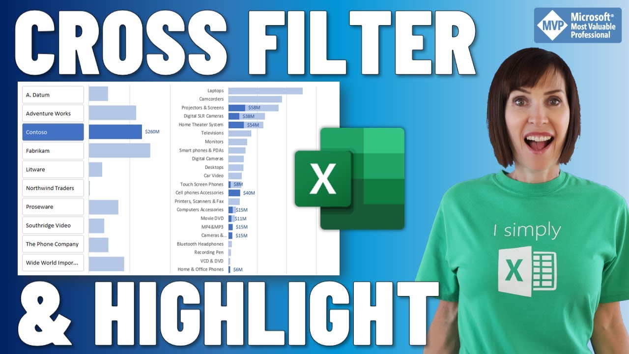
Cross Filter and Highlight Excel Charts like Power BI

Learn Excel Pivot Tables in 10 Minutes - A complete beginner's tutorial

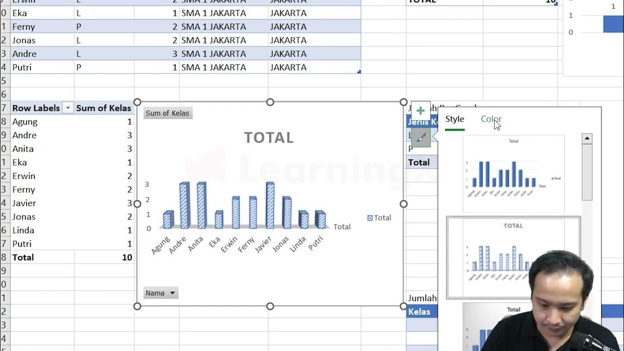
Chapter 5 - Tutorial Analisa Data Part 3 (Pivot Table) | Informatika Booster

How to Create Charts and Graphs in Microsoft Excel - Quick and Simple

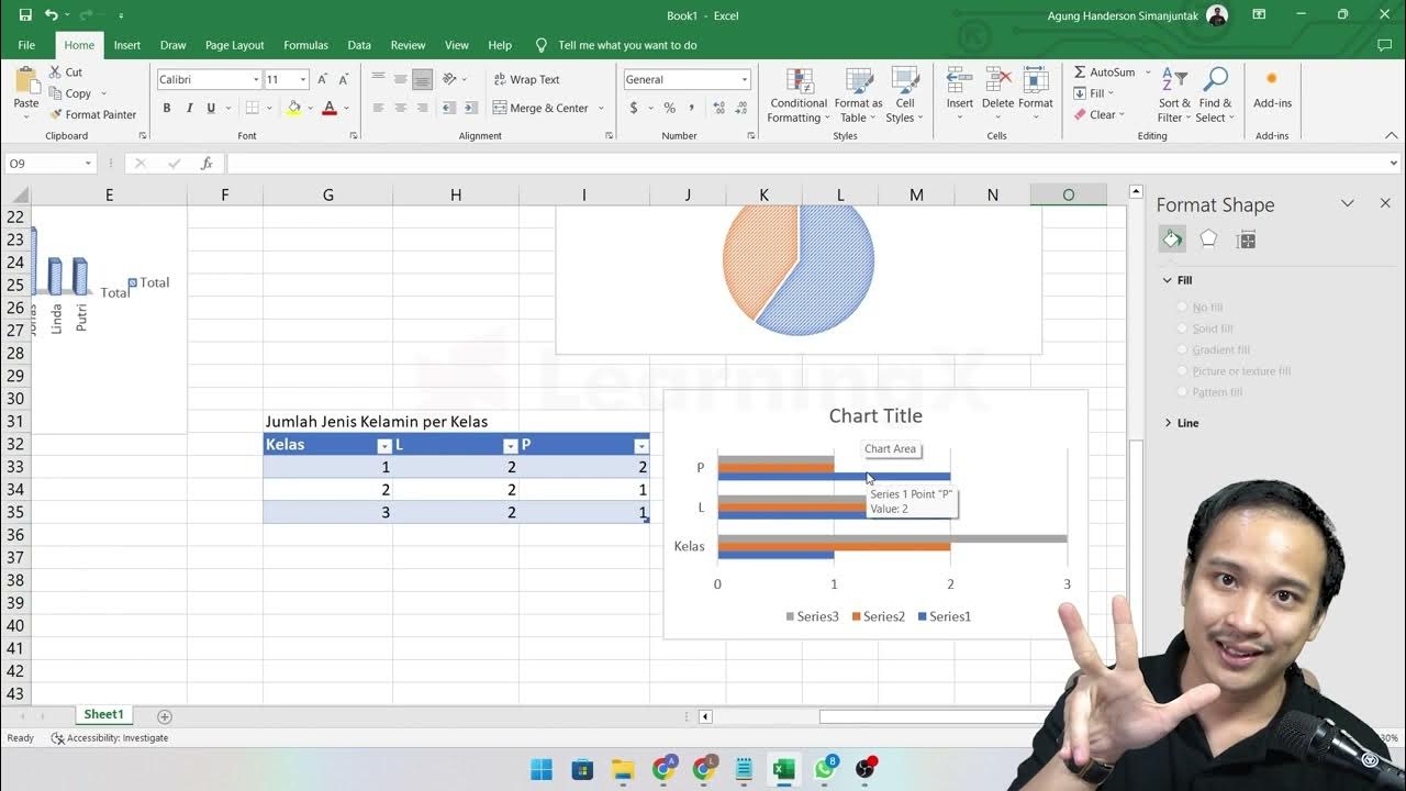
pivot dua dimensi informatika Kl 8 bab 6 Analisis Data kurikulum Merdeka bag 37 hal 153 156

Chapter 5 - Analisa Data melalui Excel | Informatika Booster
5.0 / 5 (0 votes)
