Mitä data-analytiikka on?
Summary
TLDRIn this video, Olli Koskela from HAMK University of Applied Sciences explores the concept of data analytics, emphasizing its importance in understanding complex phenomena through detailed analysis. He illustrates the process with historical and contemporary examples, such as World War II aircraft armor optimization and sales statistics analysis. Koskela also discusses the role of data analytics in various fields like bio- and circular economy, welfare, education, industry, and transport, highlighting the significance of effective data communication for decision-making.
Takeaways
- 📊 Data analytics involves examining the components and structures of data in detail to build understanding.
- 🔍 The term 'data' can be thought of as a 'collection of measuring points', which forms a dataset.
- 🛡 Analyzing data often involves combining statistical methods and machine learning to uncover insights.
- 🔧 Data analysis can be performed with simple tools like crayons and paper, not just digital methods.
- ✈️ A historical example from World War II demonstrates how data analytics can optimize outcomes, like aircraft armor placement.
- 📉 Visualizations such as scatter plots and histograms are crucial for understanding data distributions and patterns.
- 📈 The median and average are basic statistical measures that can provide insights into data, but may not tell the whole story.
- 📊 Histograms group data into ranges to show the frequency of data points within those ranges, which can reveal trends.
- 🌡️ The Bioeconomy 4.0 project uses IoT sensors and data analytics to correlate environmental conditions with milk yield in cows.
- 🐄 Machine vision and image classification can analyze animal behavior, like cow queuing for milking, to improve farm operations.
- 🌡️ Monitoring environmental conditions like temperature and humidity can help prevent spoilage in silage, ensuring feed quality.
- 🌐 The HAMK Smart Research Unit uses data analytics to develop solutions across various sectors including bio- and circular economy.
Q & A
What does Olli Koskela believe data analytics to be?
-Olli Koskela believes data analytics to be the elucidation of the internal structure and properties of a set of measurement points, using appropriate tools such as statistical methods and machine learning.
What is the significance of the term 'data' in the context of data analytics?
-In the context of data analytics, 'data' refers to a collection of measuring points, often derived from physical experiments, and is used to analyze and understand patterns or trends.
How does Olli Koskela describe his background in relation to data analytics?
-Olli Koskela has a master’s degree in applied mathematics with a major in analysis, which involves using analytical tools and methods to understand problems and review them according to agreed and proven rules.
What is the Abraham Wald’s The Statistical Research Group data set mentioned in the script?
-The Abraham Wald’s The Statistical Research Group data set from World War II contains information about bullet holes in aircraft and was used to determine where to place armor for optimal protection.
Why is it important to consider the data from planes that did not return in the aircraft armor optimization problem?
-It is important to consider the data from planes that did not return because they likely had more bullet holes in areas that were critical for survival, thus providing crucial information for where to place armor.
How did Olli Koskela become a data analyst?
-Olli Koskela became a data analyst by volunteering to develop fundraising and analyze sales statistics for products sold by children and young people during a campaign.
What was the initial assumption in the sales statistics analysis that Olli Koskela worked on?
-The initial assumption was that Group A sold better than Group B, and the task was to find out why.
What did Olli Koskela discover about the sales data when he looked beyond the averages?
-When looking beyond the averages, Olli Koskela discovered that Group A sellers sold an average of 13.3 products and Group B sellers sold an average of 12.6 products, indicating a small but significant difference.
What is the significance of the histogram in the sales data analysis?
-The histogram in the sales data analysis is significant because it groups measurements into ranges, showing the number of sellers who sold the same number of products, which helps to identify patterns and trends in sales volumes.
What insights did Olli Koskela gain from analyzing the sales data more deeply?
-Olli Koskela gained insights such as the potential of sellers who had not sold any products, the fact that sellers rarely returned products, and the possibility of increasing sales by raising prize limits.
How does the HAMK Smart Research Unit utilize data analytics?
-The HAMK Smart Research Unit utilizes data analytics to develop solutions in various fields such as bio- and circular economy, welfare, education, industry, and transport.
What is the purpose of the Bioeconomy 4.0 project mentioned in the script?
-The purpose of the Bioeconomy 4.0 project is to measure environmental conditions in a cowhouse and correlate them with the milk yield of cows using temperature and humidity data.
Outlines

هذا القسم متوفر فقط للمشتركين. يرجى الترقية للوصول إلى هذه الميزة.
قم بالترقية الآنMindmap

هذا القسم متوفر فقط للمشتركين. يرجى الترقية للوصول إلى هذه الميزة.
قم بالترقية الآنKeywords

هذا القسم متوفر فقط للمشتركين. يرجى الترقية للوصول إلى هذه الميزة.
قم بالترقية الآنHighlights

هذا القسم متوفر فقط للمشتركين. يرجى الترقية للوصول إلى هذه الميزة.
قم بالترقية الآنTranscripts

هذا القسم متوفر فقط للمشتركين. يرجى الترقية للوصول إلى هذه الميزة.
قم بالترقية الآنتصفح المزيد من مقاطع الفيديو ذات الصلة

DISS Q1-M1 Social Sciences: A study of society

Fundamentals of Qualitative Research Methods: What is Qualitative Research (Module 1)

What is Audit Data Analytics?

What is Qualitative Research?

Overview of Qualitative Research Methods
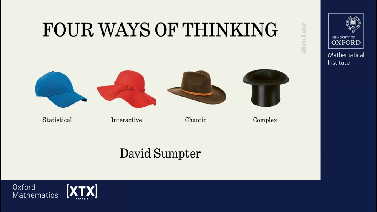
Four Ways of Thinking: Statistical, Interactive, Chaotic and Complex - David Sumpter
5.0 / 5 (0 votes)
