ID: Apps Pod 02

Sarah Waterson
20 Jul 202222:04

Summary

TLDRThis interactive design apps lecture delves into app-specific design and the evolution of web design paradigms, from print to interactive media. It highlights the importance of user interaction and the shift in content hierarchy in modern websites compared to early web design. The lecture emphasizes the distinction between web and app design, the need for iterative development, and the significance of mobile-first design. Designers are urged to adapt their thinking, understand mobile design conventions, and work closely with developers, using tools like XD for prototyping and adhering to platform-specific guidelines.

Takeaways

  • 🌐 The evolution of design has been significantly influenced by new devices and the shift from print to interactive media like the internet, which has made the user a central participant rather than just a spectator.
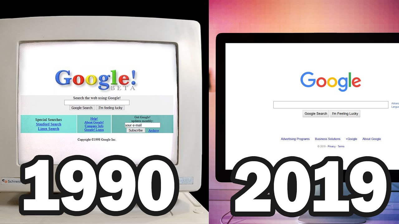
  • πŸ“š Early web design was heavily influenced by print media, with websites resembling digital versions of books or magazines, but this has evolved to a more user-centric approach.
  • πŸ”„ The importance of understanding the unique characteristics of each platform when designing for mobile, as simply translating web designs to mobile can lead to issues with usability and user experience.
  • πŸ› οΈ The necessity for designers to adapt to a fast-paced development cycle for apps, which often involves iterative design and quick releases based on user feedback.
  • πŸ“± The concept of 'mobile first' design, which emphasizes starting the design process with the smallest screen size to ensure a focused and efficient user experience that scales up.
  • 🀝 The collaborative relationship between designers and developers in the app development process, with both roles contributing to the success of the app through an iterative process.
  • πŸ›‘ The need for designers to be familiar with the design guidelines for different operating systems to ensure that apps are intuitive and consistent with user expectations.
  • πŸ“š The value of using development tools like Adobe XD to create screens that can be quickly and accurately transferred to developers, facilitating better communication and collaboration.
  • πŸ” The emphasis on prototyping as a crucial part of the app design process, allowing designers to test and refine the functionality and user experience before finalizing the design.
  • πŸ”„ The understanding that apps are never truly 'finished', but rather are subject to ongoing updates and improvements in response to user feedback and changes in technology.
  • 🌟 The importance of considering the distinct nature of different devices, such as smartphones, tablets, and smartwatches, and designing apps that are optimized for each specific platform.

Q & A

  • What is the main focus of the 'Interactive Design Apps' podcast?

    -The podcast focuses on app-specific design and the development process for apps, including the evolution of design paradigms and the importance of understanding user interaction in app design.

  • How has the advent of new devices like smartwatches impacted the field of design?

    -New devices like smartwatches have forced designers to learn new design paradigms and adapt to the unique constraints and opportunities these devices present.

  • What was a significant shift in design thinking that occurred with the advent of the internet?

    -The significant shift was the transition from print-focused design to designing for an interactive medium, which required learning how to create content that was more engaging and user-centric.

  • How did early websites resemble traditional print media, according to the script?

    -Early websites often had design elements similar to print media, such as tables of contents, sidebars, and banner ads, reflecting a direct translation of print design principles to the web.

  • What is the difference in design hierarchy between the 1997 Apple website and the modern Apple website?

    -The modern Apple website has a clear hierarchy that directs users to key content areas, like the MacBook Air or iPhone 13, whereas the 1997 design was more of a 'slab of text' with hyperlinks, lacking a clear hierarchy.

  • Why is it important to escape the web structure when designing for mobile?

    -Escaping the web structure is important for mobile design because it allows designers to fully leverage the unique capabilities of mobile devices and create more appropriate and satisfying user experiences.

  • What does the term 'mobile first' mean in the context of design?

    -'Mobile first' is a design approach where developers start by creating designs for mobile or small screens first, ensuring that the user interface is effective on these devices before scaling up.

  • How does the development process for apps differ from traditional web development?

    -App development is characterized by a compressed time frame, rapid releases, and an iterative process that relies heavily on user feedback for continuous improvement.

  • What is the significance of understanding both design and development processes in app creation?

    -Understanding both design and development processes is crucial for effective collaboration between designers and developers, leading to a higher quality outcome and shorter iterations.

  • Why is it necessary for designers to use and understand various mobile platforms when creating apps?

    -Designers need to use and understand various mobile platforms to ensure their designs are adaptable and effective across different operating systems, taking into account the unique design conventions and user interface patterns of each platform.

  • What role do prototypes play in the app design process?

    -Prototypes are essential in the app design process as they allow designers to test and evaluate the functionality and usability of the app before finalizing the design, which is a key aspect of the agile methodology.

Outlines

00:00

πŸ“± Evolution of App Design Paradigms

The script discusses the evolution of app design, starting from the early days of the internet when designers transitioned from print to interactive media. It highlights the significant shift in design thinking with the introduction of new devices like smartwatches and the importance of learning new paradigms. The speaker uses the example of early Apple websites to illustrate the transition from print-like designs to more user-centric, interactive layouts. The summary emphasizes the importance of understanding the user's role in app design and the need to move away from traditional print design approaches.

05:01

πŸ› οΈ Adapting to App Design Strategies

This paragraph focuses on the strategies required for app design beyond traditional web design knowledge. It emphasizes the need for designers to challenge their thinking and adapt to a fast-paced development cycle with iterative updates based on user feedback. The speaker introduces the concept of 'lean user experience cycles' and the importance of starting with wireframes and basic designs before moving on to more detailed design stages. The summary underscores the necessity of a mobile-first approach to design, beginning with small screens and scaling up, and the importance of understanding the development process to achieve a successful app outcome.

10:02

🀝 Collaboration in App Development

The script discusses the collaborative nature of app development, where designers and developers work closely in an iterative process to achieve a high level of outcome. It stresses the importance of using development tools to create screens that can be quickly and accurately transferred to developers, and the need for designers to have a basic understanding of app development processes. The summary highlights the use of tools like XD for design and communication, the importance of using the same terminology as the development team, and the need for designers to experience different platforms to understand the nuances of design across iOS, Android, and other operating systems.

15:03

πŸ“š Understanding Design Guidelines for Apps

This paragraph emphasizes the importance of adhering to platform-specific design guidelines for both Android and iOS. It mentions the need for designers to familiarize themselves with resources like Material Design for Android and Apple's design resources for iOS to ensure their apps conform to the respective platform's user interface conventions. The summary points out the necessity of testing on actual devices and keeping up-to-date with the latest design trends and guidelines, as well as the importance of using resources like 'patterns' for common UI solutions.

20:05

πŸ”„ The Iterative Nature of App Design

The script highlights the iterative process of app design, where apps are never truly finished and are constantly evolving with updates and changes in design conventions. It stresses the importance of testing on physical devices to understand how the interface will function and the need for designers to embrace change as an opportunity for improvement. The summary underscores the continuous nature of app development, the importance of prototyping, and the idea that app design is a never-ending process of refinement and adaptation.

Mindmap

Keywords

πŸ’‘Interactive Design

Interactive Design refers to the process of creating interfaces that allow users to interact with digital products, such as websites and apps. In the context of the video, it emphasizes the importance of designing for user engagement and interaction, moving away from traditional print design to digital mediums that require a more dynamic approach. The script discusses how the advent of the internet and devices like smartwatches have necessitated a shift in design paradigms to accommodate user interaction.

πŸ’‘Design Patterns

Design Patterns in the video script represent common solutions to recurring design problems within a given context of use. They are templates for solving common interaction design issues and are part of the development process for apps. The script briefly mentions looking at design patterns, suggesting that they are an integral part of creating user-friendly and effective app interfaces.

πŸ’‘User-Centered Design

User-Centered Design is a design approach that focuses on the user's needs, preferences, and limitations. The script highlights the importance of considering the user as a central figure in the design process, especially in the transition from print to digital media, where the user is no longer just a spectator but an active participant in the interaction with the medium.

πŸ’‘Information Architecture

Information Architecture is the organization of information on websites or apps to make it easy to find and understand. The script discusses a significant shift in how content is structured, moving from a print-like hierarchy to a more user-focused hierarchy that funnels users directly to the content they seek, which is a core aspect of effective information architecture.

πŸ’‘Mobile Design

Mobile Design pertains to the creation of user interfaces specifically tailored for mobile devices. The script emphasizes the importance of understanding mobile design conventions and the need to escape web structures when creating apps, ensuring that the design is optimized for touch interactions, screen sizes, and mobile usage contexts.

πŸ’‘Native Apps

Native Apps are applications developed for specific platforms, like iOS or Android, and are built using the platform's software development kit (SDK). The script contrasts native apps with web apps, highlighting the importance of adhering to mobile design conventions and platform-specific user interface patterns to create a native-like experience.

πŸ’‘Iterative Process

An Iterative Process in the context of the video refers to the continuous cycle of development, testing, and refinement that is characteristic of app design. The script mentions 'lean user experience cycles' as a way to describe how apps are never finished products but are constantly evolving through user feedback and updates.

πŸ’‘Mobile First

Mobile First is a design approach where the design begins with the smallest screen size and then scales up. The script explains that this approach is beneficial because it forces designers to prioritize content and functionality, ensuring that the most important elements areηͺε‡Ί on the smallest screens, which will then scale effectively to larger screens.

πŸ’‘Prototyping

Prototyping in the video script refers to creating preliminary models of the app to test and refine its functionality and user interface. It is a key part of the agile methodology in app design, allowing designers to understand how the app will work before fully developing it. The script also humorously mentions a historical example of a prototype made of wood for the Palm Pilot.

πŸ’‘Cross-Platform Design

Cross-Platform Design involves creating apps that function and appear consistently across different operating systems and devices. The script discusses the importance of understanding and adhering to the design guidelines for different platforms, such as iOS and Android, to ensure that the app provides a consistent user experience regardless of the device.

πŸ’‘Agile Methodology

Agile Methodology is a project management approach that emphasizes flexibility, collaboration, and customer feedback throughout the development process. In the script, it is mentioned in the context of app design, where the methodology requires constant iteration and user testing to ensure the app's usability and functionality.

Highlights

The necessity for designers to adapt to new devices like smartwatches and the evolution of design paradigms.

The historical shift from print to interactive web design, emphasizing the user's role in the design process.

Early web design's resemblance to print media, with tables of contents and sidebars, and the transition to a more user-centered approach.

The importance of understanding the unique characteristics of web and app design, including the use of hypertext links and content hierarchy.

The distinction between web and app design, with examples of how apps can mimic websites but fail to adhere to mobile design conventions.

The iterative nature of app development, with a focus on rapid prototyping and user feedback to inform design.

The concept of 'mobile first' design approach and its significance in creating efficient and scalable user interfaces.

The importance of working closely with developers in the app design process to achieve a high level of outcome.

The use of development tools like Adobe XD to streamline the design-to-development process in app creation.

The need for designers to understand and utilize platform-specific design guidelines for both iOS and Android.

The differentiation in design patterns and user interface conventions across different operating systems.

The importance of prototyping in app design, including the use of physical objects to test interface concepts.

The continuous evolution of app design, emphasizing that apps are never truly finished and require ongoing updates and improvements.

The practical workflow from design to prototype using industry-standard software like Photoshop, Illustrator, and XD.

The challenge of ensuring that the design works effectively across various screen sizes and devices in mobile app development.

The role of user testing in the agile methodology of app design, highlighting its importance in evaluating usability.

The need for designers to adapt their thinking and embrace the unique challenges and opportunities of designing for mobile devices.

Transcripts

play00:12

foreign

play00:16

welcome back to interactive design apps

play00:19

this is the second pod and this pod

play00:21

pretty much follows on from the week one

play00:23

pod we're going to continue looking at

play00:26

what app specific design might be and to

play00:29

look very briefly at design patterns as

play00:32

part of the development process for apps

play00:35

but let's

play00:36

let's start

play00:38

by looking at

play00:40

um

play00:40

what the device is so new devices things

play00:43

like smart watches Force us as designers

play00:47

to constantly learn new design paradigms

play00:50

and you can see how I've just put some

play00:51

apple watches there and of course this

play00:54

big change in design thinking came

play00:56

nearly 20 years ago now with ubiquitous

play00:59

or 30 years maybe with ubiquitous

play01:01

internet access and the desktop which I

play01:03

should in the first websites before then

play01:06

like most designers and myself included

play01:09

we were focused on print and the arrival

play01:11

of the internet required us to learn how

play01:14

to design for an interactive medium

play01:16

which is what we're trying to do in this

play01:18

unit or this subject the user

play01:21

has become you know far more important

play01:24

than just a spectator

play01:26

they're now interacted in more

play01:28

sophisticated way than they ever did

play01:30

with the print magazine or a book in

play01:33

this transition lots of early websites

play01:35

looks like signs with buttons on them

play01:38

and as designers we didn't immediately

play01:41

understand the characteristics of this

play01:43

new medium

play01:44

now if we look here I've found from the

play01:48

Wayback machine an early Apple website a

play01:52

lot of the design paradigms

play01:54

that we began web design with

play01:57

um started from print as we can see in

play02:00

this website from I think it's 1997.

play02:03

you can see to the left there's a table

play02:05

of contents in what we now call the

play02:07

sidebar

play02:08

it's like a book in that way there's an

play02:11

applicable advertisement and you know

play02:14

banner ads that sort of thing is still

play02:16

with us and there's a use of hypertext

play02:18

links which was quite revolutionary in

play02:21

the early days of web design it created

play02:24

a whole lot of excitement that we could

play02:26

link to anything without having to turn

play02:28

pages now if we compare that to the site

play02:31

today I'd say my quicksquiz we can see

play02:35

there's a huge amount of design shift

play02:37

there for Apple you can see there's

play02:40

still the standard top nav menu which

play02:42

has come from the sidebar up to there

play02:45

and we can see that there's two key

play02:47

content areas that we open up with the

play02:50

MacBook Air or the iPhone 13. they're

play02:53

featured in the center there so we can

play02:56

guess that these are the items that

play02:58

Apple think we want to see first or they

play03:00

want to push us to see first

play03:03

um

play03:04

and you can see the hierarchy is really

play03:07

now about

play03:08

what is most useful for Apple to show us

play03:11

or what is most what they think is most

play03:13

useful for you to want to view first so

play03:16

we don't just start at the start and

play03:18

then go through a table of contents like

play03:20

a a print medium wood but you can see

play03:24

that we're now being funneled directly

play03:26

to the content that we want

play03:29

um so if we think back to the original

play03:31

1997 design the hierarchy

play03:34

really wasn't there there was just a

play03:36

long slab of text with hyperlinks inside

play03:39

it and it required you know you as a

play03:41

user to read through at length to find

play03:44

what you're looking for so that is a big

play03:46

shift in how we think about designing

play03:49

content and information architecture

play03:52

generally for devices now

play03:54

now we're going to move to you know

play03:57

these distinctions are becoming clear

play03:59

between web and app design which is the

play04:01

theme again of this week's pod if we

play04:04

look at the apps by the BBC left and

play04:07

hurts right they look

play04:09

kind of like websites they don't really

play04:11

look like native apps and we know native

play04:13

zaps are from last week and they emit

play04:16

some really basic mobile design

play04:18

conventions

play04:20

um the same thing is happening today

play04:22

with apps one you will often come across

play04:25

applications that look like many

play04:27

websites they're constructed as web

play04:29

pages they're just translated for

play04:31

smartphones and in turn I would say that

play04:34

they fail with contrast

play04:36

font size touch targets and gestures and

play04:40

we touched on these things last week

play04:41

they also missed the mark with who will

play04:44

be using the app where and when on what

play04:47

devices

play04:48

so when designing for mobile escaping a

play04:51

web structure is really important we

play04:53

have to face projects with a different

play04:55

mental approach to fully understand

play04:57

mobile design in order to take full

play05:00

advantage of what phones offer and how

play05:04

to deliver you know so more appropriate

play05:06

and satisfying experiences so what do

play05:10

you need to do in order to be a web an

play05:12

app designer other than that rather than

play05:14

a web designer beyond the knowledge and

play05:17

tools I would say that you need to

play05:18

challenge the way you think and I'm

play05:21

going to go through in a little bit of a

play05:23

listy way again some of the strategies

play05:25

for adapting to this world about design

play05:27

so first of all you will

play05:30

change the way that you work

play05:33

hundreds of apps as we know are entering

play05:36

the App Store and development from the

play05:40

idea to the launch is a very compressed

play05:42

time frame for apps as opposed to web

play05:44

development we can't spend months on

play05:48

detailed fancy designs before launching

play05:51

I need to realize that other apps have

play05:53

come in earlier and solve the problem

play05:56

locally in a similar way you'll notice

play05:59

in the app development process that

play06:01

things get released really quickly and

play06:03

then they rely on user feedback to

play06:06

update you know to provide you know a

play06:08

next release and the next release I

play06:11

don't know if you've ever had an app

play06:13

said oh there's a new one updated and

play06:14

it's almost weekly that there's an

play06:16

update provided for the app and that's

play06:18

part of

play06:19

um I guess it's endemic to apps that we

play06:22

let them loose on users before having

play06:25

them completely fully fledged and

play06:28

they've they're never finished anyway

play06:29

okay so in terms of production cycle

play06:34

um there's a thing called lean user

play06:36

experience cycles and we can see a chart

play06:39

here and this means that there's a

play06:41

constant iterative process for apps

play06:44

there's always something being developed

play06:46

and iterated on keeping you know in the

play06:50

middle of your mind the single Focus

play06:52

that you know it will need to be

play06:54

improved again at some some point it's

play06:57

never ending

play06:59

so app design can't really begin with

play07:02

just interface design in Photoshop or

play07:04

illustrator or any of those normal

play07:06

production Pathways that we're used to

play07:08

working with it has to start before that

play07:10

with wireframes and basic designs to

play07:13

kind of get those things right before

play07:15

even

play07:16

moving along into developing the

play07:19

Prototype that is a faster or more lean

play07:22

way to develop things so in this diagram

play07:25

let's just go through it we've got think

play07:27

make and check and if we have a little

play07:30

look under those we think there's some

play07:32

generative research there's an ideation

play07:34

that happens there's mental models

play07:36

behavioral models there's test results

play07:38

or competitive analysis or what any of

play07:40

those research things that would

play07:42

normally enter into a development of an

play07:44

app there's the making and we can see

play07:46

here the prototyping the wireframes the

play07:50

unique value proposition which we

play07:51

touched on in IDM things like the

play07:54

landing page hyper comps or deployed

play07:57

code so comps we just mean the screen

play07:59

compositions and then there's checking

play08:01

and user testing is a big thing so a b

play08:03

testing any analytics usability testing

play08:06

any of those funnel testing sign ups all

play08:09

of that sort of stuff and then going

play08:11

back to the think part again and so it's

play08:13

this iteration circle is pretty normal

play08:16

for apps and it's pretty fast

play08:18

for app design generally

play08:22

okay

play08:23

so the next point we wanted to make was

play08:25

that mobile first is has been a buzz

play08:28

word in the screen design sector for

play08:31

quite some time now it simply means that

play08:33

it is very good practice whenever you're

play08:36

you know you're charged with developing

play08:38

uh

play08:39

screen materials for a company or a

play08:42

client that you actually begin with

play08:44

mobile or small screens first so mobile

play08:48

first because a lot of that user

play08:50

interaction has to be quite nuanced and

play08:52

the patterns of user interface will then

play08:54

give you a better website in the end so

play08:57

mobile first is a great way to design

play09:00

because it looks good on a small screen

play09:03

it will definitely scale but not vice

play09:06

versa

play09:08

okay so it's I guess the big best

play09:10

analogy here to kind of bring this point

play09:14

home is this idea of traveling with

play09:16

luggage if you've got a small bag you

play09:19

know you'll only bring certain amount of

play09:20

stuff but if you were given a large bag

play09:22

and or like a website you generally fill

play09:26

it to take it on on

play09:28

your trip with you so if you you know

play09:31

it's best to start with that small bag

play09:33

so you've already edited your contents

play09:35

down to make it this your trip the most

play09:38

efficient that it could be I guess okay

play09:41

so that's why we've got small screens or

play09:44

mobile first is the buzz thing that I'm

play09:46

trying to get you to pay attention to

play09:49

right here okay so the next step is to

play09:52

actually understand the development

play09:55

and the success of your app depends on

play09:57

both your designer and your developer so

play09:59

a developer is the person that will go

play10:01

ahead and code your project you do need

play10:03

to work together not at the end like as

play10:06

part of this iterative process

play10:09

um to achieve a high level of outcome

play10:12

so you can shorter iterations by working

play10:15

in parallel and then kind of

play10:17

intersecting quite often so you will

play10:21

find in the real world whatever that

play10:24

might be that you will be designing and

play10:27

prototyping at the same stage as it

play10:29

being produced by your developer so it's

play10:33

good good to have a basic understanding

play10:35

of app development processes as well as

play10:38

just the design phase

play10:40

okay so the next thing

play10:43

um one way to be ahead of that is to use

play10:46

development tools

play10:48

um

play10:49

to build your screens that can be

play10:52

transferred quickly and Faithfully to

play10:54

your developer and that's why we'll be

play10:56

using XD this semester while accurately

play10:58

sort of communicating the design intent

play11:01

we'll be doing this by using XT so

play11:05

you'll need to use the same terminology

play11:07

as your rest of your team so that

play11:10

everyone speaking the same language for

play11:12

your designs

play11:13

designers developers often refer to the

play11:16

same thing but with different words

play11:17

which makes understanding different

play11:19

parties more difficult but we'll try to

play11:21

get a handle on that as we unfold in the

play11:24

semester

play11:25

um next point is that when you're

play11:28

developing or designing either one a

play11:31

mobile app

play11:32

you can't just use your phone for

play11:34

reference I mean you will for your

play11:36

project for this semester because you

play11:38

don't have a whole range of phones out

play11:39

there but if your target is a global

play11:42

mobile market

play11:44

um you've got to at least be able to

play11:45

access some Android some iOS devices

play11:49

maybe even a Windows phone and be using

play11:52

them constantly in order to fully

play11:54

understand how to resolve the different

play11:56

design scenarios and patterns for each

play11:59

platform I have a draw full of a whole

play12:03

range of phones

play12:05

um but the truth is that the world

play12:08

doesn't begin and end with the iPhone so

play12:10

many designers so some designers do

play12:12

limit themselves to iOS

play12:15

um and so their designs don't really

play12:17

translate to from the original map so if

play12:21

we look here

play12:22

just basically uh three screens so

play12:27

simple navigation resources like Tabs

play12:30

are used in different ways on iOS to

play12:32

Android and to the Windows phone and we

play12:34

can see them there

play12:35

uh iPhones using them at the bottom

play12:38

Android's at the top there although this

play12:40

is changing and then there's a a Windows

play12:43

Phone set up there so the interaction

play12:45

patterns so the established solutions to

play12:48

design problems of user interface are

play12:51

different on each operating system and

play12:53

I'll get at those a little bit later

play12:55

so as such as a designer it's kind of

play12:58

good to you know flip between the two in

play13:01

order to be you know on top of what they

play13:04

actually are and be able to use them

play13:06

correctly in your design work

play13:09

um so a few examples are the location of

play13:11

your tabs how to show menus when to and

play13:14

how to display primary and secondary

play13:16

navigation they all they differ between

play13:18

the two two main platforms there of the

play13:20

IOS and Android

play13:23

um

play13:24

so yeah I just thought I would point

play13:26

point that differentiation out okay if

play13:29

we look here here's a concrete example

play13:31

of it and this is an older version of

play13:32

Instagram

play13:34

um we can see that it looks suspiciously

play13:36

similar on both devices so we going from

play13:39

last week's put a okay I know now that

play13:42

they've probably

play13:43

um designed it as a hybrid app so it's a

play13:47

HTML5 implementation of their website at

play13:50

this stage of their development they've

play13:52

changed the way they work now in

play13:54

Instagram

play13:55

so you can see you know

play13:58

we can see in the Android implementation

play14:00

that you know it hasn't paid attention

play14:02

to the Bottom bar nav ideas and it's

play14:05

just sort of hasn't ported particularly

play14:07

well and I think this kind of

play14:09

illustrates that we also have you know

play14:12

different tabs showing up as defaults so

play14:16

I was yeah okay so next

play14:20

um

play14:20

I just wanted to point out how do you

play14:23

deal with this as a designer

play14:25

so you you can have the phones or you

play14:28

can also alongside having the phones is

play14:32

reference the design guidelines that

play14:36

they both publish regularly up and

play14:38

regularly update depending on the

play14:40

operating system comes out so material

play14:42

design is for the Android number three

play14:44

has just come out and I've got a link

play14:47

there I'll put these Links at the bottom

play14:48

of the Pod as well in today's session

play14:52

um but if you're wanting to conform or I

play14:54

think that you probably will want to

play14:56

perform because I will ask you to to the

play14:58

user interface conventions and the

play15:00

device specific things for Android you

play15:03

will definitely need to take a squiz

play15:05

through material design three

play15:09

um

play15:09

and then if you were designing for the

play15:13

iOS you'll see here that Apple also puts

play15:18

out developer resources for designers

play15:20

and developers

play15:22

um to look at and you can see here I've

play15:23

just taken the screen grab from the

play15:25

website there again I'll put the link at

play15:28

the bottom but you can see they've got

play15:30

design templates for XD and production

play15:33

templates for XD Photoshop or sketch

play15:35

sketches are popular program for app

play15:37

development but we're using XD this

play15:39

semester but you can see you can

play15:41

download them from the get go to make

play15:43

sure they're conforming to Apple's

play15:45

fairly strict guidelines and in fact if

play15:48

they do not conform to their strict

play15:50

patterns of user interface design they

play15:53

don't get accepted into the App Store so

play15:57

you'll be knocked back and asked to

play15:58

remedy things or they'll just knock it

play16:00

back and won't tell you why Okay so

play16:03

whether you're doing it for Android and

play16:05

I'm pretty sure you haven't decided yet

play16:07

or iPhone and it'll probably be the

play16:09

device that you actually have in your

play16:10

hand or your pocket right now make sure

play16:13

you're familiar with the material design

play16:15

for Android or the iOS design patterns

play16:19

and guidelines that there

play16:23

okay there is another site that I

play16:25

thought I'd alert you to it's in your

play16:27

links and again I'll put it there it's

play16:29

called patterns it does go through

play16:31

common patterns for all sorts of page

play16:34

layouts and user interface issues that

play16:38

you might have we can see some

play16:40

onboarding patterns there and different

play16:43

splash screen patterns so that is

play16:45

another resource that would be useful

play16:47

for everybody doing app design to have a

play16:50

a little look at

play16:52

okay so another thing that you'd need to

play16:55

do with that production in the flow is

play16:57

to prototype everything all the time so

play16:59

an agile methodology which is what we

play17:01

call app design requires us

play17:03

understanding how something will work

play17:05

and function before you make it and

play17:08

before you go through and put your fonts

play17:10

in and your colors and all the normal

play17:12

things that you would do as a designer

play17:15

do need to get that um the functionality

play17:19

right you know

play17:21

likewise all prototypes help us

play17:23

evaluating and again via user testing

play17:25

the app's usability and that's a key

play17:28

thing for app design particularly as

play17:30

part of an agile methodology so we don't

play17:33

have to wait very long before building

play17:35

our prototype so as a result of that oh

play17:39

let me just look at some prototyping

play17:41

things I thought I would put in as one

play17:45

of the funniest prototypes I've seen

play17:46

which actually worked and they did use

play17:48

it it's a

play17:50

it's a piece of wood with with a piece

play17:52

of paper on it it's one of the early

play17:54

prototypes for the Palm Pilots before we

play17:57

kind of had mobile phone

play17:59

usage um and it's from the Computer

play18:01

History Museum

play18:02

so you might not remember that you won't

play18:04

remember the Palm Pilot but it's one of

play18:07

the first prototypes for you know this

play18:09

thing to help us organize our life

play18:10

before the mobile phone came in and they

play18:14

prototyped it in wood to see if it fits

play18:16

in people's pockets and if it actually

play18:17

felt useful to people in the size and

play18:21

weight actually worked and I guess other

play18:23

than just the historical fun of putting

play18:26

in a piece of wood with a piece of paper

play18:27

and a pen you can see the pen part there

play18:29

too

play18:30

um you can see you know it's kind

play18:33

industrial design or you know the look

play18:35

and feel of products is important to

play18:37

prototype as well

play18:40

um Okay so

play18:43

let's move on okay so in terms of our

play18:46

production Pathways

play18:49

um you can see here clear workflow going

play18:52

from design in Photoshop and illustrator

play18:55

into a prototype in XD and then a

play18:58

shareable

play18:59

you know blink NXT as well I mean we

play19:02

could complicate this more with the user

play19:04

testing

play19:05

um Cycles but this is the basic uh

play19:09

workflow for us you can actually design

play19:11

an XD but I imagine most of you

play19:14

will probably kind of go oh actually I

play19:18

want to have more control than the tools

play19:20

that XD provides me but this is a basic

play19:23

production workflow that you'll go

play19:25

through and they're the softwares that

play19:27

we'll be using this semester which are

play19:29

fairly industry standard

play19:31

that you use out of uni and into work

play19:35

okay there are many prototyping tools

play19:38

out there so even though you're using XD

play19:41

you've probably you might have touched

play19:42

on Envision sketches the other popular

play19:44

one so sketch XD and envision are the

play19:48

most common prototyping tools out there

play19:53

okay next next rule is what you see is

play19:57

not always what you get when you um

play20:00

start from a draft design as you work so

play20:03

when you're designing for the web it's

play20:04

possible to watch a live draft but with

play20:07

apps you don't really know how the

play20:10

interface will look and function unless

play20:12

you test it on all of those devices as I

play20:14

said before so such test testing on

play20:18

actual physical devices is really

play20:20

important in Mobile

play20:24

app develop development

play20:27

okay there's so many different screen

play20:28

sizes next thing is that apps are never

play20:32

finished and I keep I said that at the

play20:33

start it's an iterative process

play20:36

um but you're never creating anything

play20:37

that you just launch and say hey my

play20:40

app's finished I've launched an app

play20:42

um problems always occur

play20:45

um

play20:46

different releases of material design

play20:49

might come out or iOS 16 is coming out

play20:52

later this year halfway through your

play20:54

project project probably

play20:56

um so it's it's impossible to always you

play21:00

can't just make a an app design and

play21:02

think that that's finished

play21:05

um detecting problems and changes in

play21:07

conventions is not a bad thing it's an

play21:09

opportunity to learn and kind of improve

play21:11

as you go so

play21:14

you know keep that in your mind whenever

play21:16

you're developing an app never think the

play21:18

hey in assessment too when you do your

play21:20

design document this thing's finished no

play21:22

way you have to kind of use it and go

play21:24

through a whole range of cycles of

play21:27

prototyping to get a new release ready

play21:30

put it that way

play21:32

okay so let's end where yeah let's end

play21:35

where we we started sort of finish up

play21:39

um I guess from this pod you need to

play21:41

come away with the core idea that

play21:43

designing apps requires a bit of a

play21:46

change in thinking uh it's time to leave

play21:49

web design for computer screens and to

play21:52

understand that smartphones and tablets

play21:54

and even watches are separate and

play21:56

distinct devices and need you to

play21:59

consider them as such so thanks for

play22:01

listening and I will see you in class

Rate This
β˜…
β˜…
β˜…
β˜…
β˜…

5.0 / 5 (0 votes)

Related Tags
Interactive DesignApp DevelopmentUser ExperienceMobile FirstWeb ParadigmsDesign PatternsPrototypingIterative ProcessCross-PlatformUI Guidelines